Although every technique in the Ultimate Gann Course is important, they work best when they are all working together as a team. I can’t think of an example where Time by Degrees ALONE called a major turn or Squaring Time and Price ALONE called a major turn. As David said, there is always harmony around the major tops and bottoms, which means we should expect to find multiple sources of confirmation, across multiple techniques. So, using an example from NAB that I was looking at with a student in December last year, I thought I’d run some counts and see what I could find. You might like to recreate this work in your software.
I’ll begin my counts from the 10 March, 2009 low, which is shown in Chart 1 below. As you can see, this is a major bear market low that came in at the end of the Global Financial Crisis.
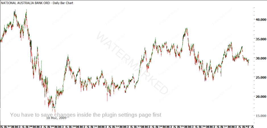
Chart 1 – National Australia Bank (NAB) – The March, 2009 Low
If we run our eyes over the next 8 or 9 years, we can see two nice, clear bullish moves, and two nice clear bearish moves. We’ll start our counts by applying them to these big picture ranges, beginning with the First Range Out of 219 days, as shown in Chart 2 below.
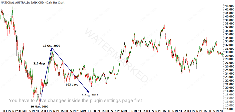
Chart 2 – The First Range Out, 219 Calendar Days
The run-up of 219 calendar days was followed by a pullback of 663 calendar days. Now, you might think that this is very bearish, however, it is important to compare this down range to the previous downside range. Look at the Double Tops all the way back at the top left of Chart 2. Do you think it would be worth measuring the run down from each of those tops into the March, 2009 low? I do!
Now, continuing a trend from last month, I’m not going to do that work for you. If you want to learn, you can go and run those counts in ProfitSource. It might take you five minutes if you have to open your software first. Or, if ProfitSource is already running, it might take you two minutes. If you don’t really want to learn, or you already know all of this stuff, it makes no difference whether I give you the answer here or not. However, if you do want to learn and improve, you’ll get more out of running the counts yourself than reading my answer. So just to be clear, I’d like you to take a moment and run day counts from the two tops in 2007 down to the low in 2009 on NAB.
The 663 day run down from the October, 2009 high gave us the 9 August, 2011 low. 9 August is very close to one of Gann’s Seasonal Dates. Can you remember the other Seasonal Dates? And, can you see any other supporting evidence for the 9 August, 2011 low on NAB? Remember, David tells us that there is always harmony around the major tops and bottoms, so it’s not just the Seasonal Date that called the low.
After the 9 August, 2011 low, NAB ran up for 1343 days into the 13 April, 2015 high of $37.75, which is just over double the 663 day range down into the 9 August, 2011 low. After this, NAB ran down into Double Bottoms in February and June, 2016, giving us counts of 301 or 441 days. You would also pay attention to the average of these dates, which would give us 371 days down. This is all shown in Chart 3 below.
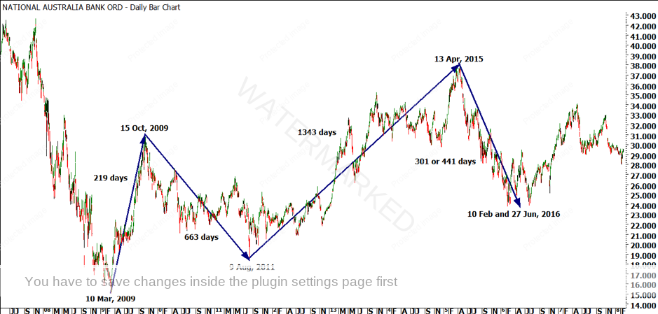
Chart 3 – Two Sections Up, Two Sections Down
So, what does all of this mean? If we consider Gann’s lessons on Sections of the Market (and David’s comments from the ‘Position of the Market’ DVD), then we would be expecting a third section up out of the February and June, 2016 Double Bottoms. So, we will assume that we are looking for a large third section up from either the 10 February or 27 June, 2016 lows.
Depending on whether you use the 10 February or 27 June low as the final low for the bear market (I think that the 27 June, 2016 low is stronger in terms of Time), we have a run up of either 308 days or 446 days into the 1 May, 2017 high. This is shown in Chart 4 below.
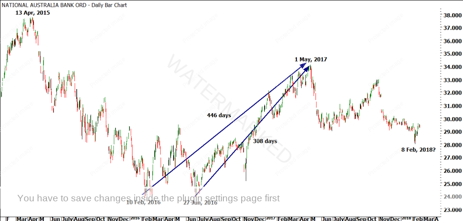
Chart 4 – The Third Section Up (So Far)
446 days is just over double 219 days, from our First Range Out from the 2009 low, but it is a lot less than the last run up of 1343 days. This is where we can find some confusion as traders. Is that it? Is the third leg over? Are we now looking at a bear market? Or, is this 446 day run merely the first, smaller section that makes up the large third section?
If this talk of sections of the market is confusing, I would encourage you to re-read pages 40-42 of the Ultimate Gann Course, to get both Gann and David’s thoughts on Sections of the Market. You might also like to check out the Price Forecasting Webinar, specifically Session 4 – Sections of the Market.
Let’s assume for a moment that the run up into the May, 2017 top of NAB was simply a First Range Out, and there is still more upside ahead of NAB. Note, I said ‘assume’ – we won’t know that for certain until we do more research. But that is our working hypothesis.
So, if the run-up to 1 May, 2017 was a First Range Out, the next move down would be a pullback or a Re-test of the 2016 low. We would expect this to be a higher bottom compared to the 2016 Double Bottoms. But where should we expect it to come in? What techniques can we use to call a low, in this case?
I would look at three things. Firstly, I would look at my Price Forecasting techniques from the Number One Trading Plan, particularly Ranges Resistance Cards (over the 2016 to 2017 range) and Ranges. Then, I would look at my Time Counts, as we have been doing. I would measure the Time Counts between all the nearby swing chart highs and lows on the 3 day, weekly, monthly and quarterly swing chart turns in ProfitSource, using the ‘Turning Points’ tool. Finally, I would look for other supporting techniques to help confirm any conclusions that my Price Forecasting and Time Counts gave me. This might be Time by Degrees, to confirm a Pressure Date, or some Squaring Time and Price, to lock in a Time and Price Pressure Point, for example.
Now, there’s a little bit of work involved there. You can’t just open a chart of NAB, and then expect to know exactly what it is doing. You need to spend some time pulling it apart, and seeing what the Price Ranges and Time Counts are telling you. How much time? That’s up to you. But I’d say you’ll be amazed at what you can find if you dedicate a whole hour to this one stock.
Now, I’ll be following this setup again in next month’s article, which gives you two choices. Firstly, you can simply wait until our March newsletter to find out what’s happening with NAB. Alternatively, you might like to open a chart of NAB in ProfitSource, follow the three steps I listed above (Price Forecasting, then Time Counts, then other supporting techniques), and see what you come up with. The choice is yours.
I received some really good feedback from a couple of students who took on last month’s challenge to study the Classic Gann Setup on the Australian Dollar. They were pleasantly surprised at what they found. Perhaps that will be you, next month, telling me how pleasantly surprised you were at everything that you found on NAB, whether you are applying Price Ranges only, or whether you are applying David’s Long-Term Forecasting lesson from the Master Forecasting Course, there is plenty in this market for everyone!
Until next time, I wish you all the best!
Mat