The Big Picture, the Small Picture and the Hand Chart
It’s no surprise that recent market volatility has inspired some interesting topics for our newsletter articles. And such is the case for this article. It relates in a simple way to recent market conditions – we get much larger ranges in our daily bar charts.
The vast majority of us will trade with the use of software. For many this is ProfitSource. And that’s a good thing. We can analyse many markets with many techniques in a small period of time if we learn to use the software efficiently. But, on occasion there are opportunities which we may only see if we are charting a market by hand.
And why is this? The ultimate reason is because our hand chart will have a fixed scale. In the software, the scale is not physically fixed – it adapts itself to the size of recent market action. For some markets the software will change the scale every day. And fair enough because we obviously want our screen to show us all that has happened. But this can make it difficult for us to truly know what the average sized range in a market normally looks like, or what it normally “feels” like.
Let’s examine this a little further using the example of what proved to be a strong price cluster in the Gold futures market recently. As usual, I will first present the details of the setup using a chart from ProfitSource, then we’ll re-examine the same setup using a hand chart of the same market.
The setup:
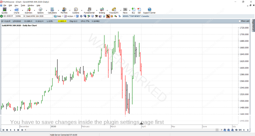
Below is an individual contract chart of the Gold futures market, the June 2020 contract. GC-2020.M is the chart symbol in ProfitSource and Walk Thru mode will be used to show how things were, and what unfolded. On 1 April 2020 at a low price for the trading day of $1576.0 USD/Troy Ounce, this market had found potential support at 50% of the range from 16 March to 25 March. The exact 50% resistance level calculated, 1575.5, was only 5 points out from the low for that day. This is illustrated by the Ranges Resistance Card below, drawn in ProfitSource using the Gann Retracement Tool. And being the 50% resistance level of a range, of course this is an important level for us to watch.
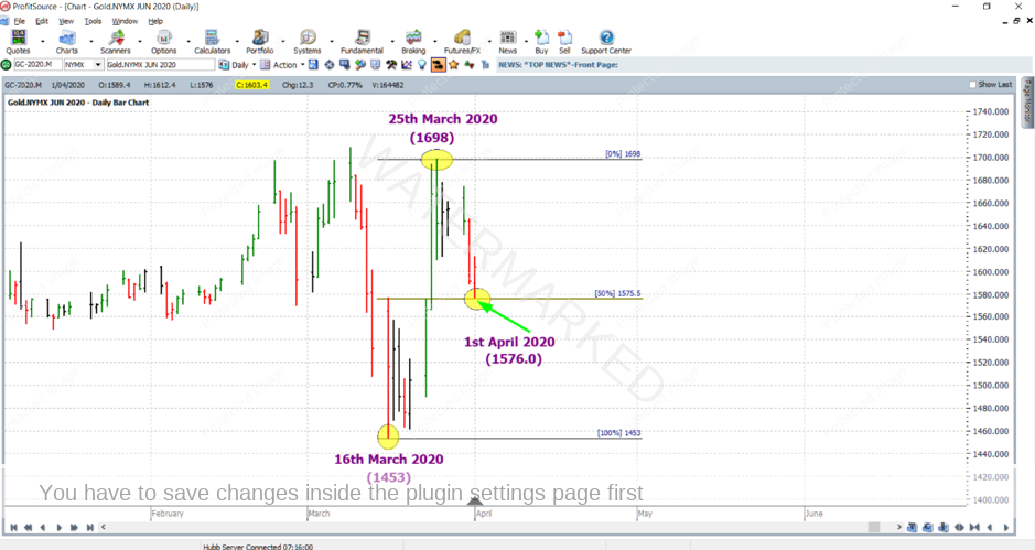
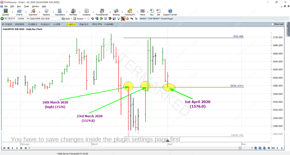
But it wasn’t only that – remember for a price cluster we need at the very least two technical price reasons. To the same chart again I’ve added a second reason. On 1 April this market was potentially being supported by some previous tops – those of 16 March and 23 March. Price wise these were extremely close to the 1 April low, each being 1576.0 and 1574.8.
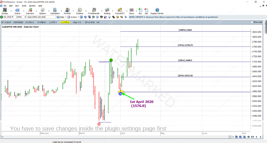
And as it turns out, this simple set up has been well and truly worth following. Since the 1 April low, the market has rallied strongly. And at the time of writing it has broken through the 75% milestone of the previous range.
And what about trading it? There’s something in it for everyone, even if you’re at the Smarter Starter Pack level.
Homework: I’ll leave this part up to you – send us an email, how would you have traded it?! tradingtutors@safetyinthemarket.com.au
Now that we’ve identified the setup, what of our argument for the hand chart? As you’ve been reading this article, perhaps even with some of our previous articles in the back of your mind, you might notice a slight contradiction. The setup is only based on market action from a few recent daily bars. And the previous “tops” of 16 and 23 March were part of the analysis, but they hadn’t even put a swing in the daily swing chart. If anything, they were intraday chart tops. So according to the usual definition of a strong setup – the above is not a strong setup. Based only on a few recent daily bars, our setup doesn’t appear to be based on much from the big picture!
But there was good reason for this specific setup to still be regarded as a strong one. I will use the hand chart to explain.
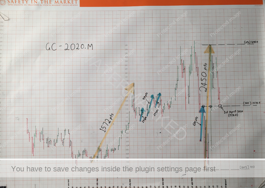
First take a look at the photograph of the hand chart below. It’s for the exact same contract, Gold futures, June 2020 contract. Roughly six months’ worth of data is shown and charted up to and including the trading day for 1 April 2020. The scale has obviously remained fixed and the charting was done on a standard sheet of Safety in the Market charting paper.
Now, having opened your software just after trading closed for 1 April and looking at this market, you might not notice anything significant. Just another set of daily bars in front of you with an automatically adjusted price scale…
However, as keeper of a hand chart to this market, you might be noticing more. In the hand chart I have drawn attention to two ranges, each highlighted in orange. The first is one of the bigger weekly swing chart swings over the 6 month period. And like any decent weekly swing, it would have been worthy of note in our price analysis routine. The size of this range was 1572 points (8 January 2020 high @ 1624.5 minus 26 November 2019 low @ 1467.3).
The second range is the one used in the analysis of our setup mentioned earlier above, for the Ranges Resistance card: 2450 points (25 March high @ 1698 minus 16 March low @ 1453). This range, although only formed over a mere 6 or 7 trading sessions, constitutes what is a very significant range! Take a look at the two ranges from the hand chart more closely – side by side in the image below we notice that the recent range of 2450 points is at least as significant as the other weekly range of 1572 points, which we burned into our memory when we hand charted it. By contrast, when charting the newer range we will gain a very strong feel for the significance of this most recent range – and hence pay more attention to it in our analysis… and likely find a good trade.
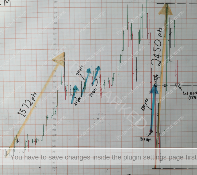
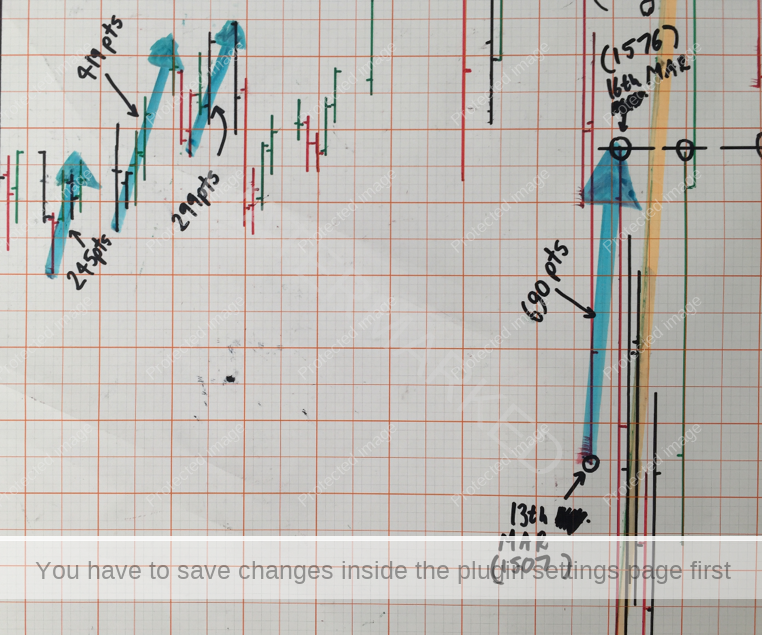
And as for the “tops” in the analysis of our setup, why were they worthy of note? Let’s take a look at the top of the daily bar for 16 March 2020. At a price of 1576.0 on that day, the market had rallied 690 points from the low of 1507 on 13 March. Again, between 13 and 16 March there wasn’t even a swing put in the daily swing chart, but if we compare the typical size of a daily swing in this market to 690 points – it shows that ordinarily 690 points is a price movement very worthy of note. See below for the comparison, highlighted in blue.
So what does all of this mean? No I’m not pointing you to intra-day trading, but just the simple routine of maintaining a hand chart for a given market. Become more familiar with that market – and you’re better placed to know when there are some truly good moves on the way.
Work hard, work smart!
Andrew Baraniak