It’s All About Balance!
I am not sure how you are finding things in your world, but our new reality under Covid 19 is creating challenges but also bringing change that could I say is welcome. The change I am noticing most is time, time together with my immediate family and time to reflect on relationships and the environment around me. This has been forced upon me as the other time-wasting demands of normal life have been suspended (good and bad and for obvious reasons).
Many moons ago I used to tell a story, very tongue in cheek, that I wanted to create a program called Trading Survivor, where a dozen traders are dumped on an island and the only way off was to generate a certain return. No other distractions, enforced discipline you could say. Would that give you the nudge you need to prepare and do the study to achieve the results you desire? Trading Survivor is never going to happen, but we find ourselves in a “time” where we may look back later and ask how did we spend this isolation time, and did we undertake some enforced disciplines?
Most people in life are using wealth in exchange for meaningful time, we know Gann and David said time was more important than price. We can also look for the harmonies in both time and price, and these are points in market activity that we can set up for tradeable runs in markets.
The reaction we saw across investment markets in February this year has seen global markets from equities, currencies and commodities all take sizeable or crushing moves to the downside. There has also been a rally of shorts out of the March seasonal date. If we focus in on the S&P500 and the SPI200 we see similar but different stories unfolding. Whilst in normal times we often see global markets heavily correlated, we could see fragmentation of market performance across the globe, so doing the work on each market in depth is now more important than ever before.
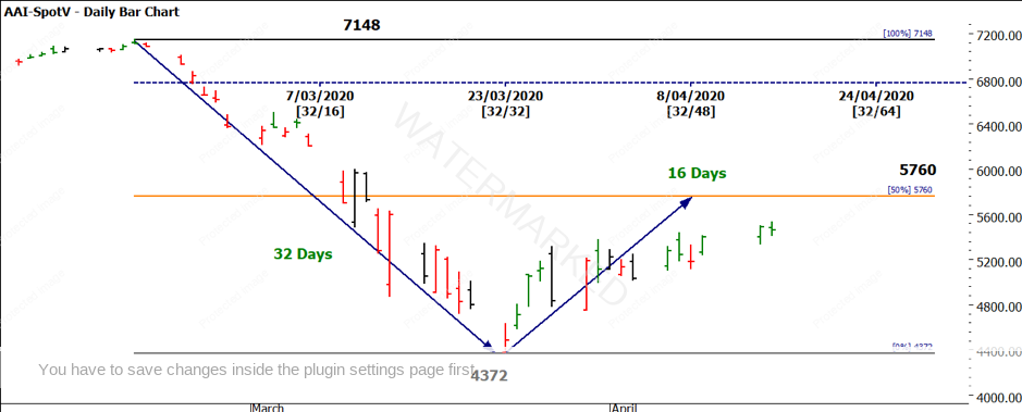
If we look at the SPI200, we can see in Chart 1, the market has declined from its peak on 20 February of 2776 points in 32 days. If the bounce from 23 March was to hit 5760 on 8 April, then we would have seen price and time equal.

Chart 1 – Daily Bar Chart SPI200
As the price action fell short of the 50% level, we might say this market is a little weak to the upside when compared to time.
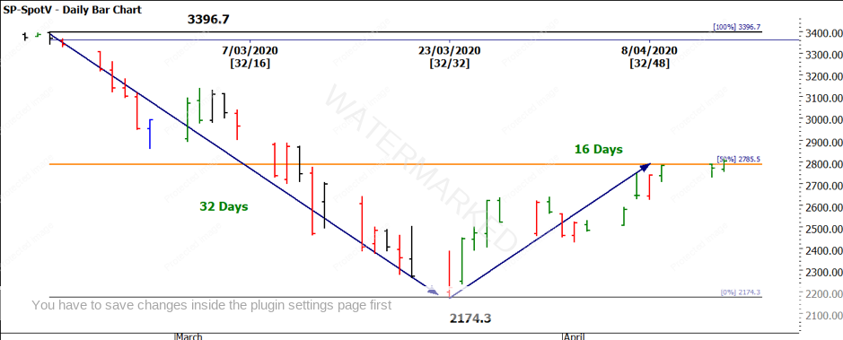
We can apply the same logic to the movement in the S&P500. Chart 2 shows the same dates for the high and low, and therefore we can compare the recovery of both markets. The S&P500 in fact reached the 50% level on 9 April (one day after the 50%-time target of 8 April). The price level of 2785.5 has acted as resistance and will be a key hurdle for any further US market movement higher.

Chart 2 – Daily Bar Chart S&P500
One of the other factors we could compare, relates to the relative percentage drop in markets. The US market fell 36% from its highs while the Australian market fell 39%. It’s a small difference but it does suggest there could be some other factors in the recovery based on local market effects. If you are focused on the current position of the markets then it should come as no surprise that trading off a swing chart, the supposed simple side of Gann, has enabled good signals, simplified risk management and in turn good returns.
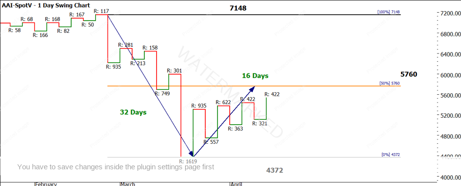
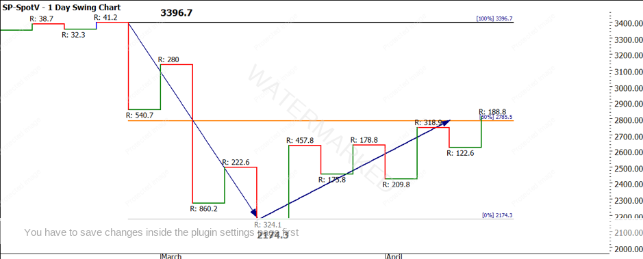
Chart 3 and 4 shows us the same period of time on the chart but represented as a swing chart as opposed to a bar chart.

Chart 3 – Daily Swing Chart SPI200
We can see that trading the first higher bottom of the low has seen good returns. Some would say it’s not a standard ABC trade and they would be correct. It can be viewed in the sense of an overbalance in price trade when we compare an upswing of 935 points versus the previous range of 301. Also, there would have been the need for some advanced management of limits in terms of the entry.
There is a slightly different story on the S&P500 as we see a different swing chart pattern out of the low i.e. not clear higher tops and bottoms.

Chart 4 – Daily Swing Chart S&P500
Using some standard tools like swing charts and time and price balance has kept you on the right side of markets since this whole pandemic kicked off. I suggest you pay very close attention to swing ranges and their expansion/contraction as they could be used as an early warning that things are about to get turbulent again.
The 50% levels in the near term will act as potential resistance in the near term and should be respected. The old chestnut of resistance becoming support could also be of use if the markets continue to rally. Watching swing charts on smaller and larger time frames have been very helpful to me across my markets in recent times. I hope you have them on your trading plan.
Good Trading
Aaron Lynch