Technology Getting a Roll On
Continuing our analysis of the Nasdaq from last month’s newsletter allows us to better understand what a standout index performer it has been. It will be no surprise that technology and innovation drive our behaviour in the modern world. We would be hard-pressed to imagine a life without the internet, smart phones, and the array of on-demand functions we perform seamlessly every day.
The Nasdaq index to many represents the new face of markets. Easy access for the retail trader, exciting companies like Google, Amazon, Netflix as opposed to the “old” economy of companies that are more intricately linked to the boring side. If we think healthcare, utilities, and banks they don’t have the same zing as Elon Musk’s latest Tesla play or the secrecy of the Facebook algorithm and all that implies as we have seen here in Australia recently.
This leads to conjecture over how markets in the post-pandemic world will thrive and survive. Will the old economy stocks roar back or will the tech-heavy companies maintain their dominance? This has many pundits, economists and traders wondering and we can be left with lots of questions and no real answers on the fundamental possibilities. The answer for me is to turn to the charts. Technical analysis whilst not perfect will drop clues along the way and history, when studied, provides insights into the future.
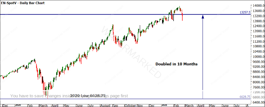
Chart 1 shows the Nasdaq 100 (mini futures contract EN-Spotv in ProfitSource), after the initial COVID-19 decline in March 23, the price action doubled in 10 months. That is an exceptional return in a period of such uncertainty. The date the market lowed in 2020 is one to watch as well, can we equate this low in time to any other major turns in this market?
Chart 1 – Daily Bar Chart Nasdaq
The main “issue” that many see for the Nasdaq is that the growth has been restricted to a handful of stocks and predominately the “FAANG” constituents that make up 25% of the Nasdaq 100 market cap. In short, low-interest rates and COVID-19 uncertainty helped these stocks. Normal interest rates, inflation and a healthy economy provide more places for returns.
A great exercise on any market is to understand what the normal and abnormal moves look like. Last months article looked at what the ranges are on the large scale to see how they can be used to assist. This time I want to focus on what bearish ranges look like and do they resonate with any of our techniques.
I know one of David and Mat’s favourite techniques utilises the First Range Out, this simple but powerful tool in essence should not work if the random walk hypothesis of markets is true. If markets are completely random, then there should be no memory of previous moves, tops or bottoms and they should only rarely if ever vibrate in balance with previous moves.
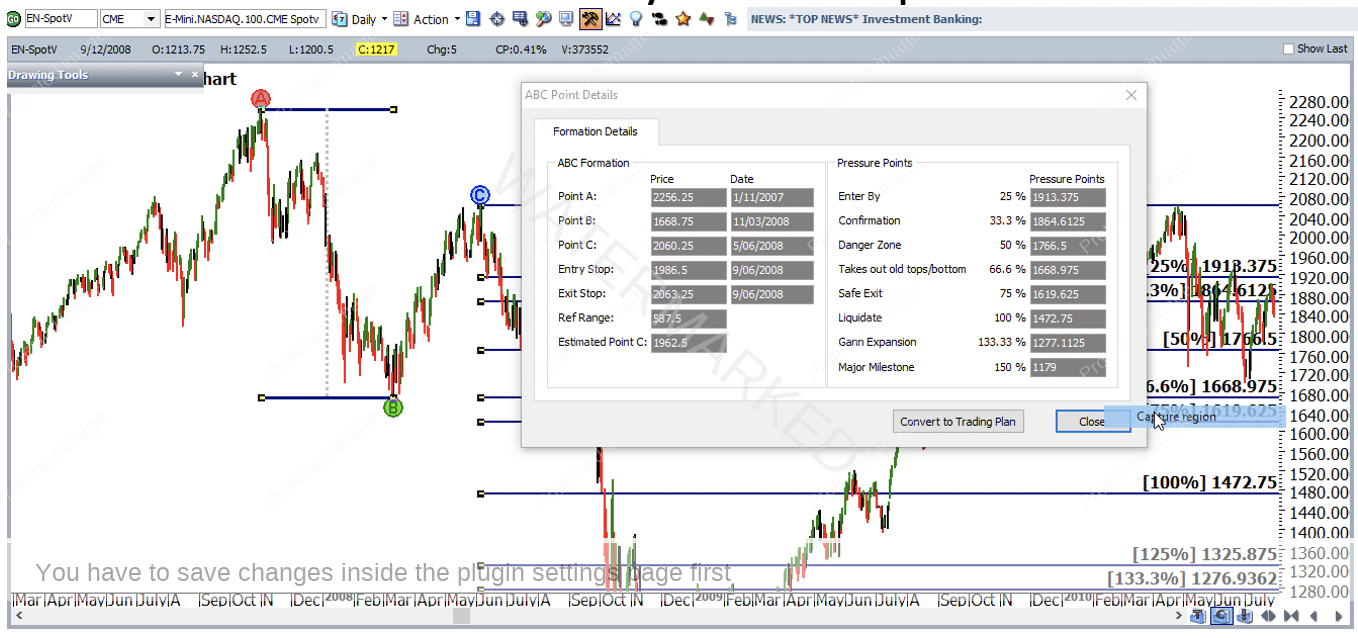
This of course tests our belief of the history repeats mantra, but we need to test our thinking to ensure it’s valid and useable to generate profits. Chart 2 focuses on the First Range Out from the 2008 highs. Using the ABC Pressure Points Tool you can capture the range from the November high to the March low. The price action did head lower from here and produced a larger range which would also be worthwhile studying. In this case, we see the range of 587.5 points as the number to watch repeating.
Chart 2 – Daily Bar Chart Nasdaq
Once we have established a reference point, we can begin to test its effectiveness and its frequency in terms of how often it delivers outcomes to our analysis.
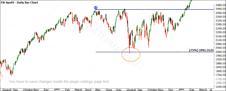
You can create a basic spreadsheet and test from all tops that produce defined changes in trend (see below)
| NASDAQ | Range | 587.5 | |
|---|---|---|---|
| TOP | DATE | PRICE | MILESTONE WHERE TURNING POINT LOW CAME IN |
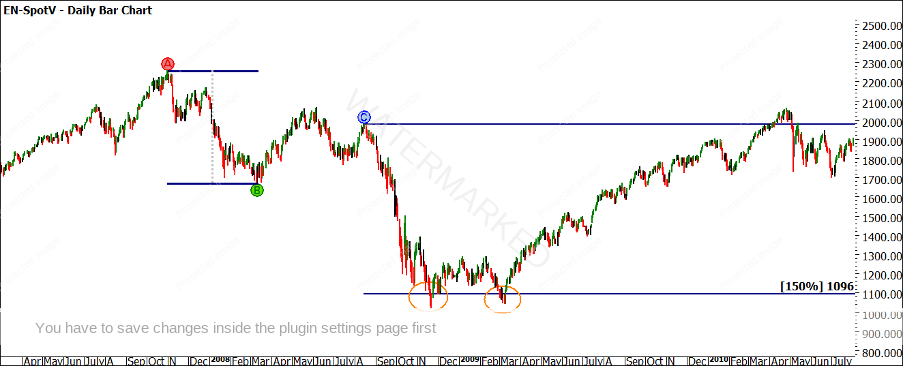
| 1 | 15 August 2008 | 1977.25 | 150% Double Bottom |
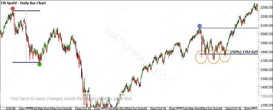
| 2 | 26 April 2010 | 2058.75 | 50% Multiple Bottoms |
| 3 | 2 May 2011 | 2428 | 75% |
| 4 | |||
| 5 | |||
| 6 | |||
| 7 | |||
| 8 | |||
| 9 | |||
| 10 |
Charts 3, 4 and 5 show the tops that are labelled in the table and you can see the relevant milestones noted as to where they stopped the market.
Chart 3– Daily Bar Chart Nasdaq
It was a rather complex and dynamic entry. And you’d have to be on your game, most importantly before the high of the 3rd was taken out. Again, setting an alert for a price that was a comfortable amount below the high of the 3rd could have helped out here, if not checking the market yourself a few more times during the session.
Yes, you’d be checking the market during the trading session, but remember this is still not considered to be an aggressive intraday chart entry. Order placements were based on updated versions of the daily bar of the 6th as that daily bar evolved. In other words, this type of trade entry still uses the more conservative daily swing chart.
The other thing to note is that this entry was a bit of a hybrid. Technically, Outside Continuation Pattern entries require a few strong up days in a row before we consider them as such, something that lacked from this case study at the point of entry. But with strong enough reasons for a trade, you could overlook this. Or, you could say instead that this entry better fits the category of a First Higher Swing Bottom, also defined in the Number One Trading Plan. Either way, it was worth paying close attention to. The small size of the bar of the 3rd meant that entry was achieved with low risk, and hence more likelihood of a better reward to risk ratio.
Either way, you call it, here is what the swing chart looked like a few days after entry:
Chart 5 – Daily Bar Chart Nasdaq
If we can test this off all the relevant tops, we can build some market smarts on the effectiveness of the tools, which in turn builds confidence when attempting to identify larger turning points for higher reward to risk ratio trades. As it can be said, the market proves the rules. There are a number of tops to examine so I encourage you to complete this exercise, if done correctly there should be a pattern shine through.
There would be many people asking ‘what can a range from 10 years or more ago on a market that has changed so much in that time tell us?’ The main way I am using this range will be to see what the next bear range is doing in terms of normal or abnormal. If the Nasdaq is the future and it can continue to climb higher, then a good idea would be to buy the dips. The challenge is always, is it a dip or the beginning of a change in season?
Good Trading
Aaron Lynch
