The September Effect?
Welcome to this month’s edition of the Safety in the Market newsletter. Many may feel like the Phil Connors character from Groundhog Day as played by Bill Murray. I can attest that setting and maintaining good routines has been challenging as we maintain the prolonged COVID lockdown conditions across many parts of Australia.
Its also interesting to watch the “chatter” that occurs by pundits and participants attempting to create self-fulfilling prophecies. A few circles that I travel in are talking up the prospect of a change in trend in September based on the simple fact that the 9th month of the year has been a common place to see “crashes” and we can recall a number of significant market events in the 1987 crash as well as the 9/11 attacks. The first thing we should query is how often do these occur in the month of September and can we create a trading system around it?
Having studied the timing systems of Gann and David there is a lot more to it than just expecting a month to produce a particular event, in this case, short trades in equity markets. The possibility of a correction/sell-off/crash has real merit in any month currently as we have seen global markets extend to the upside significantly since the last major low in 2009 (the GFC).
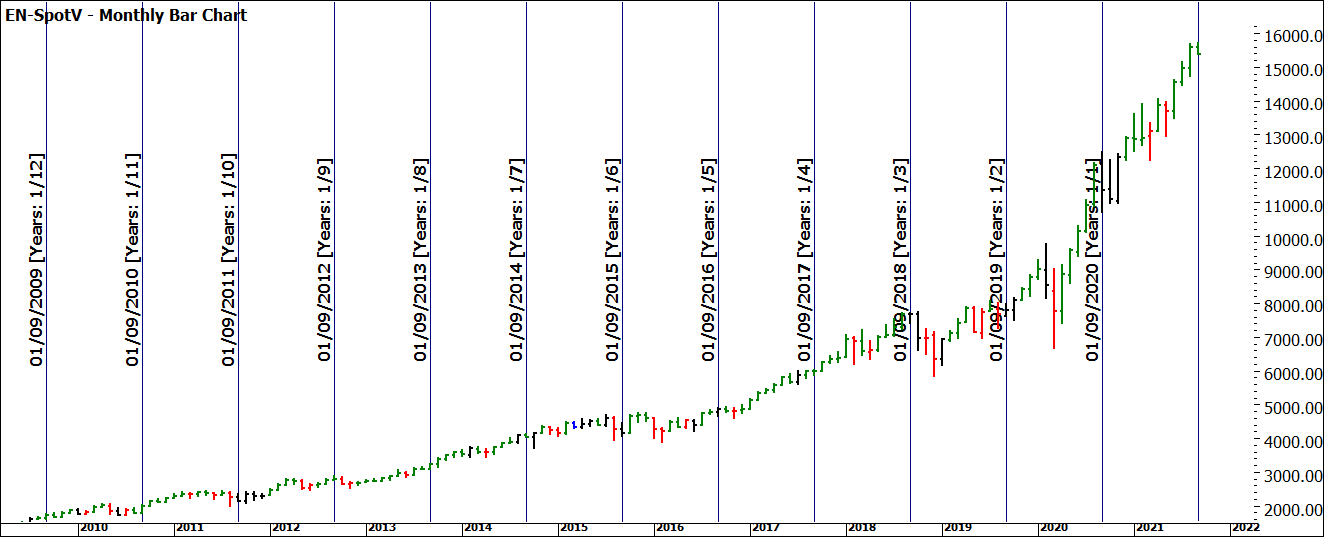
One way I “test” this market truism is a chart, with a pen and paper. How many times has my chosen market been a negative month in September (this is where lots of data helps). In the case of the Nasdaq, we can go back to 1996 for the futures market and assess what each September looks like. This can provide patterns. The chart below uses the Time Cycle Analysis Tool set to a 1-year time interval and we start from September 2021 and go back 1 year at a time.
This process allows us to visually review what sort of month the market had, and whether it was part of an existing trend or the commencement of a new cycle (much harder to identify at the time, than using historical data.)
Chart 1 – Monthly Nasdaq Bar Chart
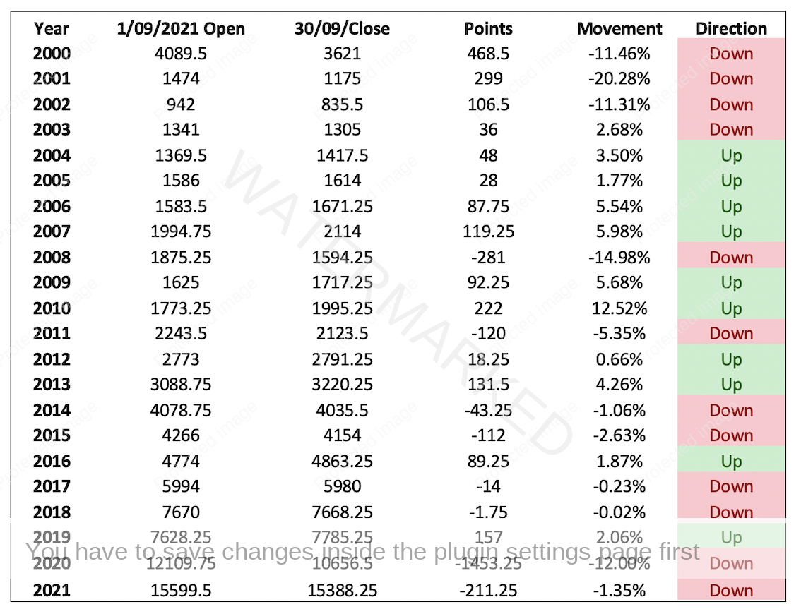
An overview of the data shows us the following based on the open and close price of the month of September going back to 2000 (the year ProfitSource data commences.)
Table 1 – Raw Data EN-Spotv
The first market take away is that September is not significantly bearish, a tally of 12 bearish and 10 bullish (that includes using 2021 as bearish so far) shows an outcome no better than 50/50. The magnitude of bearish years is on average 7% when down and 4.4% when up. This does suggest when the bears do prevail, they do so with greater magnitude.
These averages can also be misleading in terms of what has occurred, as we know humans all possess biases and they can appear in the data conclusions. Confirmation, event, and recency bias are all areas that cloud the September effect. Some purely want to confirm and believe what they ‘know’, ie that September is a crash month. Those who lived through the 1987 crash or 9/11 will bias their viewpoint around those major events. If someone has not had that experience, they may discard with greater ease those events. Imagine you lost significant amounts of money in the 1987 crash or the 9/11 market crash. They are emotional anchors that are hard to push to one side.
We all use a recency bias to judge data, how long ago did it happen? I stubbed my toe 10 years ago, I did it again recently. The more recent occurrence is likely to frame my opinion more so than the historical event. In many ways our style of analysis requires us to focus on data points that are many years ago and we must fight our bias to make them as relevant as todays price action. (That’s another article in itself).
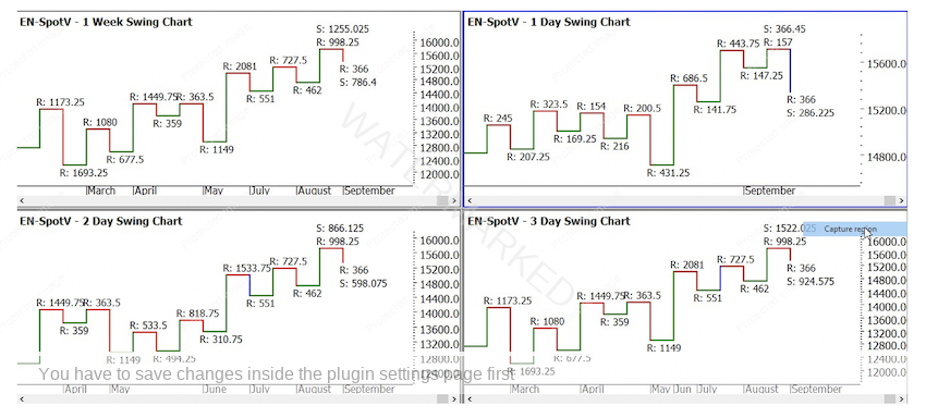
With any luck I have enabled you to ask more data-driven questions to plan for outcomes as opposed to, it’s September lets be short the market. There are several factors as mentioned before that dictate if September could be a continuation of the trend. If we look to the swing charts in the chart below…
Chart 2 – Nasdaq Swing Chart’s
The weekly, 2- and 3-day swing charts are all still pointing up.
The daily swing chart is uncertain with higher tops and lower bottoms.
Any significant change of trend should have many big picture price as well as time signals suggesting the gig is up. If we focus on the 1-day chart, there is some information we can watch and see if it unfolds.
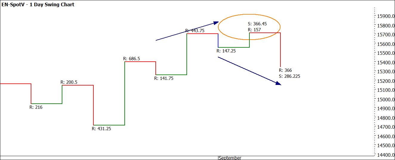
A study of major tops suggests that once its underway there is often an Overbalance in Price to the downside, this is where swing ranges are critical to watch. We need to watch for expansion/contraction and where they are within normal averages or abnormal.
Chart 3 – Nasdaq 1 day Swing Chart
The current upswing shows a contracting range of 157 points as opposed to the previous range of 443.75. This upswing is also smaller than the average of the last 10 upswings of 366.45.
The down swing (that has not completed yet) of 366 points is larger than the previous 2 down swings and larger than the average of the last 10 down swings (286.25). If this swing was to continue and expand to a number, for example 2 times larger than the average, approximately 550 points, this may signal that we have overbalanced against the prevailing trend. This of course will be worthwhile watching and you may keep a diary each day for the next two weeks on the Nasdaq and write down your daily thoughts on the position of the market in relation to the swing and bar charts.
The month is only halfway through, and markets can do strange things, but if we can approach with a clean slate and no data bias, we can make better trading decisions.
Good Trading
Aaron Lynch


