The Ranges Resistance Card
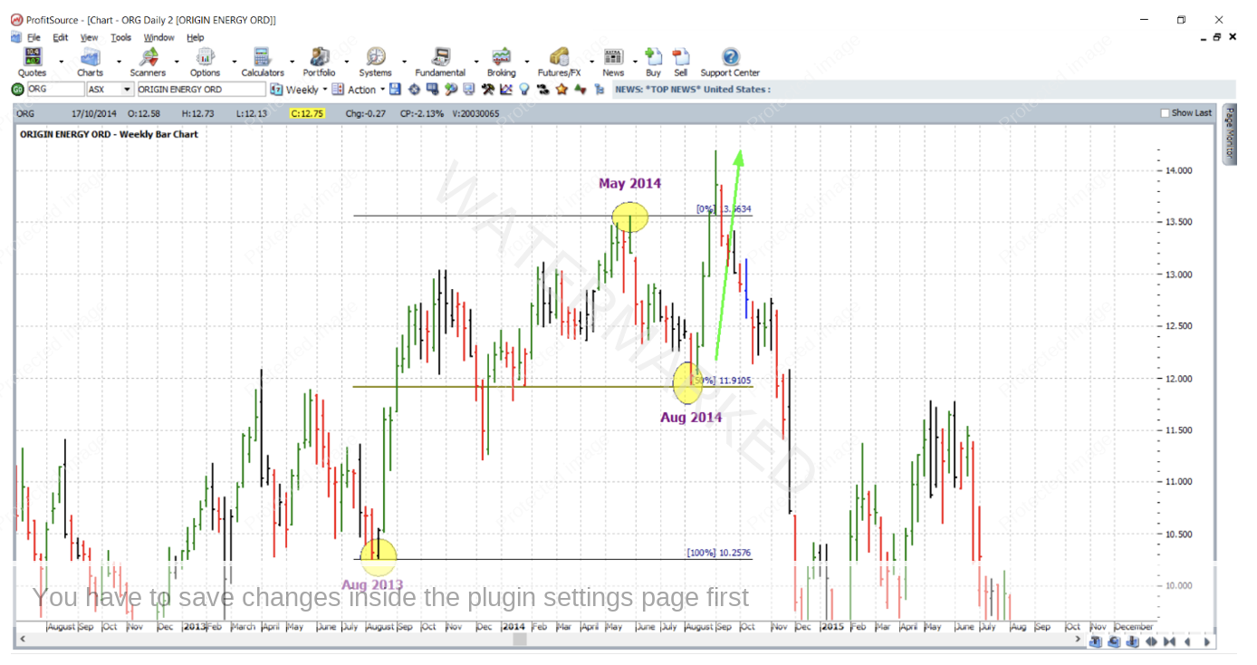
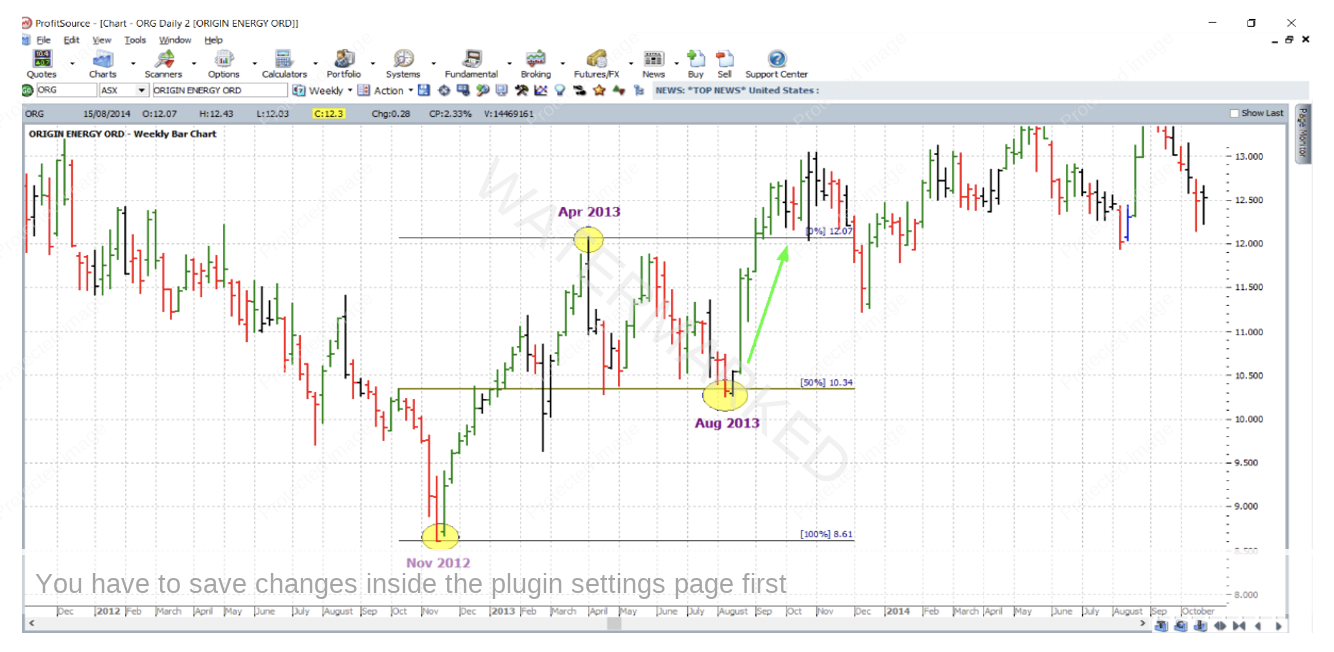
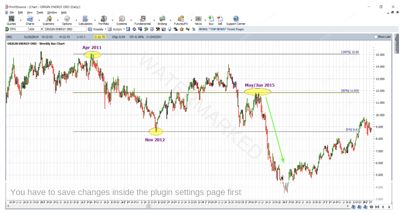
When it comes to price analysis, the Ranges Resistance Card works well when applied to the bar chart of Origin Energy (ORG:ASX). Back testing its recent history certainly reveals a few good examples. To keep the analysis strong, the weekly bar chart has been used. And to emphasize the most important resistance level, the 50% resistance level has been left as the only default to appear on the Gann Retracement drawing tool. As usual, these examples will tolerate a few cents / points of error either side of the key resistance level.
In August of 2014, this market reversed at 50% of its range from the August 2013 low to the May 2014 high. A big rally followed.
Looking further back, in August of 2013, this market reversed at 50% of the range from the November 2012 low to the April 2013 high. A big rally followed.
In May/June of 2015, the market reversed at 50% of the range from the April 2011 high to the November 2012 low. A huge sell off followed.
Open up a daily bar chart of ORG:ASX and make sure your historical data is as up to date as possible. Then hit the plus key to zoom out to weekly chart resolution. Then try to reproduce and save the charts above. Doing this is a simple but effective exercise when it comes to learning price analysis.
The chart immediately above gave us one reason to look for a short trade in June of 2015 – $11.83 was the 50% resistance level, but as a diligent Safety in the Market trader at the Active Trader Program level should know, more than one reason is required for a high probability, high reward to risk ratio trade. So, what else was going on at the time?
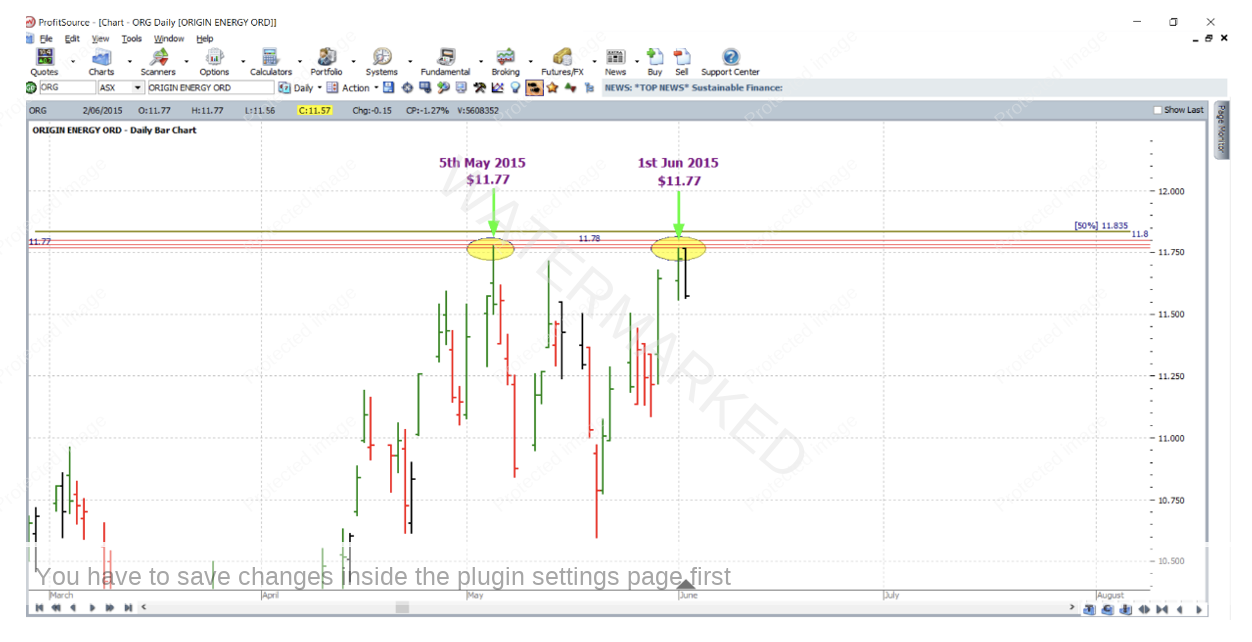
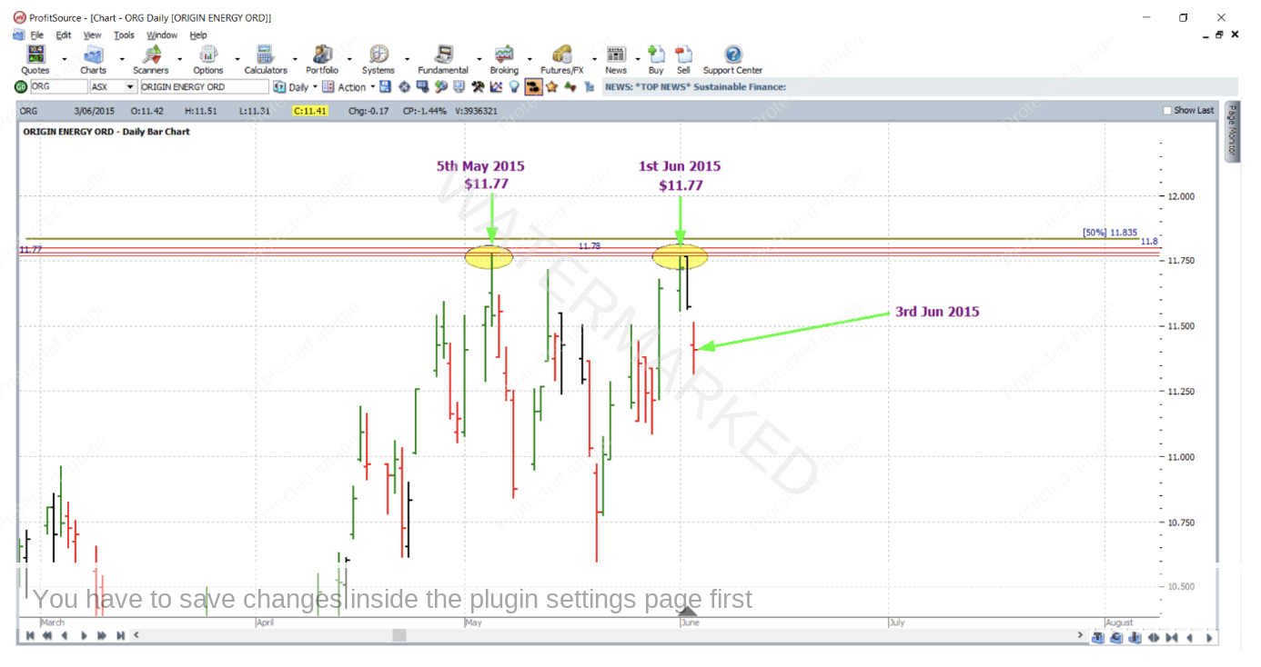
The chart below zooms in further and shows an additional three outputs from price analysis – that is three more price levels. One of these was a small picture double top, with 5 May 2015 and 1 June 2015 being small picture double top partners at $11.77; the other two shown are at $11.80 (from an application of Repeating Ranges – FRO) and $11.78 (from a general application of repeating ranges).
So, with enough reasons to trade, what about the entry? On 3 June 2015 the market gapped down on open, triggering entry on open at $11.42, with an initial stop loss one point above the two double tops at $11.78; the bears were certainly eager to take control.
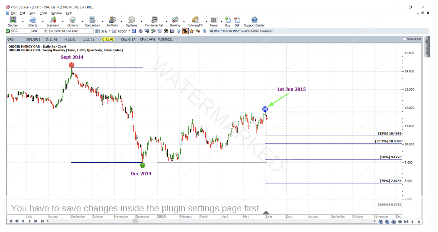
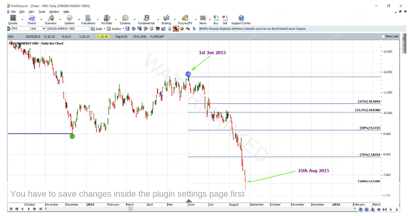
For a reference range, the last quarterly swing in the same direction was chosen (Point A being the September 2014 high, Point B the December 2014 low, and Point C the high of 1 June 2015). This is shown below on the daily bar chart with the aid of the quarterly swing overlay and of course the ABC pressure points tool.
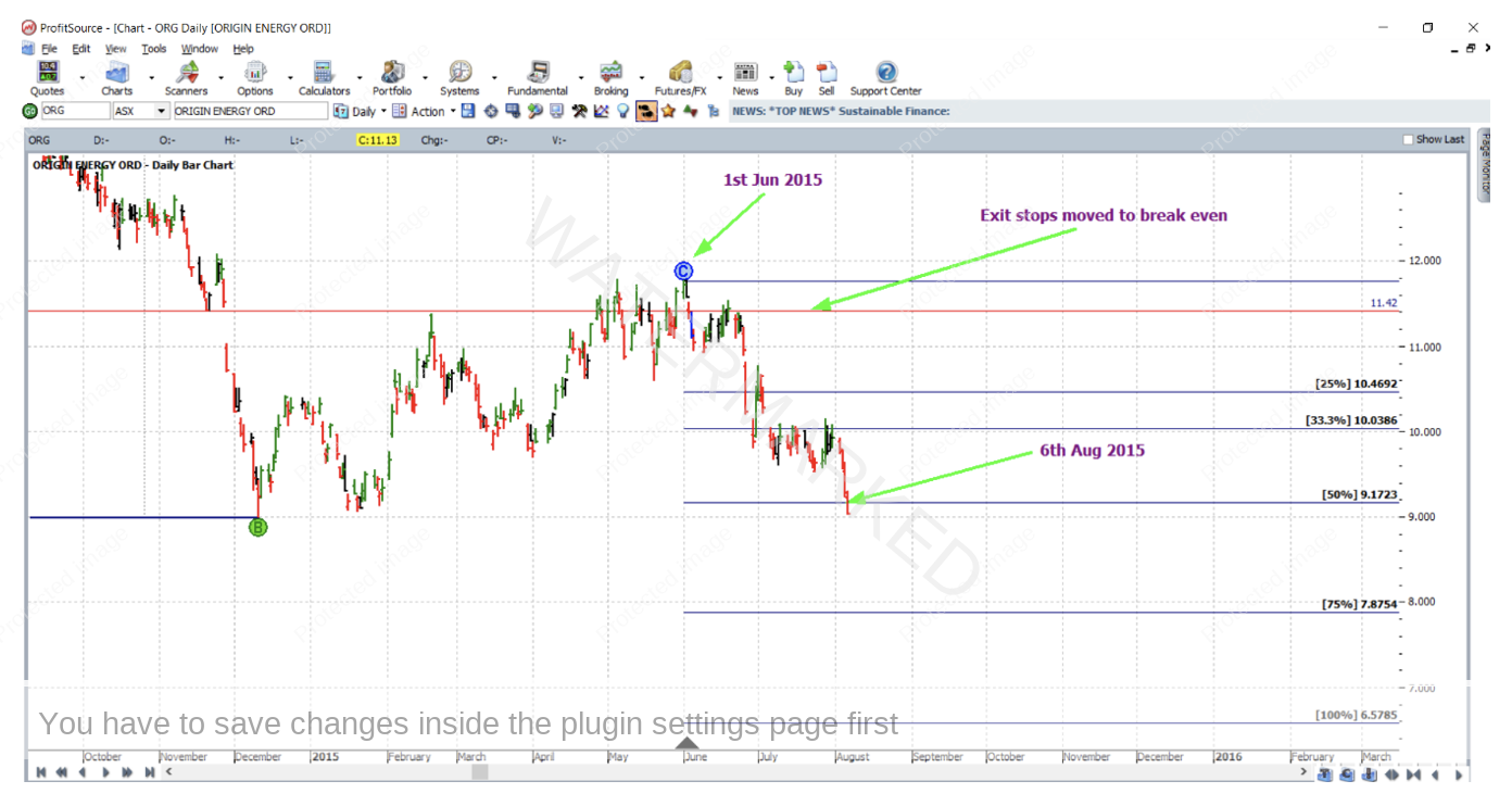
With stops managed Currency style, the market reached the 50% milestone on 6 August 2015 and exit stops were moved to break even.
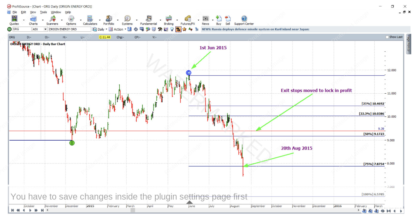
Then on 20 August 2015, the 75% milestone was reached and exit stops were moved to $9.39 which was 21c (one third of the average weekly range) above the 50% milestone to lock in some profit.
Then on 25 August 2015 the market gapped down on open for an exit at $6.57 – even though the 100% milestone was technically rounded up to $6.58.
Now for a breakdown of the rewards. In terms of the Reward to Risk Ratio:
Initial Risk: 11.78 – 11.42 = $0.36 = 36 points (point size is 0.01)
Reward: 11.42 – 6.57 = 4.85 = 485 points
Reward to Risk Ratio = 485/36 = approximately 13.5 to 1
Assuming that 5% of the account size was risked at entry, the gain in account size would be as follows:
13.5 x 5% = 67.5%
Assuming that 5% of a $10,000 account was risked, i.e. $500, the reward in absolute Australian dollar terms would be:
13.5 x $500 = $6,750
Thanks to all readers for your show of interest in these articles in 2022, the feedback is always valued and welcomed. And needless to say, all the best for a Merry Christmas and a great new year ahead!
Work Hard, work smart.
Andrew Baraniak
