A Cure for an Ailment?
We’ve all been there – too many lines on the chart! This is a common ailment, especially when new to the world of technical analysis and price forecasting. And it’s generally a product of two things. The first is not knowing which lines are important, and which are not. We cover this in our Safety in the Market course materials. It helps to use the more significant turning points and pay most attention to milestones and resistance levels that are multiples of 50%.
The second major cause of this form of analysis paralysis leads us to the main theme of this month’s article – the defaults and settings of ProfitSource’s price analysis drawing tools. The idea will be demonstrated by referring back to a trade set up from one of our previous articles “Cotton – Major Low” from the January 2021 newsletter (read the article in full here).
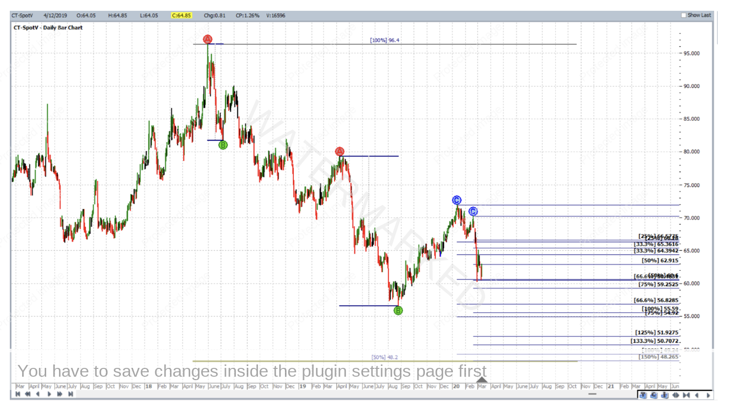
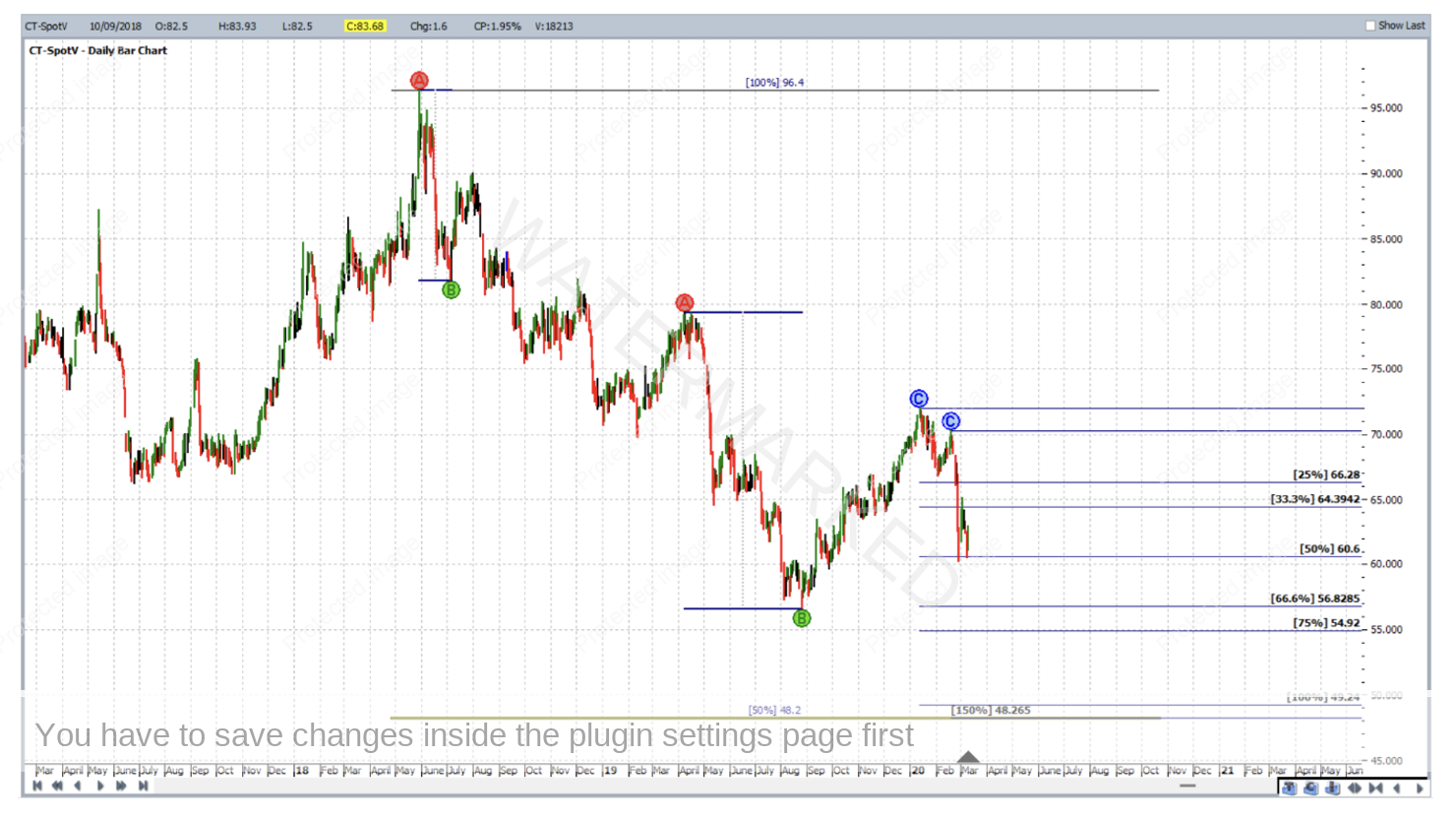
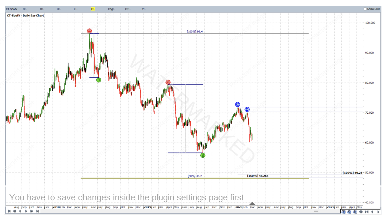
To recap, in the first quarter of 2020, as the Cotton futures market continued to move down, price analysis of its CT-SpotV chart in ProfitSource lead to a strong underlying price cluster, giving reason to anticipate a change in trend to the upside if and when that price cluster were reached. This analysis is applied in full to the chart below, but the question is, can you see it? Where or what is the price cluster?
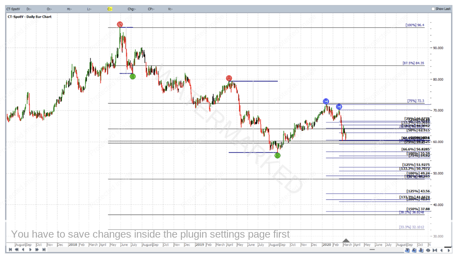
To answer that question truthfully, some will see it. But others won’t. Therefore, what can be done in order for all to see it clearly?
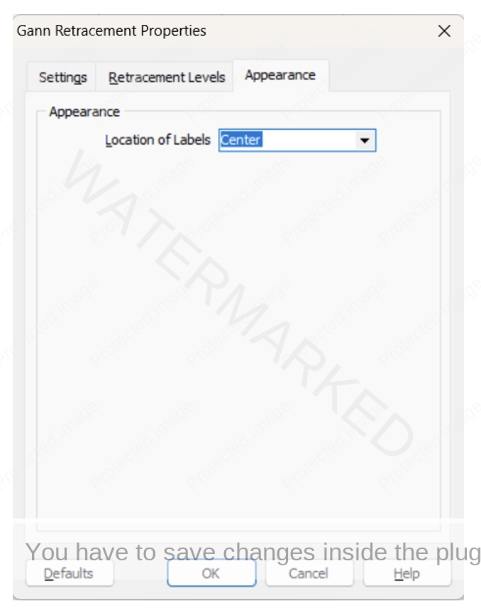
First of all, let’s delve into the settings of one of the drawing tools involved in the analysis above. The May 2018 high had a Gann Retracement tool applied to it for the purpose on constructing a Highs Resistance Card. A right click on any one of the lines of this drawing tool can allow us open its Properties box.
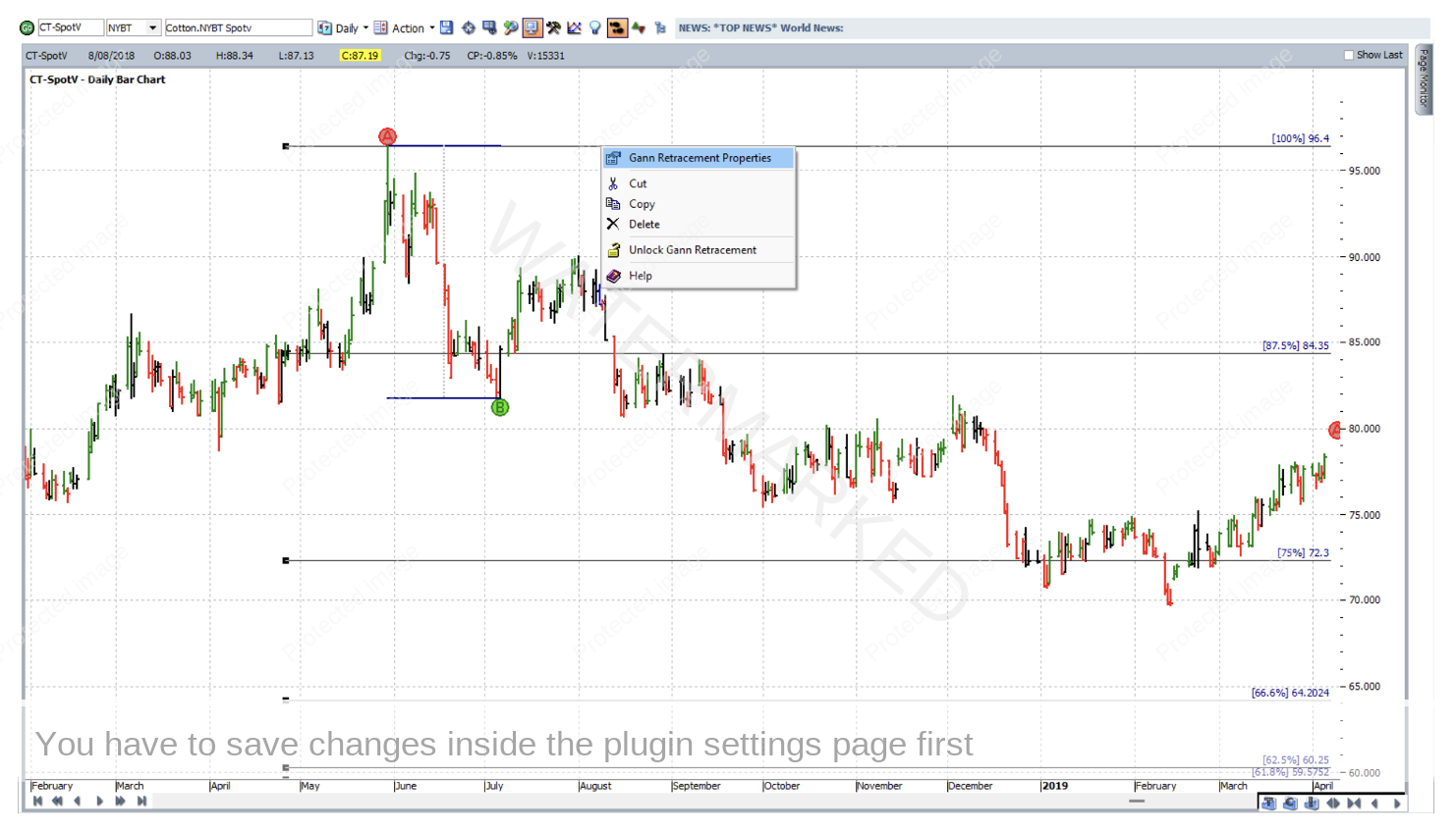
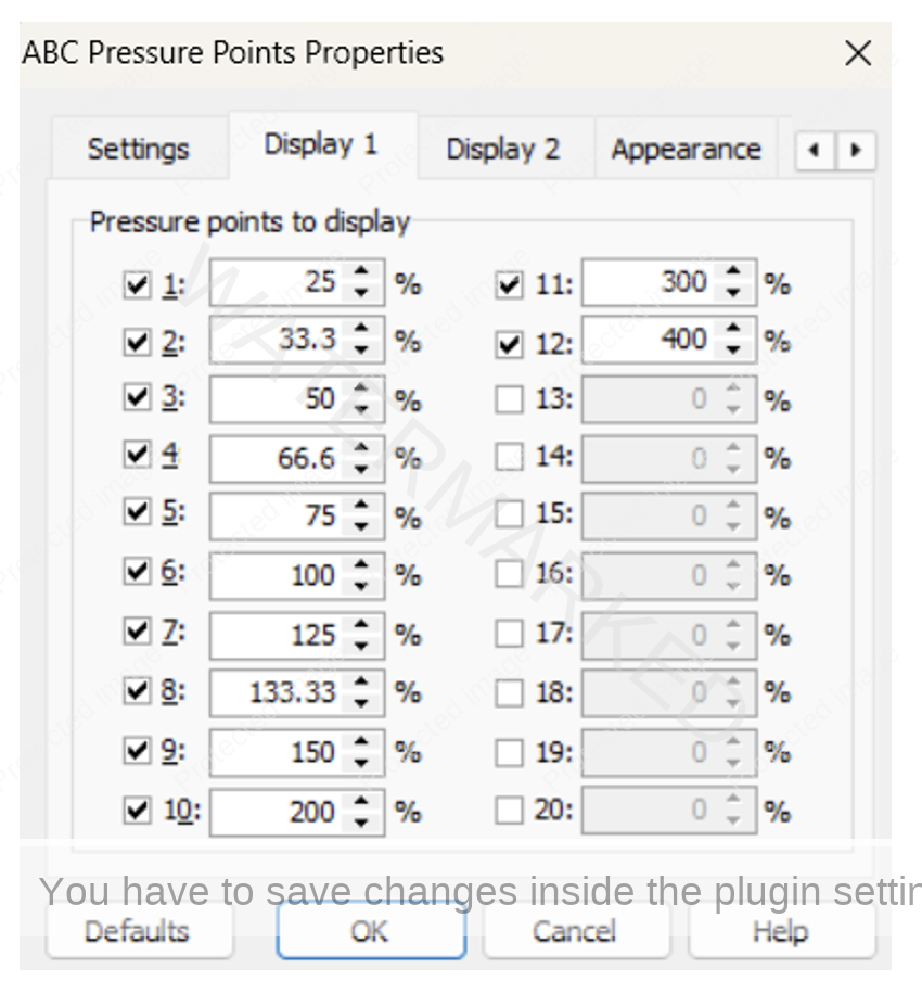
With the Properties box open at its Retracement Levels tab, here is what you will see:
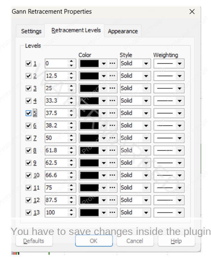
Note in the above that all available levels are checked for display. The following will begin the clean-up process of the chart: Uncheck all but the 0%, 50% and 100% levels. Then change the colour of the 50% level to a colour that stands out and set its Weighting to a thicker line.
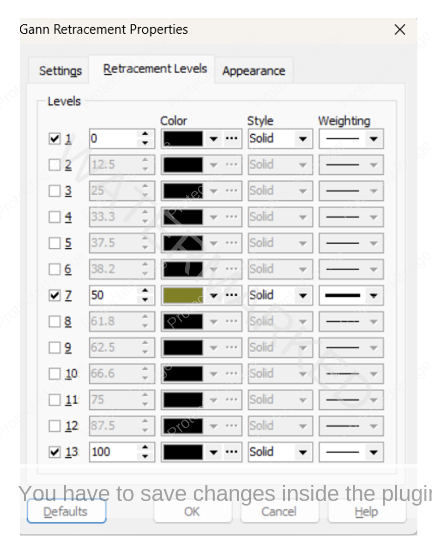
Then in the Appearance tab, changing Location of Labels to Center will stop the resistance levels displayed from overlapping (partly or otherwise) other levels from other tools applied to the same chart.
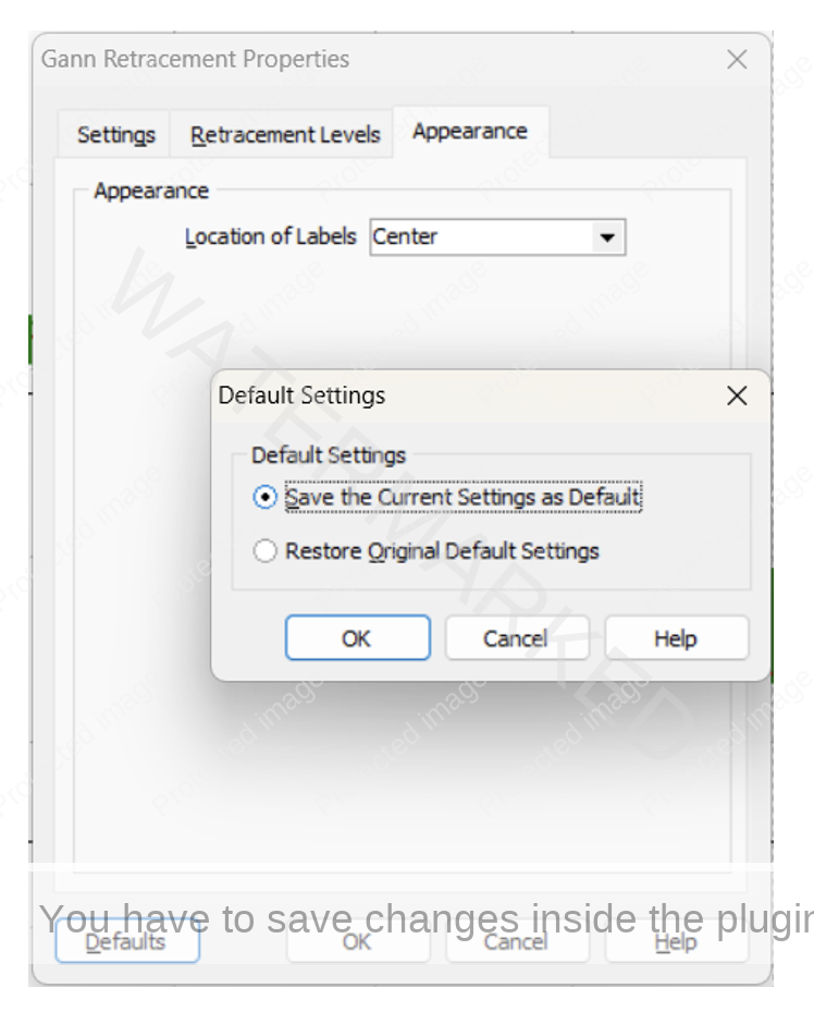
Then going to Defaults and clicking OK in response to “Save the Current Settings As Default” will keep the same settings each time this drawing tool is applied until it is told to do otherwise.
After clicking OK again to exit that tool’s properties box, upon zooming back out the chart is clearer, and you might already begin to see the cluster we’re looking for.
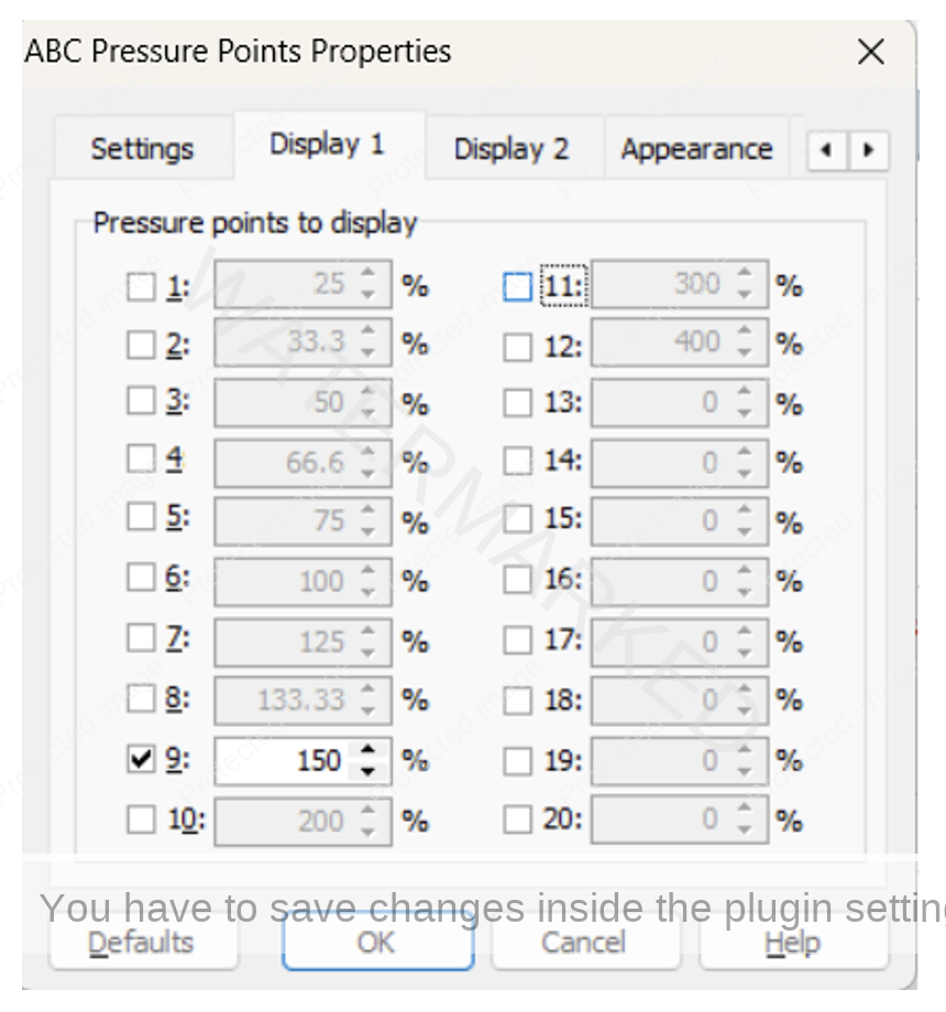
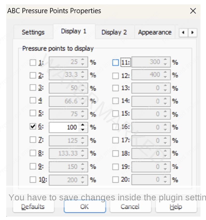
But there’s more work to do. There are still two applications of the ABC Pressure Points Tool on the chart, each still displaying the maximum number of available of milestones. Each however only has one important milestone that contributed to the price cluster.
Zoom into the ABC First Range Out applied from the May 2018 high, right click on any one of its lines (the middle-dashed line is generally easiest) and open its properties box (to the Display 1 tab) shows how the tool is currently set:
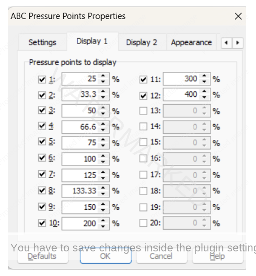
This time let’s switch off all but the 150% milestone.
Then in the Appearance tab, set location of labels to Left.

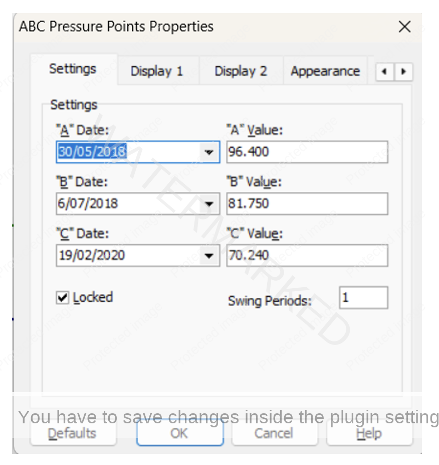
And for reference purposes, if you wish to recreate the charts and follow the instructions in this article (for practice!) the Settings tab gives the details of Points A, B and C in this First Range Out application:
Now exit Properties and zooming back out we get an even clearer picture:
One more to go! Let’s zoom back in to the remaining ABC application (the one in the middle of the run down), click on its Properties box and reveal all of the milestones that are still being displayed.
This time switch off all but the 100% milestone:
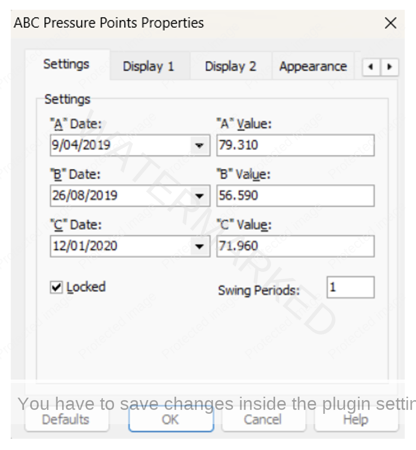
And again for reference purposes here are the details of that ABC formation:
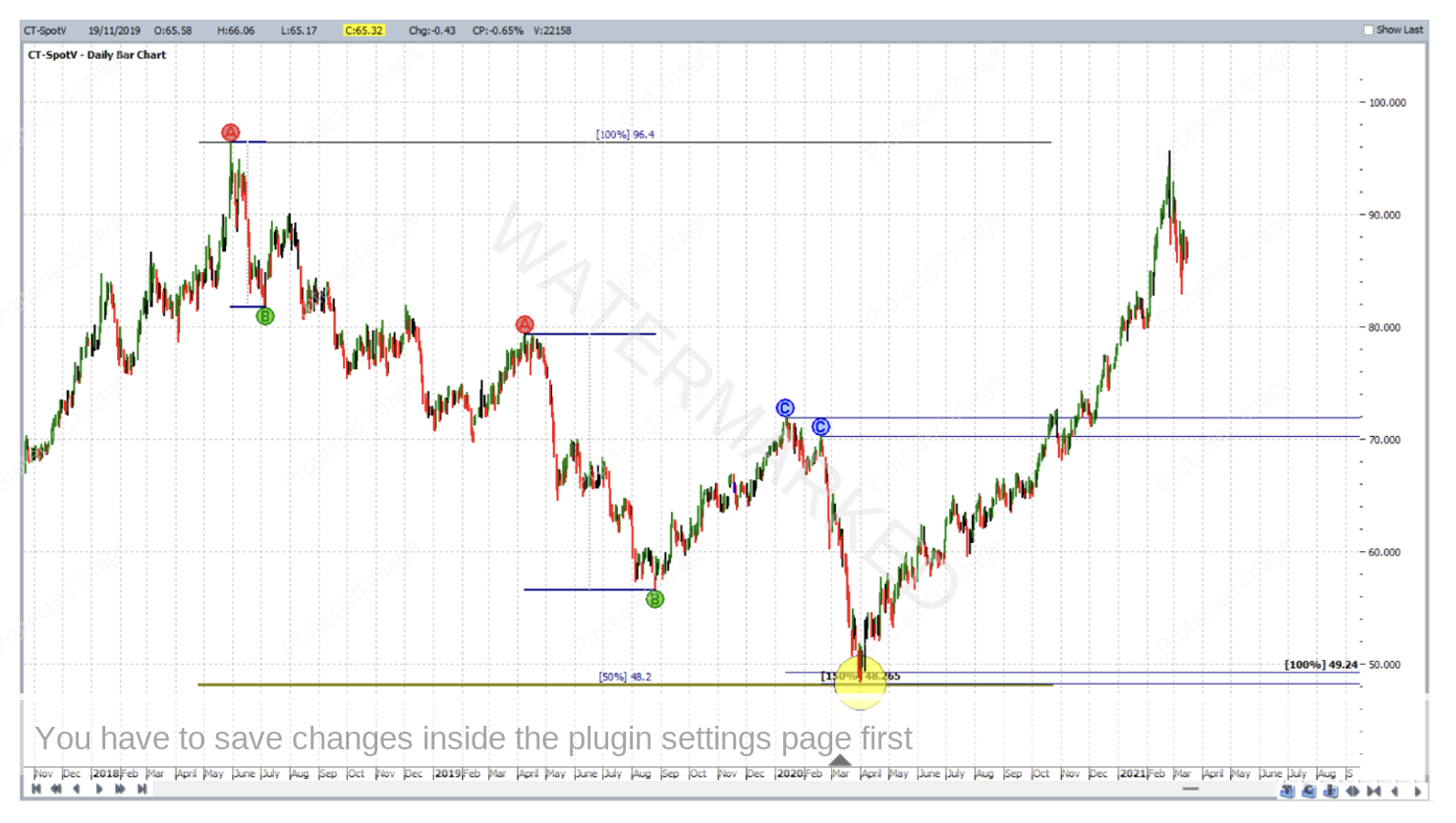
Then clicking OK to exit and zoom back out to reveal the final picture:
By now the cluster (at roughly 48 cents) is obvious, clear and ready for stalking! The bulls that stalked out the April 2020 low were rewarded well and for more details about that don’t forget to refer back to the January 2021 newsletter.
Applying this knowledge to your software’s charts and drawing tools can deliver a more efficient approach. Referring back to a saved chart and recalling why you created it in the first place is easier.
You’re more likely to learn the difference between a strong price cluster and one that’s not, and even talk yourself out of trading one that was simply too weak to begin with, bringing further truth to a catch phrase we’ve all heard before: “less is more”.
As a side note, if in the future you send us any of your analysis with a trimmed down chart, you’re likely to get a much quicker reply because the information you present in that chart will disclose your analysis thoughts, and where your emphasis is, a lot more quickly.
Finally, regardless of whether or not anyone is ever going to see your chart, ask yourself anyway, is my chart clear enough for someone else to read?
Work hard, work smart
Andrew Baraniak