A Handy Short Cut
So how do I find a stronger price cluster? If you’re wondering whether or not this is an FAQ, it definitely is! The complete answer to this question is not a short one. Studying manuals, reading articles, following case studies, online training, not to mention a rock solid daily routine. And no, we’re not going into detail with all of those things here and now, but there is one simple key stroke on your computer which can help you, as a ProfitSource user, to get things under way. And it will be discussed in this article.
One of the most important things for a strong price forecast is to engage turning points from the big picture. By this we mean previous turning points in the market which were significant enough to put a turn in the monthly, quarterly or yearly swing chart. If a market is moving up and down fast enough, you could say a chart resolution as low as weekly would also put in what we’d deem a significant turn.
So how do we gain a quick view of these big turns with a chart we have just opened, and start to engage them sooner rather than later in our price analysis? We do it with the humble PLUS (+) key!
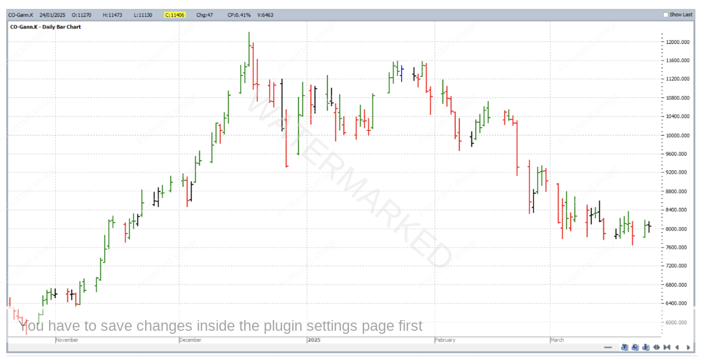
Let’s start with the Cocoa futures market. Assume for the moment that the goal was to engage the simple price forecasting technique of scanning for major double top or double bottom formations that were either being approached or underway. Due to the seasonal nature of most of the soft and agricultural commodities, it pays to keep an eye on not just the continuous SpotV chart (that which draws data from the contract trading with highest volume), but also continuous and discontinuous individual contract charts. One of these for the Cocoa futures market is CO-Gann.K which links the May contract of each year for Cocoa. This chart by default opens at daily bar chart resolution, and is shown below with the vertical and horizontal scales that it defaults to on open.
But of course, we don’t immediately see anywhere near the maximum available price history of this market and probably not any significant turning points that the price history may contain. So now we begin the process: Hitting the PLUS (+) key once gets the chart from Daily to Weekly resolution. Hitting it again, within seconds can bring us to the monthly bar chart as shown below.
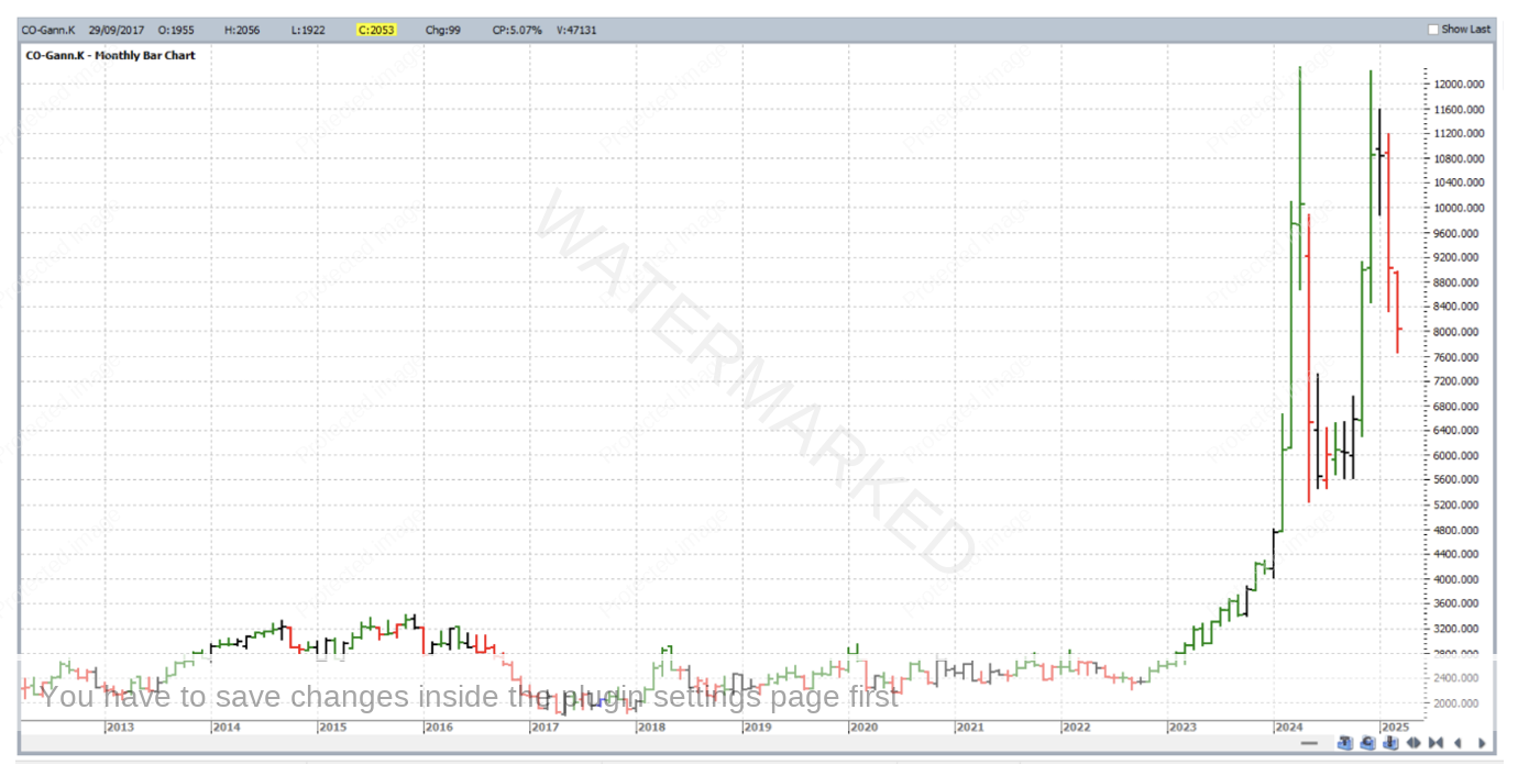
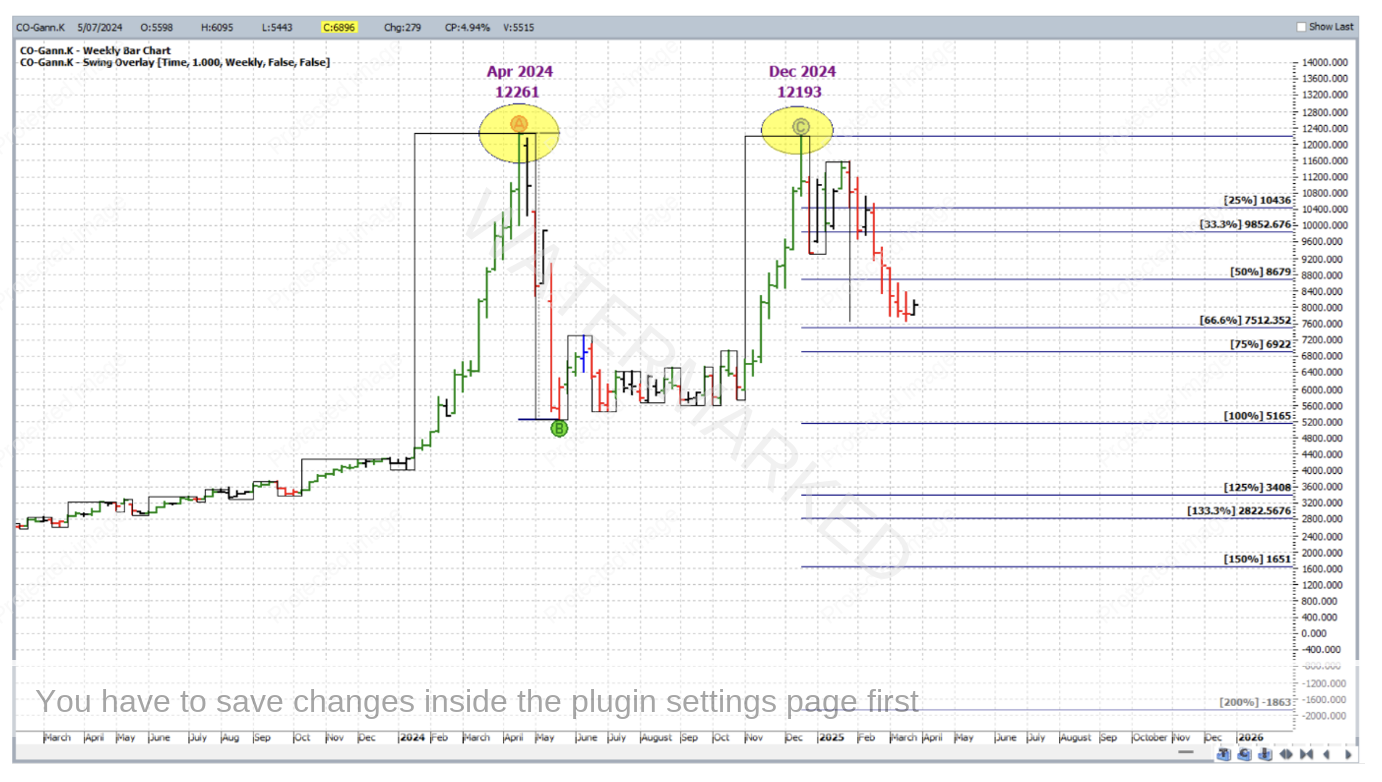
In the above monthly chart, now apparent is a major double top formation. Not exact double tops, but within a tolerable percentage error of one another. Hitting the MINUS (-) key then brings us back to weekly bar chart resolution, where the major double is still visible. Then as an example, for further reference the chart could be labelled and saved as per below. Obviously if this is the first time you’ve looked at Cocoa’s May contract chart, you’ve missed the December top itself but the current weekly swing chart trend is DOWN, and there’s still plenty of room left for the bears to play with the 200% milestone a long way off (even if it’s impossibly negative!).
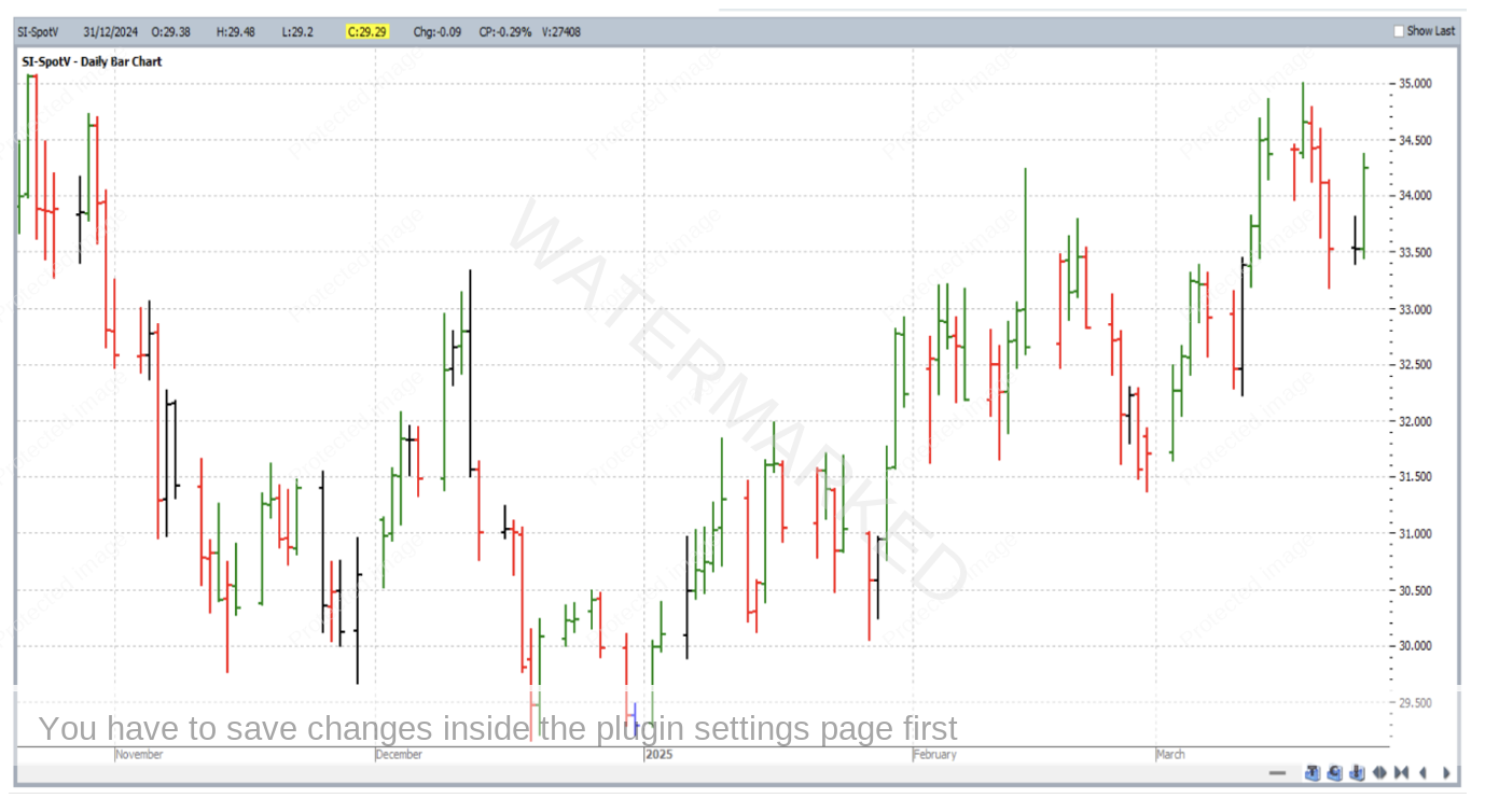
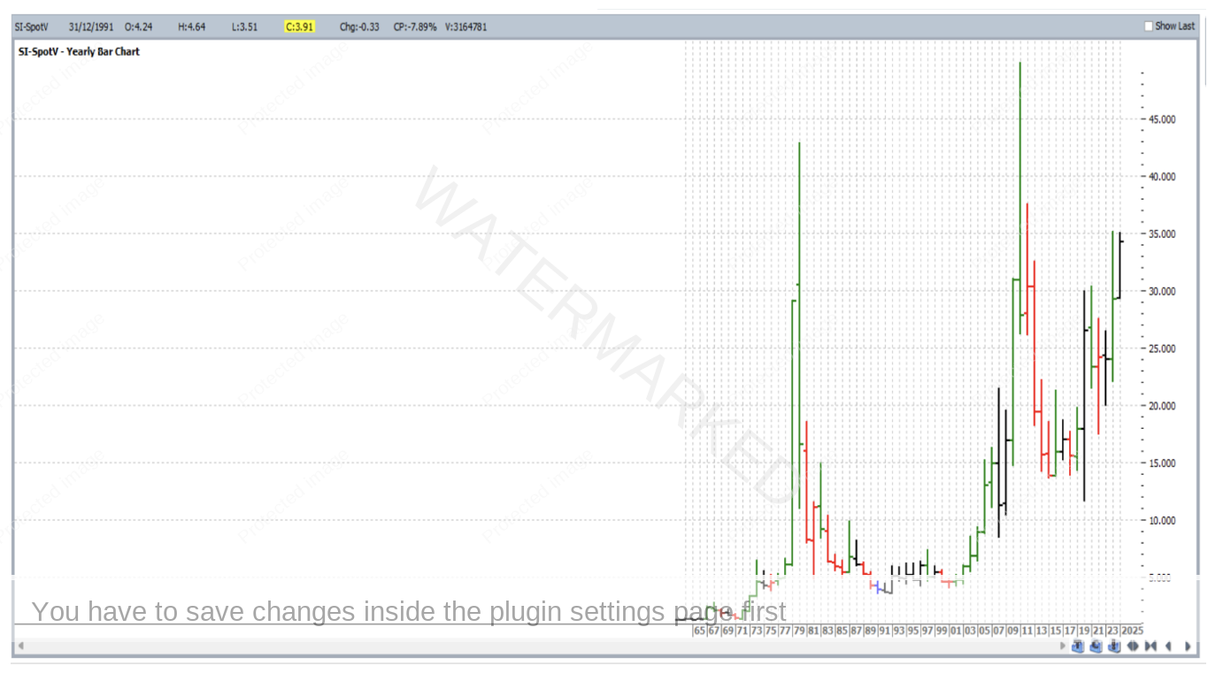
Next to another market with another price forecasting technique, but the same idea with our little hot key. Silver’s continuous SpotV chart (symbol SI-SpotV) is shown below, also as it opens by default at daily bar chart resolution.
Hitting the PLUS (+) key four times brings the chart to yearly resolution:
In our Price Forecasting, we’re encouraged to apply points A, B and C to major turning points. Applying Point A to the 1991 low, Point B to the 2011 high, and Point C to the 2020 low gives us the chart below to save for near future reference. Note the current position of this market is at a key milestone!
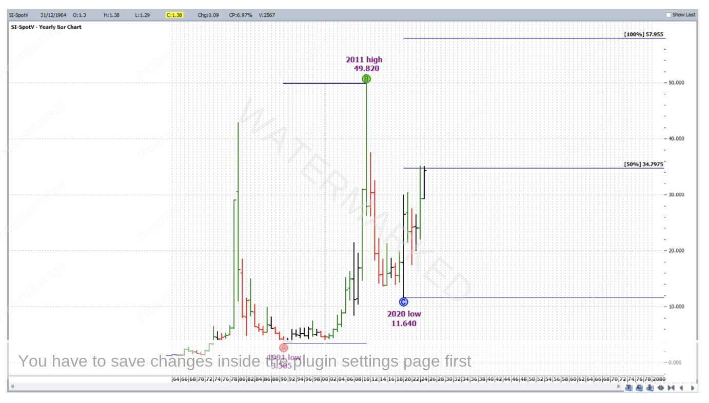
Note that if hitting the MINUS (-) key on the above chart, points A, B and C can become displaced as a chart at yearly resolution doesn’t remember the exact days of the extreme highs and lows, but going into the ABC Pressure Points drawing tool’s properties can allow this to be fixed/re-adjusted. It’s also a good habit, before saving a chart, to “lock” each application of an ABC pressure points tool into place (again, via Properties) as their ABC points are easy to dislodge by mistake with your PC’s mouse.
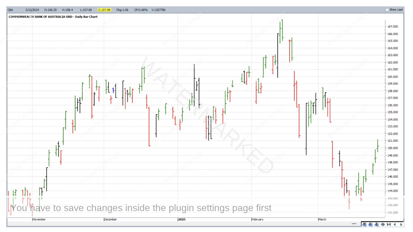
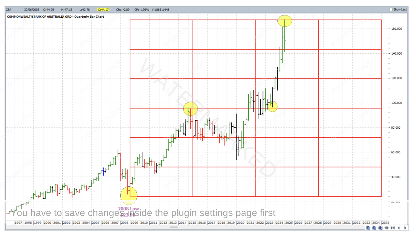
Now to yet another market with another price forecasting technique, and another example of how we can quickly engage the bigger turning points. By default, a fresh daily bar chart of one of our local banks, CBA:ASX, opens as follows:
Hitting the PLUS (+) key 3 times gets us to the Quarterly bar chart resolution, with a few major lows visible.
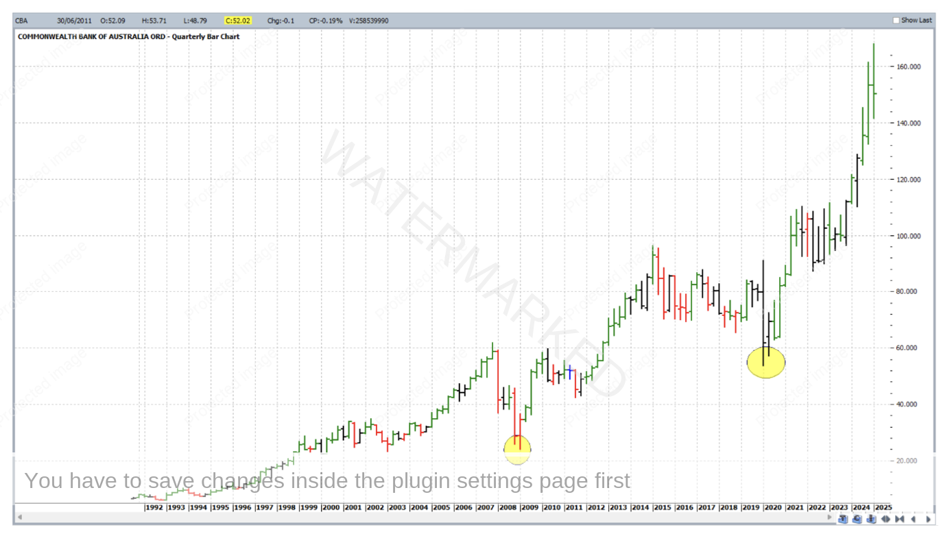
Major Lows are important for the application of a Lows Resistance Card. In the example below one has been applied to the 2008 low, and hi-lighted are a few subsequent major turns where this Lows Card may well have formed part of a strong price cluster.
It doesn’t stop there, remember that price cluster inputs can also be found using Ranges Resistance Cards and Highs Resistance Cards, and these too will offer the most strength when they are based on the bigger picture turning points.
In conclusion there are a few other things to bear in mind:
- Make sure that ProfitSource (or your own third party software) is configured with maximum historical data, at least for the market sectors that you are interested in trading.
- This article was not about discussing a specific price cluster. It’s more about giving the reader some of the skills that need to be brought together on an individual market to form a strong price cluster in that market.
- Stronger price clusters are fewer than weaker ones. This is not a bad thing, but more patience is required, otherwise, more time is required to scan more markets.
- Not a ProfitSource user? See if you can find the equivalent short cut key in your own trading software. And as mentioned last month, more resources on software use can be found in the Member’s portal on our website.
Work Hard, Work Smart.
Andrew Baraniak