A Pullback or a New Bear Market?
As we continue to review the movements of the Nasdaq, one question that we all face in trading is, when market movements change trend are they doing so as a normal rebalancing or part of a major trend reversal? The easy answer is to wait 6 months and look at the chart, the answer will be obvious, but you are no closer to boosting your trading balance if you do that.
We should all be familiar with the moves in the Nasdaq both pre and post-COVID. Its movements have been spectacular against an uncertain economic landscape and bearish views that the move has been unsustainable. I have never been more confident in technical analysis than I am in 2021 as we start to see the breakdown of fundamental analysis models or maybe we are in a stage of writing new ones?
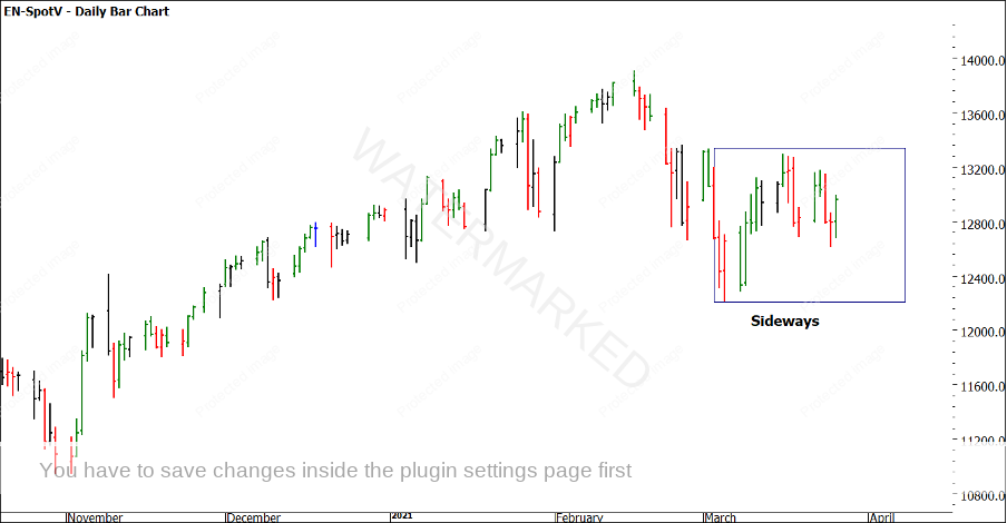
The Nasdaq in Chart 1 shows the recent slowdown in its velocity to the upside. We could argue that it is sideways in the short term (not too different to our local SPI200). Back to my question on what is next for this market, is it the start of a big decline or just a pause in the medium-term trend? Gann and David provide many tools for us to analyse and build a perspective, but none can tell the whole story 100% of the time as I see it. We begin with price to assess what history has done and how it could repeat in the future. Time-based techniques would guide us to when to expect a major turn but that comes further down the track in your education so let us focus on price.
Chart 1 shows the price action in 2021. From the high in February, we have seen a low in early March followed by a sideways pattern emerging.
Chart 1 – Daily Bar Chart Nasdaq Futures
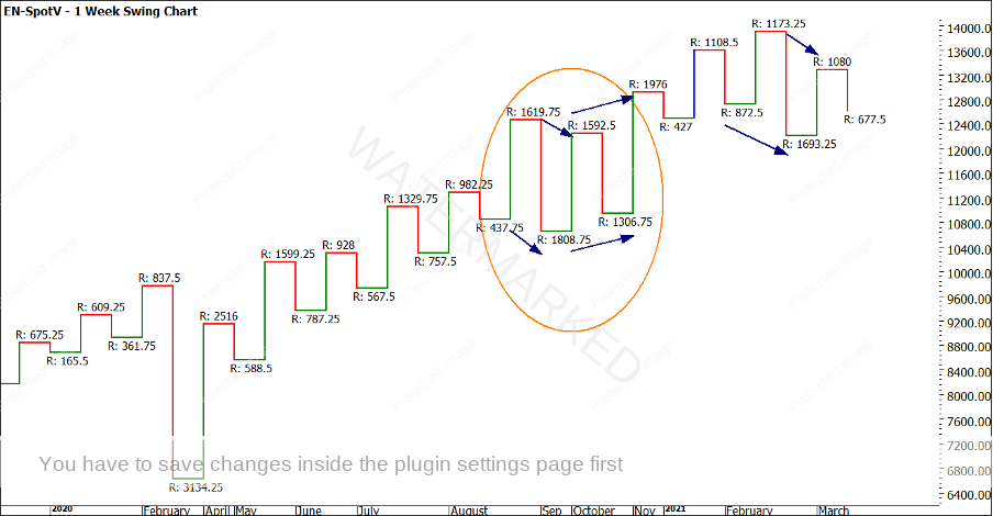
Chart Two is a weekly swing chart and the pattern of lower tops and lower bottoms is similar to the pattern we saw when the Nasdaq last took a breath in September/ October 2020. A lower top, lower bottom pattern on the weekly chart was followed by a strong run to the upside. You should be looking at the actual swing ranges and looking for a repeat or percentages of previous moves.
Chart 2 – Weekly Swing Chart Nasdaq Futures
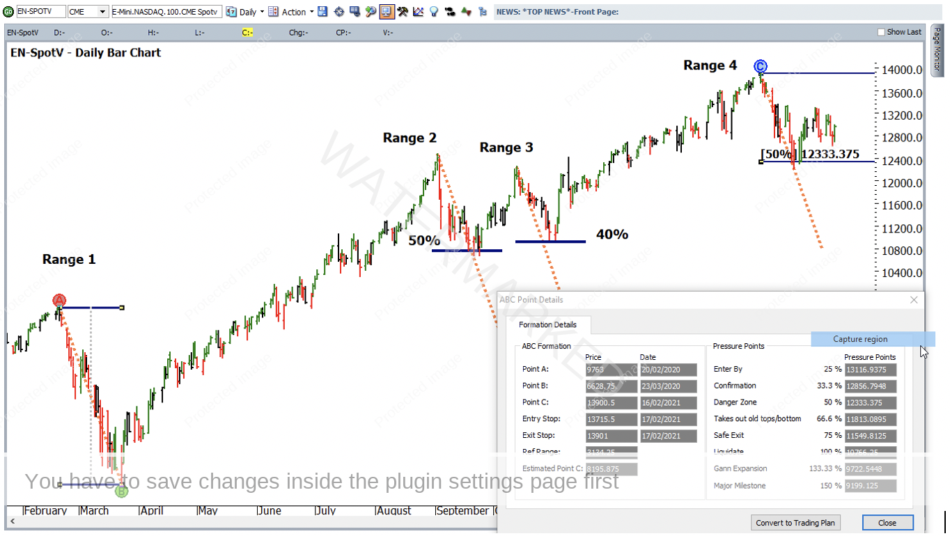
If you still keep a hand chart one of the quickest and simplest ways of comparing price ranges is with a speed angle. This allows us to transfer the speed and pitch of the market to be referenced without creating all the milestones whilst we examine if this move is worthwhile noting on our charts. The good news is that it’s even easier in ProfitSource by creating a trendline and then using the Create Parallel Trend Line option.
Chart 3 shows us the most logical bearish range to use back in 2020. The February/March decline was the initial reaction to COVID and was a short /sharp decline. I have copied the ABC formation details so you can replicate the range as needed. This is labelled range 1. I have compared the speed angle to ranges 2, 3 and 4. We can see how the price action sits on or above the speed angle, we can see this as supporting prices. When the price action starts to drift away from the speed angle, we can suggest in this case the price decline is losing momentum.
It’s worthwhile noting that the price action in ranges 2, 3 and 4 has not been able to close consistently under the 50% milestone. You should be comfortable with the significance that Gann gives to the 50% level.
Chart 3 – Daily Bar Chart Nasdaq Futures
If you are not counting time in your analysis just yet, the speed angle is a simple but still sophisticated way of including time into your analysis. When using a speed angle to project the next run, if the trend terminates at the end of speed angle, we have seen a 100% repeat in price and time.
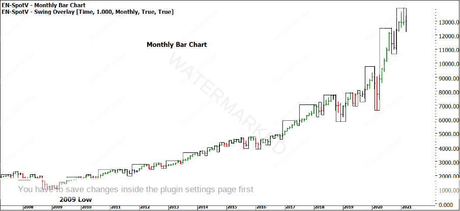
The value of a monthly chart in trading is often overlooked, many will ignore monthly charts as we are unlikely to take trades using the prices of swing tops and bottoms. Where a monthly chart can come in handy is for form reading around major turns and understanding what is normal or abnormal.
Chart 4 starts at approximately the 2009 lows. We can use a swing overlay to assist us with the swing tops and bottoms. Your task is to look at the price action over this time and understand what a normal pullback looks like.
Chart 4 – Monthly Bar Chart Nasdaq Futures
A quick eyeball shows that rarely does the price action have more than 2 red bars (two down months). How many months would we need to see as down bars before we are in unusual territory?
This analysis against the pure technical skills of Price Forecasting can give us some insights (not as early as time analysis may provide) but still a strong confirmation indicator of the type of trades you may be anticipating (long or short). The Nasdaq is an excellent market to study and broaden your analysis skills in and deepen your understanding. One final note is that the monthly bar in the charts above has not completed yet, so there may still be more to the story to be told before the end of March.
Good Trading
Aaron Lynch


