And We’re Back Again…
Continuing on from last month’s article “What Goes Up, Must Come Down” – May 2020, as you can see the market has somehow broken its All-Time High of $968.99 when the world economy seems to be broken.
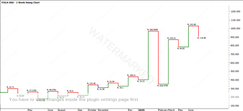
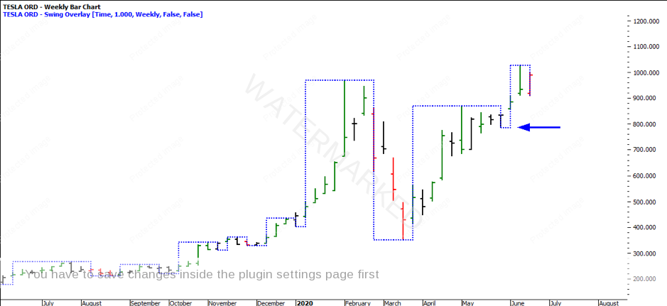
Reviewing the bigger picture first up, the weekly swing chart has produced a higher swing bottom, though some could argue that it doesn’t count as it was the breaking of an inside day and the pullback isn’t sufficient enough. The market was able to rally nine weeks consecutively in a row, breaking weekly tops and higher bottoms.
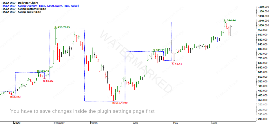
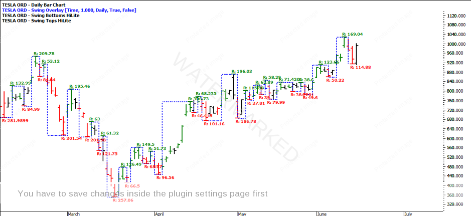
Reviewing the 3-day swing chart provides some further clarity regarding a pullback and looks to be a little more balanced in terms of ranges. What I have used in ProfitSource software is the tool called ‘Swing Overlay’ with the ‘Swing Tops’ and ‘Swing Bottoms’ HiLites. As you can see, it provides the swing chart overlaid on to the bar chart.
As you can see the previous run into the All-Time High on 4 February 2020 was 429.71. The first 3-day swing range out of the COVID Low on 18 March 2020 to 17 April 2020 produced a range of 424.44, which is somewhat balanced with the previous 3-day swing. For the more advanced students, note that these dates are seasonal dates.
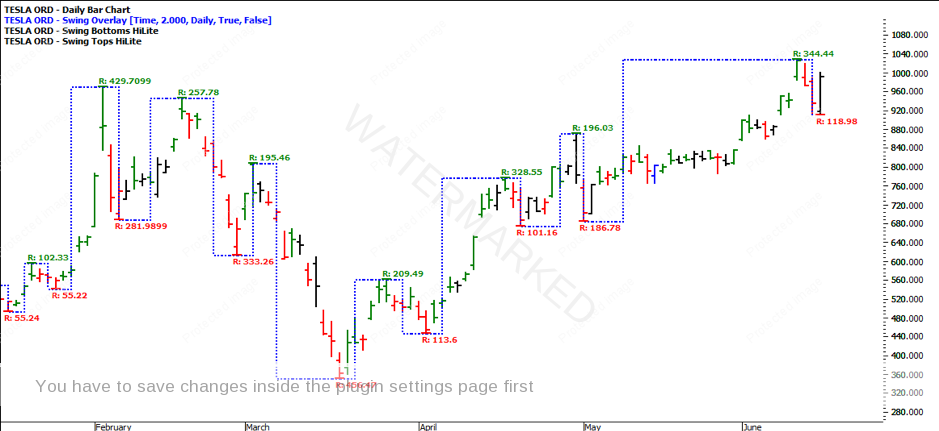
Applying the Swing Overlay to the 2-day swing chart, you can see the trend is currently up. While there has been an increase in average true range, the swing ranges are somewhat consistent and there isn’t any abnormality in the swing chart ranges.
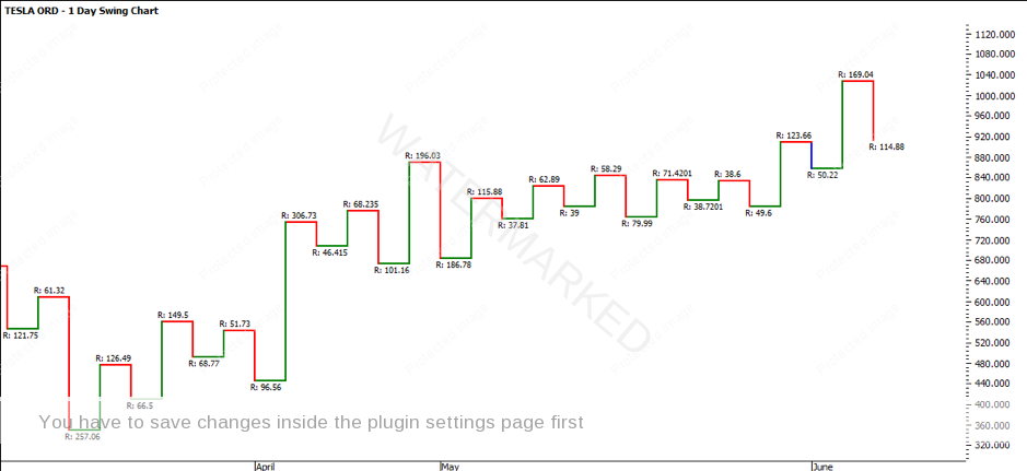
After looking at the above swing ranges and turning to the 1-day swing chart, it sure makes it a lot easier to filter out the noise. That is why starting with the major trends and working your way down to the minor trends is so important. The chart already looks full and messy, which can than cloud your judgement.
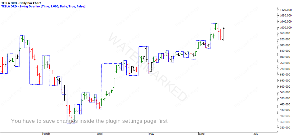
By simply turning off the swing ranges you can see how much cleaner the chart is. More importantly it might be worth switching to you swing chart altogether to remove the noise further.
Currently the 1-day swing chart is up. There has been consistency in the swing ranges, though the most recent pullback was 200% of the previous range. This isn’t a major concern due to the market recently breaking the previous ATH. Often, a market will react off major resistance levels.
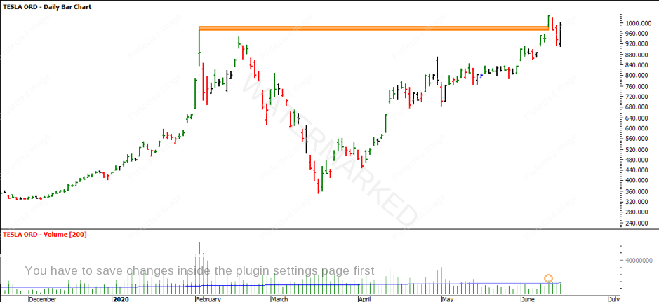
Turning to the daily bar chart, the pullback seems to have been the market reaction, after the market cleanly gapped above the previous ATH. The volume was higher than the previous day and closed on its high. The fact that the market was able to break above the previous ATH as well as gap and close strong, makes me think there is a bit more upside. The proceeding two days were down days that came and closed that gap. We currently have an Outside Reversal Day.
Regardless of whether the market continues to move higher, the best thing about this market opportunity is that there are tradable scenarios in either direction. We can portray this set up as a continuation of the trend into new highs or we can portray it as a double top. Be on guard to make sure you learn as much as you can out of this market opportunity, whatever the market scenario should be.
If you’d like to learn more about analysing multiple swing charts at the same time and recognizing when and where to enter trades on the bigger picture ranges for high probability, high Reward to Risk Ratio trades, check out our new Active Trader Program Online Training by clicking on this link (insert link) to see the first five videos for free!
It’s Your Perception,
Robert Steer
