Black Gold
The price of petrol alone should be an anecdotal sign that oil prices have been rising, but a more detailed study of the charts shows what is an interesting position for Crude Oil and what has been a very strong run in recent times. As I have discussed many times, there is also the impact that US dollar pricing plays in the overall ebb and flow of commodity prices, but for this article we will leave that to the side. My only comment on that relationship is that we are currently at odds with the normal inverse relationship, currently both are trending strongly higher.
A side comment to make at this point as well is I have recently had a break from work and trading, and I can confirm the value in shelving the charts for a period of time, as it allows us to return with a fresh set of eyes.
Crude Oil continues to be a geopolitical football and I am no expert on the whims of OPEC or the machinations of cutting production and how countries continue to buy and sell even with embargoes. Even with those challenges that ultimately generate noise and talking points, oil to me continues to behave around its cycles and our role is to pull apart and monitor the cycles accordingly.
If we start with the big picture, there is a simple and recognizable pattern in play, that of an ABC point, albeit on a large scale. Chart 1 looks at that rough framework and what could be, if it repeats.
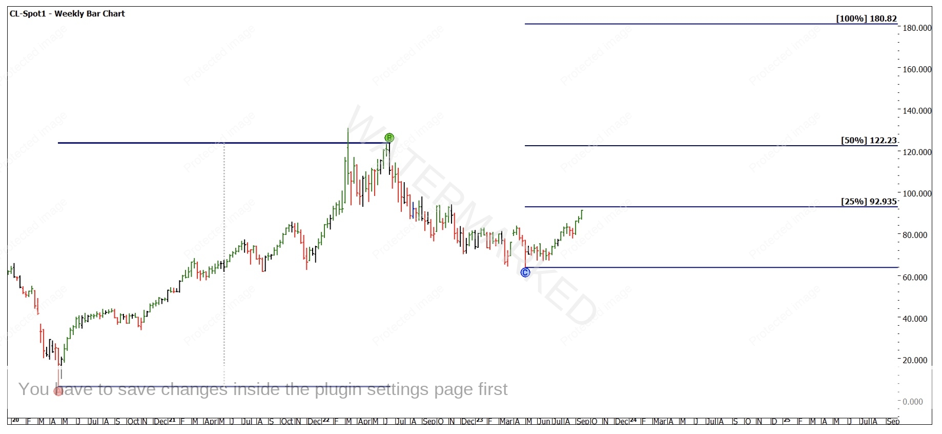
Chart 1 – Weekly Bar Chart CL-Spot1
You will note a repeat of the A to B range sees an All-Time High of approximately $180 a barrel, though I am not suggesting that will happen. It would be a fearsome world if that was to be the case, but it’s more a marker we can use to anchor to. You will also note I have used the June high at $123.68 as the high as opposed to the March high at approximately $130.
This comes down to the concept of true and physical tops and bottoms. A physical top or bottom may be, as it suggests, the highest or lowest prices a market trades at, however, as we are more interested in cycles, you can look to where the market reverses trend. In this case the bear market cycle commenced in June and being short from the March high would have been a more difficult trading start point.
This is supported further when we test both highs with a Ranges Card (Gann Retracement Tool), in Charts 2 and 3 we can see the harmony of a 50% retracement aligns better with the June top. A reminder is that we can allow the market to prove this to us, we don’t necessarily have to confirm this at the time.

Chart 2 – Monthly Bar Chart CL-Spot1
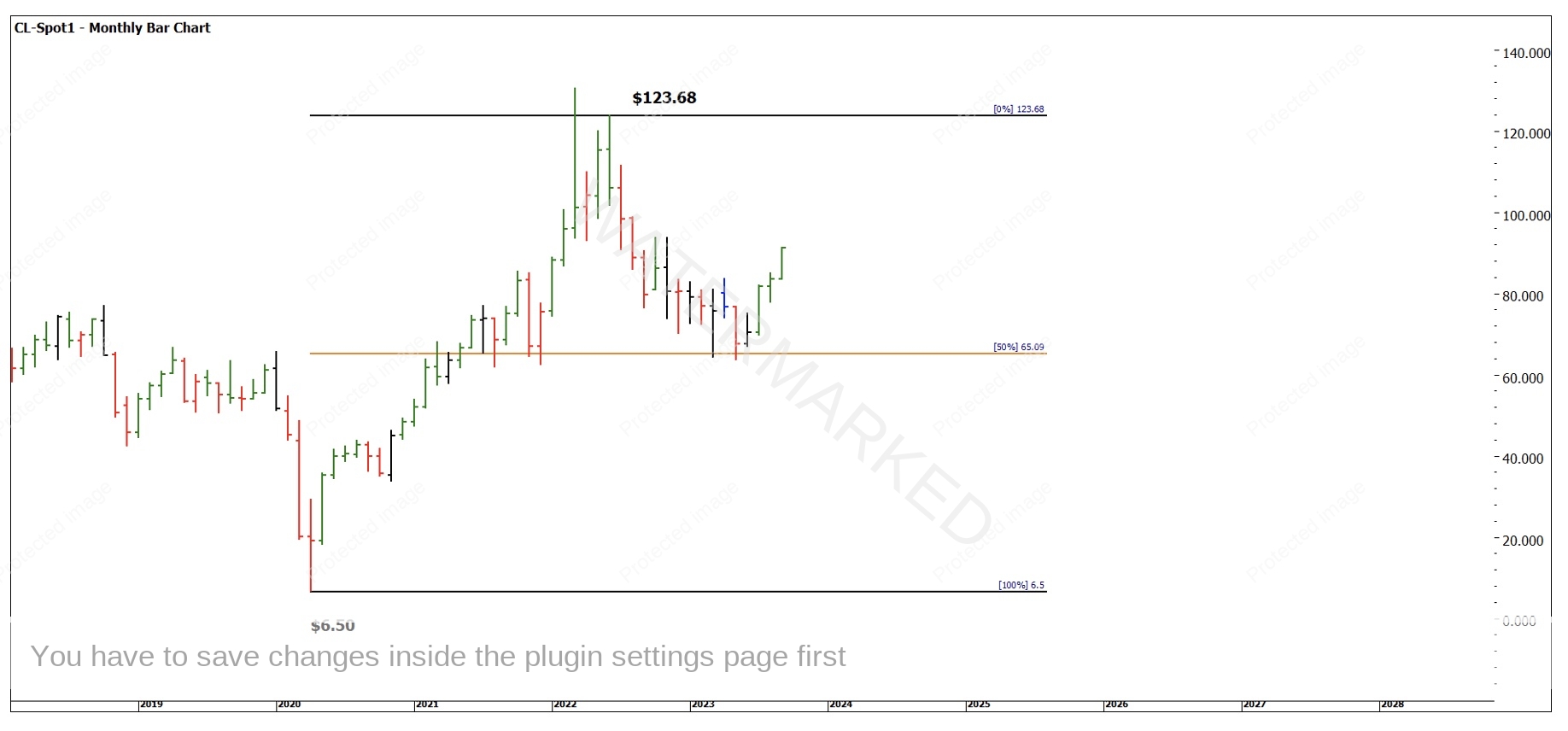
Chart 3 – Monthly Bar Chart CL-Spot1
In the case where it’s hard to split the two, I often will use other tools to confirm. In Chart 4 I have overlayed the Lows Resistance Card from the All-Time Low of $6.50 and you can see both highs vibrate to that low so we can be comfortable to use both as anchor points.
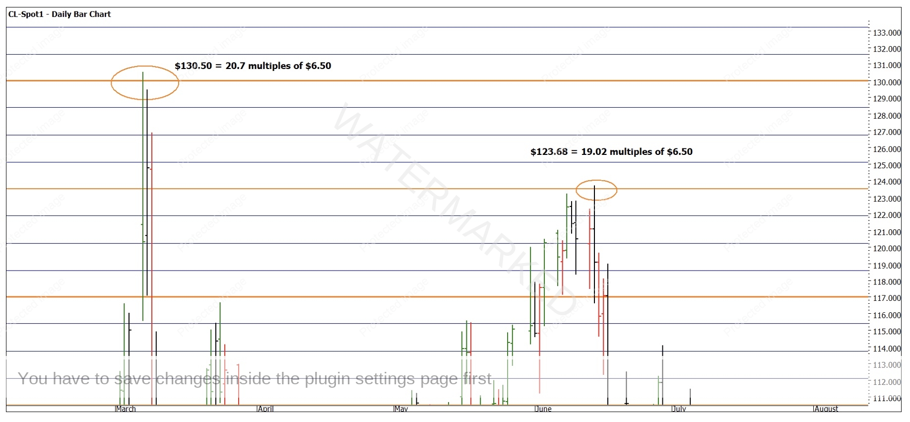
Chart 4 – Daily Bar Chart CL-Spot1
The months of April, August and November align to the use of Master Time Cycles that Gann discusses, and we can start to place markers for the big “rocks” the market may step on this year. I would suggest that you do some work of your own to ensure you are comfortable with those months I have mentioned.
Keep in mind the loose garment comment that David makes is appropriate here. We don’t have to align too specifically here as a given month has a start, middle and end to it that can all provide signals, so here we may consider anniversaries and Time by Degrees as our scalpel to align the markets tempo.
If we start simply, we can look for what the market did in November 2022. Last year the second high of a minor double top was confirmed on the 7 November 2022. We can also note turns on the 10th of November 2021 and a low on the 2nd of November 2020. This can allow us to tune up a potential zero date. The purpose of this is not necessarily to generate a forecast to hang our hat on but more so to monitor the big picture vibration. A trading plan is of course required to generate a signal.
Chart 5 highlights the price action from the 2022 high, the 50% level is the orange horizontal line and may act as a guide for price. Using the 7th of November Anniversary of 2022 as an anchor, we see some Time by Degrees harmony starting to take shape. I will be watching to see if around the 23rd of September we see some sort of reaction as this is 45 Degrees out from November.

Chart 5 – Daily Bar Chart CL-Spot1
There are numerous smaller and bigger picture tools that we can use to overlay over what is here to assist tying more proof points to the story. The challenge for you is to make that process reliable, repeatable, and profitable.
Good Trading
Aaron Lynch