Coffee’s Up!
Firstly, a shout out to Josh M from Victoria. After reading last month’s article on the SPI200, Josh recreated all of the charts, worked out what made up the cluster and sent it in. It was a great example of learning something new from the clues left behind in an article.
I’m fascinated by the world of hand charts and how they can help you to get the right perspective and feel for the market. One perceived downside to hand charts is that they take time, time to create and time to update. Alternatively, opening the software can have you analysing as many markets as you like, at the click of a button.
However, the fact that it takes time to update hand charts is actually one of the greatest benefits of having them, as it makes you slow down and really digest what the market is showing you. Another benefit is that you can have everything in front of you all the time.
So, this month I’ve decided to put together a simple and easy set of swing charts on Coffee, in the hope that one person not already doing so will decide to take the leap into hand charting. It doesn’t matter what high-level technique I learn, if a trade doesn’t make sense on the swing charts, I’ll leave it alone.
You could choose Coffee or any market you like. Whatever you decide, I would love to hear about your progress.
The first thing I did was print off three A1 blank sheets of charting paper from Officeworks, they are roughly $3 per sheet. If you’re not sure how to do this drop a line to Trading Tutors.
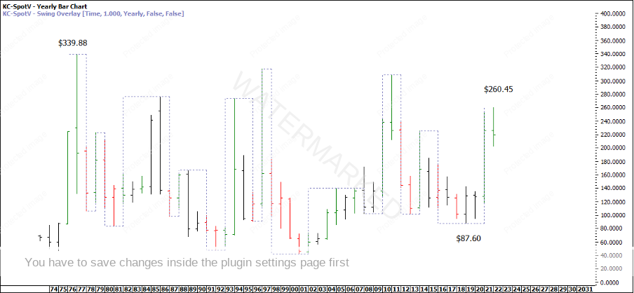
Next you need to decide the scale. For this I’ve decided on $8 per inch or $1 per 1/8 inch. That way using the yearly swing low of $87.60 and orienting the A1 page to portrait, (there are 32 full squares), I can take the top end of the scale to about $343.60 which is above all time highs.
Chart 1 – Yearly Swing Chart
Whatever market you choose to specialise in, I would highly recommend having a separate chart for each swing time frame for rigorous back testing to get to know your market.
However, for just getting one market up and running quickly, try this approach and combine a number of swing chart time frames on the one piece of A1 paper.
Firstly, draw the price scale on the left. Then, draw the past 3 yearly swings to give a reference range in either direction to work with followed by the ABC swing range milestones.
Now that you have a current yearly swing range, grab another A1 sheet and make a table for the Yearly Ranges Resistance Card levels. See Chart 2 below.
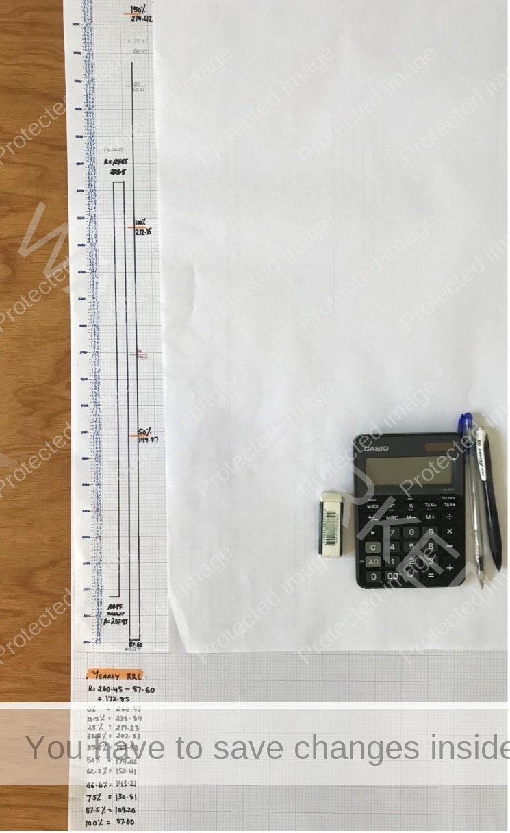
Chart 2 – Yearly Swing and Ranges Resistance Card
Next we can draw the Quarterly swings that make up the current yearly swing range. I’ve left a space of 2 big squares in between which should give me at least 3 years before the yearly swing catches up to the quarterly swing.
As you can see below the yearly swing is made up of 3 quarterly swings. So this time I’ve used the current quarterly swing range up ($165.90) to create a Ranges Resistance Card (RRC). At this point I’ve also highlighted the 50% RRC levels (estimated Point C) in pink and the major ABC swing range milestones in Orange.
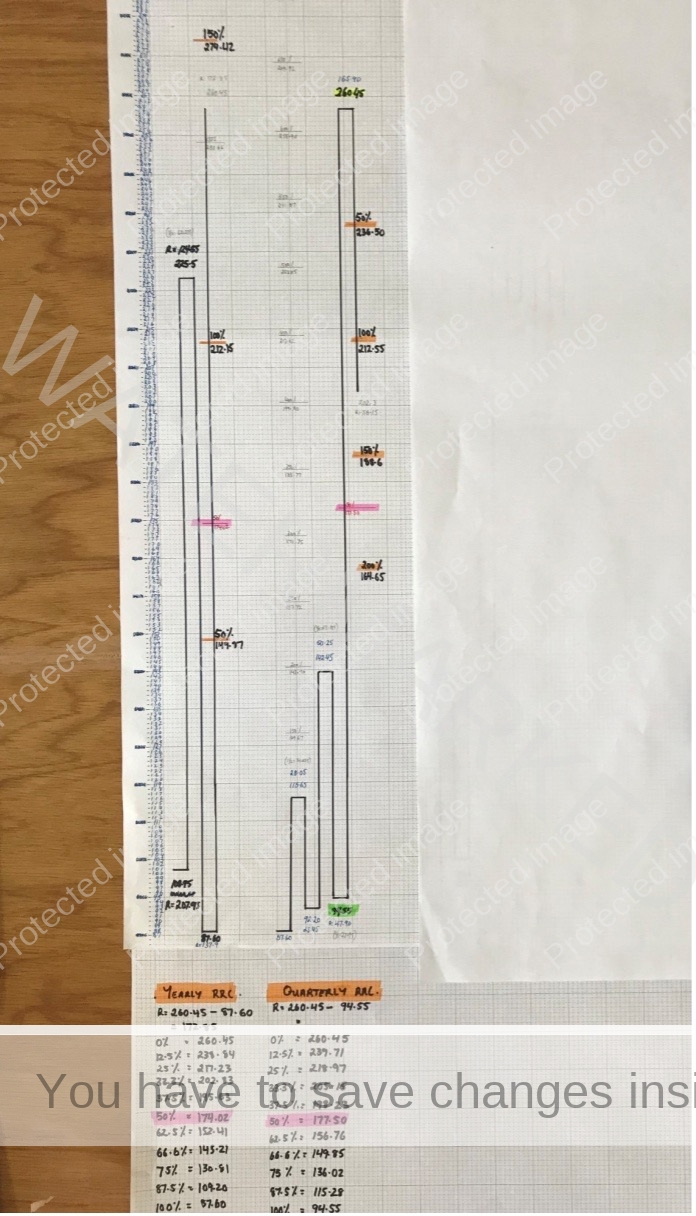
Chart 3 – Quarterly Swing and Ranges Resistance Card
Next is to draw the monthly swings that make up the current quarterly swing. Again I’ve left 2 big squares of space between the monthly and quarterly swing charts, which should give me roughly 2 years before the quarterly catches up to the monthly swing.
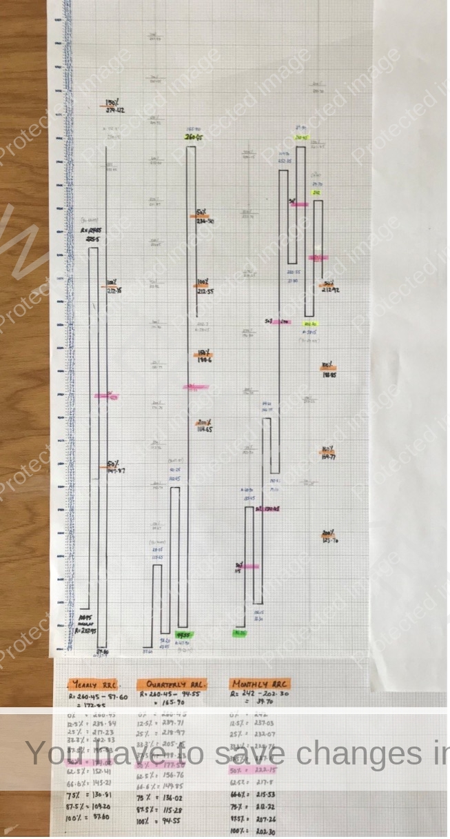
Chart 4 – Monthly Swing and Ranges Resistance Card
I’ve never taken a trade on Coffee, but one reason I picked this market was because of what a great example the monthly swing chart is leading into the quarterly swing top. I would really encourage everyone to apply all your knowledge of Price Forecasting to the monthly swing chart, it’s a cracker of an example and what I look for on any swing time frame.
The final swing chart for this A1 sheet is the weekly swing. Then I’ve started a separate A1 for the daily swing. I’ve also added in the All-Time High to All-Time Low Ranges Resistance Card, and the All-Time Highs Resistance Card to the bottom right.
I’ve then used bull clips to clip the charts to a piece of ply wood (800mm x 1200mm). This makes it very easy to pick up and move around. The final product can be seen below.
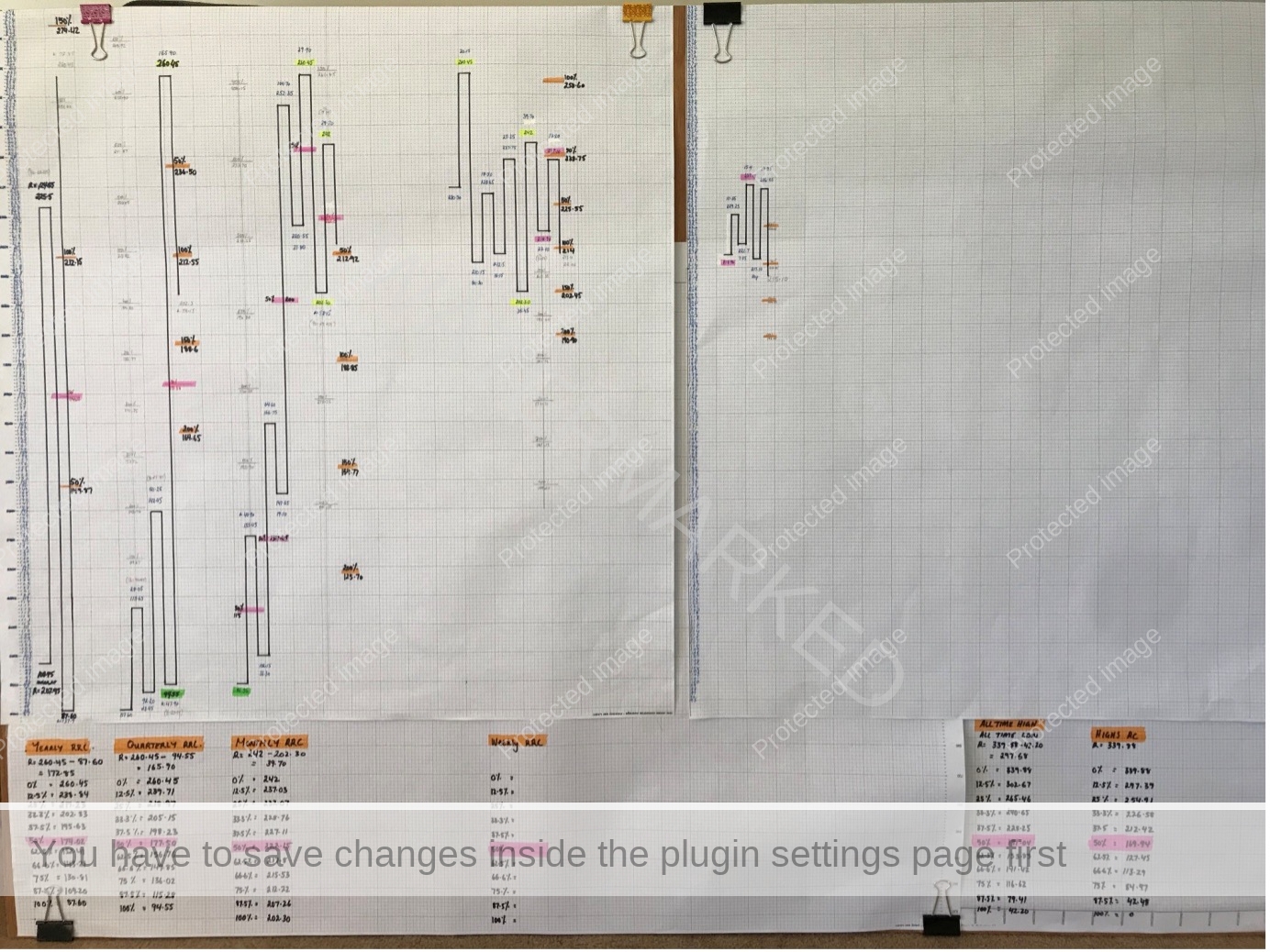
Chart 5 – Final Product
One piece of advice is to use plenty of colour so that your price milestones stand out. Really try and make these charts your own by writing in your calculations, writing notes and lessons learnt! I also use green pen to label all my entries and exits. Something as simple as this could be set up in half a day!
Now it’s time to interpret what the swing charts are showing us in terms of future direction. Which swing time frames look bullish or bearish? To me the Monthly and Weekly swings look very bearish at present so I would be looking for short trading opportunities in line with these swing charts. Considering the weekly swing has just gone through the 100% milestone of the previous weekly A-B range and is now an expanding range down, I will be watching for a cluster at the next lower weekly swing top if one comes together.
The best way to do this is to update your swing charts daily and always have the major ABC milestones labled for each swing in every direction.
Happy trading,
Gus Hingeley
