Creating a Ranges Resistance Card
ProfitSource Chart Re-Creation Exercises – Part Two
Let me start by saying well done to all of those who handed in something for last month’s homework – there was some high-quality work amongst it. Many students are now starting to show improvement in their understanding and application in ProfitSource. Keep up the good work!
After such positive feedback from the exercise of learning ProfitSource by chart re-creation, I have decided to do another one with you this month – but this time for a Ranges Resistance Card. Before you go ahead with this article, please make sure you have had a read of last month’s article, where some important foundations were laid.
Below is an example of a Ranges Resistance Card applied to a chart. You will find it on page 137 of your Number One Trading Plan manual. It is applied to the JP Morgan Chase Company, NYSE (chart symbol JPM in ProfitSource).
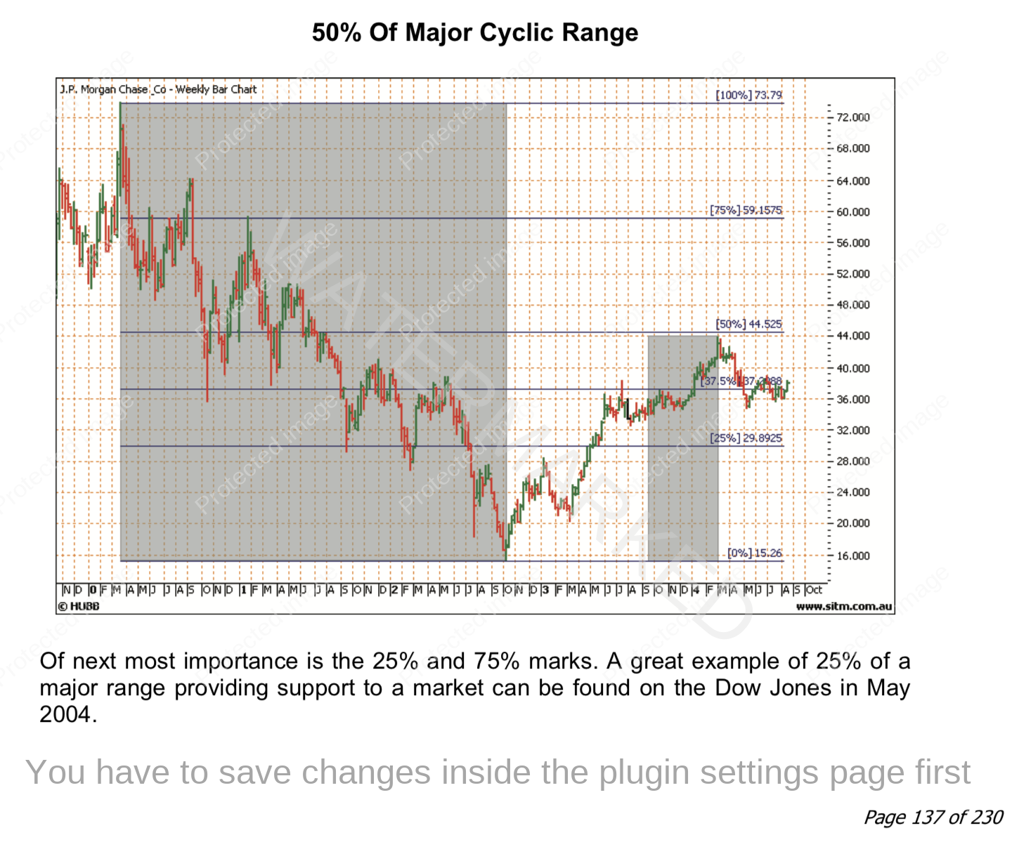
Our goal again is to re-create the above chart in ProfitSource to the best of our ability. As usual read this article one step at a time, following the instructions directly and applying them in your own ProfitSource installation. Start here:
- Open ProfitSource
- Charts -> New Price Chart -> Enter JPM (NYSE) and click OK
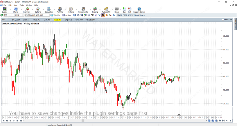
Now that you have the chart open, hit the plus “+” key, on this occasion only once in order to change from daily bar chart to weekly bar chart. You can also use the drop-down menu (seen under the “Calculators” and “Portfolio” tabs in my software chart below) to change from a daily chart to a weekly chart.
Left click and drag the chart so that the year 2000 high for this market ($73.80) and the 2002 low ($15.26) are centred in the chart space. The F7 and F8 keys (or the arrow buttons in the bottom right-hand corner of the screen) can help adjust the time scale, and remember that left clicking and dragging up and down on the right-hand side price axis can adjust the price scale.
Click on the Walk Thru mode button and apply the start of Walk Thru mode to anywhere in late 2004 with another mouse click in line with somewhere in late 2004 – so we have similar historical data to the chart image from the manual.
If you have done everything right so far, you will see something like:
Now we’re ready to start drawing on the chart. Click on the Drawing Tools icon, then click on the Gann tab, and left click on the Gann Retracement tool. Like the Highs Resistance card example from last month, a Ranges Resistance Card also requires the same tool.
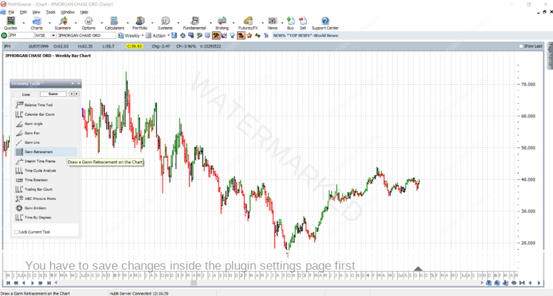
Now that you have selected the correct drawing tool, apply it to the chart as follows:
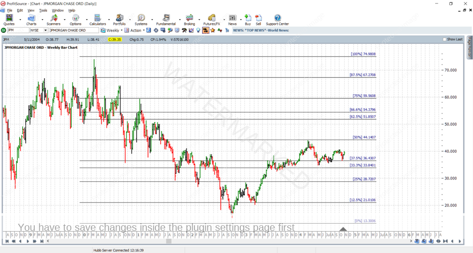
First left mouse click somewhere above and to the left of the $73.80 year 2000 high on the chart – this will initially fix the top left corner of the resistance card to the chart.
…then drag the mouse towards the bottom right of the chart, and then…
a second left mouse click will fix the bottom right corner of the resistance card to the chart. If you have done everything correctly to this point, you should see something like the following:
Now that the resistance card is on the chart, the next thing of course is to fine-tune its settings with the correct high and low prices. Double click anywhere on the Resistance Card to bring up its Properties box.
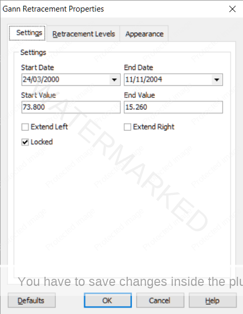
In the Gann Retracement Properties Box’s Settings tab, we lock in the prices and dates so that the corners of our Resistance Card are placed on the chart where we want them.
Set Start Value to a price of $73.80, Start Date to 24/3/2000 and End Value to a price of $15.26; End Date I will again leave up to you, but make sure it is set so that your resistance card covers a similar period of market action to the chart we are re-creating. Play with this a little!
See below for an example of what you want to see thus far. Like I mentioned last month, it’s a good idea to “Lock” the Resistance Card into place – just so we don’t accidentally move it around on the chart later on.
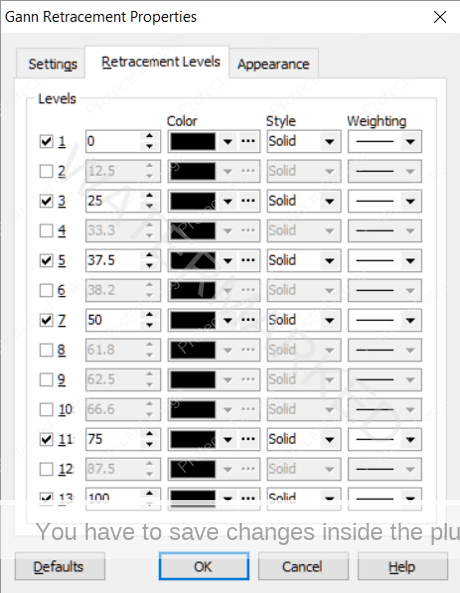
Before clicking OK, you might also need to make adjustments in the “Retracement Levels” tab. The adjustments you make here will also depend on how you left the defaults for this drawing tool the last time you used it. Go to the Retracement Levels tab and make sure that the only levels checked for this exercise are the 0%, 25%, 37.5%, 50%, 75% and 100% resistance levels.
Just before clicking OK, here is what you should see:
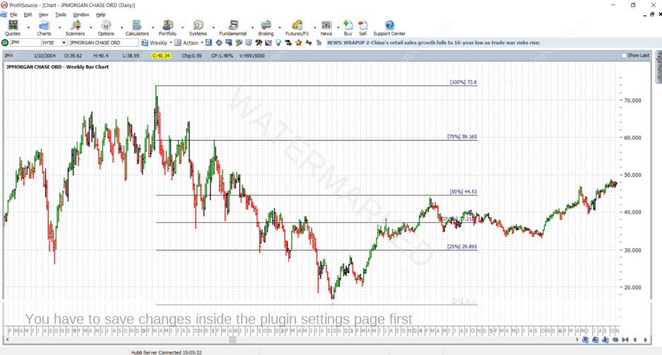
…then after clicking OK, here is what you should see:
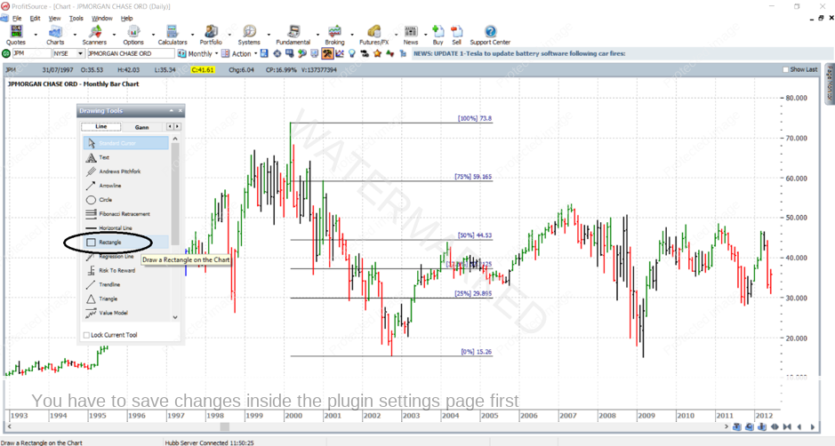
Now it’s time to play with a new drawing tool – the Rectangle. While this is not something you will be putting on every single Ranges Resistance Card which you use in ProfitSource, nonetheless it is a new tool to practice with. Start by selecting it from the Drawing Tools box:
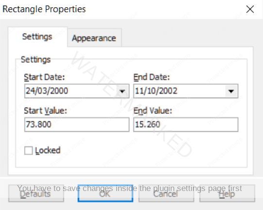
Apply this tool by clicking somewhere near the 2000 high – to place the top left-hand corner of the rectangle on the chart, and then somewhere near the 2002 low to place the bottom right-hand corner. Once it is applied to the chart, double click anywhere on the rectangle’s border to bring up its Properties. Then fine tune its settings with values as follows:
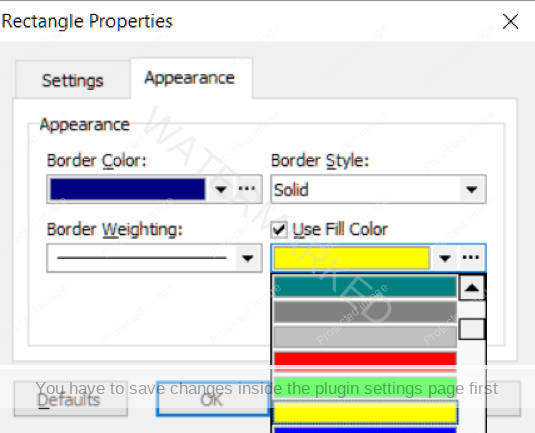
While we’re at it, let change the colour – set “Fill Colour” to any colour that you think will allow easy viewing of the finished chart:
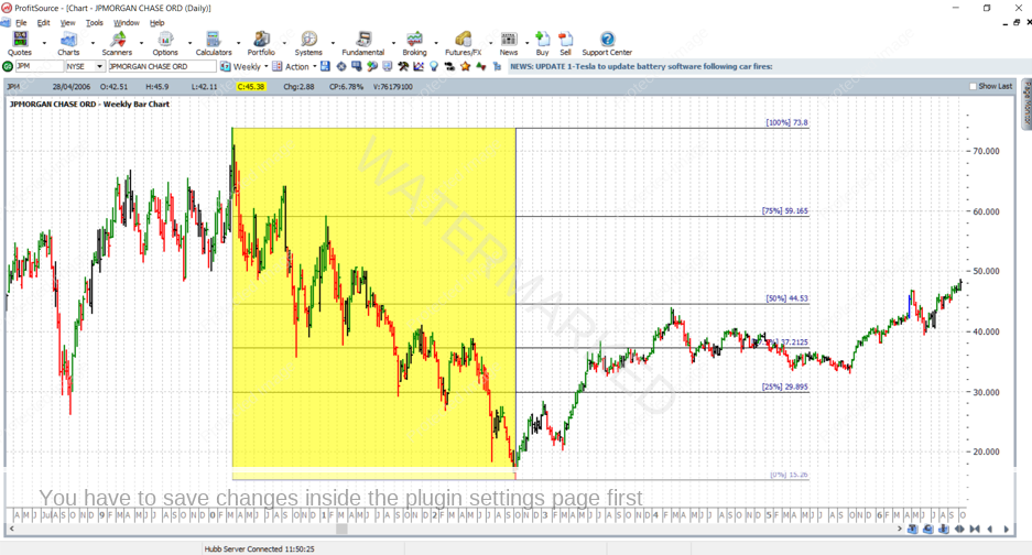
Then you should see the following:
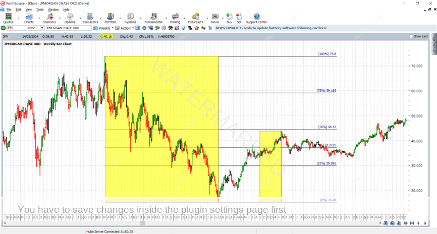
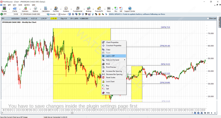
You will notice the chart in the manual also has a smaller rectangle applied to the period of market action leading into the March 2004 top for this market. See if you can apply it correctly yourself – send it in as homework. Remember this will take some chart reading ability on your part – i.e. you’ll need to use the ProfitSource chart itself to determine the prices and dates which will form the corners of the new rectangle. Here is what you are aiming for:
As was the case last month, now take the following steps:
- Save your work in ProfitSource (click on the Disk icon in the toolbar above the chart page OR select Action -> Save Chart Page).
- Send a screenshot to us at Trading Tutors
-> Right click on the chart and select Save As GIF. Save your GIF file in a known folder on your computer.
Hopefully by now your ProfitSource skills are steadily building. And there is more to come next month – stay tuned for another chart re-creation example.
Work hard, work smart.
Andrew Baraniak