Debt Ceiling – Watch or Ignore?
One of the top trending topics for global markets at the moment has been the impact of the debt ceiling in the US and will the Government run out of money? For observers of US markets this theme arrives every few years and impacts both sides of politics as the question of whether the credit card limit can be lifted rears its head. My takeaway is that it often arrives at price and time points in markets, that is, it seems to be linked to cycles. The other observation is, as much as so-called hard liners call for a default, the games behind the scenes always (historically) have arrived at an agreement that allows for the problem to be magically solved (until next time).
The horse trading was enough to see President Biden cancel his trip to Australia as the need to be at home was greater. The impact of a US government shut down has been seen before, the most recent in 2018-2019 and it can bring all Federal services to a halt. The cost to the economy can be large and a flow on to global markets can occur.
The major indexes in the US, the Dow Jones, Nasdaq, S&P500 and the lesser-known Russel 2000 all can be traded and provide a snapshot of the prospects of the US economy and the companies that make up the indexes.
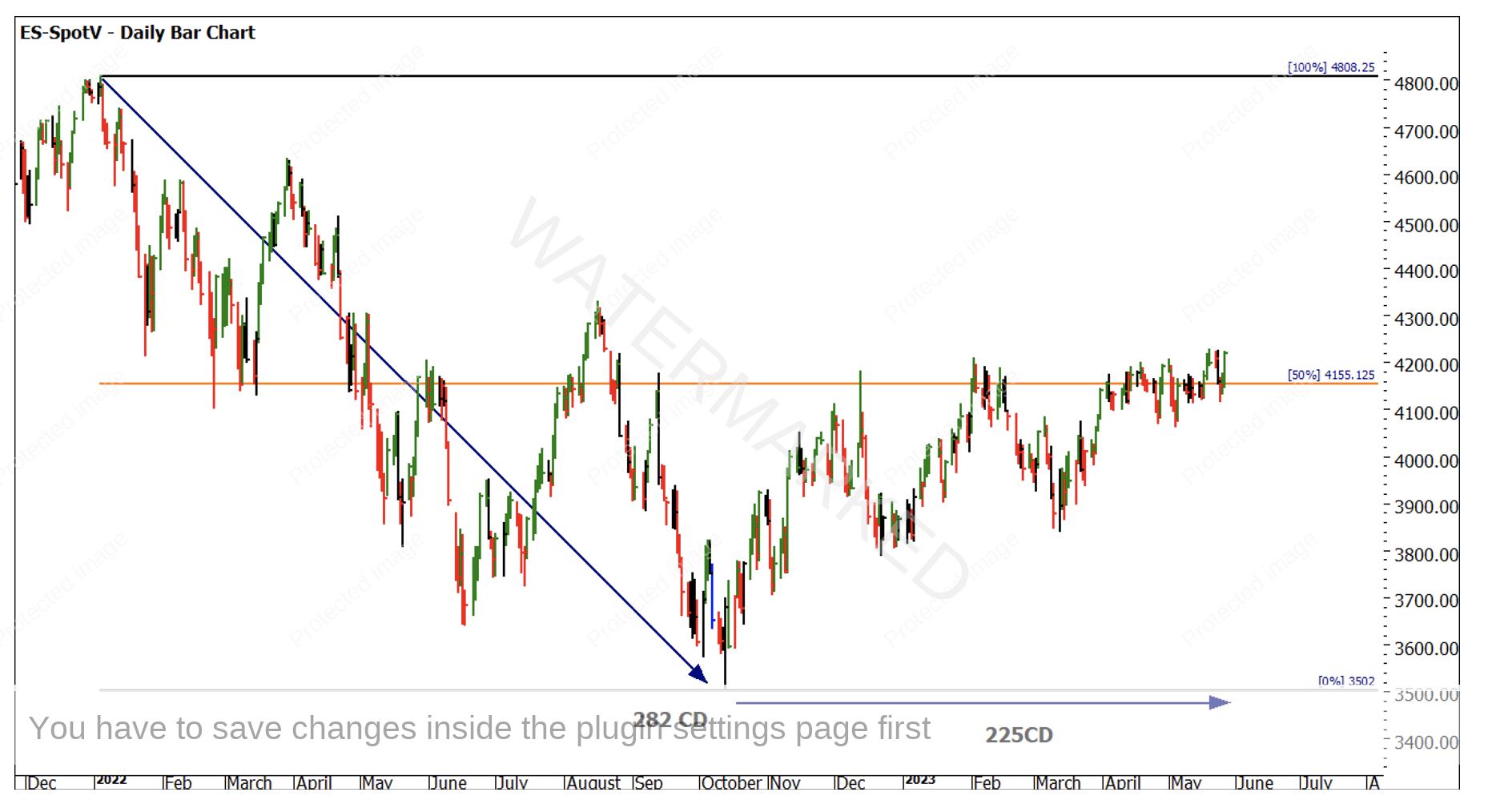
Chart 1 shows the S&P500, and since the low in October of 2022 the price action has found resistance at the 50% level of 4155. It has on occasion held above, only to break back below. In recent times, including the last trading day, it has traded strongly above. The pattern has not shown extreme optimism in breaking through. The sideways pattern has seen higher bottoms forming a wedge so the next moves will be critical.
Chart 1 – Daily Bar Chart ES-Spotv
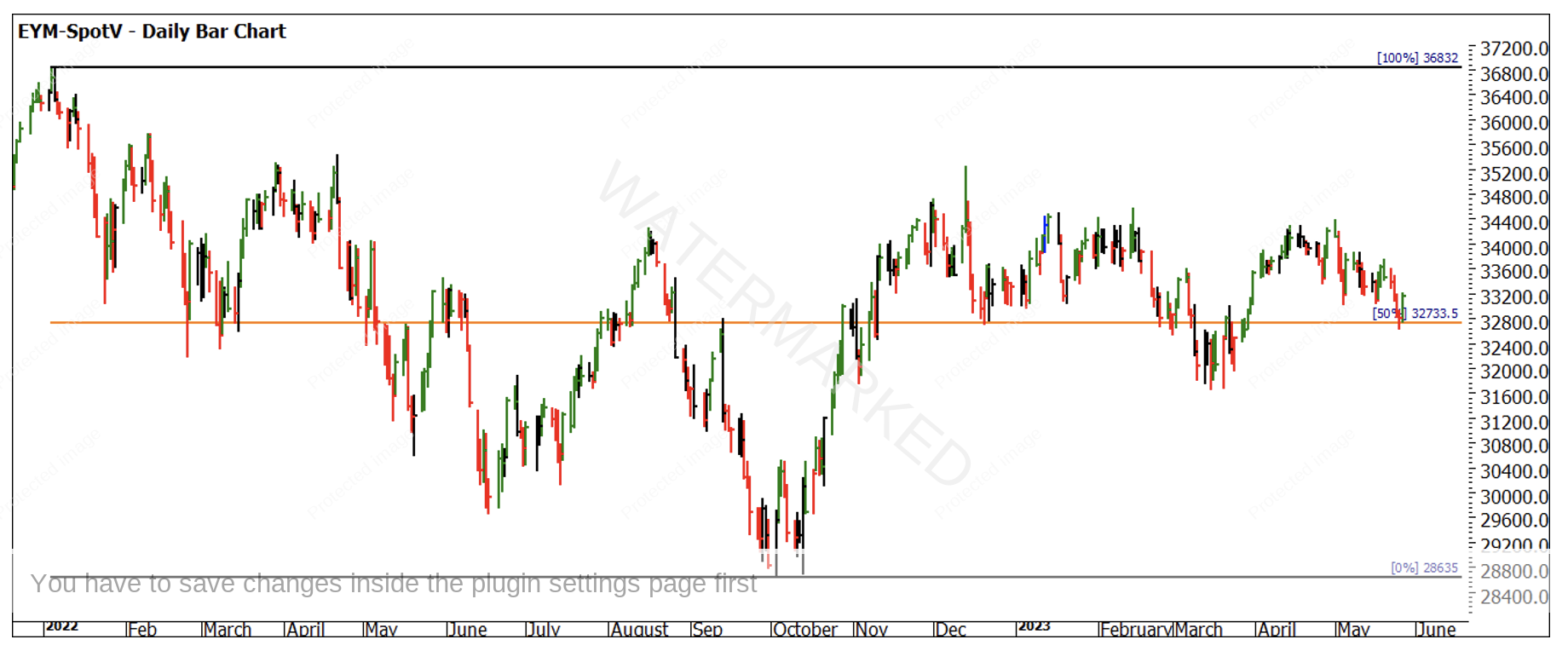
Chart 2 is the Dow Jones, only a small set of stocks, the pattern is different but also worth watching. The price action in this case has spent more time above the 50% level of the 2022 range, with the last two trading days bouncing back up off the 50% level.
Chart 2 – Daily Bar Chart EYM-Spotv
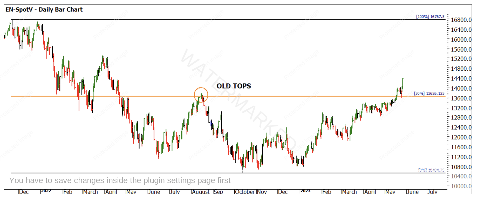
Chart 3 follows the Nasdaq; this index does tend to have the ability to run its own race and offer different patterns to the other indexes discussed. To my eye this chart is simpler and cleaner when looking for a market to analyse. The old tops of August 2022 at the 50% level have in the last few days acted as a springboard higher. From a trading perspective this market may have been the pick of the bunch so far for setting entries and risk management.
Chart 3 – Daily Bar Chart EN-Spotv
To round off the patterns, we can review the Russell 2000, which measures the small cap end of the market and most likely holds names that many of us would not easily identify. We could discuss the economics of what they deliver to the US economy, like Australia there is a significant number of businesses that employ millions of people who are impacted in the first line of headwinds such as any Government closure.
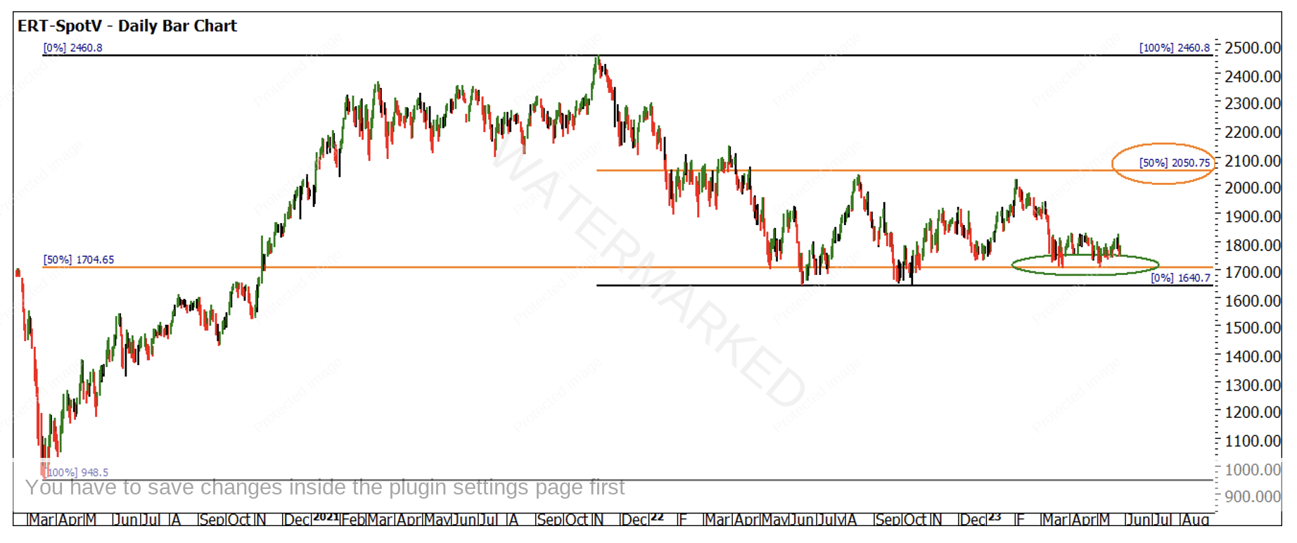
Chart 4 shows that the price action is much closer to the yearly lows and is not close in engaging the 50% level of the smaller range. If we step back to the bigger picture, our reliable pressure point of 50% is in play when viewing the 2020-2021 range.
Chart 4 – Daily Bar Chart ERT-Spotv
All four of these stock indexes display the importance of milestones and in this case the 50%. What causes the price action to arrive at these levels around important and often perceived unlinked events is one for smarter people than I. What I can confirm over two decades of trading is we see price and time collide around news headlines that create market opportunities. We don’t have to understand the headlines just the charts.
I will be watching for confirmation this week of price action to understand whether short trades or long trades can be expected in the short term.
Good Trading
Aaron Lynch


