Getting Technical with Wheat
When it comes to choosing a market to trade, let’s not forget Wheat, another strong mover from the commodities sector. This market has been interesting to watch and trade over the last couple of years. There were a handful of occasions when it formed a strong price cluster, headed towards that cluster, only to turn around well and truly before, denying the advanced price analysis trade. There were also times when it formed strong price clusters and smashed right through them. To be honest, I’m fine with that, all it means is going back to the basics when required and trading in sympathy with the existing trend. Still, a perfectly acceptable way to trade regardless of one’s trading education level – using the Smarter Starter Pack.
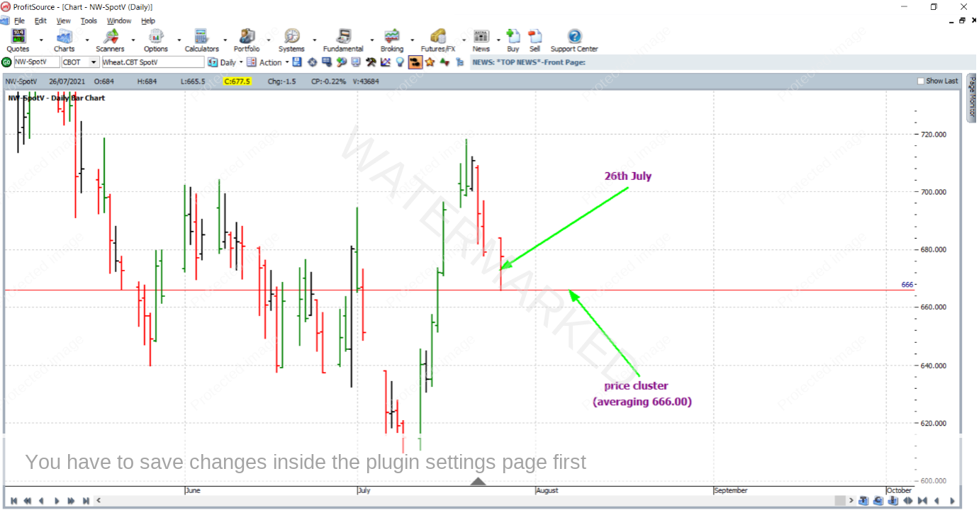
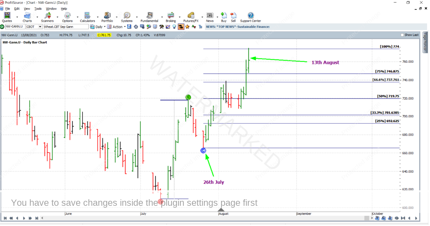
But if you kept up your price analysis with some degree of regularity, you will know there has also been at least one good price cluster which came to be effective. Take the 26th of July this year for instance. We had the best of both worlds. Not only did it allow for a very high probability standard ABC trade, it allowed for an advanced trade entry. Just prior to this date the market headed down towards a price of 666.00 cents per bushel. There were three simple pieces of price analysis involved, and the key parts of each averaged out at that price. As you can see below, the market false broke this price cluster by only a tiny amount – by half a cent (2 points!) bottoming out at 665.50 cents for a very small error in relation to the average size of a daily bar in this market.
As you can see above, there was a strong close on the 26th, with the market closing in the top half of the bar’s range for the day. And you could have had an entry order ready to go on the 27th for an ABC long trade. As you will see further on, that trade was filled on the up day which was the 27th of July (and eventually exited on August 13th). And it gave a reward to risk ratio of more than 4.5 to 1, still respectable, especially for a standard ABC trade.
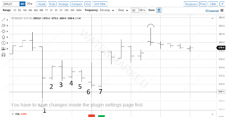
But, what kind of trade could have been taken to give a better reward to risk ratio? Given that a strong price cluster was present, let’s look to the intraday chart. Specifically, we go to barchart.com and zoom in on the hourly bar chart of Wheat’s September 2021 futures contract, around the time of the 26th July low.
As you may notice in the hourly bar chart above, the low itself (bar 1) was followed by a less than simple combination of inside and outside days. As many of you know, often this can lead to confusion when it comes to swing chart construction. Swing chart construction rules (and the ProfitSource software for that matter) do a good job to account for outside days when they occur. But, with markets being markets, of course, they will always do what they will do. In other words, a market can throw up an infinite array of possibilities when it comes to consecutive bars in a bar chart. So what do we do when it gets confusing? We do our best to interpret the situation!
In this case let’s make the assumption that any outside day must put one swing in the swing chart. Therefore, using this logic, since bar 3 was an outside bar, after the down bar 5, the hourly swing chart swung from the low of bar 1 to the high of bar 3, and then down to the low of bar 5. At this stage, a first higher swing bottom entry signal was therefore present. So, you’d have your order to go long placed just before bar 6 was about to form. However, things didn’t go so smoothly. Bar 6 ended up being a “bad outside bar”, with entry and exit stop both being triggered within the hour. Ouch, there goes a unit of risk. However, this should not have hurt too much because, being an aggressive intraday entry, a smaller percentage of the account than usual was ideally risked. And remember the setup was a strong one (you’ll see this if you go and dig up the analysis) so a second go was worthwhile. And this came with the up bar 7 that finally confirmed a first higher swing bottom on the hourly chart. Off and away with a long entry at 675.50c, with an initial exit stop at one point below the low of bar 6 at 668.75c.
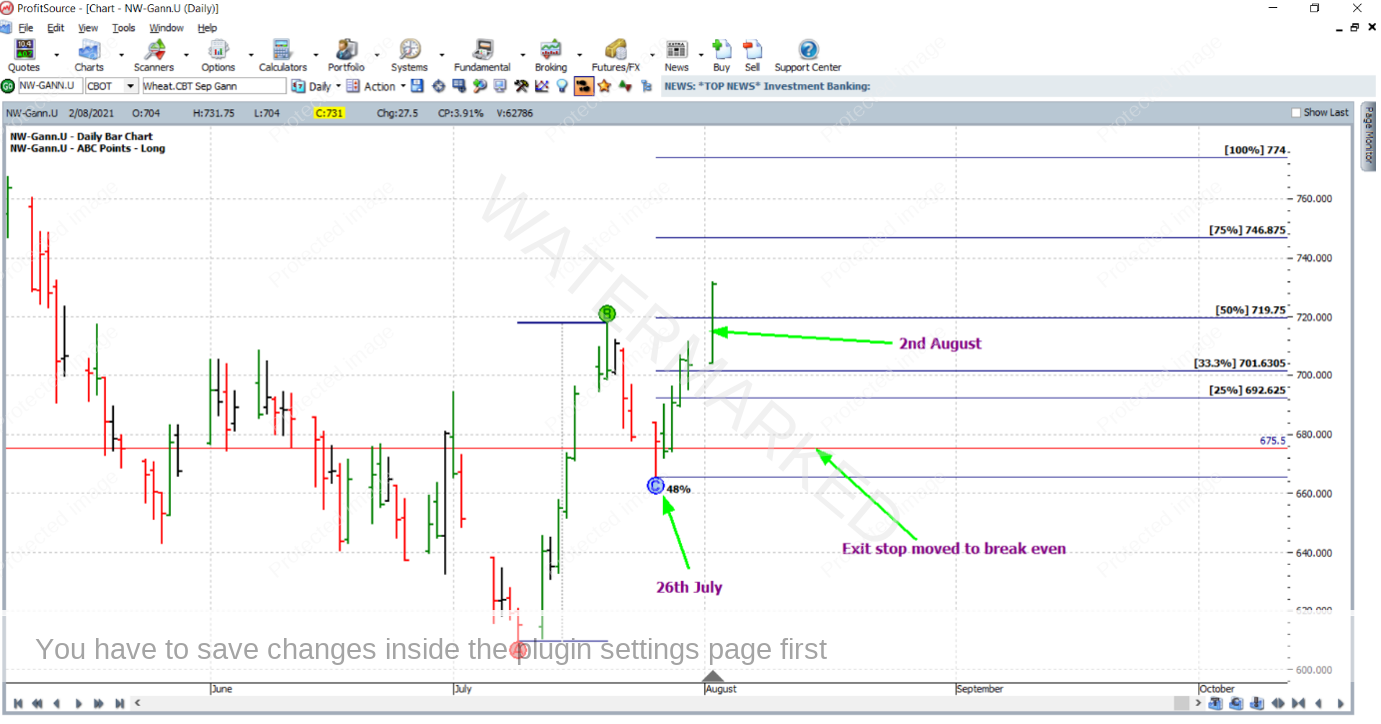
After the challenge of getting on board (yes it was a technical one!), the rest of the affair was relatively simple, that is manage stops as though the trade were a standard ABC, managed “Currency” style. On the 2nd of August, the market reached the 50% milestone – and stops were moved to break even. This is shown in the ProfitSource chart below – chart symbol NW-Gann.U (NW-SpotV can and will also suffice for this example).
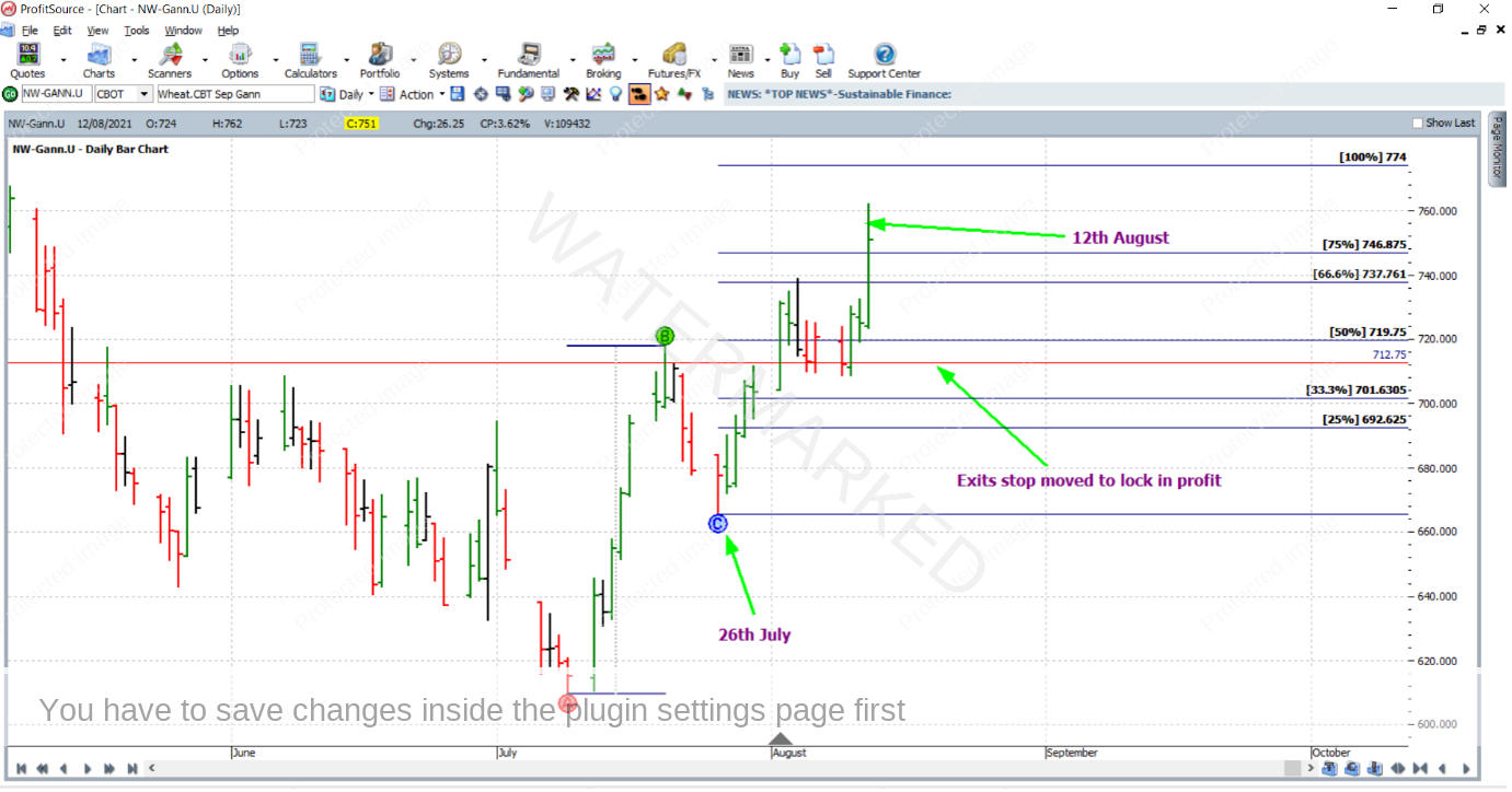
Then on the 12th of August, the market reached the 75% milestone and the exit stop was moved to trail behind the 50% milestone by 7.00 cents (approximately one-third of the average daily bar size based on the last 60 trading bars) at 712.75 cents.
Then a day later, the market tagged the 100% milestone, almost spot on for a clean exit at 774 cents. David certainly wasn’t joking when he said this was a good place to take profits! Here we simply have a market in motion doing what the Safety in the Market course materials say it should do.
So after a fairly detailed one this time, let’s wind things down in the usual way with some different perspectives on the rewards. In terms of the reward to risk ratio:
Initial risk: 675.50 – 668.75 = 6.75 = 27 points (point size is 0.25)
Reward: 774.00 – 675.50 = 98.50 = 394 points
Reward to Risk Ratio = 394/27 = approximately 14.6 to 1
The contract specifications on the CME Group website say that each point of price movement in the Wheat futures market changes the value of one Wheat contract by US$12.50. Therefore in absolute dollar terms, the risk and reward (in USD) for each contract of the trade is calculated as:
Risk = $12.50 x 27 = $337.50
Reward = $12.50 x 394 = $4,925
In AUD terms this reward was approximately $6,692 at the time of taking profits.
On the assumption that 2.5% of the trading account was risked at trade entry, the percentage change to the account size after closing the trade would be:
14.6 x 2.5% = 36.5%
Work Hard, work smart.
Andrew Baraniak
