Halfway Point
Having a timeline to measure yourself against keeps us anchored, be it a calendar, anniversary or clock. These all allow us to stare out the metaphoric window and check in with the surroundings to see where we are. This year has been tumultuous for markets, economies and societies and as I write, the issues in LA and America are the first news stories to appear – it’s been an exhausting first 6 months of 2025 on many fronts.
I have been guilty of not managing the timeline well with lots of spinning plates in the air and some unfortunately hitting the ground, all is not lost and the beauty of markets is there is always the next trade. I discussed last month the rebalance of the SPI200 as it followed its reverse speed angle (trendline) for want of a better term, back to the February highs, and we see that the SPI200 into early June managed to close above 8580 for the first time and surpassed its All Time High in February.
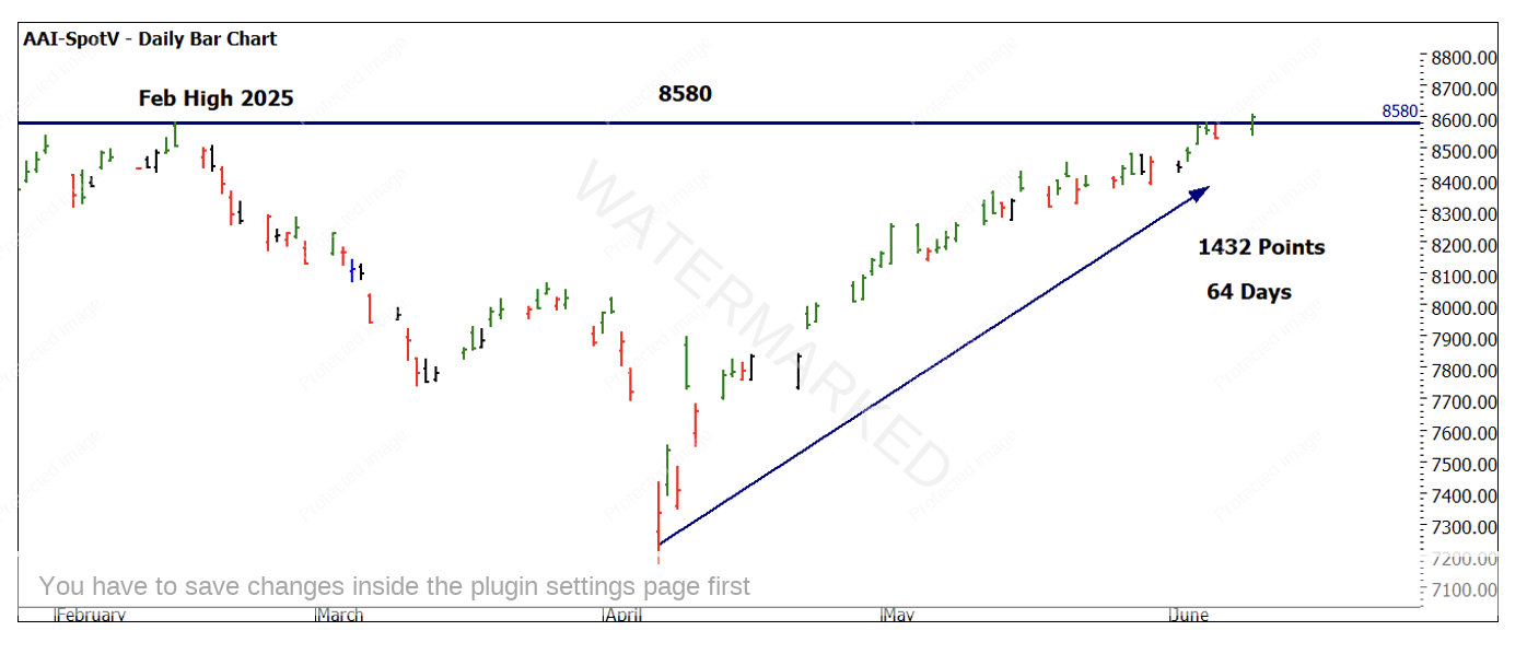
Chart 1 – Daily Bar Chart SPI200
Suggesting we are at all-time highs here in Australia somewhat defies the landscape when looking out the window. The overall vibe probably doesn’t fit the chart.
Especially when we consider that Australia is performing stronger relative to its global peers. A quick split screen of some major US indexes (Nasdaq, S&P500, Dow Jones and UK FTSE) shows by returning to previous highs sooner than the others, we are in front in that regard.
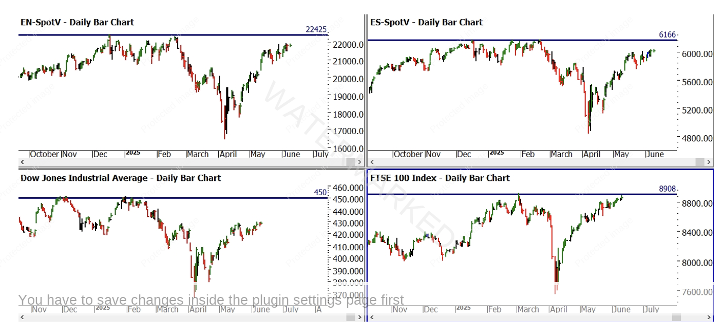
Chart 2- Daily Bar Chart Split Screen
The question the economists are forced to ponder is, are we de-coupling from these markets? Certainly not. The global economic links and ties are still there if not somewhat stretched currently, they will spring back ultimately but we need to be happy to run our own race without looking over our shoulder. The second half of the year could be rewarding for those who take a more singular view as a specialist rather than generalist.
Whilst we can’t guarantee that prices will move higher now the top has been broken, we can suggest as resistance has been broken there is strength enough in this market to attempt it. We have been breaking down the use of squares in one of our coaching programs and using the all time low as a market square – it has many uses. The first we discuss in the Number One Trading Plan is the creation of a Low’s Resistance Card. Chart 3 uses the low of 458 on the SPI200 as an anchor and each pink line travelling upwards is a repeat of another 458 points.
For those applying complete squares the use of the overlay as well as a master calculator can be observed here. The movement to the next pink line would see the price of 8702 as a target area.
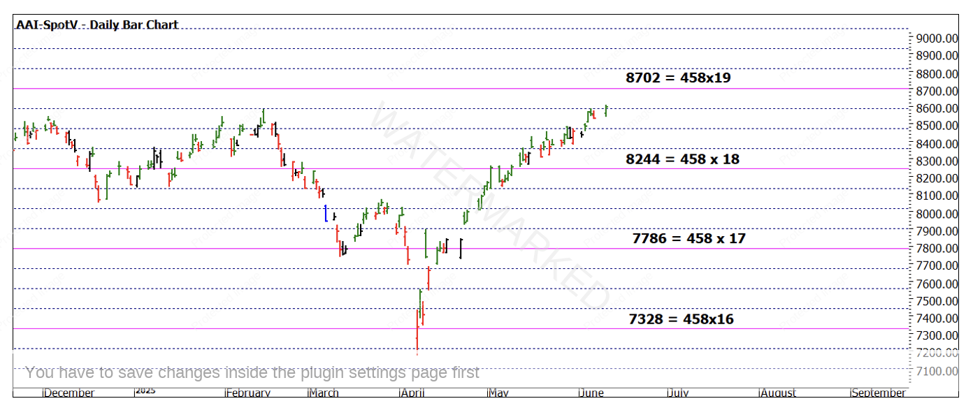
Chart 3 – Daily Bar Chart SPI200
Using price again we can apply the same technique, this time we can use the Covid low of 2020 at 4372 as an anchor.
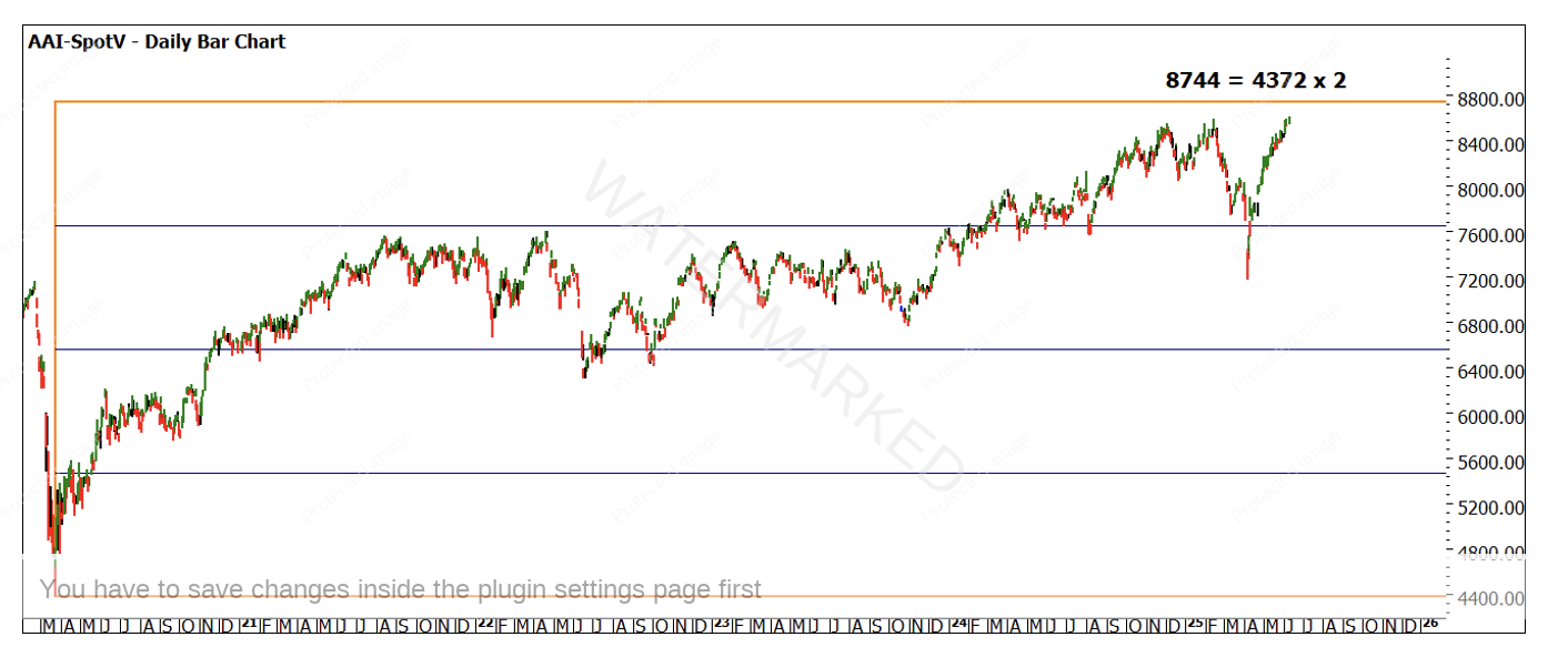
Chart 4 – Daily Bar Chart SPI200
Currently we have two prices of 8702 and 8744 as possible targets. We can apply the same analysis to other major lows (for example the 2003 low of 2679, look for 325% of that low) as well as adjusting techniques. Using repeating ranges as in Chart 5 I have measured the last run in the market to the upside, and we can see 150% of that range I 8702 (refer to your Smarter Starter Pack Milestone chart re 150% level)
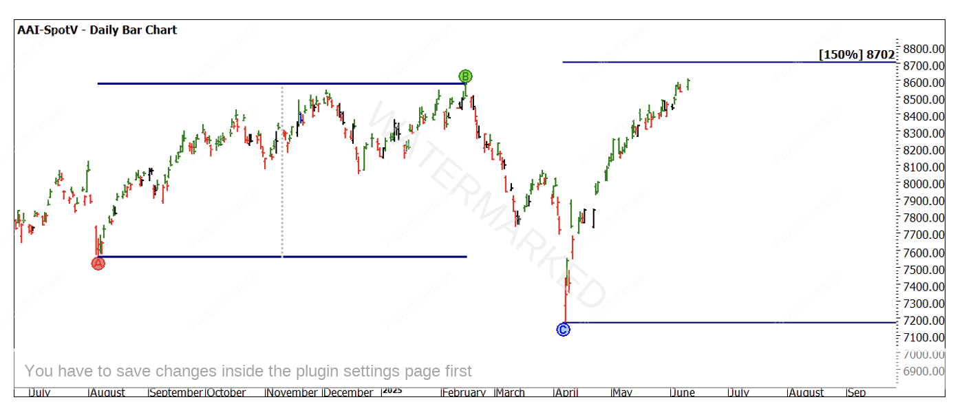
Chart 5 – Daily Bar Chart SPI200
This is the beginnings of developing a cluster in terms of price. We also note the month of June presents a seasonal time opportunity so that may offer us an easy date to anchor too as well.
Your homework will be to see what other potential anchors are available using price. We have ranges, First Range Out as well as using highs for example, to understand if there are any other puzzle pieces we can fit together.
Research is just that, it relies on a trading plan and solid risk management to turn it into a valuable outcome. As we pass this financial year into a new one, use this time to reset your focus and make the second half of this calendar year your best one for trading yet.
Good Trading
Aaron Lynch