Hand Chart Scales
At Safety in the Market we encourage students to maintain at least one hand chart on a chosen market. And as discussed before there are a number of benefits to this. More accountability for keeping an eye on the market, slowing things down and widening the time between decision making, knowing more truly whether or not a market is trending strongly (thanks to a fixed price scale), more accurate market sentiment (bullish, bearish or neither). And the list goes on…
For most the idea of a hand chart first begs the question “What price scale should I use?” And rightly so. We all choose different markets with different point sizes, we have different eye sight, hand eye coordination, the amount of physical space available at home varies. Not to mention where you decide to begin the hand chart from (e.g. last major high or low), and where in price and time you expect the next major turn in the market to be (advanced course materials).
It would be a lengthy process to answer all of those questions, but this article can get you started with some specific ideas.
Firstly let’s assume the use of standard Safety in the Market charting paper, with orange grid lines and grid resolution with main divisions one inch and minor divisions 1/8 of an inch. The vast majority of Safety in the Market students have seen and used this charting paper, pictured below is a fresh blank.
This article will use one market by example to convey the ideas and actions – one of our local top 50 stocks – the Commonwealth Bank, CBA:ASX. Now let’s say you were planning to start and maintain a daily bar chart by hand, and wanted to choose, for your own purpose, a suitable price scale.
The first of two main assumptions in this article is that you wish to experiment with a hand chart where the average daily bar is to be spaced over approximately one inch. In this case the next step is to determine the average size of a daily bar in this market. You could do the manual grind and take say the last 60 daily bars (from whatever data source or software you already have), then calculate 60 bar ranges manually and average them out. Or use MS Excel with a data dump and its formulas if you know how. Even better though, a software like Hubb’s ProfitSource can do it for you automatically! This is thanks to its “AR” or “Average Range” indicator. Many readers will have used this indicator previously for when it comes to determining “one-third of the average daily range” for the purpose of ABC trade management. Either way the last 60 trading bars has always been a rough guide for how many daily bars to use when calculating this handy little statistic.
This is shown below for CBA with data up to and including the time of writing. $2.9003 is the average daily range calculated.
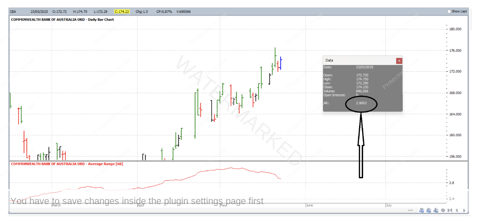
CBA’s point size is one cent i.e. $0.01, therefore the stat returned by the software is thought of as 290 points. The thing is, to space 290 points over precisely one inch would make for rather unfriendly numbers, scaling and rather difficult chart updating. This is because if you divide 290 by 8 (because there are 8 eighths of an inch in a whole inch) you get a number which is not whole and not an easy number to work with. So let’s use a little discretion – and space the close by 320 points over one inch. 320 divides by 8 much more nicely. And here is what we’d get for the vertical price scale:
320 points per whole inch
EQUALS
320 divided by 8 = 40 points ($0.40) per 1/8 of an inch square
As a result of this the average daily bar would end up spaced over a little less than a whole inch (squeezing 320 points into each inch rather than 290), but the end result has us relatively close to the initially desired scale.
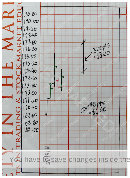
Using this scale, shown below are 5 complete daily bars for CBA, the first of which is for 19 May 2025. Price scale starts at $168.00; and every quarter inch (2 x 1/8 inch square) is marked going up by 80 points ($0.80) from one quarter inch to the next. Read that again if you have to! 😊
To be completely honest that was still not the easiest to chart! Even with the tweak from 290 to 320 points per inch, bar size was still a little small. Actually labelling more prices in between (like once every 2 small squares) may have helped, but either way you’re still doing multiple divisions in your head to exactly locate each of the four OHLC figures each day. There must be a better way!
So let’s aim for bigger and simpler. This time, let’s assume that you’d like to space the 320 points over two inches.
320 points per 2 inches
EQUALS
160 points per whole inch
EQUALS
160 divided by 8 = 20 points ($0.20) per 1/8 of an inch square
As a result of this the average daily bar would end up spaced over a little less than two whole inches, again, squeezing in 320 points rather than 290.
Using this new scale, again shown below are the same 5 complete daily bars for CBA. Price scale again starts at $168.00; and every quarter inch (2 x 1/8 inch square) is marked going up by 40 points ($0.40) from one quarter inch to the next. For comparison purposes, the result is shown beside the charting outcome from above.
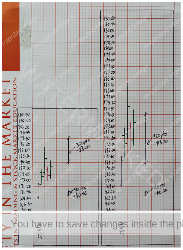
Obviously the bars are bigger this time and the division mental arithmetic was a little easier. It still begs the question what if we used 10 points per 1/8 of an inch square, but by then the bars are getting fairly large, and you’re looking at taping together a lot more charting paper if CBA takes off for a strong run in either direction.
In conclusion we need to remember a few things. For one, there’s no such thing as a perfect one fits all answer when it comes to choosing your price scale. The first scale you chose might not be the one you end up with. So be ok with ripping it up a few times and starting over!
Work Hard, work smart.
Andrew Baraniak