fbpx
At the Trading Tutors desk, we are often asked questions about ranges. Which range do I use in my analysis? Is it strong enough? Is it significant enough? How do I know it is the right range to use? And the answer we start with is, of course, a simple one… if in doubt…. zoom out!

While this month’s article ultimately points towards a nice price cluster, a few software basics first, for those still getting familiar with ProfitSource.

So, once you’ve opened ProfitSource, how do you know you are getting up-to-date data and access to the market you want?

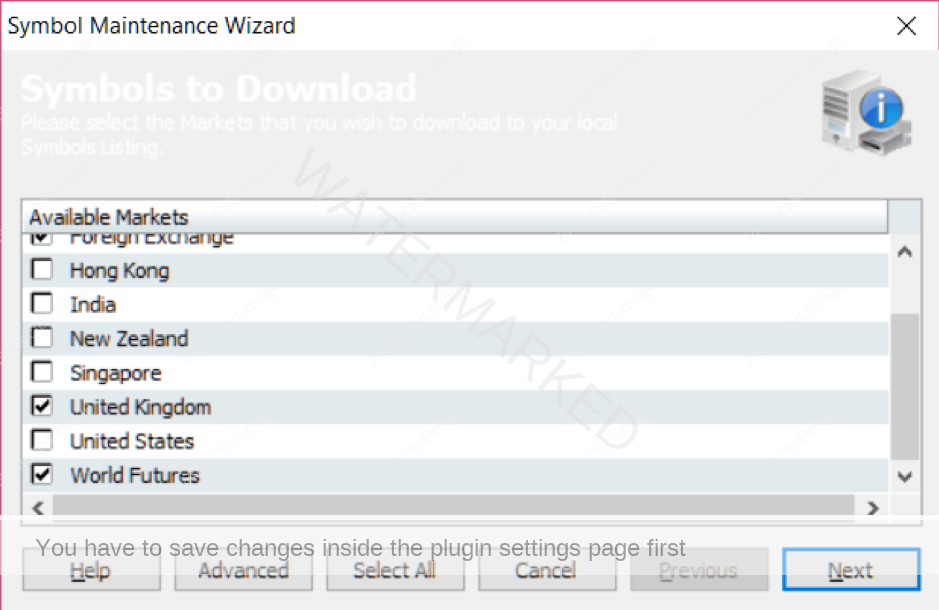
Tools -> Maintenance -> Symbols Maintenance Wizard

If you see something like the diagram below, you know you’re in the right place. Check the boxes which cover the markets you are interested in. In particular, for today’s example, you would scroll down to and tick “World Futures” as we will be using the chart for Platinum Futures. Then click Next and follow the wizard prompts. This is usually done as a one-off when first using ProfitSource. No need to repeat it every day. However subsequently, to keep your data up to date on a daily basis, Ctrl+U will run the Update Manager.

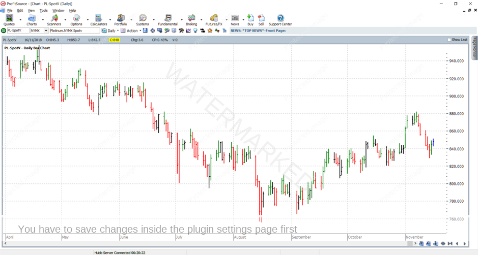
So now that’s done, how do we access a chart? For example, to open up the chart for Platinum Futures, you would do the following:

Charts -> New Price Chart; then enter symbol PL-SpotV and click OK.

So far so good? Here is what you should see:

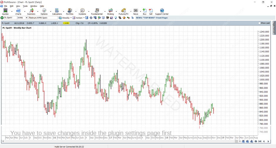
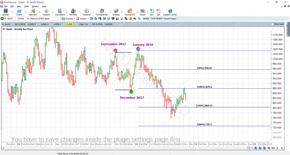
What you will notice is that the chart above opened by default in the daily time frame. To get to a bigger time frame, i.e. weekly, monthly, or even quarterly and beyond, just hit the “+” key. If at daily resolution, hitting it once gets you to weekly resolution, and hitting it twice will get you to monthly resolution, and so on.  The ““ key will do the opposite i.e. get us back to a lower time frame. See the chart below for a weekly bar chart of Platinum futures.
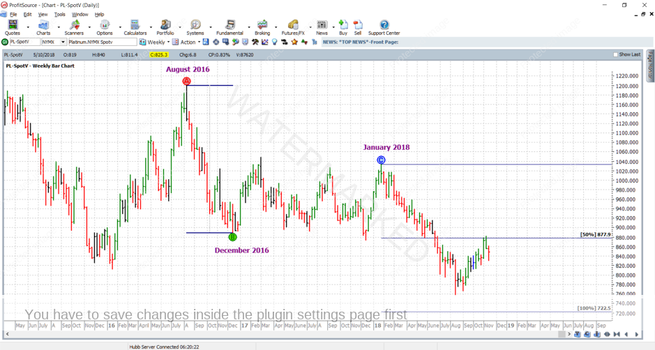
So, what about a range to work with? When deciding this, I prefer to start with a larger timeframe than the daily chart – at the very least weekly. In other words don’t be shy to zoom out to a larger time frame for your chart. The chart below shows an application of the ABC Pressure Points tool (found in ProfitSource’s Drawing Tools box) to a nice clearly defined range – the bearish range in the Platinum market in the second half of 2016 – from August 2016 to December 2016. Point C has been applied to the significant top in January of this year. Notice I have adjusted the tool’s settings (right click and select ABC Pressure Points Properties) for this application so that the focus is on the important milestones – the 50% milestone, the 100% milestone (simply our halves and our wholes!)
Who has been keeping up with their Safety in the Market Newsletters of late? Another recent article also applied the ABC Pressure Points Tool to the Platinum market, but to another range. See the chart below:
Now, as an exercise, go ahead and recreate the two charts as one. You will notice a few very interesting price clusters. Remember if you need any help along the way please drop an email to tradingtutors@safetyinthemarket.com.au

Work hard, work smart,

Andrew Baraniak