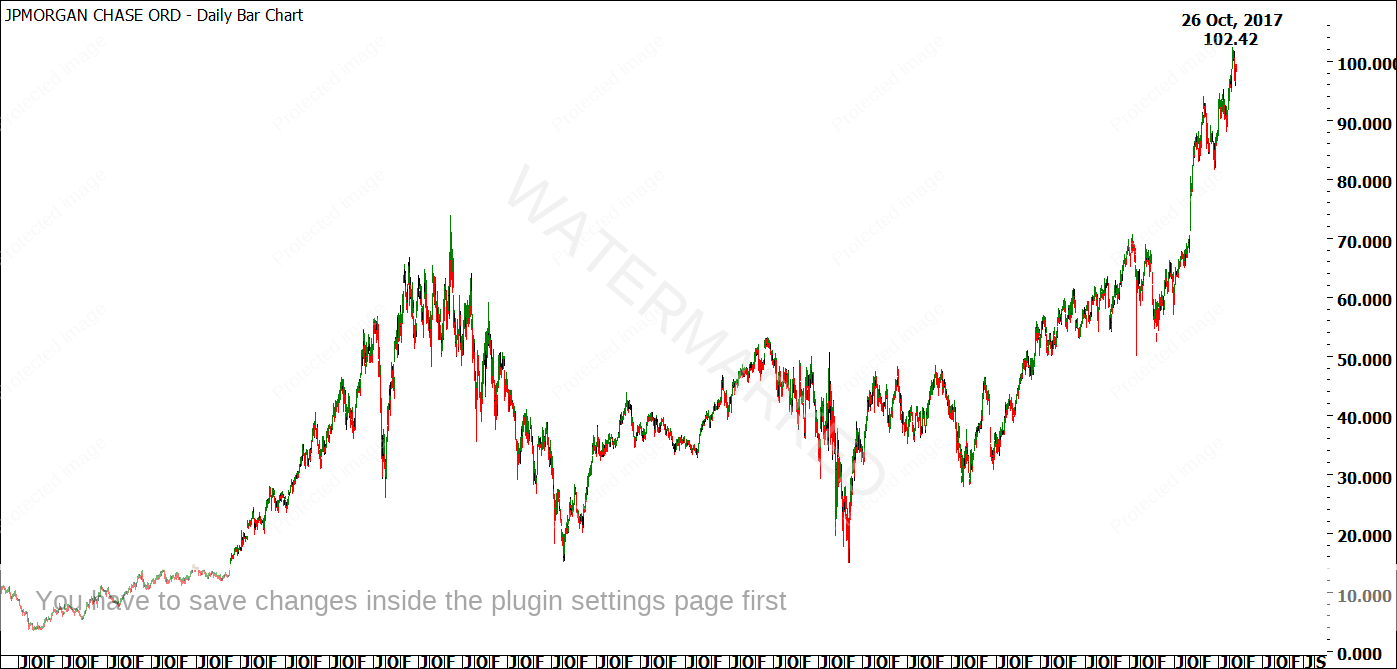
We’ll start with a chart of JPM. In Chart 1 below, you can see that the high of 102.42 on 26 October, 2017 is the current All-Time High. Note that this doesn’t mean it is a top – a market can always go higher than we think, or lower than we expect.
Chart 1
A thorough analysis of all of the swing charts on JPM led me to believe that the 26 October, 2017 high had potential to be a major top. Note the use of the word potential – I’m not just covering my backside in case I’m wrong. I’m teaching you to cover your own backside in case you’re wrong! After the Theory Lesson above, you should know why I don’t treat any trade differently to any other. I only take trades that look excellent – but even then, some of them don’t work out.
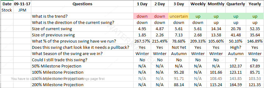
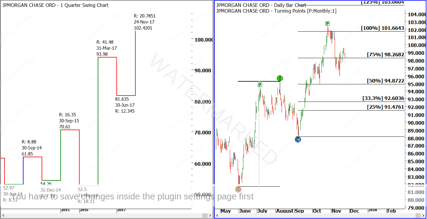
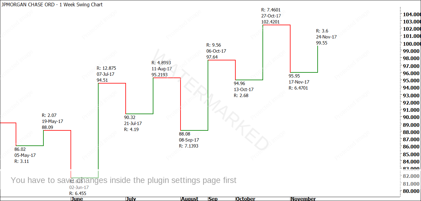
I won’t revisit all of the swing trading analysis on JPM, but I will share three highlights with you. The first, shown in Chart 2 below, is a Wheels Within Wheels analysis spreadsheet that I completed on JPM on 9 November, 2017, the day I found the setup. The second, shown in Chart 3 below, are two key swing chart milestones on the monthly and quarterly swing charts. The third, shown in Chart 4, is simply the weekly swing chart as it stands on Saturday, 24 November, 2017.
Chart 2
In Chart 2, you can see that I have analyzed swing charts on several different time frames on JPM, all the way from daily up to yearly. I call the daily swing chart a ‘small wheel’, and the yearly swing chart a ‘very large wheel’. Looking at the current setup on JPM, you can see that on the larger wheels, the trend is up. However, the daily and 2-day swing charts have turned down, and as you’ll see in Chart 4, the weekly swing chart is starting to look like it is getting ready for a lower swing top as well.
In Chart 3 below, you can see a quarterly swing chart on the left, with an upswing of 20.78 points. At first glance, this may not look all that exciting, but when you compare it to the previous quarterly upswing of 41.48, you’ll see that JPM is currently struggling at the 50% milestone, or Danger Zone, of the previous range. Similarly, the monthly swing chart on the right of Chart 3 shows a 100% repeat. Straight away, we notice a Price Cluster happening here.
Chart 3
Chart 4 below is extremely interesting. Having seen that the monthly and quarterly swing charts are hovering around potentially major resistance levels, we notice that the weekly swing chart is still showing an uptrend. However, take a moment to examine the swing ranges on the weekly swing chart.
Chart 4
Notice that the final weekly range into the top was 7.46, a contracting range compared to the previous 9.56 range? The rundown after this was 6.47 – more than double the previous rundown on 2.68, making it an Overbalance in Price. Could the weekly swing chart be the next wheel to turn down? The current weekly upswing is 3.60, a little bit over a 50% retracement of the 6.47 weekly swing. A down week next would confirm a lower swing top on the weekly swing chart, with expanding downswings and contracting upswings.
Before we move on to the more advanced techniques, I want to make a couple of points. Firstly, I have not used just one swing chart to get a reading on this market. It took a proper analysis of all of the swing charts to get to this point. Secondly, the next weekly downswing could fail, and JPM could turn around resume its uptrend. All we are doing as traders is putting ourselves into position to potentially trade a major turn. There are never any guarantees, and that is important to remember.
Now that we have a potential turn, we can start to look at some additional analysis to see if we can find some confirming indications that a top might be in place. If I start analyzing a market at this point and find nothing, I am very skeptical about the turn. David said that there is always strong harmony in numbers around a major top or bottom, and I agree with him. If I am looking at a turn and seeing nothing, then I have to accept that it might not be as strong as I thought. In fact, it probably isn’t. Now, where do we start on JPM?
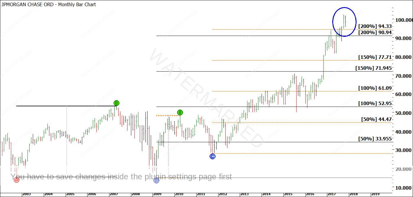
Ultimately, that’s up to you. There is no single, correct order to apply your analysis. Sometimes, I will have made up my mind at the swing charting phase of analysis, others at the Price Forecasting phase. In the case of JPM, it didn’t take too long for me to get excited about the harmony around this current high. First, I like to look at the big picture price history of the market, to pick up any ranges that might not have been clear on my swing charts. In the case of JPM, I see several of these. In Chart 5 below, I have run milestones from the large Double Bottoms in 2002 and 2009, and the large First Range Out from these bottoms.
Chart 5
In each case, JPM has exceeded the 200% milestone of these big picture ranges. Although the milestones haven’t given us an exact turn, this at least tells us that JPM has gone a long way, and is probably much closer to a top than it is to a bottom. Pay close attention to the orange lines on the chart, which are the milestones coming from the big picture First Range Out after the Double Bottoms. See how a top was made in 2011, just past the 50% milestone? And see how the current market is just past the 200% milestone? To me, that says that four multiples of this small First Range Out would get us close to the top. Let’s see what happens in Chart 6 below.
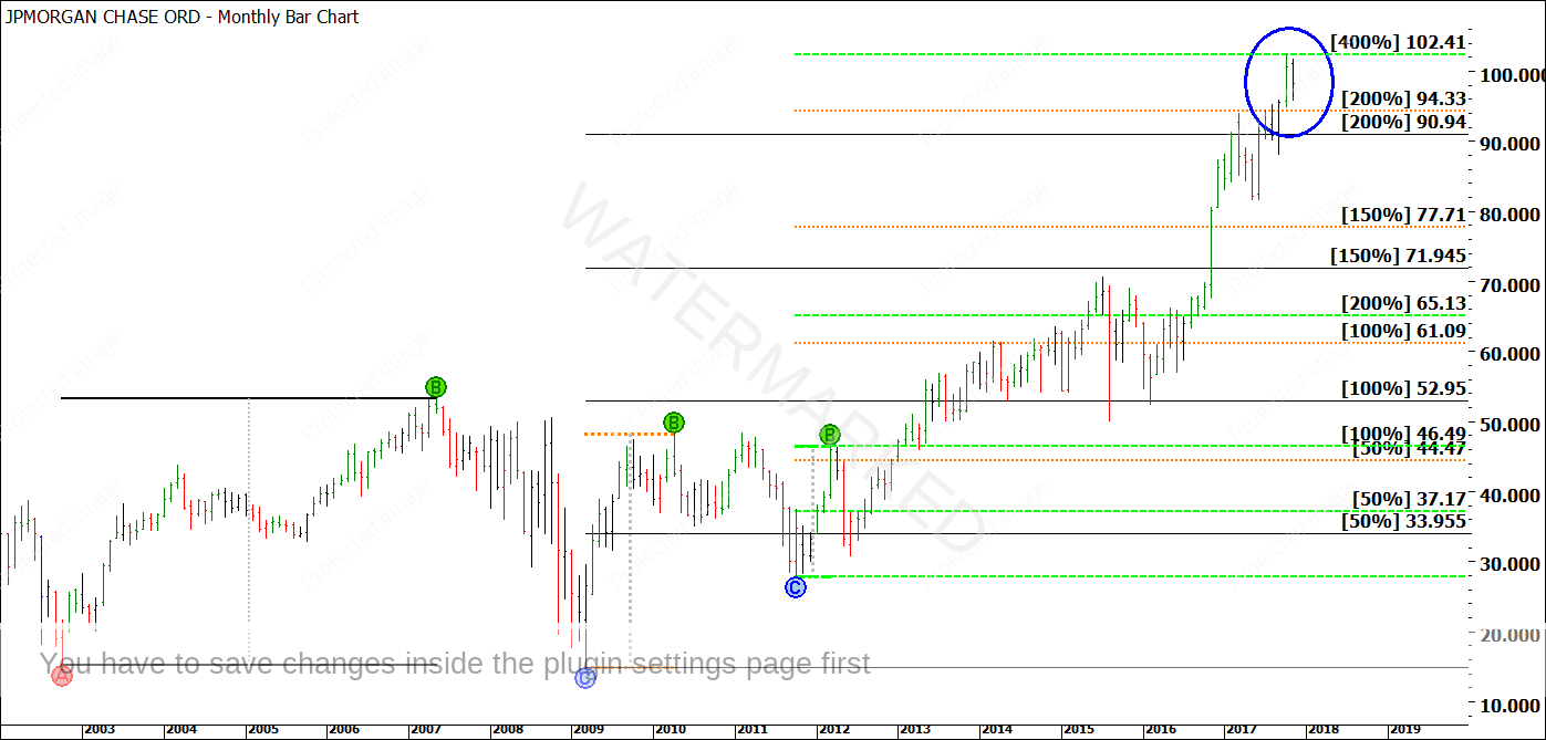
Chart 6
Interestingly, I have run a separate set of milestones (green dashes) using that smaller First Range Out in Chart 6. The result is a 400% milestone of 102.41, which is one cent off the exact top! I always like to see a First Range Out appearing in some form at the end of a major run – it almost always does, and this appears to be no exception. Interestingly, there is another more recent First Range Out in play as well, as shown in Chart 7.
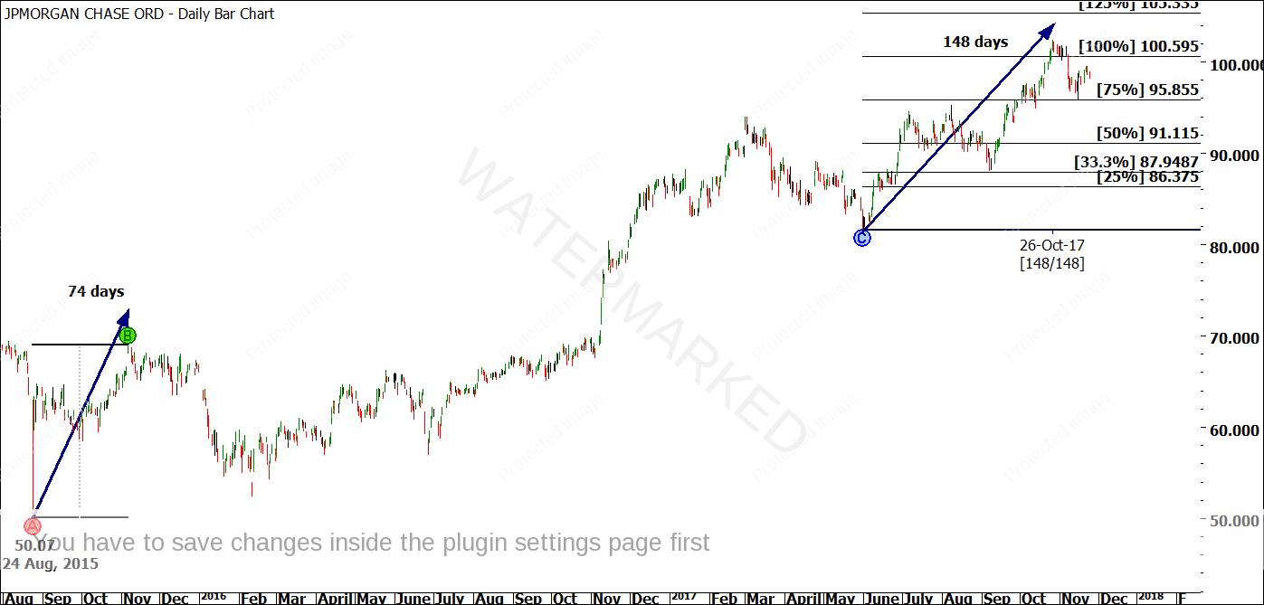
Chart 7
Notice that the First Range Out from the 24 August, 2015 low repeated 100% into the current top? Although important even by itself, it is no guarantee. The market could continue to keep running up through there. In other words, perhaps this just looks like harmony today, but won’t look like harmony six weeks or six months down the track. However, have you noticed the additional detail included on the chart? The First Range Out unfolded in 74 days. Now, as it is repeating into the top, it has taken 148 days. In other words, it has run exactly 200% in Time! Again, I love seeing the First Range Out repeating itself into a top, so this, of course, has me even more interested!
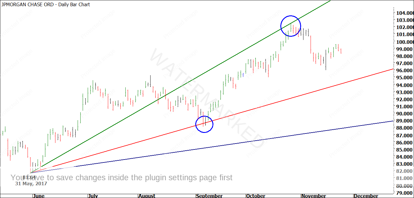
To me, there is enough harmony here to warrant keeping an eye on the JPM swing charts (all of them!) over the coming weeks. I will finish with two more interesting observations, both concerning Gann Angles. The first, shown in Chart 8 below, is a 2×1 Trading Day angle from the 31 May, 2017 low, which runs through the current high. Notice that this is not a ‘random fan’ only working once – the 1×1 line (in red) previously picked up the September, 2017 low.
Chart 8
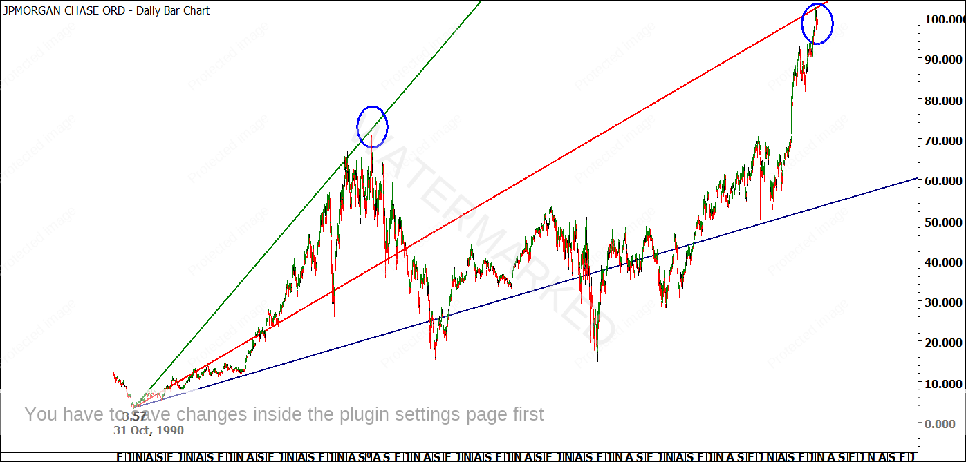
The final observation, as shown in Chart 9, is even better. It is a 1×1 Calendar Day angle running from the All Time Low of 3.57 on 31 October, 1990, running, you guessed it, smack bang through the current high on 26 October, 2017.
Chart 9
There are several things to note about Chart 9. Firstly, it is an interesting ‘coincidence’ for the market to be hitting the 1×1 line after all of this time. Secondly, the All Time Low was 31 October, 1990, whereas the current high is 26 October, 2017. That’s an anniversary date! Finally, notice how important this Gann Fan has been in the long run. The 2×1 line called the last major high in the year 2000, while the 1×2 line called the 1991 low. It has worked before. Will it work again?
At the end of the day, I have seen more than enough evidence of a Classic Gann Setup. I will leave you with two final thoughts to reflect on. Number one – Chart 4, the weekly swing chart, is probably the key chart to follow for the remainder of the year if you want to watch JPM unfold. And second, I will remind you of the Theory article at the beginning of this newsletter. The December, 2016 low on the Australian Dollar was near textbook and came in beautifully. The May, 2017 low on the Australian Dollar was near textbook and came in beautifully. The September, 2017 low on the Australian Dollar was looking like another textbook setup but it never happened.
Note: Due to some minor technical delays in launching this first Platinum Newsletter for 2017, this article is now a couple of weeks old. The top on JP Morgan did not hold. In fact, JPM smashed through the resistance and ran for several hundred points past the top. As we discussed during the Swing Trading Webinar, there was still some money to be made on that first weekly downswing from the potential top, however, the market did not fall heavily as expected.
After 17 years in financial markets, I can honestly say that I am yet to find the ‘perfect setup’ that cannot fail. This is why I don’t deal in ‘perfect setups’. I only deal in ‘high probability setups’ with ‘high Reward to Risk Ratios’.
Be Prepared!
Mathew Barnes
