Markets that Trend
The eternal search for markets that move in line with our analysis and trend (be it up or down) for long periods is the remit of Gann traders. The opposite can be the case with markets, as we all know only too well. That is why we all must have a few key markets we are close to and others that can be brought up to speed pretty quickly if the right conditions start to unfold.
Many would know I like commodities and in particular oil markets. They have again produced tradeable moves in 2020 be it long or short, but as we look at the current moves based on swing ranges, we can see the momentum in the swings is starting to show signs of slowing. There are a lot of questions around the global economy and its ability to bounce back from COVID. While putting this article together the announcement of Qantas cutting 6,000 jobs was announced. The aviation sector is a big user of oil and whilst they remain stunted in moving passengers, we will see reduced demand for Crude Oil.
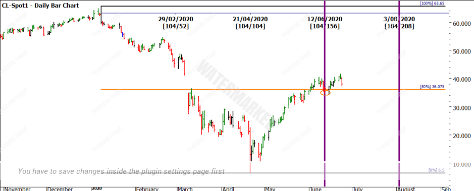
If we look at the notion of forecasting for a short moment, often we overcomplicate matters when looking at markets. In Chart 1 we can see how a forecast could have been made in early May as we saw Crude prices rise. Please note this is not the sort of forecast to trade or crow about, but it does show how markets do like to trade as a reflection of history and be in balance.
Chart 1 – Daily Bar Chart Crude Oil
Chart 1 breaks down the range from the January high to the April low in price and time. The time was 104 days down (2 x 52) and a price move of $59.15. If we project the time and price out to the right-hand side, we see that 50% in time and price gives us 12 June / $36.08. The market traded there on that day and has since moved higher. By always measuring the repeat of price and time you can be watching if a market is balanced or not.
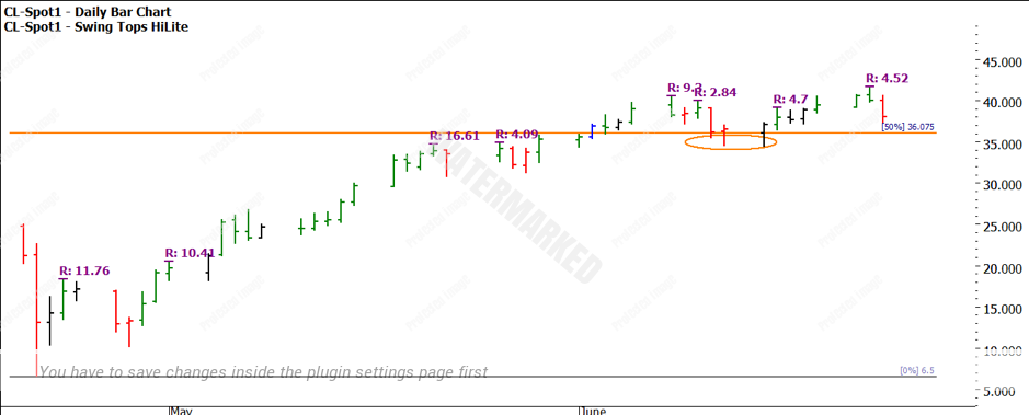
Chart 2 shows the swing ranges over that period also starting to contract to the upside, these are worth watching when we analyse how far this run has to travel.
Chart 2 – Daily Bar Chart Crude Oil
When markets start to show signs that momentum is falling, we can be cautious of how much of the end of the move we want to capture. The point of this article is not to suggest that the end is upon us. If you are tracking Crude Oil your analysis for the next turning point in time should be calculated already. The idea of getting 50% of each move was David’s rule of thumb and this would be no different, it’s fair to say the hardest parts of the move to capture typically are the beginning and the end.
Having other markets that you can move into quickly is always important when looking for trading ideas. Over the years I have moved in and out of following Copper futures as a market to trade. The beautiful part of this market is that when it trends it does so strongly. The downside is that it can be sideways for prolonged periods as well. This market has again recently regained my interest and may be a market you choose to follow. Copper being an industrial metal makes it less susceptible to the emotions we often see around the Gold and Silver precious metal markets. You don’t often hear about people hoarding Copper as a hedge to the end of the world.
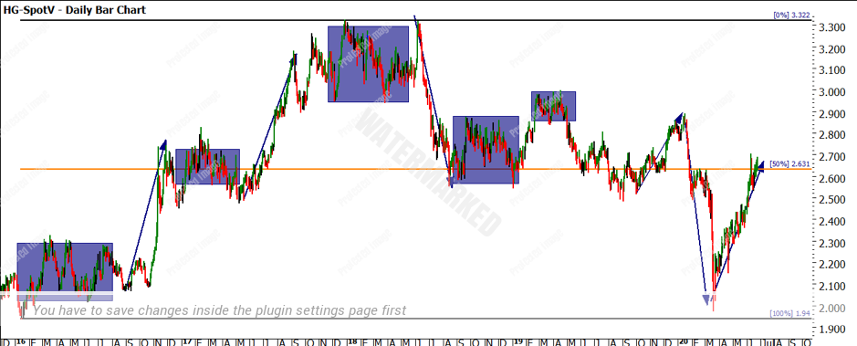
Chart 3 shows the Copper market for the last 4 years. I have loosely marked the strong tradeable runs, contrasted to the prolonged sideways markets in boxes. There can be considerable patience required for this market hence it has become a sometimes market for me.
Chart 3 – Daily Bar Chart High-Grade Copper
One of the best exercises I have ever undertaken in a chosen market was to measure all the sideways trading periods in an individual market and then obtain an average in days of sideways movement. You should also know the shortest and longest period before that market breaks out. This can be a good post to lean against when you find yourself impatiently waiting for a market to be tradeable again.
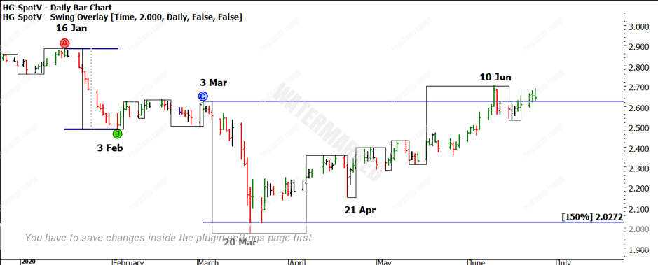
Chart 4 – Daily Bar Chart High-Grade Copper
Chart 4 lists the dates of the secondary turns and the run down into March 20 in terms of price. The 150% milestone (potential Point A of the Road Map Chart) may have us on red alert for a change in trend. Overlayed on the chart is the 2-day swing chart that has shown a series of higher bottoms since March.
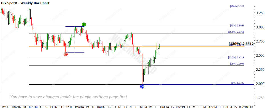
When we overlay the Ranges Resistance Card over the move from the 2018 high to 2020 lows, we can see that there is some strong support and resistance around the major pressure points. We can see we are at the big picture 50% (orange line) with the 150% milestone of the 2019 bull range clustering around the same area.
Chart 5 – Daily Bar Chart High-Grade Copper
There is always more value in you reproducing the charts I have mentioned, I would also encourage you to review the market turns in the month of June. Copper does appear quite active in this month. Now is the time to have multiple markets to work with as I do see the second half of 2020 offering lots of opportunities.
Good Trading
Aaron Lynch
