Mission Accomplished?
To study history in all its forms is truly a wonderful vocation, as it allows us to form opinions and make judgements on matters armed with solid reference points as opposed to guesses. The term ‘mission accomplished’ was once used by a former US President and was later proven to be a very poor choice of phrase. The markets are fickle at best sometimes and if you follow the news cycle it seems the volatility or wild ride we experience from February to April is all in the past and we are back to normal transmission.
The underlying cycle and therefore the influences are still in play and linger for longer than most expect (much like the cold/flu/covid episode I am still working through). The SPI200 allows us a market that is close to home and provides a trading environment built for Gann traders.
Chart 1 shows us approximately the last 12 months and the resistance seen at the 8500 level with the November and February tops. The tariff response followed and now seems to have abated as quickly as it arrived. There is the question though, can markets push through on the 3rd occasion or will we see another event that derails the rally?
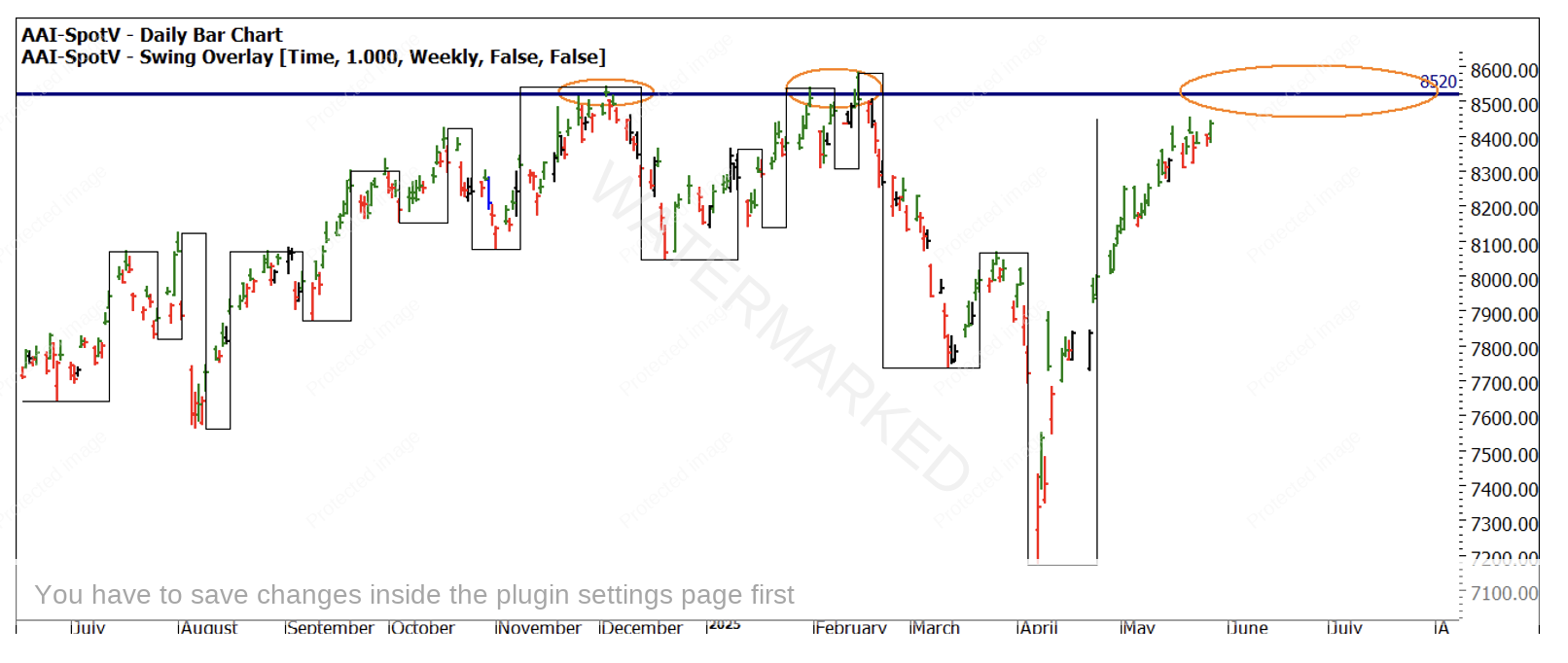
Chart 1 – Daily Bar Chart SPI200
The Third Dimension of analysis, Price and Time, gives us many tools to add to the toolbox on offer, one of the simplest in its application and understand is David’s use of speed angles. More attuned than a trendline but less esoteric than say a Gann angle or square, it’s a simple way to rate the strength of a market in comparison to a previous move. If we analyse the sell off from February, we see in Chart 2 the market sold off 1408 points in 52 calendar days. If we use the number of trading days (36) we can calculate the average points per day movement. In this case we see the move lower by an average of 39 points per day to the downside.
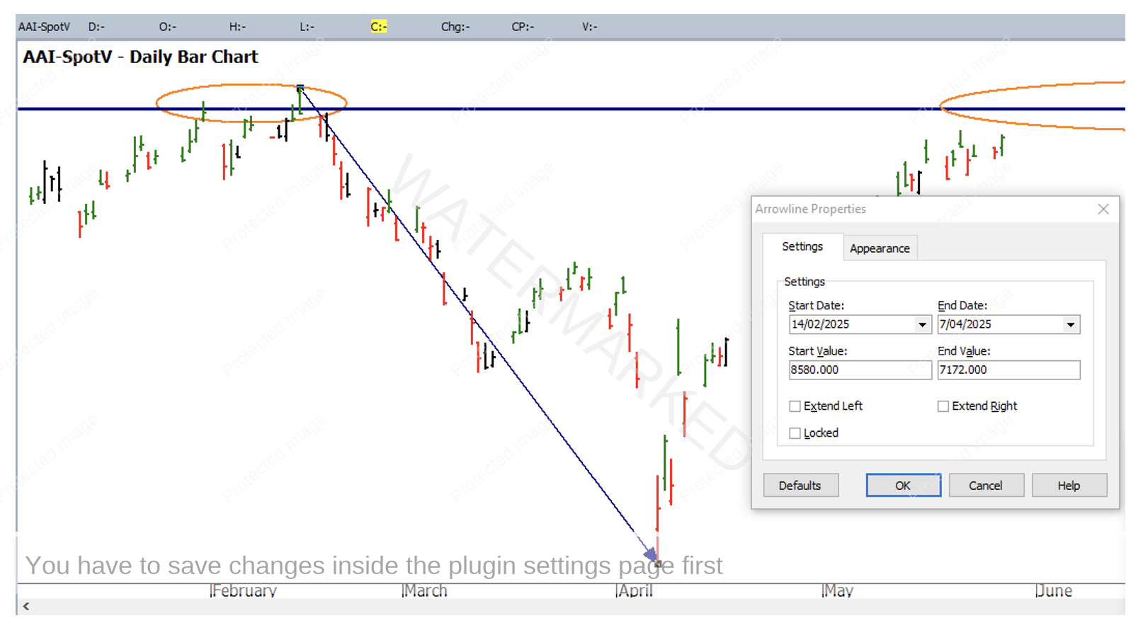
Chart 2 – Daily Bar Chart SPI200
Using ProfitSource we can manipulate this information to allow us to reverse the speed angle out the other way, this allows us to rate the strength of the move in comparison to the run down. It requires us to reverse the prices for the high and low (as in Chart 2). Firstly, you need to create a parallel trendline then reverse the start and end values across. In this case the start value becomes 7172 and the end value is 8580.
This will then allow you to pick up and move the trendline and align it with the April low. There is a small amount of error in the process but as long as you move the trendline on the low manually and don’t adjust the properties box again you will achieve the desired result as in Chart 3.
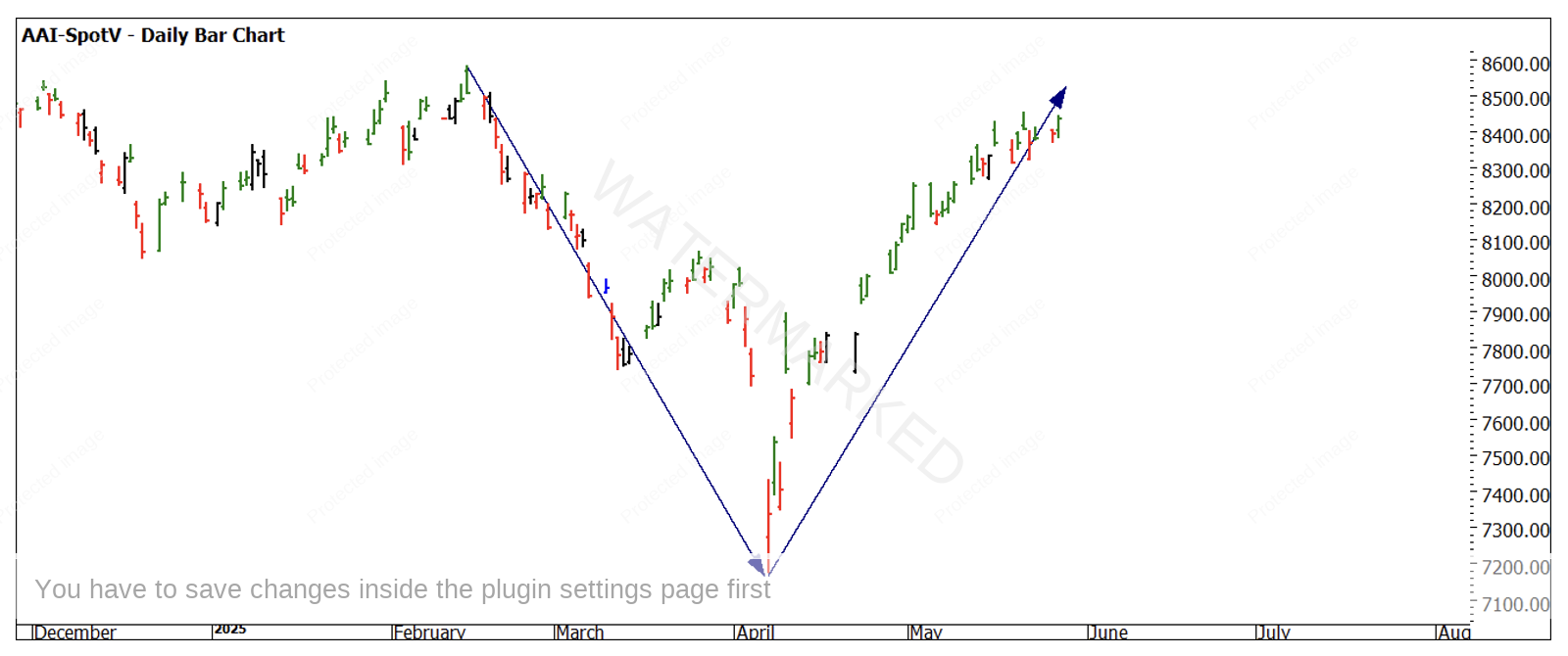
Chart 3 – Daily Bar Chart SPI200
Chart 3 shows us the move back out of the April low was stronger for the most part as prices held above the speed angle for the bulk of the move. It tells us as well that time is now equal for the move down and then back up. We have not yet hit the same price level of 8580 so potentially the market is losing some steam? Double top and bottom pattens are great setups, especially when they are symmetrical. There are many tools we can use to measure this, but speed angles may be the simplest.
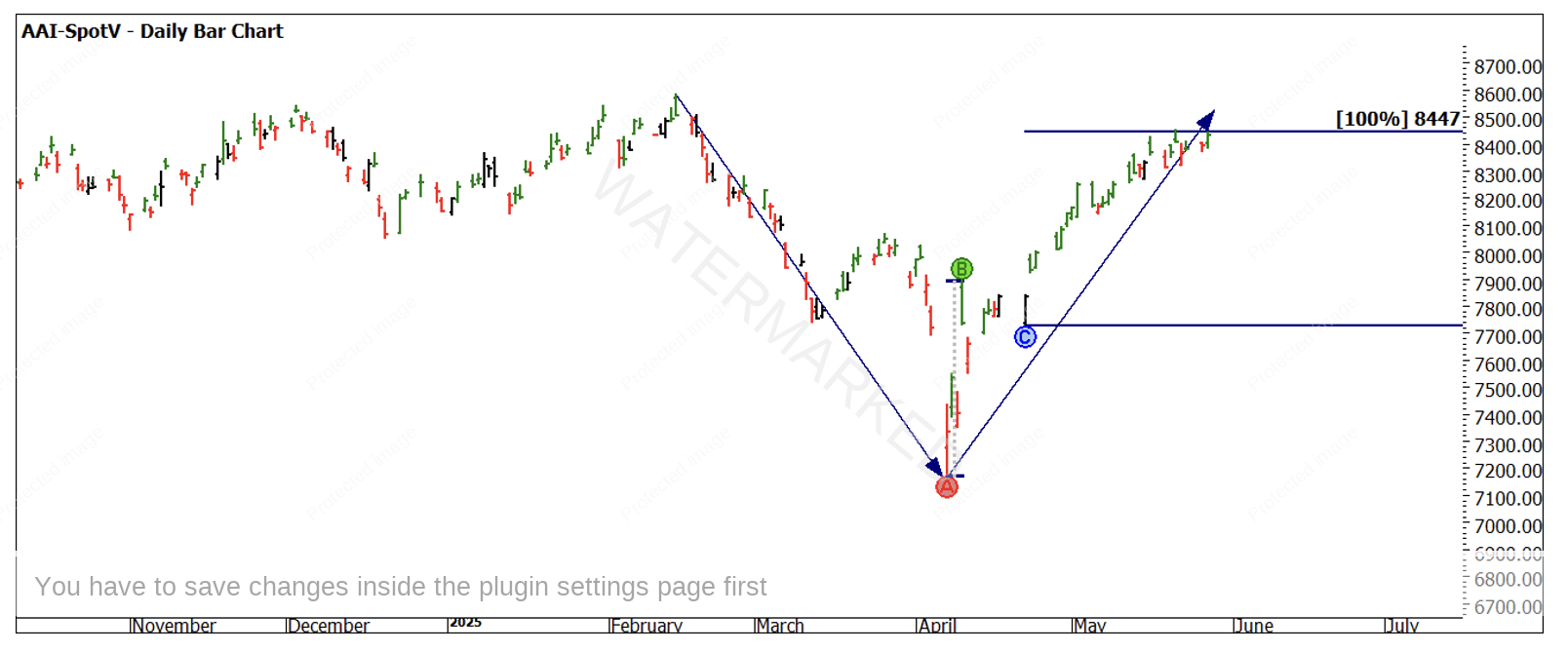
If we review the relative position of global index markets, Australia has travelled higher than most of the majors in its recovery, most index markets have not been able to get as close to the February high as we have. What this means is we may have some divergence, or we have run a little too far and potentially need to return to the pack. Chart 4 uses the First Range Out from the April low as a guide in price and applying the swing bottom of 22nd April we see a price of 8447 holding the market currently. The next week may well be interesting to understand the next phase of markets.
Good Trading
Aaron Lynch