“There is nothing new under the Sun.”
A famous biblical quote and one that Gann and David both leant on at different times in their discussions. A true example of history repeating allows me to “borrow” the phrase as I discuss my thoughts on the current market.
Its great to be back writing for Safety in the Market and I was lucky to catch up with some old faces at the recent live event in Sydney. I am still actively involved in markets via trading and my “day job” keeps me close to the big end of town and the application of ideas to the retirement savings world in Australia. The simple take away from my more recent experiences is that the collective “learning and understanding of markets” hasn’t improved and that even though technology and innovation around cryptocurrency and algorithmic trading has come on in leaps and bounds, the old lessons hold true (at least in the markets I am following).
One of the great challenges for the investor over the last 10 years since the GFC, is that interest rates have been maintained around the globe at emergency lows. With some changes in the US occurring, we may be starting to see some degree of normalisation. The raising of interest rates was expected locally at some point in 2018, but the latest consensus is pointing to 2019 as the next jump off point. The basic outcome of this has been to gain real returns above inflation and has meant the savvy investor has looked to equities (stock markets) around the globe for returns.
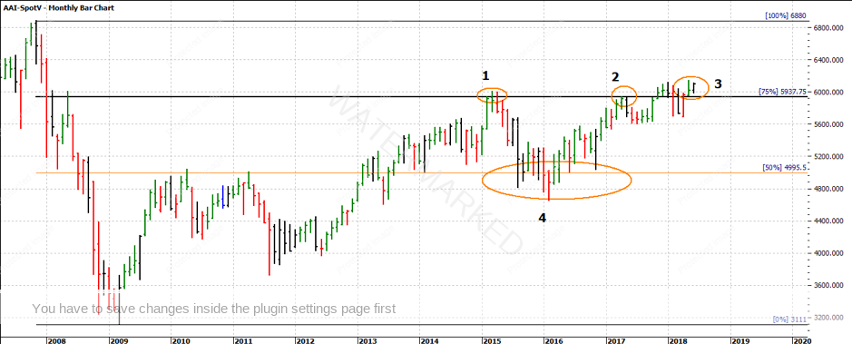
So, it seems fitting we look to the SPI200 as the first market to look at, for what from the “old bag of tricks” is still working in current times. In Chart 1 we have a monthly bar chart and a Ranges Resistance Card tells us some important areas to watch for market activity.
Chart 1 – SPI200 Monthly Bar Chart
It’s interesting to note we are still trading in the GFC range whilst many if not all major markets in Europe and the US are trading at fresh highs. Our local market has been failing to keep pace in that regard. One of my hats I wear forces me to look at that is, but the beauty of trading is a simple case of is it heading higher or lower and can I trade it? Point 4 in Chart 1 also identified a strong consolidation area around the 50% of the GFC range. As we can see, a simple ranges card from the Number One Trading Plan could help keep you on the right side of the markets.
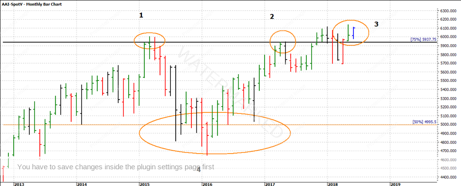
The interesting areas for me are marked 1, 2 and 3 on Chart 1. The 75% retracement level has over the last 3 years proved to be strong resistance and it is no surprise that level of 5938 is very close to the 6000-point psychological level that many in the news discuss, round numbers like that can be important for markets. Twice we have stalled there, but we can see that we are now above 6000, and those old tops, in the short term at least, have acted as support. I don’t know how many times I have said “old tops become new bottoms” over the years.
Chart 2 – SPI200 Monthly Chart
If we review the trade for 2018 we can see some more basic tools that can enable us to be “rating the market” at all stages. I was once part of a conversation with David where he spoke about the simple measurement of ranges in both price and time was one way to know how a market was running.
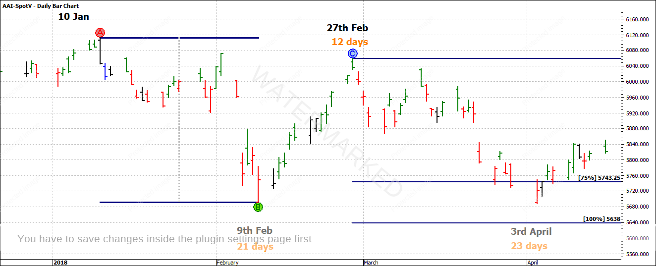
Chart 3 explores just that, with the two bearish ranges noted in both price and time. What could have been a signal that the April low was just that, a low?
Chart 3 – SPI200 Daily Bar Chart
The year started with an important high on 10 January (If you have the Ultimate Gann Course, refer to David’s lesson on Seasonal Time to know why that’s important). The SPI ran down for 21 days and then retraced to 27 February in 12 days. That in itself is a 50% retracement in time and approximately 87.5 % in price.
The next leg down ran 23 days (so more in time) than the previous range and did 87.5% in price. The market around the April low was running longer in time and shorter in price, the potential for a change in trend is on the cards.
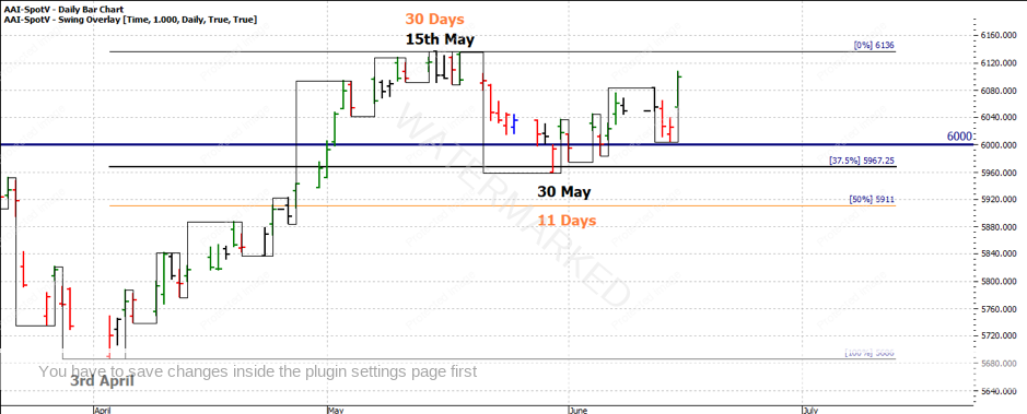
Chart 4 picks up the strong bullish movement from April into the current picture. The range out of April was expanding in price and time and ran into the 15 May high in 30 days. A simple approach for the next leg up would be to look for a 50% retracement in time and price. The market was not weak enough to reach the 50% level in price and started moving higher at the 37.5% point around 30 May. In time the market had somewhat balanced as the 11 days move is 36.6%.
Chart 4 – SPI200 Daily Bar Chart
We now see how important the 6000 point level has been as we see how the market could not close convincingly below that level to signal another potential bearish leg.
I could go on and on about how the simple things work so well, as they say, there is nothing new under the sun. Regardless of where you are in your studies, the good news is by going back to the basics you can often refocus your view on any market you have data for.
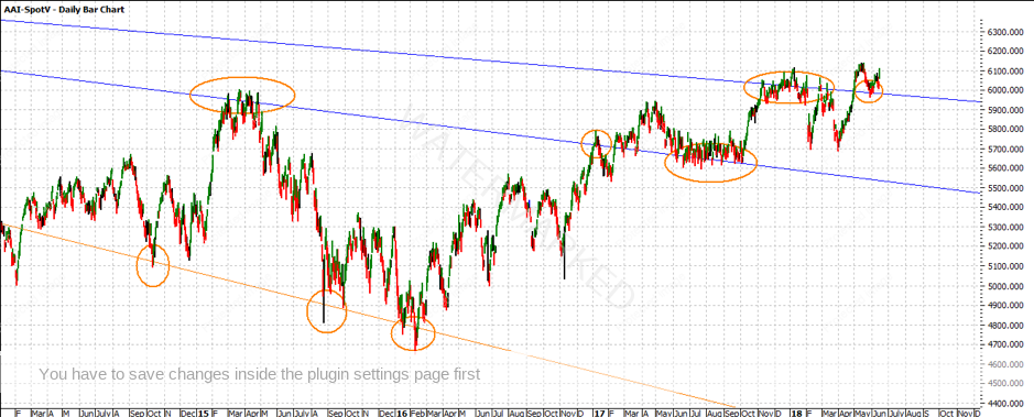
Finally, I will leave you with a chart to contemplate that might help you see why I was stronger on this area of the market. Chart 5 uses the principle of focusing on big things to get big results. Using a Geometric angle off the all-time high we can see how those “lines” have acted as support and resistance along the way.
Chart 5 – SPI200 Daily Bar Chart
As you can see, the recent lows have bounced off one of the major angles, another example of how old tops become new bottoms but more in a third dimension sense.
It will be interesting to see how much more upside this current leg has in it. Again, as traders, we can be both long and short. If there is a decent move out of this leg, then through some basic techniques we may be able to see this early in the move to ensure there are some good profits left.
Good Trading!
Aaron Lynch
