Pound for Pound
On page 22 of the Number One Trading Plan, under the heading ‘Trading the Big Moves’, David says:
“The biggest moves are produced from a constant, orderly chart pattern. So a big move must be a clean move…… That might be one of our first market truths – that the clear moves give us the setups.”
So what does a clean move actually look like? This is a great question to ponder and try to answer as it was a real light bulb moment for me one day while I was marking up my hand charts.
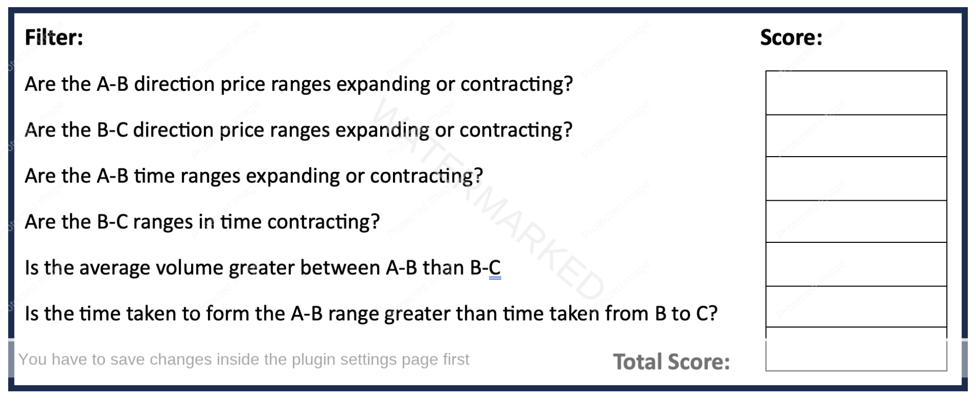
On page 101, Section 8 – Advanced ABC Filters, David gives us a checklist to rate the strength of a price setup, which is Chart 1 below.
Chart 1 – Advanced ABC Checklist
We can apply the above checklist to further our analysis on the British Pound which continues from last month’s discussion, as I was looking for a nice price setup that would call a weekly Point C.
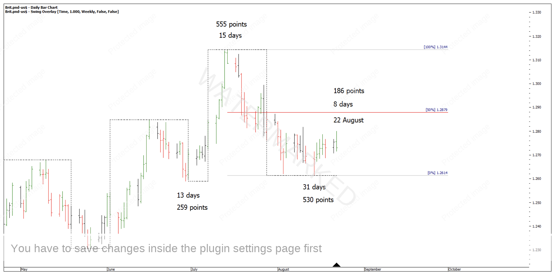
The weekly top came in on 22 August, well short of any of the price clusters I had identified. However, you can still use the above checklist to rate the strength of this weekly ABC setup to see if it’s worth following this market and watching for another setup on a daily swing chart to trade a potential second weekly range out.
Chart 2 – 22 August Weekly Swing High
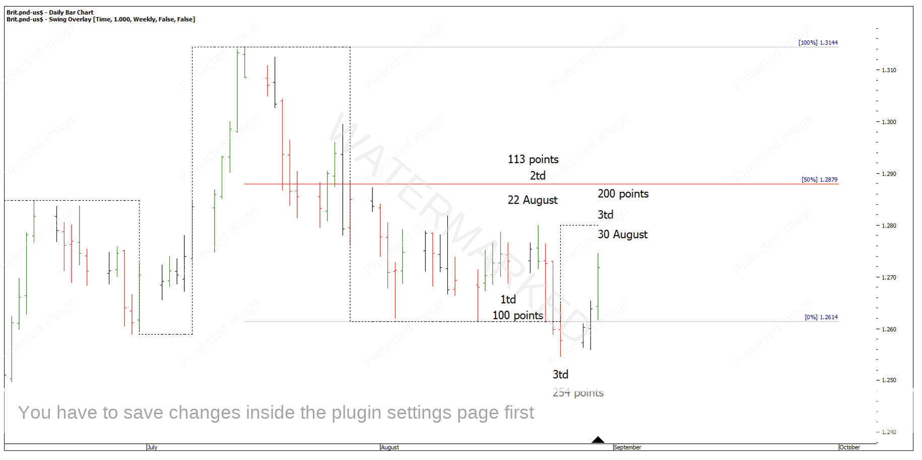
30 August presented the next lower daily swing top which is also the daily First Range Out for this second weekly section down.
Chart 3 – Daily First Range Out ABC
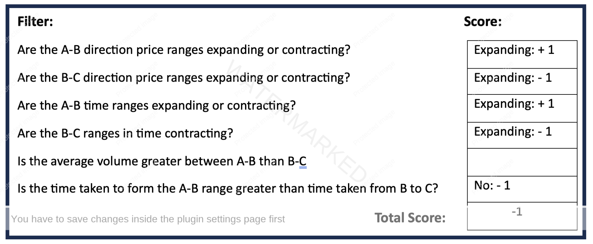
When filling out the checklist below I’ve left out volume for this case study as it’s a little more subjective and not as clear as counting time or price. With that said, I get a score of -1 for the above trade setup. David said he liked to see a minimum of + 3 but preferably + 6, so in this case the checklist kept us out of a trade. See Chart 4 below.
Chart 4 – Advanced ABC Checklist
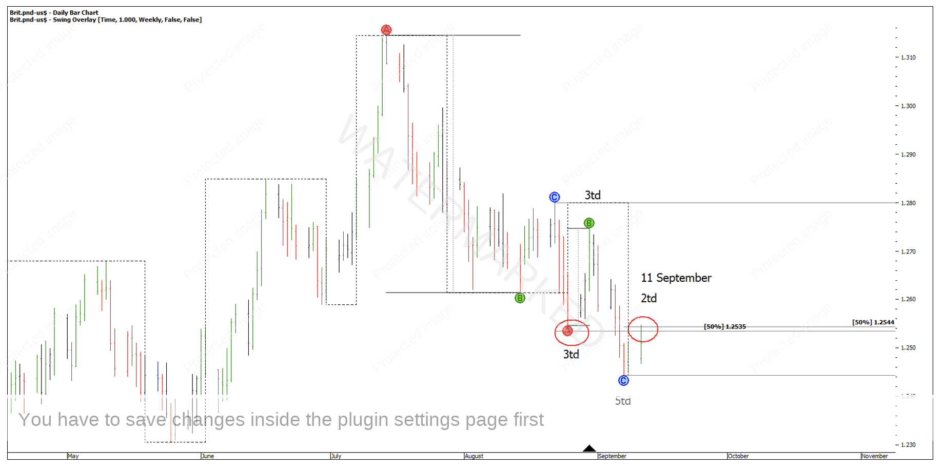
The next lower swing top formed on 11 September. This time I get a checklist score of + 5. Not only that but the 11 September top was now approaching the 50% of the weekly swing milestone from underneath, and this was a good case of an ‘old bottom becoming a new top’.
Chart 5 – ABC Setup
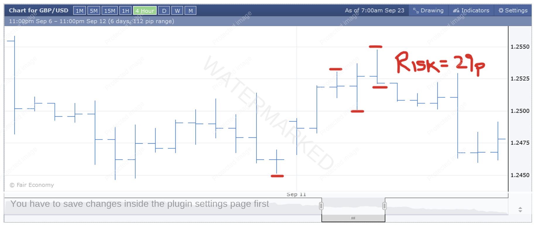
Now that we have a daily swing setup, we can drop down a time frame for further confirmation and a possible entry. In this case the 4-hour swing range failed just through the 50% milestone, giving a key reversal signal bar with a risk of 29 points.
Chart 6 – 4 Hour Swing Entry
The price cluster I see here is:
- 50% of the weekly First Range Out = 1.2535
- 50% of the previous daily swing up = 1.2544
- Old bottom at 1.2546
- 50% of the 4-hour swing = 1.2544
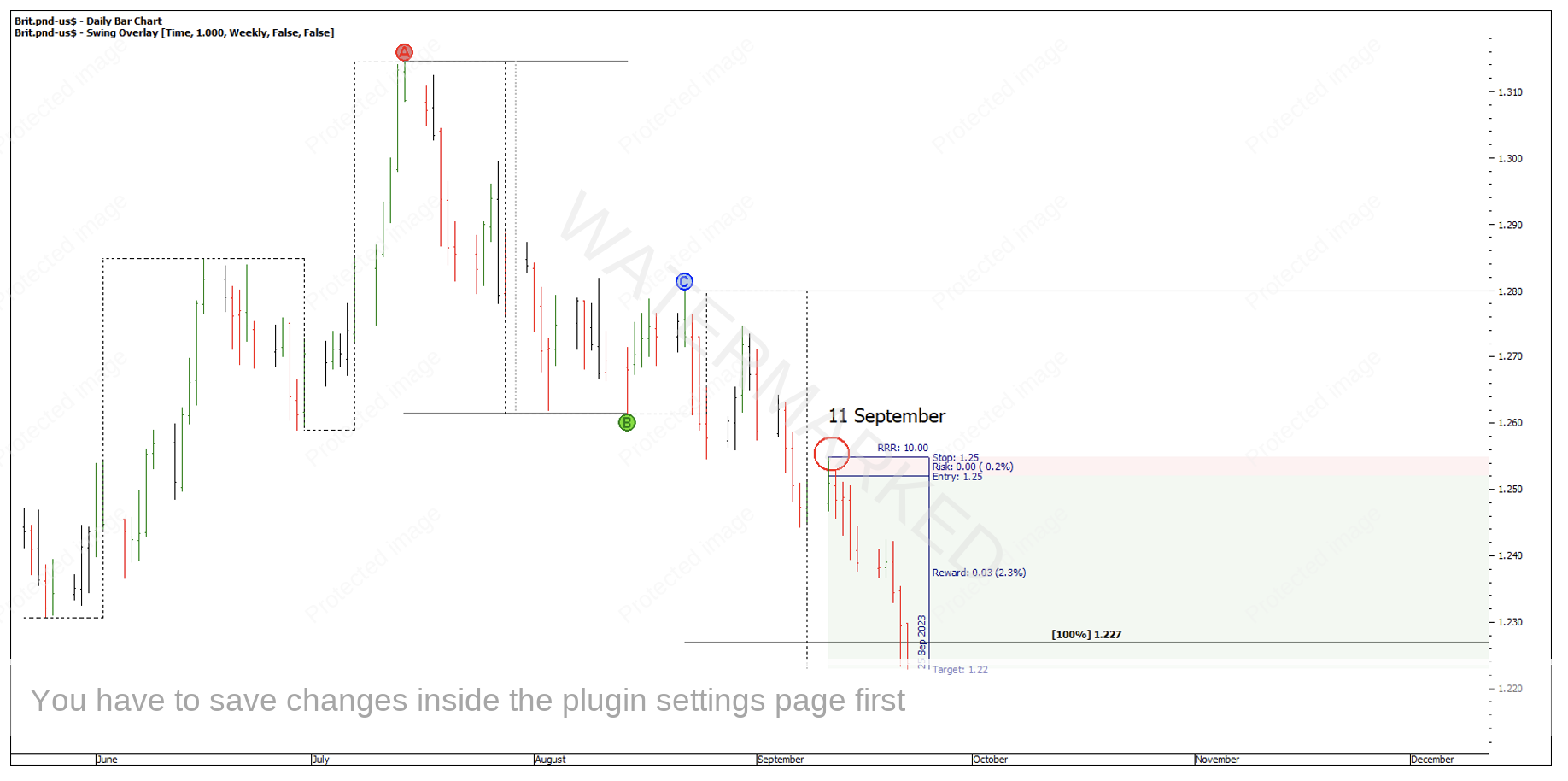
With an entry at 1.2520 and a risk of 29 points, it’s possible you could have exited on 22 September at 1.2230 for a 10 to 1 Reward to Risk Ratio. However, the market was well into the winter of this weekly swing.
Chart 7 – Seasons of a Trade
In my opinion there is no substitute for doing one market by hand. There is just so much you can learn from the hand charts that I just don’t believe you can get from letting ProfitSource do the work for you.
Happy Trading,
Gus Hingeley
