Sugar – Getting in Close
If you’re an end of day trader, it’s not every day that you would consult the intra-day chart for a trade. For the most part, your confirmation will come from the daily chart or beyond. However, in the event of a very high probability setup, we can look to the intra-day chart. There are two reasons for this. The first is that it can give us an entry signal that is very close to our price cluster, whereas a daily swing chart may only give confirmation after the market has already taken off. Secondly, the reward to risk ratio can be much, much, higher.
This month’s article details the execution of a recent trade in the Sugar futures market. The trade took place during July and August of this year, with the Sugar futures March 2021 contract. It was a long trade out of the 14th July low, and for the patient and savvy, a high reward to risk ratio was up for grabs.
Now as many of you are aware, it’s not just a matter of jumping into the market with gut instinct. There were, of course, technical reasons for us to believe that a low was in place at the time. But that part I’ll leave up to you. See if you can engage your Price Forecasting skills, from the Active Trader Program Online Training program or otherwise and come up with sufficient price reasons that would have had you keen to get long in this market. I won’t spoil it here – in fact, all I will say is that the price cluster averaged 12.00 cents per pound. The rest is up to you – have a try, and send in your analysis. We’ll be more than happy to take a look and give you some feedback. The ProfitSource chart code is SB-Gann.H.
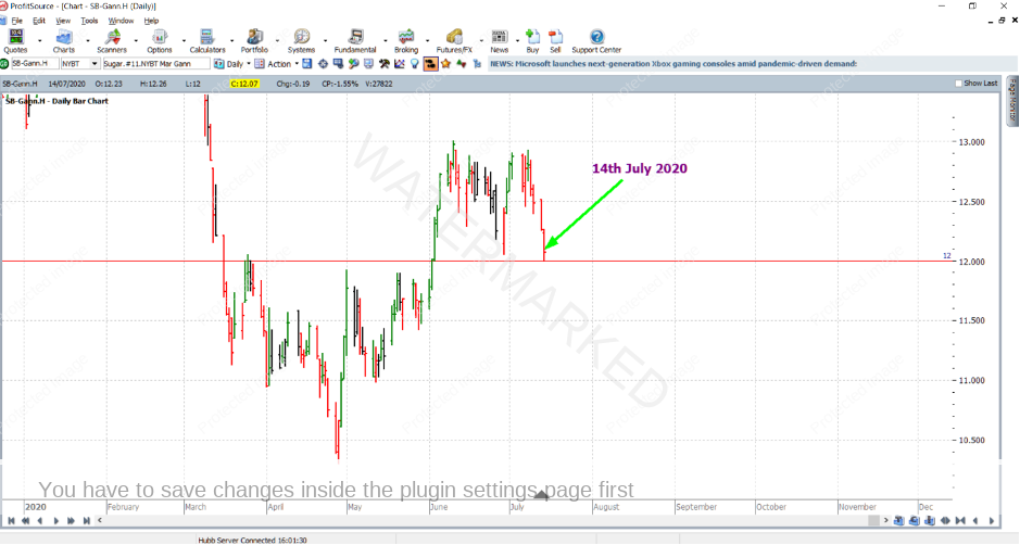
A day or two before 14 July, the market was heading down towards the price cluster. So with your analysis up to date, and your trading plan ready, you would have been watching this market closely. See the ProfitSource chart below.
…and there you have it, the next day, 14 July, the market touches the price cluster at 12.00.
But what about entering the trade? If we look at the daily chart, there is no ABC signal, no higher swing bottom signal, and the daily swing chart hasn’t yet turned up. But we’ve convinced ourselves that a high probability trade is just about to occur, right near the price of 12.00. So how and where can we look to get into the market?
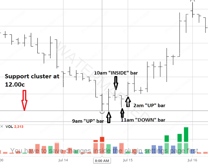
If we believe the chance of a reversal is strong enough, we can zoom into the intra-day chart. In this case, let’s go to barchart.com and take a look at the hourly bar chart.
Looking closely at the chart above, on 14th of July, the hourly bars for 8 am and 9 am (New York time) both double bottomed at 12.00. Technically the 9 am bar was an up bar compared to the 8 am bar, because it had an equal low to the 8 am bar (“on the line is in” so to speak). So this would have turned the hourly swing chart up.
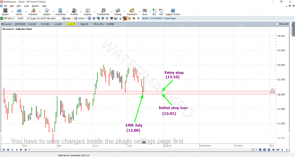
Then the 10 am bar was an inside bar (the swing chart waits for further information), and then 11 am bar was a down bar, turning the hourly swing chart down. And then, in anticipation of an up bar for the next hourly bar, we’d have our entry stop 1 point above the high of the 11 am bar (at 12.10), and initial stop loss 1 point below its low (at 12.01). In other words, you’d be anticipating a first higher swing bottom entry on the hourly chart.
And this entry signal was triggered when the next hourly bar (2 am for the 15th of July) was an up bar.
So, just after trade entry, let’s zoom out to the daily bar chart in ProfitSource – with Walk Thru mode to the close of the 15th. As you can see below, you’d be in the market very close to the low of the 14th.
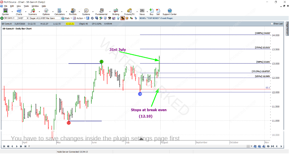
And what about stop-loss management, what about an exit target? Let’s take the simple plan which will be based on the weekly swing chart, and aim to take profits at 75% of the last weekly swing in the same direction, having moved stops to break even after the market reaches the 50% milestone of the same range.
Fast forward a few weeks to 31 July, and you will see that the market broke through the 50% milestone (13.01). At this point, you’d move your exit stops to break even.
And then a few days later on 5 August, the 75% milestone was tagged by the market, and you would exit the trade at 13.51; note that in theory the calculated 75% milestone was 13.515 – but this was rounded down before being put into the trading plan.
Now for some calculations – how could we have been rewarded for a trade like this? In terms of the reward to risk ratio:
The initial risk was: 12.10 – 12.01 = 0.09 = 9 points
The final rewards was: 13.51 – 12.10 = 1.41 = 141 points
So the reward to risk ratio was 141/9 = approximately 15.7
And in terms of a percentage, given that this trade had quite an aggressive entry (being on the intra-day chart), let’s assume that you were prepared to risk a more conservative percentage of your account, say 3% (less than the usual 5% of a normal entry based on the daily chart). If this was the case, the percentage gain on the account would be calculated as follows:
15.7 x 3% = approximately 47%
And for the reward in absolute dollar terms, we need to work out a few things first. According to the specs on the ICE exchange website, each point of price movement changes the value of a Sugar futures contract by $11.20USD. So, the dollar risk (USD) and dollar reward (USD) would be:
Risk = $11.20 x 9 = $101
Reward = $11.20 x 141 = $1,579.20
Now let’s say that you had a $10,000USD account, and went to risk approximately 3% of this account for the trade. With this you could afford to trade 3 contracts so the risk would be $303USD. And the reward $4,737 USD which was approximately $6,543AUD at the time of taking profits.
By the way, for those of you with some time analysis skills, there were also time reasons that added some strength to this trade, but these are beyond the scope of this article.
Work hard, work smart
Andrew Baraniak


