The Other Contracts – Part 2
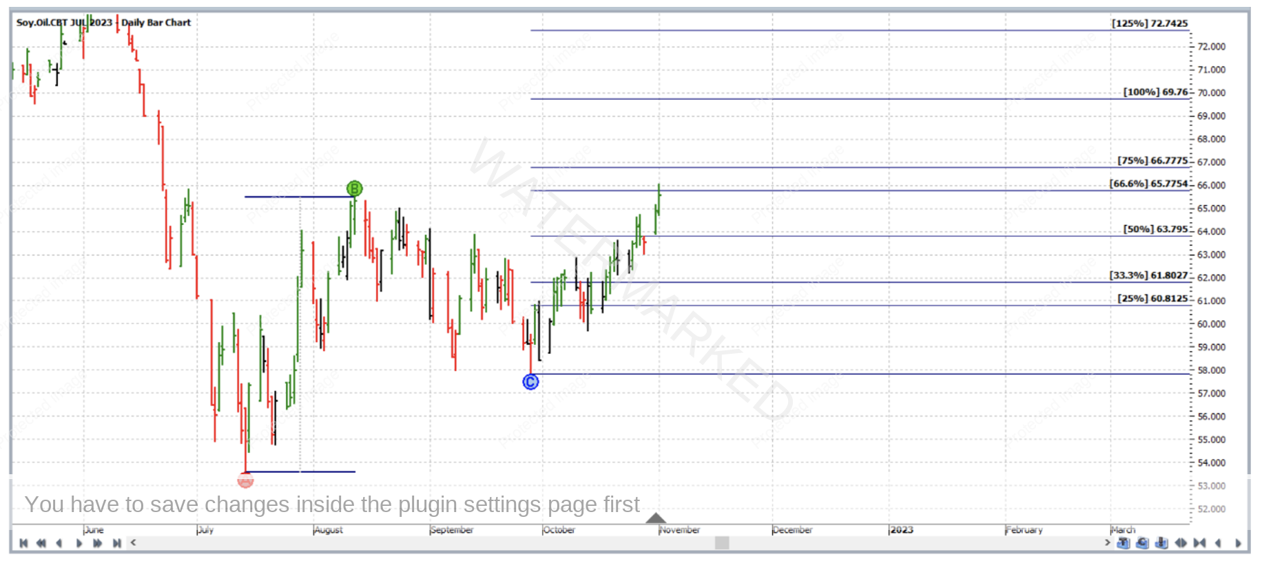
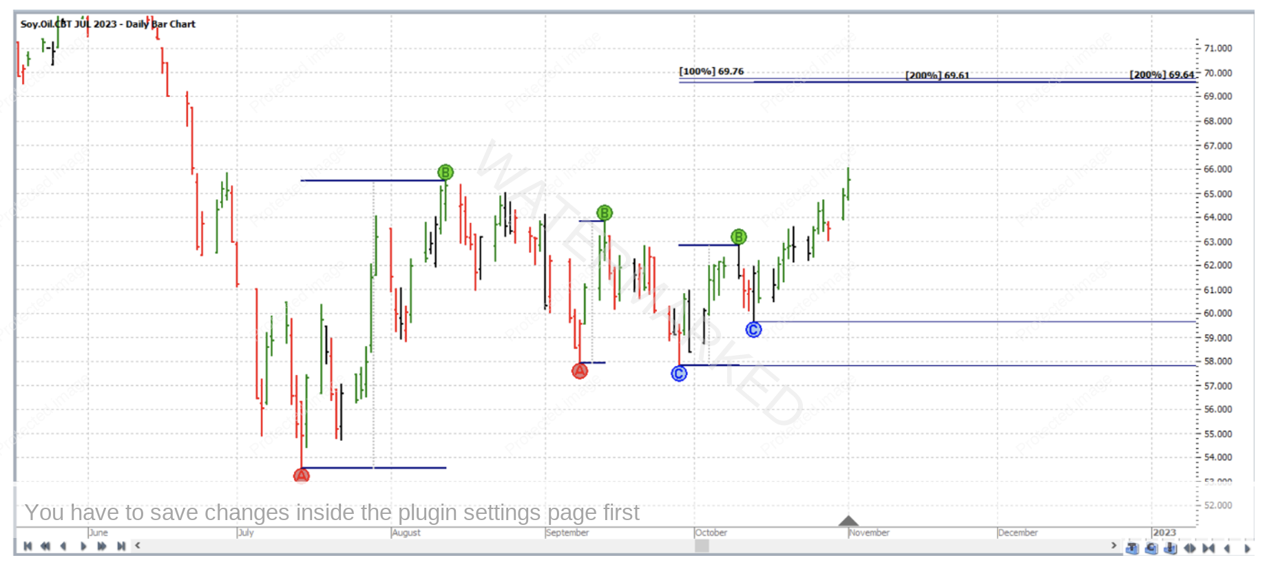
In our September 2022 newsletter, there was an article which considered taking a trade in a contract other than that from the SpotV chart. This time we will do something similar. The trade analysis and execution in this article applies to the bar chart of the July 2023 Soybean Oil futures contract, individual contract chart symbol NBO-2023.N in ProfitSource. This month we’ll take a close look at a trade as it unfolded – before, during and after. The chart below is in Walk Thru mode with data up to and including that of the trading day which was 1 November 2022. The ABC Pressure Points Tool has been applied as follows:
Point A: 14 July 2022 low (53.56)
Point B: 12 August 2022 high (65.49)
Point C: 28 September 2022 low (57.83)
In the above chart, while more than one key milestone is displayed, we can note that the 100% milestone is at a price of 69.76.
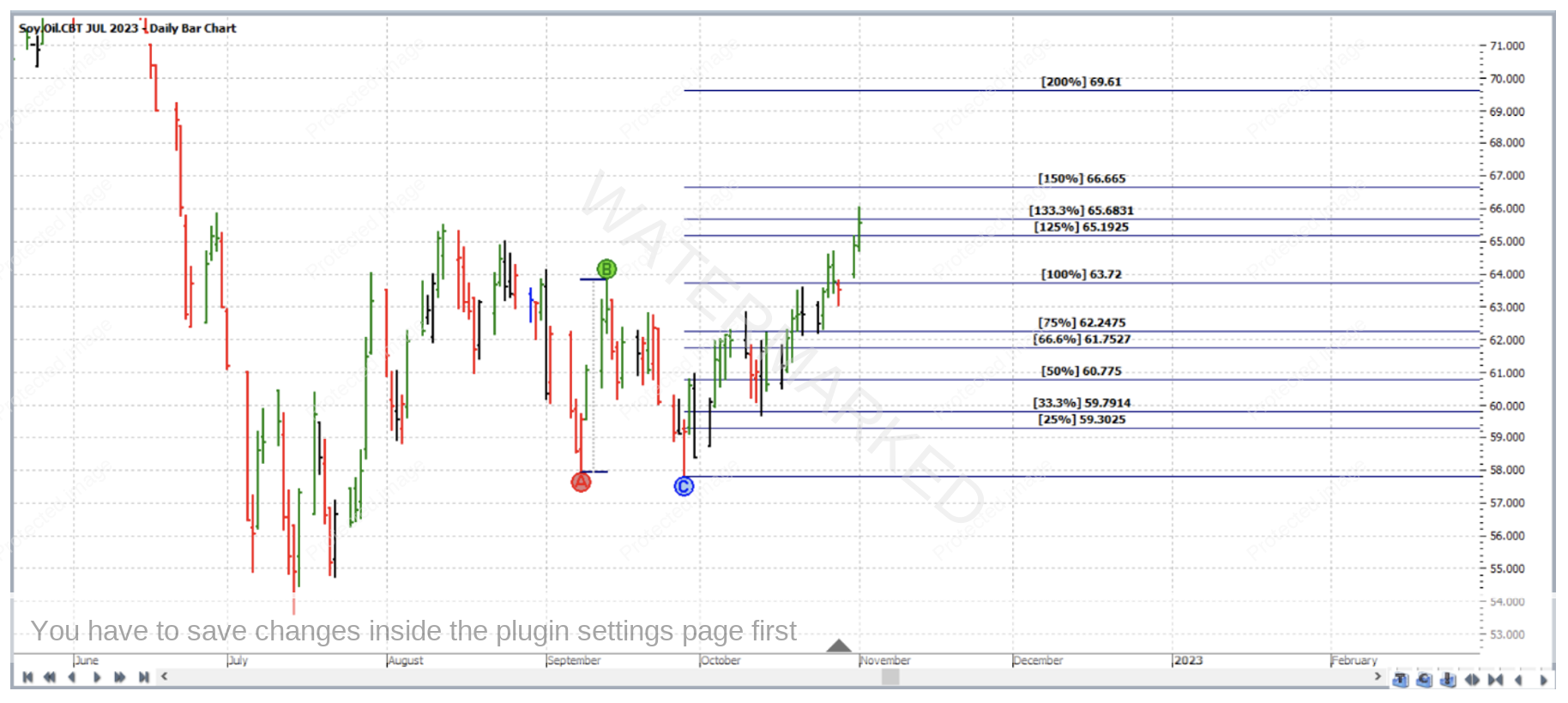
Now, going back to the same chart (again in Walk Thru mode with data up to 1 November 2022), but this time the ABC Pressure Points Tool was applied as follows:
Point A: 8 September 2022 low (57.94)
Point B: 13 September 2022 high (63.83)
Point C: 28 September 2022 low (57.83)
In other words an ABC has been applied to a pair of double bottoms.
Among the milestones displayed above, we can note that the 200% milestone is at 69.61.
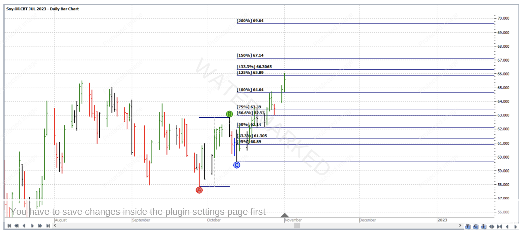
Then, likewise with a third application, to a different range as follows:
Point A: 28 September 2022 low (57.83)
Point B: 10 October 2022 high (62.83)
Point C: 13 October 2022 low (59.64)
In the above chart, the 200% milestone is 69.64 – very close to the key milestones (of 100% and 200% mentioned in the previous two charts) at 69.76 and 69.61; These three prices average at 69.67.
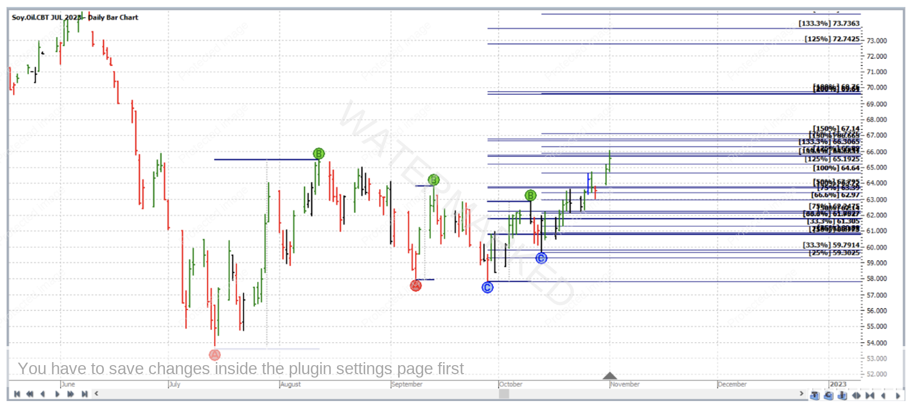
By now, the obvious price cluster can be more efficiently displayed by three applications of the ABC Pressure Points Tool on only one chart. Initially, here is what we get when the drawing tools used are displayed with all of their typical default milestones switch on.
If you look at the chart above – it’s a bit cluttered! In fact if you showed it to someone else, it might not immediately be obvious to them that you’ve found a price cluster average at 69.67; even worse if you had saved the chart and come back later to check it yourself, what if you had forgotten where your cluster was? After all, it appears that there might be even be more than one cluster appearing on the chart (and not all clusters are good ones). David would often say, with too many lines on your chart, it simply ends up looking like Charlotte’s web!
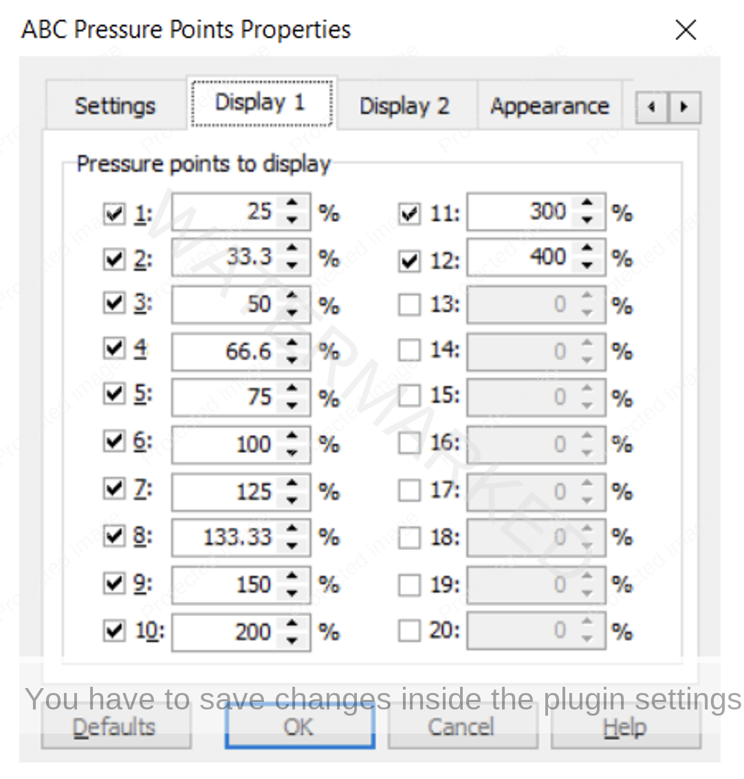
In this case, a little tidying up can be useful. Going into the Properties box (Display 1 tab) of the first application of the ABC Pressure points tool we get the following:
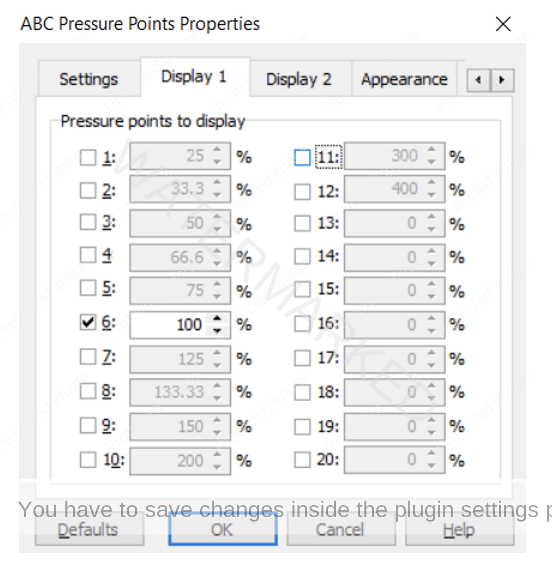
Then unchecking all but the 100% milestone, leaves us with:
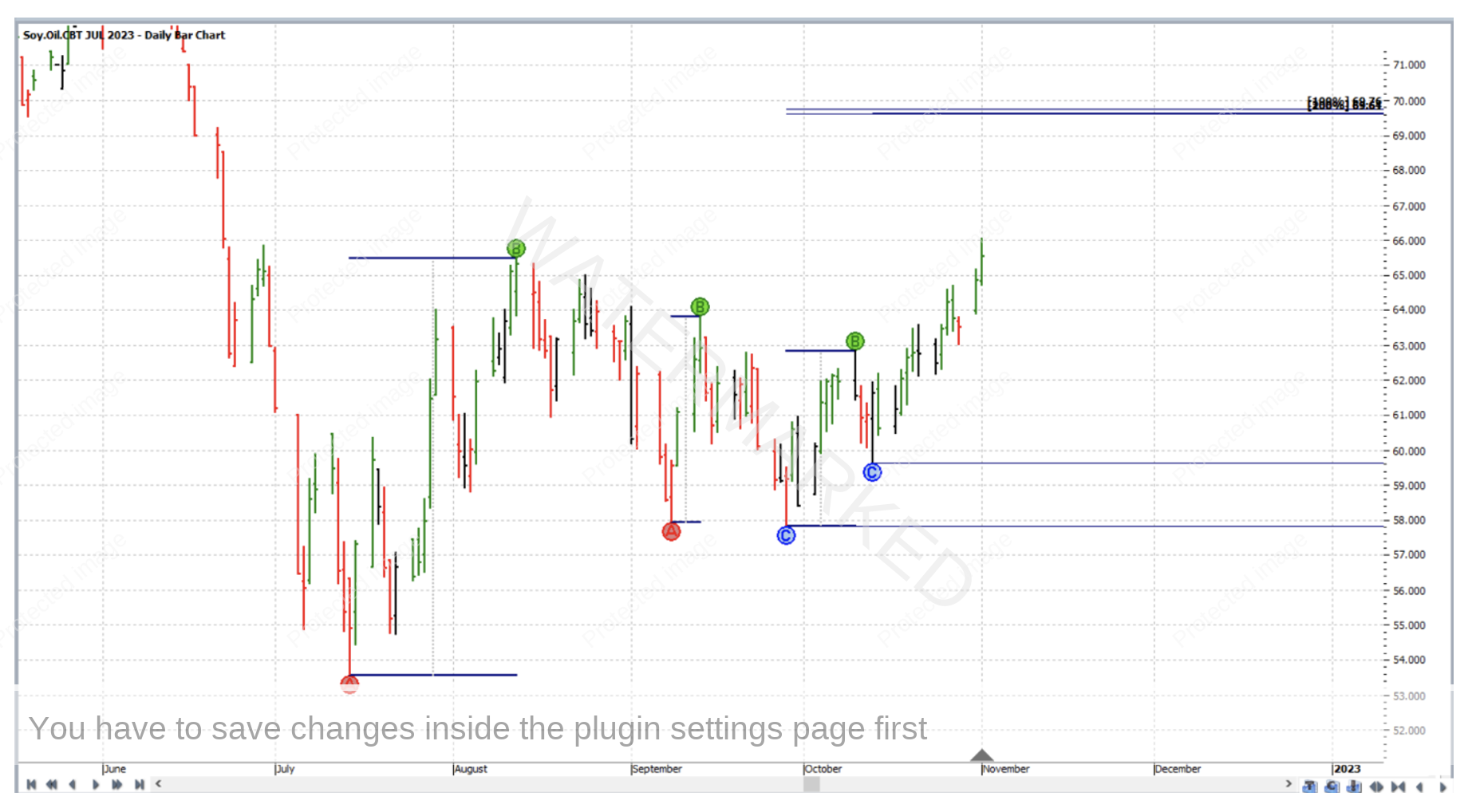
Clicking OK, and then going to do likewise with the other two applications (leaving only their 200% milestones switched on), reveals a much cleaner chart, with our looming price cluster a little harder to miss! Once our tools are in place, going back into their Properties box (Settings) tab, and checking the “Locked” box is a good idea.
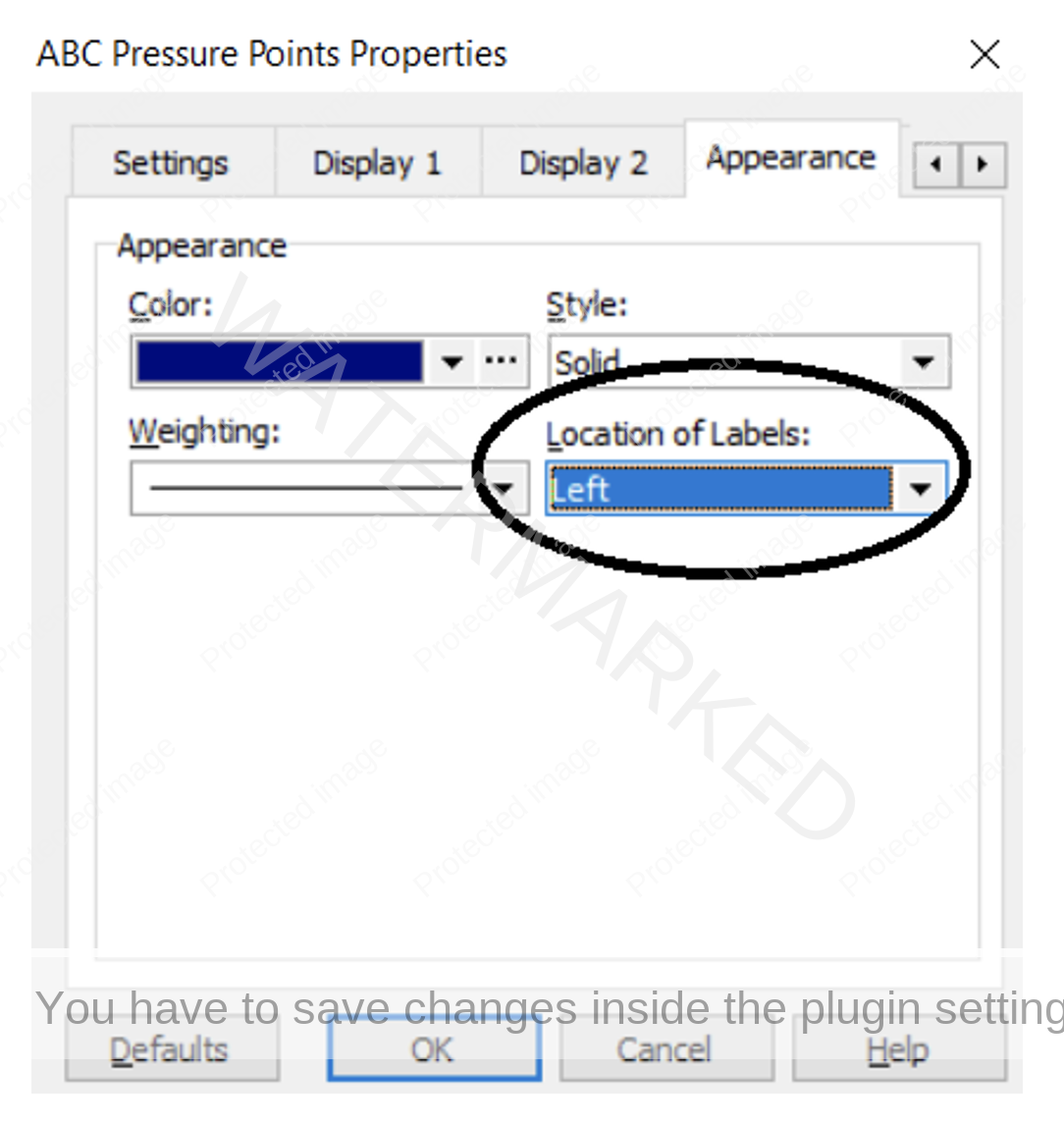
One final thing that was useful in this example before saving the chart for stalking out the cluster itself, is to go back into the Properties box once more (this time to the Appearance tab), and adjusting the position of the milestone labels. For the first application this is shown below, and “Location of Labels” has been changed from Right to Left.
In the chart below, the Location of Labels for the second application was changed from Right to Centre, and for the third application it was left as the default i.e. Left.
That was just a small improvement so that the individual milestone values are clearly visible as opposed to being piled on top of one another. And no it’s not a matter of trimming and tuning your chart for the sake of someone else to read – but ask yourself the question – if they in fact did try to read it would it be clear enough to them? If the answer is yes then the chart is clear enough for yourself.
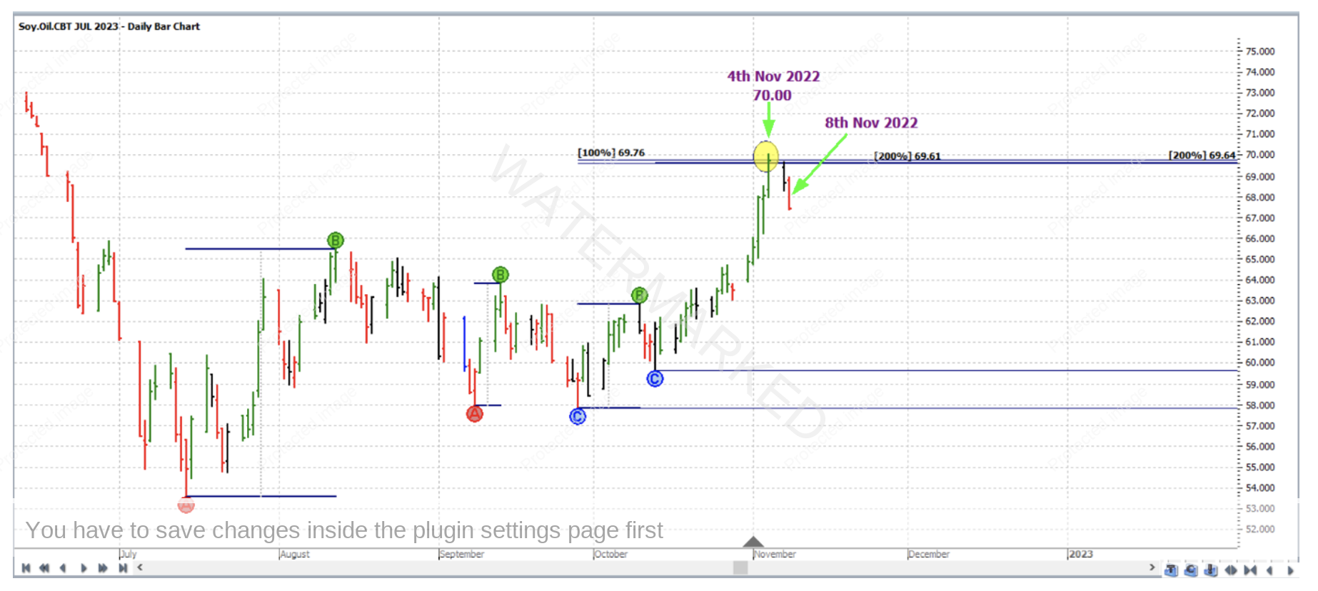
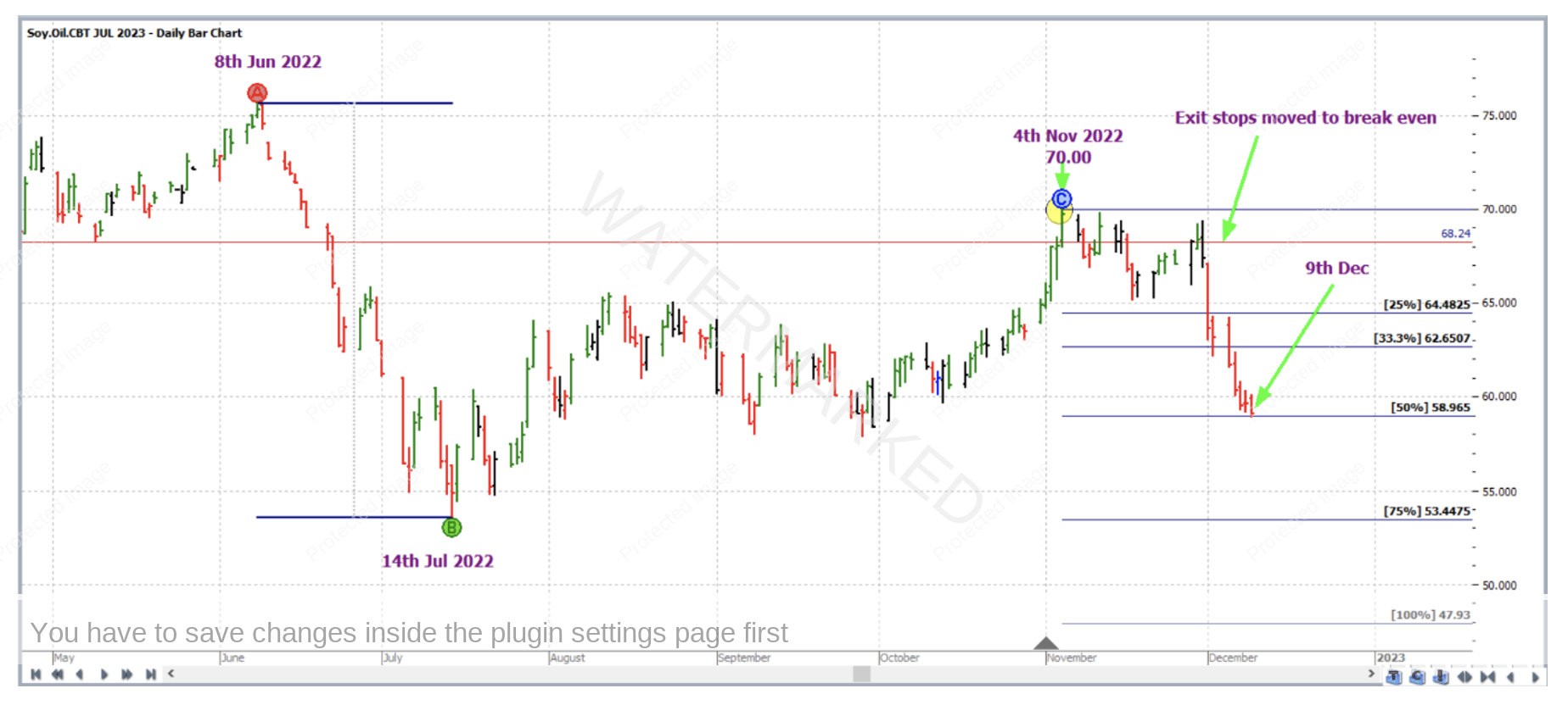
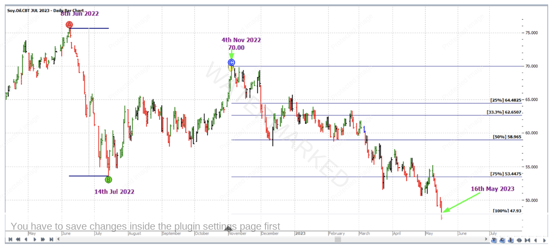
So how did this trade unfold? If we fast forward in Walk Thru mode, on 4 November 2022 the market reached the cluster, topping at 70.00, false breaking the cluster average by 33 points. The down day that was 8 November 2022 turned the swing chart down, trigged the entry to a short trade at 68.24, with initial stop loss at 70.01.
The AB reference range chosen for the trade was the monthly downswing from 8 June 2022 to 14 July 2022, with Point C being on the high of 4 November 2022. Stops were then managed “Currency” style as though the trade was a large ABC. On 9 December 2022 the market reached the 50% milestone and stops were moved to break even.
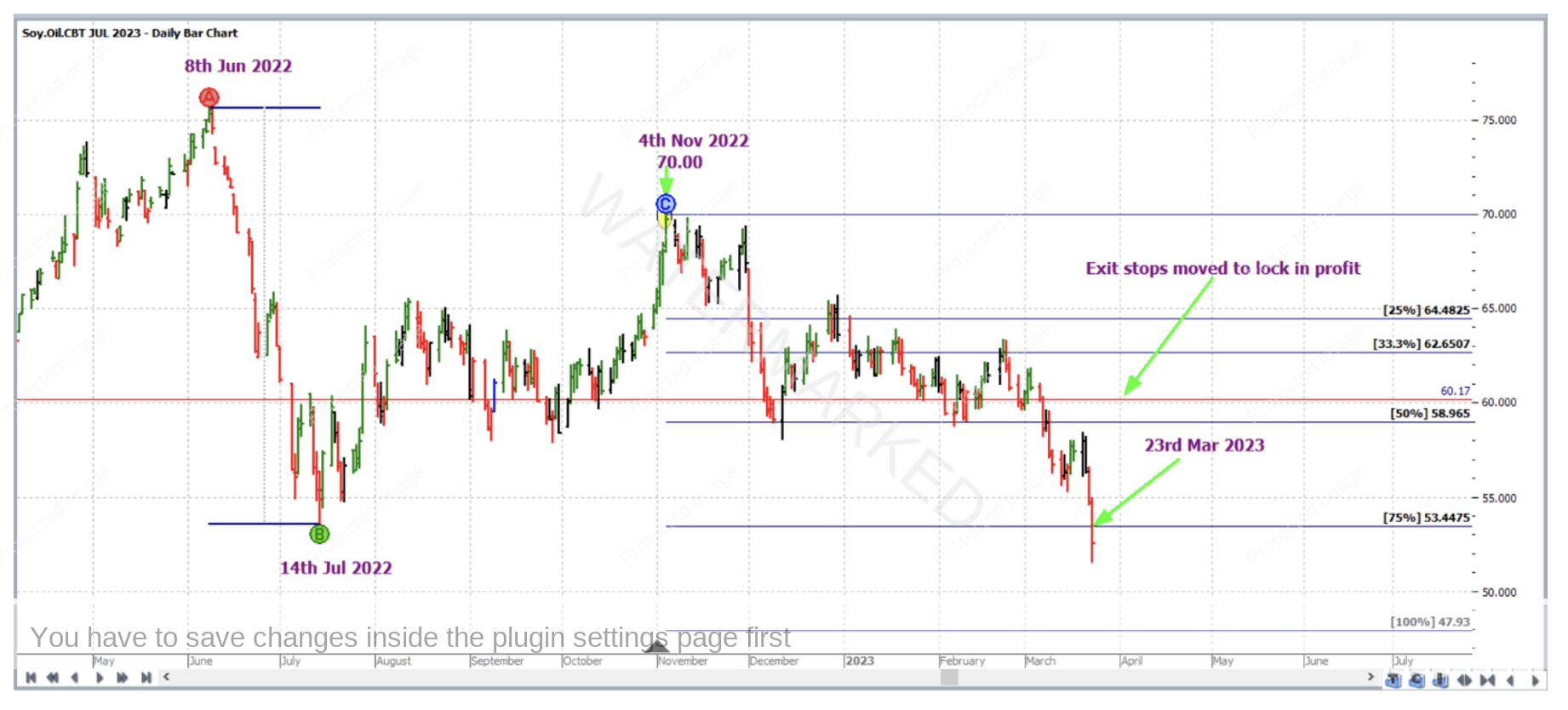
This was definitely a trade for the patient – it took until 23 March 2023 for the market to the reach the 75% milestone, when stops were moved to one third of the average weekly range (approximately 1.20 based on the last 60 weekly trading bars at the time) above the 50% milestone in order to lock in some profit.
And then the market reached the 100% milestone of 47.93 on 16 May 2023.
Now for a breakdown of the rewards. In terms of the reward to risk ratio:
Initial risk: 70.01 – 68.24 = 1.77 = 177 points (point size is 0.01)
Reward: 68.24 – 47.93 = 20.31 = 2,031 points
Reward to Risk Ratio = 2,031/177 = approximately 11.5 to 1
The contract specifications on the CME group website say that each point of price movement changes the value of one Soybean Oil futures contract by $6USD. So in absolute USD terms the risk and reward for each trade of the contract is determined as:
Risk = $6 x 177 = $1,062
Reward = $6 x 2031 = $12,186
At the time of taking profit, in AUD terms this reward was approximately $18,215.
If 5% of the trading account was risked at entry the gain in account size would be as follows:
11.5 x 5% = approx. 58%
At the time of taking this trade in the July 2023 contract, while that contract had built up adequate liquidity to trade, the December 2022 contract was in fact the one with more trading volume so needless to say it would have had our attention in the first place. But, due to seasonal factors with a commodity market like this, individual contract price charts can and will be different, with one providing a price cluster at the same time that another chart for the same market might not. It can definitely pay to keep an eye on the other contract charts.
Finally, as an exercise, it would be worthwhile to reproduce the charts from this article in ProfitSource.
Work Hard, work smart.
Andrew Baraniak
