Time to Get Focused
The more time you spend around markets and by time, I mean working closely with, following routines, studying, and being active when your trading plan suggests, you can become accustomed to the wax and wane of individual and markets in general. Some would define it as ‘gut feel’, which for trading, can be a really bad thing, but you can become attuned to your environment in a subconscious way. This experience can allow you to “feel” times where we need to be sharp, as markets are poised for volatility.
This year I have been writing around the Nasdaq market. There is an abundance of reasons why this market has been worthwhile to study, its place in the media landscape and its sheer quantum of funds makes it a clearly dominant market. Technology now sits as a backbone of nearly all tasks we perform in the modern world, the recent ramblings of Elon Musk and the effect it has had on the crypto space shows how we have entered the world of “influencers” in markets as well as social media. There were influencers of financial markets well before social media.
We have looked at the usefulness of ranges in the Nasdaq, Mat has recently mentioned the value of history repeating in price as one area we can focus on. If I break down my thinking of why this appealed to me, it was that markets can be hard enough without making them harder. If the market can give us prices to measure and we just need to watch them to repeat, then maybe I can get an edge without having to invent a method.
Volatility is a blessing and a curse for traders. Not enough volatility and markets move sideways, and ranges are hard to extract a good risk vs reward ratio from, too much volatility and hanging in for longer period can be hard as stops get tapped as intraday movements are too great for our “systems”. The VIX index is one we can review and is universally watched in markets as a guide to how much asset prices are jumping around. A lower number is less volatility and a higher number shows increased volatility.
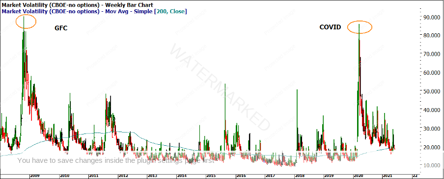
Chart 1 – VIX Weekly Bar Chart
Chart 1 gives us a broader historical view, the all-time peak in the VIX, or fear index, was during the Global Financial Crisis (GFC) and the values were actually higher than what we saw in 2020 at the peak of COVID 19. We have seen a gradual decline back to the blue moving average (200 day SMA) with a recent jump again as inflation concerns were processed by the markets and we saw the subsequent sell-off in May.
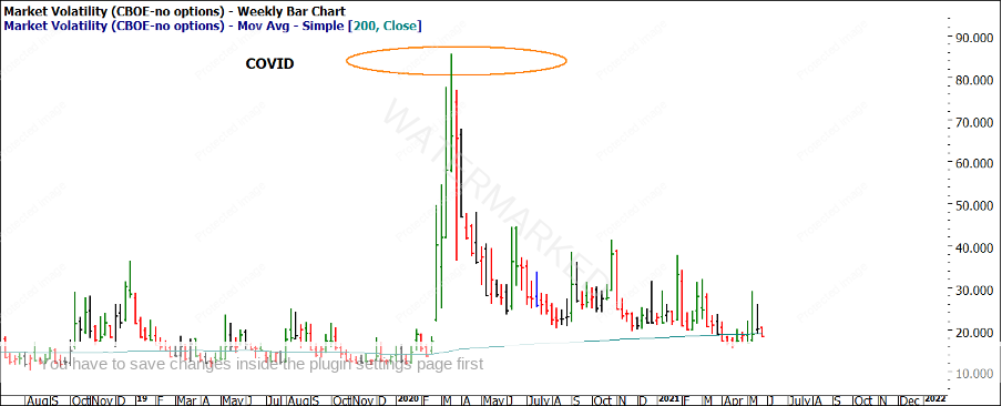
Chart 2 below shows in more recent detail, how volatility has remained above average but against the theme of the world’s worst pandemic in 100 years the market has coped well.
Chart 2 – VIX Weekly Bar Chart
As mentioned, there have been rumblings around inflation and interest rates across most economies and especially in the US this month. Inflation has behaved interestingly since the GFC as all theories suggested with the global printing of money and capital available cheaply at historic low rates asset price bubbles should be bursting on a regular basis. Something we have not seen to date, but that does not mean we will avoid it sometime in the future.
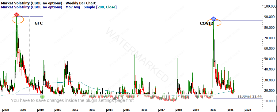
As the VIX returns to its simple moving average (it’s mean we could say), like we say with price, “history repeats”. Then the more chance we could see a reaction again to the upside. There is a case to say that the volatility has a way to go down still if we look at the GFC range compared the COVID range in Chart 3 (using the 100% milestone)
Chart 3 – VIX Weekly Bar Chart
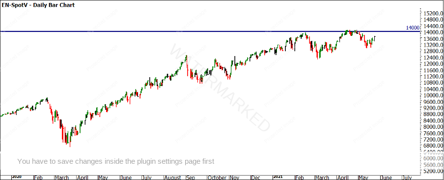
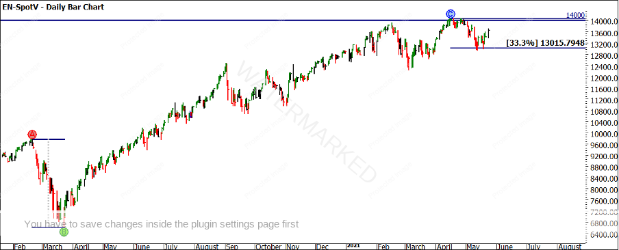
If we compare this back to our analysis on the Nasdaq, since the last article, the price action nudged 14,000 points on the index (Chart 4) before falling back under. People always want to know if round numbers are levels of importance. I remark that they are if enough people think they are. In short, the numbers are important until they are not important anymore.
Chart 4 – EN-Spotv Daily Bar Chart
The reaction of that level, combined with the concerns around inflation, may have been enough to send markets tumbling for longer. Instead, the selloff was short-lived and orderly based on previous ranges. It ran down and made a small double bottom, from which at the time of writing suggests we may be tackling 14,000 again rather than a retest of the lows.
Chart 5 – EN-Spotv Daily Bar Chart
Chart 6 – EN-Spotv Daily Bar Chart
For those looking to expand on the recent low on the 19th of May, you could look for harmonies with the February 2021 high as well as the February 2020 high.
The Nasdaq will remain for the foreseeable future a bellwether of markets and will therefore be closely watched. Staying focused and always measuring its current moves with its previous moves lets us know how it is tracking compared to history. Is it orderly or disorderly compared to history, are we seeing the same patterns repeat?
The adage of sell in May and go away is one many may have heard; I think the easy money across many markets has already been made and hopefully locked in. As we venture into the second half of the year we can look to the status of technology and its related stocks as a filter to the broader markets and in turn what type of trades we predominately may see be it long or short.
Good Trading,
Aaron Lynch
