During the webinar, I noted the importance of working off printed charts as opposed to just working off computer software. For this exercise, I would like you to produce a daily wall chart of Wesfarmers (WES.ASX) from the 23 February, 2015 high. I would like you to use a price scale of either 80 cents per inch (10 cents per small square on imperial charting paper) or 160 cents per inch (20 cents per small square on imperial charting paper). Later, you will be drawing angles on the chart, so it will be handy if you print the chart using Calendar Days.
You may wish to experiment by printing out a small section of Wesfarmers, perhaps enough to fill one A4 page, to make sure it is easy to work off. Officeworks will allow you to print an A1 sized page for around $2 to $6, depending on how much ink your chart uses (Light Lines use less ink than Dark Lines).
If you have never constructed a hand-drawn chart in your life and would like to experience this, you may wish to draw the chart yourself, day by day, from the 23 February, 2015 top. My estimate is that once you get going, a chart usually takes around 1 minute per trading bar to construct, meaning a chart like this should take no more than 5 hours to draw up. You can print the data by opening a chart of Wesfarmers, selecting “Actions” then “Actions for Wesfarmers” then “Price Data”.
These days, I print most of my charts out, rather than hand-drawing them, and then I update them by hand. The instructions below are for ProfitSource software if you wish to print the wall chart.
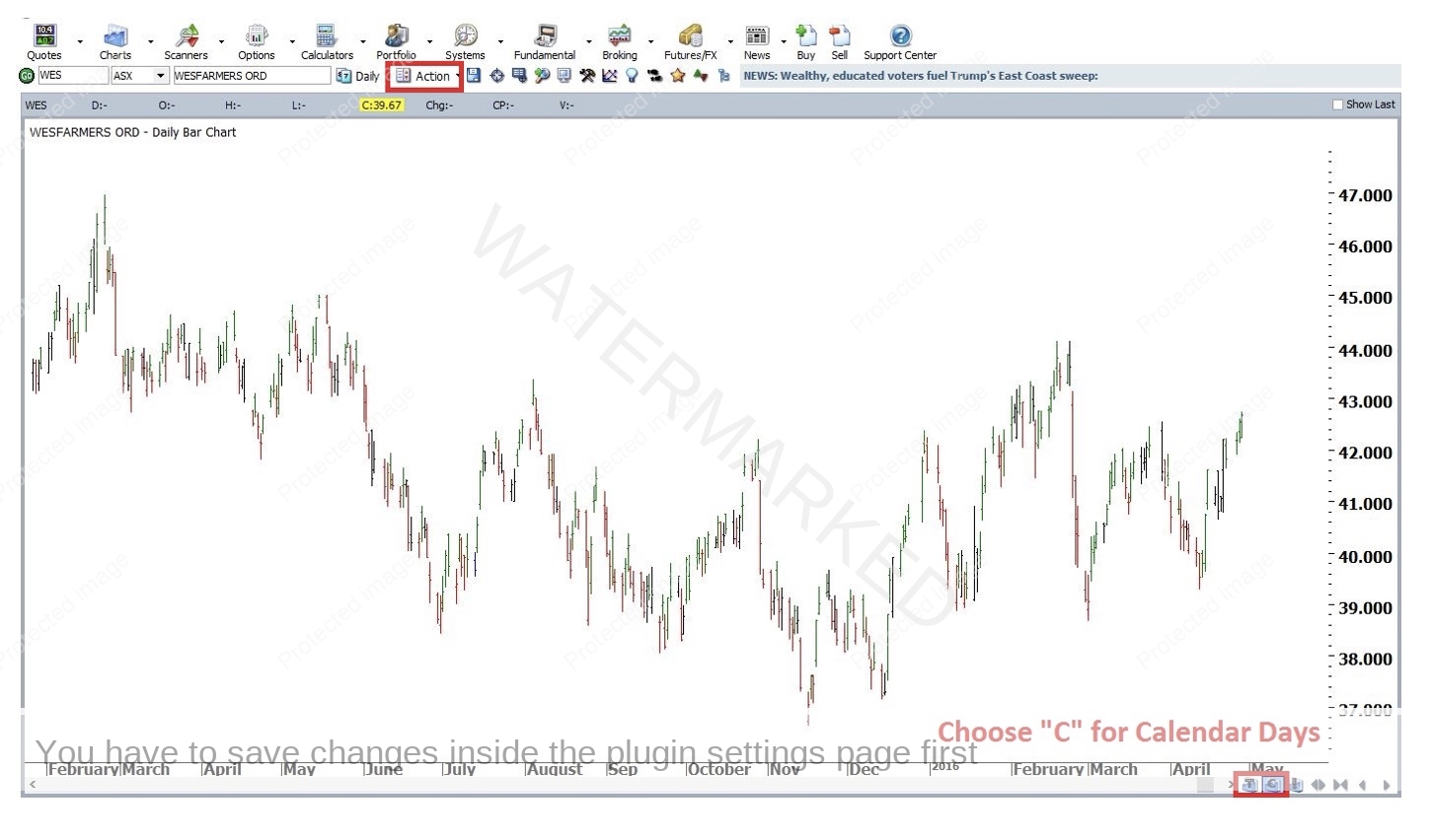
Step 1 – Clear your chart of any tools/indicators, make sure it is displaying “Calendar Days” rather than “Trading Days”, then click “Action” and “Print Wall Chart”. Note: it is a good idea to know the date range you wish to print at this stage, as the software will ask you for it later, when you can’t go back.
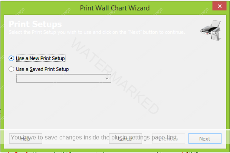
Step 2 – Make sure “Use a New Print Setup” is selected, then press “Next”
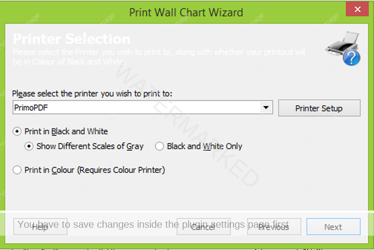
Step 3 – Select your printer then click on “Next”. Years ago, I installed a program called “Primo PDF” that lets you print PDF charts up to A1 size. I know there are plenty of others out there. If you feel comfortable installing and using a program like this, it is then very simple to have your charts printed out at a place like Officeworks, or any other printing service. If not, you can print charts A4 size, and then use a combination of sticky tape and/or glue to join them together. This can be therapeutic and fun, but it can also be annoying if you are printing large charts. I will provide instructions for Primo PDF below, if you need them.
Step 4 – Select your Paper Size, Orientation (Landscape is usually better) and Paper Size.
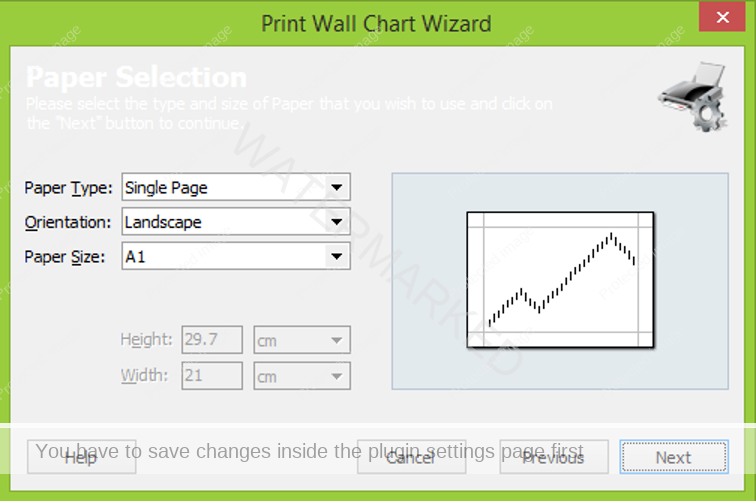
Again, A1 is my preference. This is the size of the Safety in the Market charting paper you have seen in various courses over the years.
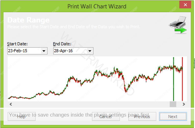
Step 5 – Type in your Start Date and End Date. As mentioned above, it helps if you know these BEFORE you start to print, so you don’t need to cancel out of the process here to look them up. Click “Next” when you are finished.
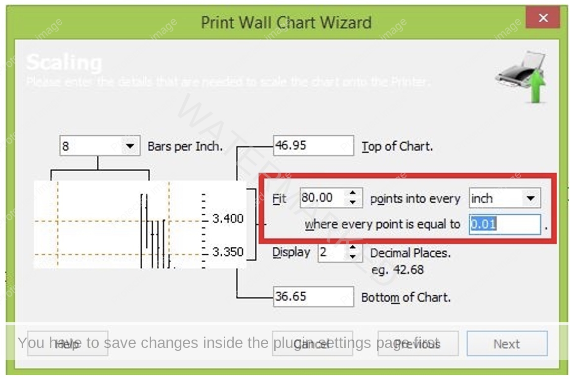
Step 6 – Choose your scale. I will take you through all of the steps here, although the key elements are all contained in the screenshot below, with a red rectangle around them.
- I use 8 bars per INCH rather than CM. You can click on the drop down arrow next to “cm” that you see below and change it from centimeters to inches.
- If I want each small square (1/8th of an inch) on my chart to equal 10 cents, I need to “Fit” 80 points into every inch, where every point is equal to 0.01. Essentially, we are scaling the chart here by telling the software we want 80 x 0.01 (80 cents) into every inch. This is probably the hardest part to work out, especially if you are dealing with a currency, but it is ESSENTIAL for students of David’s Master Forecasting Course, because you will need to be able to manipulate these settings if you wish to construct a properly scaled Comparison Chart.
- The “Top” and “Bottom” of the chart are automatically calculated for you. Occasionally, you might like to move these up or down, to create more room on your chart for future updates, but I generally leave this how it is.
- “Display 2 Decimal Places” relates to your price scale. Obviously, you want to make sure you can see the appropriate numbers for your charting. If you are charting a currency like the Aussie Dollar against the US Dollar, you would change this to “Display 4 decimal places”.
- When you are finished, check your work again. It’s not a big deal if you get it wrong – if you are printing PDFs, you will normally see any errors quickly (eg if you leave it as 16 points per cm by default, your chart will be very tall!)
- When you are satisfied that you have it right, click “Next”.
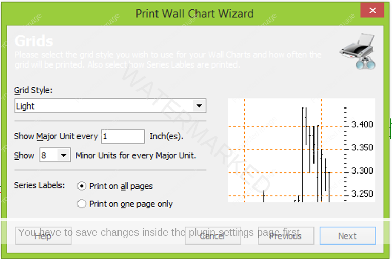
Step 7 – Grid Style and Labels. I use Light style, however some students find that Medium style is easier on the eyes. If you are printing at Officeworks, quite often going from Light to Medium will push you above the 15% ink limit, which means around $6 per A1 page instead of only $2 or so. I normally leave “Series Labels” as “Print on all pages”, which helps when it comes time to stick them all together!
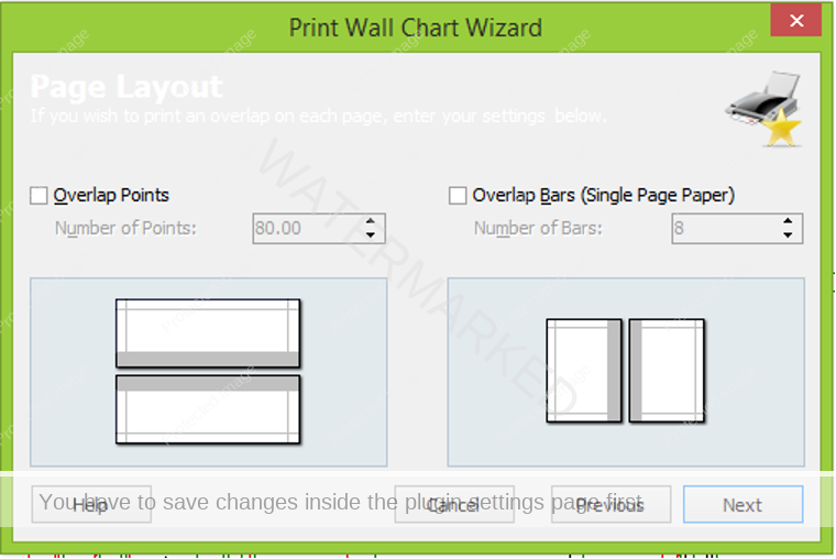
Step 8 – Overlap Points. I normally print and extra inch (or half an inch). For WES, you might consider using 40 points in price, and 4 bars, to make it easier to line up the pages when taping them together.
Step 9 – Time to Print! This tells you how many pages you are going to print. Again, not a big deal if you are printing to PDF, but if you enter the wrong scale, it may say “100 pages high by 100 pages wide” for example, which gives you one last chance to go back and fix it before printing 10,000 pages! When you are satisfied, click “Finish”, and it will send the job to your printer. And you’re done! You will be given the option of saving your print settings, but don’t bother. You will almost never re-use the same settings.
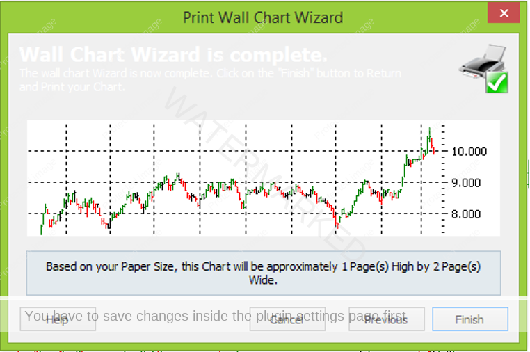
Step 10 – Primo PDF. If you have chosen Primo PDF, you will now get a popup that looks like this:
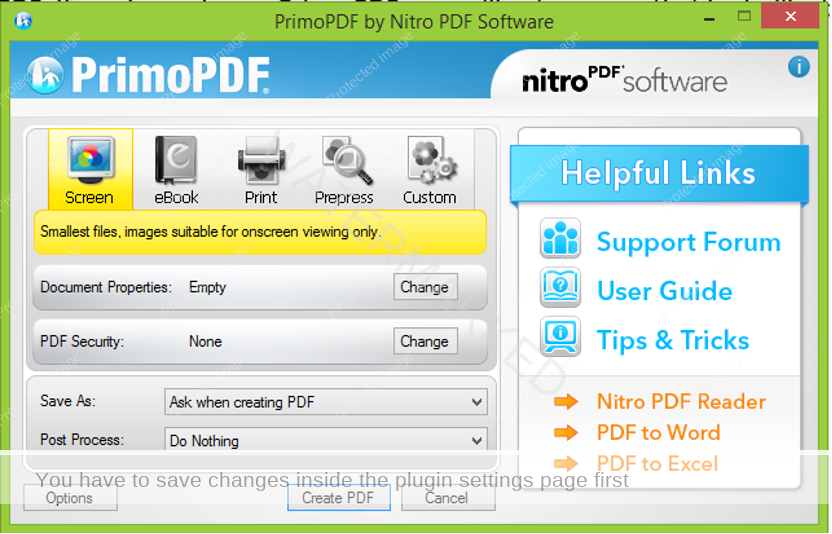
Note that I have selected “Save As – Ask When creating a PDF” and “Post Process – Do Nothing”. You will see why this is important in a moment. If you have selected these options, click on “Create PDF”.
This will give you the option to save your chart pages. I normally save them to the desktop, to make it easier to upload them to Officeworks, then I delete them when I am finished (unless I think I will need them again)
Now, here is the crucial part – the same screen that you saw above will reappear! This is because Primo PDF only prints one page at a time. For WES, we have two pages to print, so you need to click on “Create PDF” AGAIN. This gives you the option of either saving the chart as a new (and therefore separate) file, or of “Appending” the next page to the existing file.
IMPORTANT – if you are printing using Officeworks, you need to submit each page individually. It helps if you choose a save file name along the lines of “Wesfarmers A1 February 2015 High Page 1 of 2” etc.
While Primo PDF has been great for me, be careful of where you download it from. I heard one case of a student picking up a virus by trying to download it from a strange site. The actual site of www.primopdf.com should be safe to download from, but again, please be careful, and ensure that your computer has appropriate anti-virus protection. PrimoPDF is a free program – you won’t need their paid version (unless you want to use it for other things, of course).
I hope this has been a useful exercise for you. Once your chart is ready, I would encourage you to mark up the Ranges on the chart. Mark the First Range Out of $5.13 from Exercise 1, and then project that Range down from each of the monthly tops. Happy charting!