Firstly, a Happy New Year to all and I wish you all the best for the year and achieving the goals you have set. Goal setting is something that I have always found an important anchor in trading and is something that I am working on with my teenage son. Without a clear way to measure your
To the markets, we saw the 2018 calendar year close lower than it started on most of the major index markets around the world. Closer to home, the SPI finished 2017 trading at 6019 points followed by its 2018 close of 5561. The range difference was 456 points (very close to 458) and an approximate fall of 8%. In
My focus for this discussion was the rally from Christmas into the new year, referred to as the Christmas Rally. Much has been said and written on this over the years by me and others. It has come to be a reliable move that has produced tradeable runs over many years. It does require some discipline, patience and awareness to trade it, mainly as most people switch off over these breaks and don’t focus too much on markets. The volumes are lower and for the market participants
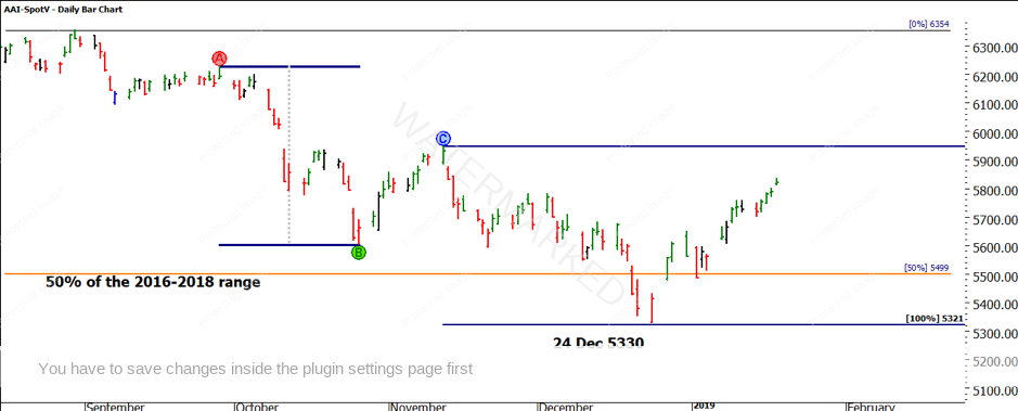
In Chart 1 we can see the SPI in hindsight. I have marked a number of key areas. The orange line is the 50% level between the 2016-2018 bullish range. 50% levels are a huge aspect of my analysis and once understood can be simple to apply.
The SPI ran down approximately 100% of the previous range into 24 December. (Seasonal time)
The day of the low produced a strong open close reversal,

Chart 1 – Daily Bar Chart SPI200
Following the low made on 24 December, a closers rule could be the most aggressive entry possible here (an openers rule may also apply for the brave.)
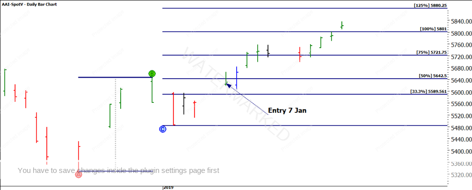
If we didn’t enter there, then the simple first higher bottom entry was possible on 7 Jan 2019 albeit outside limits. One of the confirmations you could have used to validate was the price action now trading above the 50% level and the gap in the A to B range acting as support.
Chart 2 details the first higher bottom set up and subsequent move.

Chart 2 – Daily Bar Chart SPI200
The index may not yet be a market you are trading on, my suggestion is to look at the individual stocks you may follow and see if this move was replicated on your market. A quick check on the major stocks in the ASX 50 will give you plenty of examples to follow.
I also wanted to share some other work I have been focused on, the stock RHC or Ramsay Health Care is one that has come up for a variety of reasons in other business I am involved in. It started with a lot of discussion around a level of price support that this stock has demonstrated.
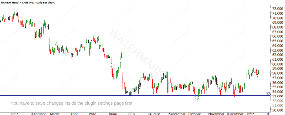
A quick look at a bar only chart allows us to see the recent level of price support (Chart 3) at $53.00.

Chart 3 – Daily Bar Chart RHC.ASX
The recent support at $53.00 could be justified
There are so many market participants who have opinions around why prices move the way they do, for me that’s great as diversity brings opportunity. A quick look in shows that the current area of support is sitting on a 37.5% retracement level from
The technical use of lows resistance cards can be challenging when we have a high-priced stock and relatively low value all time low. In this
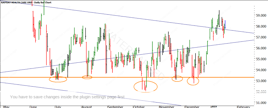
Chart 4 shows the lows resistance card with an adjustment to the $0.75 price and adjusting the point size by a factor of 10 i.e. $0.01 to $0.10.

Chart 4 – Daily Bar Chart RHC.ASX
We can now clearly see how a full multiple of the low (Orange Line) is acting as support in several areas with the price action struggling to close under that line (or the strong part of the square for those who have studied the Ultimate Gann Course).
RHC managed to move to just under $60 and may have potential to go higher given its current position. 2019 can be full of any outcomes you want around your trading, often it’s the simple things done well that work the best.
Good Trading,
Aaron Lynch