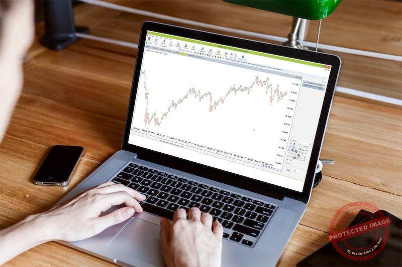

Before you place a trade, everything starts with the chart. The chart is where the market tells its story, and learning to read that story is one of the most important skills a trader can develop. Regardless of what market you’re trading – shares, CFDs, futures, or forex – the chart is your primary decision-making tool.
A chart in trading is simply a visual record of the market’s price movement over time. Instead of looking at endless numbers, the chart allows you to see price action at a glance. It shows you how price has moved in the past, where it is trading right now, and how it has behaved around key levels before. This visual context helps turn raw data into something meaningful and usable.
Charts also give you clues about what price may do next. While no chart alone can predict the future, price movement often leaves behind patterns, rhythms, and structures that repeat over time. By studying these movements, traders learn to recognise areas of strength, weakness, balance, and imbalance in the market.
There are a number of different chart types used by traders, including line charts, bar charts, and candlestick charts. Each presents the same price information in a slightly different way. Some charts are more detailed, while others are designed to keep things simple and uncluttered.
For beginners, one of the easiest charts to understand is a bar chart. A bar chart clearly shows the opening price, closing price, and the range price traded within a specific period. This makes it an excellent starting point for learning how price moves, how trends form, and how markets transition from one phase to another – without feeling overwhelmed.
The Two Axes: Price and Time
Every trading chart has two main parts:
- Horizontal axis (Time)
This shows when price moved. Each bar represents a specific time period – for example:- 1 day
- 1 hour
- 15 minutes
- Vertical axis (Price)
This shows how much the market is trading for.

Together, they answer the two most important questions in trading: When did price move, and how far did it move?

What is a Bar?
Each vertical bar on a bar chart represents all the price activity during one time period.
That single bar tells a full story — not just where price ended, but what happened inside that period.
Every bar contains four key pieces of information:
The Four Parts of a Bar (OHLC)
Open
- The price where the market started trading for that time period.
- Shown as a small horizontal tick on the left side of the bar.
High
- The highest price reached during that period.
- This is the top of the bar.
Low
- The lowest price reached during that period.
- This is the bottom of the bar.
Close
- The price where the market finished trading for that time period.
- Shown as a small horizontal tick on the right side of the bar.
Reading the Story of a Bar
- If the close is higher than the open, price moved up during that period.
- If the close is lower than the open, price moved down during that period.
- Long bars show strong movement.
- Short bars show indecision or low activity.
Over time, these bars link together to form patterns, trends, and key levels – the foundation of technical analysis.
What Can You Trade Using Charts?
Charts are used across almost all tradable markets, including:
- Shares (stocks – think Apple, Commonwealth Bank)
- Indices (for example – a measure of a collection of stocks like the top 200 stocks listed on the Australian Stock Exchange)
- Commodities (like gold or oil)
- Currencies (Also called Forex – like the Aussie Dollar against the US Dollar, or the Japanese Yen against the US Dollar as an example)
- Futures markets (things like coffee, soybeans or sugar as an example)
No matter the market, the chart works the same way.
Price is price. Time is time.
Once you understand how to read a bar, you can apply that skill anywhere.
Why This Matters
Trading isn’t about guessing or reacting to headlines.
It’s about learning to read price behaviour.
Charts strip away the noise and show you what the market is actually doing – not what someone thinks it should do.
Master this foundation first. Everything else builds on it.