What Goes Up Must Come Down!
February is not your typical month for crashes or corrections (take your pick of what we are calling the current volatility). The major historical declines tend to be centred around the end of years, not often in the first quarter where we have just returned from the Christmas break, often filled with energy and hope in the year ahead.
The movements south in nearly all asset classes (stocks, currencies, commodities (except gold)) should not be that surprising if we look at how far they have run and for how long. In talking with people in recent times I have described the markets as bear opportunities waiting for a headline. Overall what I hope you can see from this is markets can run a lot further than they are meant to both ways and are only as rational as their participants. In most cases that means hardly rational at all. The great challenge with coronavirus is that the risk is very hard to foresee and manage and hence it is impossible to price markets appropriately. In short, the market is always right no matter your opinion.
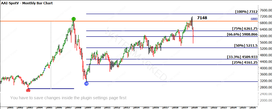
Chart 1 takes us back to a chart and technique I discussed earlier this year in January. David’s wisdom around focusing on major things for major results comes to mind when looking at the last major bullish range prior to this cycle. We see that the 100% milestone of the 2003 to 2008 range gave a target at 7312.
Chart 1 – Monthly Bar Chart SPI 200
Of note as well is the previous all-time high at 6880. Combined with the 100% milestone, it’s fair to suggest we could have been considering we were in the winter of the cycle at least in the medium term.
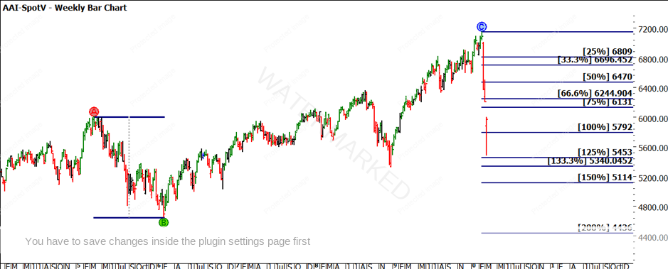
The velocity of the move is an area that certainly catches our attention as in Chart 2, we see the last bear cycle in 2015/16 unfolded over approximately 1 year and travelled 1356 points. That has been achieved and exceeded in under 1 month this time round.
Chart 2 – Weekly Bar Chart SPI 200
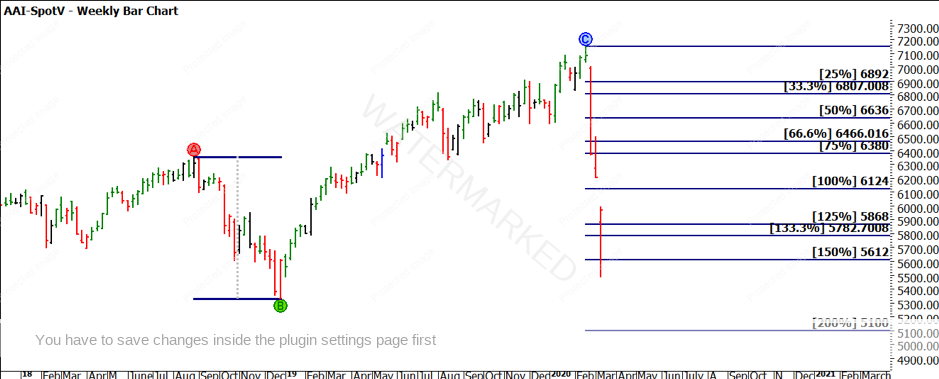
At time of writing, the range the market has produced is 1666 points, again using history and the move in 2018/19 was 1024 points and as Chart 3 shows, we have seen approximately 150% of that range repeated.
Chart 3 – Weekly Bar Chart SPI 200
The important thing to note in the chart pattern is how the markets have reacted to these pressure points. In all things we do, both price and time, we like to see a decisive reaction to a strong pressure point and to have any confidence that these markets will stabilise and then recover, we should see a continuation of those pressure points being respected.
By moving through our toolbox, we can continue to assess what the market is doing in context to major pressure points. There are so many ranges and price points we can be assessing right now, but my experience tells me in times like this, keeping analysis simple and straight forward helps us draw better conclusions. Again, the major ranges should tell us the story of where to next, for markets.
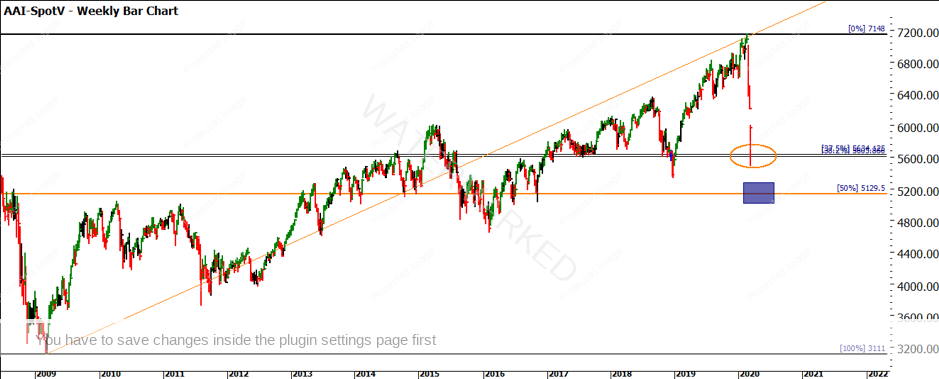
Chart 4 has a couple of analysis tools on it for consideration. Using a Ranges Resistance Card we can see the market has not yet reached the 50% point. You will note I have said ‘not yet’. This would be the real test of strength or weakness in the market 5130. I am also encouraged that the market bounced at the 37.5%/38.2% levels. Whichever level you follow, it suggests there is some technical belief in the market movements currently. Some may argue a self-fulfilling prophecy i.e. so many participants watching the same level but the old saying is “whatever works”.
Also added is a Gann Angle that provides some influence around the high we have just seen. For those who have studied this, you should look to recreate it and understand its implications.
Chart 4 – Weekly Bar Chart SPI 200
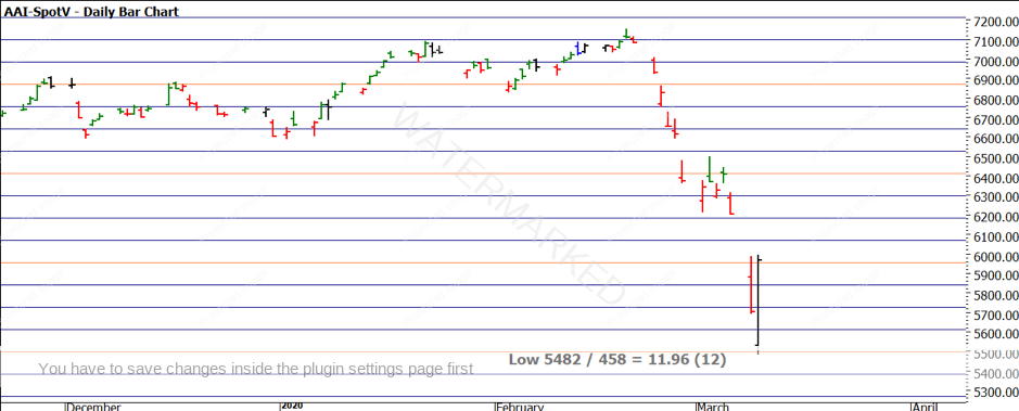
Chart 5 continues the price-based theme with a Lows Resistance Card. The All Time Low on the SPI is 458, so we can look to see if some support can be expected around the current low by performing the following calculation.
The low is 5482, if we divide by 458, we get approximately 12 multiples of the low. Now if we place this level on the chart, we see how the price action just broke the 5496 level (orange line) and has rebounded from there.
Chart 5 – Daily Bar Chart SPI 200
Regardless of which market you are watching, these techniques can be applied quickly to understand the recent drop and if support is present based on history. If you feel comfortable with this amount of analysis you can apply more ranges and prices to the discussion to look for more confirmation or otherwise of your market view.
If this is the first significant correction you have lived through as a trader, there is much to be learned by “living” the market during times like this. You may not be actively trading it, but the mental involvement builds memory for the next time. I can certainly say I have been a lot calmer and more focused in this move simply because of the experience of having lived it before.
There could be more downside to come and the coronavirus issue is far from understood and resolved. In the short term (and there are no prizes for long range forecasts currently) there are some good reasons to suggest there may be a low for now. That being said if it breaks, we need to prepare for how to benefit from that.
Good Trading
Aaron Lynch
