Where Are We?
If you are feeling like it is hard to know where we are on the economic and trading map, you are not alone. We are receiving feedback (in the extreme) from multiple sources globally. These feedback triggers are mostly noise but depending on your routines and disciplines you can be caught on one highway of information and this can distort your thinking and then individuals’ biases come to the front of mind.
I believe I could survey 100 people in 100 different Australian suburbs and get close to 100 different answers on the shape of the economy and then in turn how that impacts markets. Depending on what occupation, industry, location and political bias you hold, we could receive information that confirms we are in a depression or boom, we could be faced with thousands of deaths due to COVID or be told its no worse than the flu. If you ever needed proof as to why financial markets exist and why there is always a difference of opinion, then just run the survey above. The failed economist in me tells me that the bad data on all things economic is just starting to drop like the unemployment numbers released last week. Apparently, the rate of unemployment for April was 6.2%, some would say terrible, personally I thought that was better than I expected.
We could then undertake the same analysis in all markets and then survey businesses on their outlook and revenue numbers etc. Even with this data, there is still interpretation and subjectivity involved. I know personally of businesses I consult to who are on their knees and others are raking it in. So, how can we possibly compete against the saturation of information, its pace and then add the new era of fake news?
Look at the chart! Gann would have loved this period of time as it proves the rules so well, even though we are looking at work decades old. A swing chart and the Price Forecasting tools that Gann left us navigate people’s emotions and all the information they possess and makes it into a picture for us to decipher. One of my processes in my daily routine is to cycle through the charts in terms of the big picture and ask, “where are we?” David said he was constantly rating the strength of markets. Whilst it does not always lead to a winning trade, it can ensure we are on the right side of the trend more often than not.
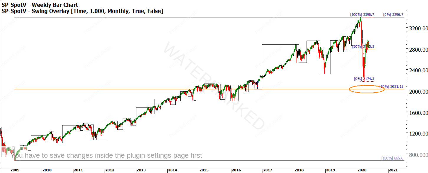
If we look at the SPI200, the weekly bar chart below is overlayed with a monthly swing chart. Then I add the retracement levels of the current range to understand, are we above or below the 50% level? There are no prizes for using the 50% level in your analysis, but it has served me so well over the years I am happy to rely on it and where possible keep it simple.
I have selected a handful of stock market indexes; your challenge is to complete a global list. Added to this I have looked at the Commodity Index Australian Dollar and Gold.
Chart 1 – Weekly Bar Chart SPI 200
As mentioned, the criteria for assessment is the monthly trend and where the current price action sits in relation to the 50% levels. The SPI is in an uncertain trend on the monthly chart and above the 50% level for the 2009 to 2020 range.
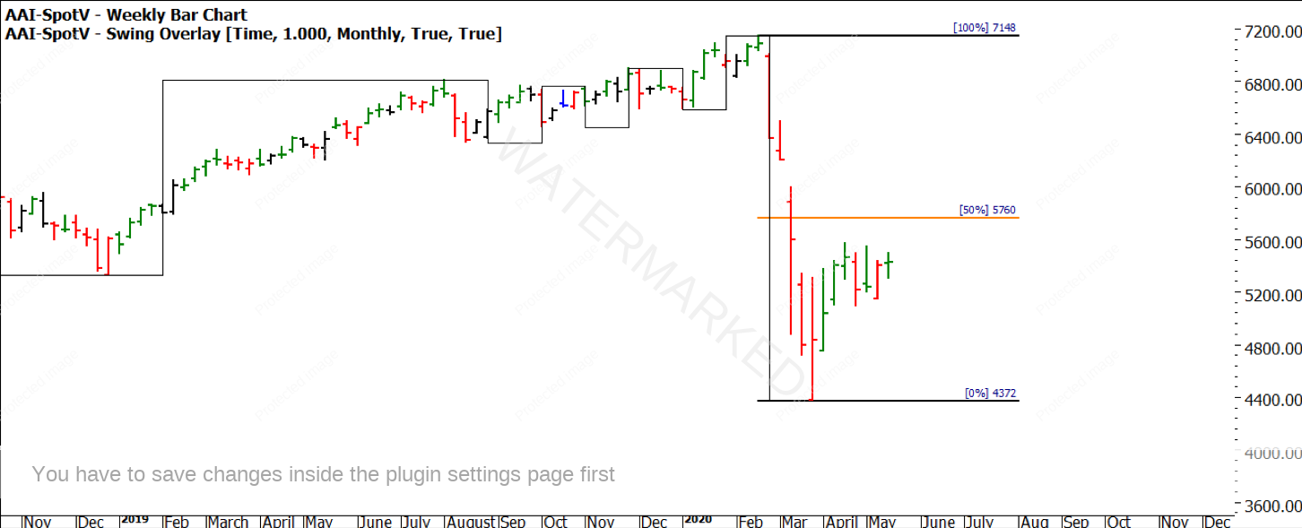
Chart 2 – Weekly Bar Chart SPI 200
When we zoom into the current bearish range, we see that the price action is holding below the smaller 50% level.
We can then contrast this with the S&P500 in Chart 3, again the monthly trend is uncertain, but the price action pulled up well short of the 50% level of the range of the last 10 years.
Chart 3 – Weekly Bar Chart S&P500
Chart 4 shows us the recent picture, again the price is holding above the 50% level. When I hear the news out of the US and read online articles out of the US this seems at odds with the noise that the media is generating.
Chart 4 – Weekly Bar Chart S&P500
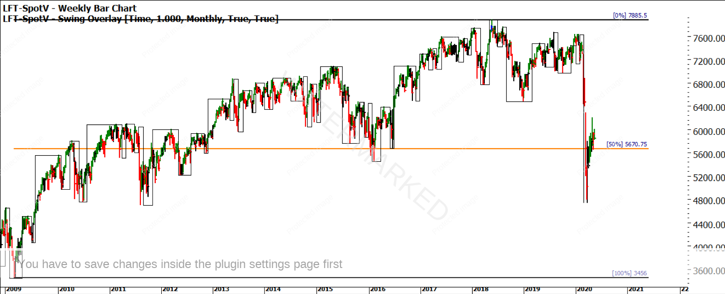
If we turn our attention to the old dart, we can ask the same questions about the UK index the FTSE 100. Again, the consistent theme of the trend on the monthly swing chart is higher tops and lower bottoms so an uncertain trend. The formation of the next monthly swings will be key to resolving the likely direction of markets. The key in this market for me will be the 50% level of 5670, can it hold?
Chart 5 – Weekly Bar Chart FTSE 100
Chart 6 aligns us with a similar picture of the SPI200 with the price action unable to break the 50% level of the small picture but holding above the bigger picture 50%.
Chart 6 – Weekly Bar Chart FTSE 100
Finally, on index markets, we can look to our largest trading partner China. I am using a proxy index for the Chinese market DJSH traded in the US. There is not a great deal of history so I have focused on the 2019 -2020 range and we can see again the 50% level holding for now and an uncertain monthly trend.
Chart 7 – Weekly Bar Chart DJ Shanghai Index
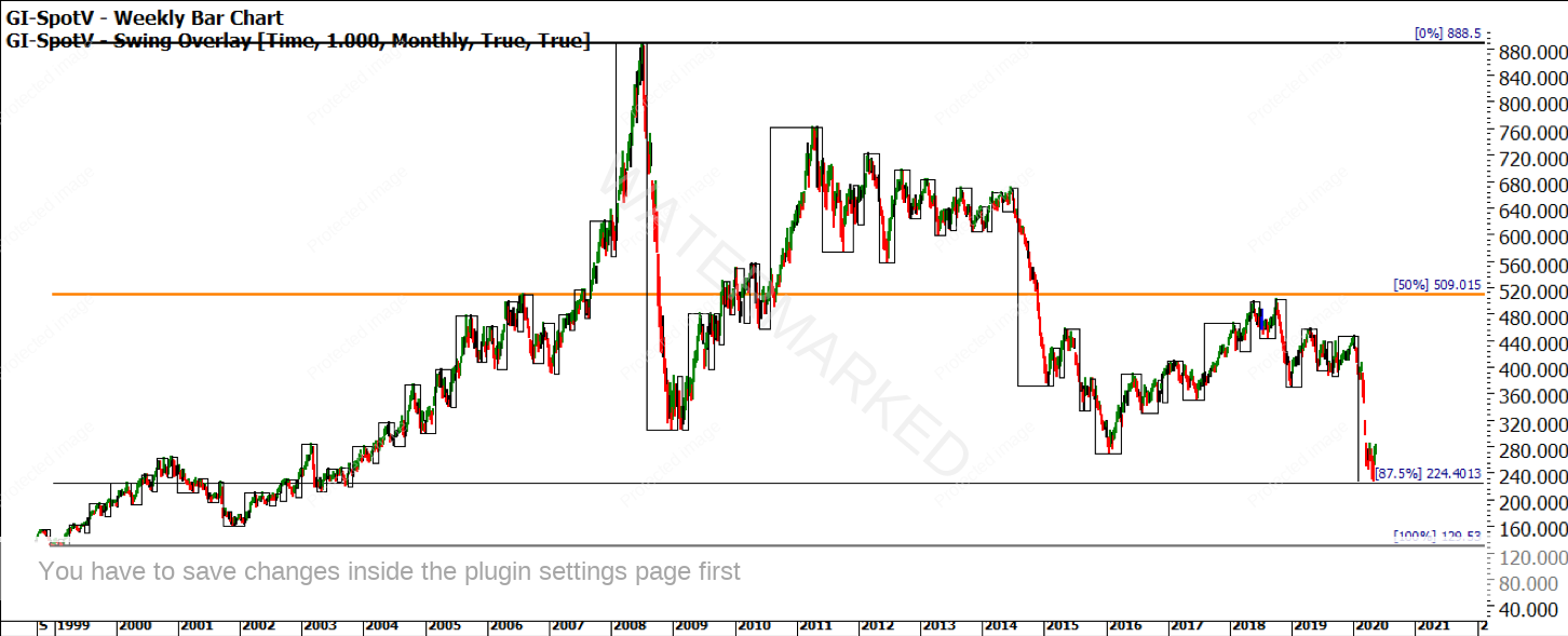
Chart 8 takes us to the world of commodities where we could say an overall bear market of over a decade has been in place. The monthly trend is uncertain; however, the 50% level is nowhere to be concerned in terms of support or resistance.
Chart 8 – Weekly Bar Chart Commodity Index
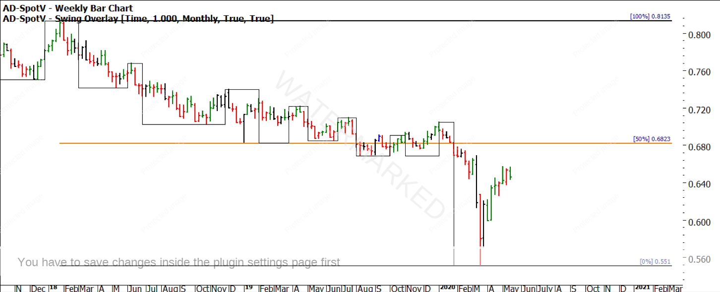
Chart 9 and 10 review our local currency and its price action, it’s no surprise given our currency is seen as a commodity play, that when commodities are lower so is the dollar. The trend is uncertain, and the 50% levels are both above the price action and will need to be overcome for any bull market of substance to unfold.
Chart 9 – Weekly Bar Chart Australian Dollar
Chart 10 – Weekly Bar Chart Australian Dollar
Chart 11 wraps us up with gold, this magic metal is many things to many people. In a case of a global pandemic like we are experiencing if gold was the so-called safe haven, could we reasonably expect it to have moved much higher in recent times? It is the only market that is in a confirmed-up trend on the monthly chart and sits well above its 50%, the next major resistance for gold will be its all-time high.
Chart 11 – Weekly Bar Chart Australian Dollar
This exercise will bring different outcomes to different traders, it’s not designed to find the trade of the year. If used in isolation its use would be limited at best. The way I use this exercise is to align my thoughts about markets, what is factual in terms of trends, what is the current position in the market in terms of major 50% levels. David prepares us on the value of the 50% milestone in the Smarter Starter Pack, it’s there for a number of good reasons.
Building an independent and viable trading plan is hard, it takes time to build and time to develop trust around it. I have long believed we have too much information in this day and age of social media and electronic consumption of news. We are fed so much our brains cannot avoid being stimulated one way or another and then our normal human workings take over. Have you become overwhelmed in recent times with the markets? If so, how can you pull the circuit breaker and reset your opinions?
A simple exercise like this can help align you to what markets are actually doing not what you are being told is happening. Opinions are important in trading but must be flexible as new information unfolds, hence having a structured process and plan means you can return to a neutral thought pattern when the process becomes overloaded.
I encourage you to undertake this exercise on a selection of markets that mean something to you. Write down your opinion of the market based on your current conscious bias and then perform the exercise and see if they align.
Good Trading
Aaron Lynch

