ABC Pressure Points Tool
Today, let’s practice applying an ABC Pressure Points Tool to your charts.
So here we are again, this time for Part Three! If you have both read and done the homework from my last two articles, you will be forming a better foundation for your ProfitSource skills. For those of you only just tuning in, the message of these articles is to re-create the charts we see in our Safety in the Market course materials. We do this with the ProfitSource charting tools, the aim of which is to gain experience using ProfitSource. This time we will do the exercise of re-creating a chart with the ABC Pressure Points tool.
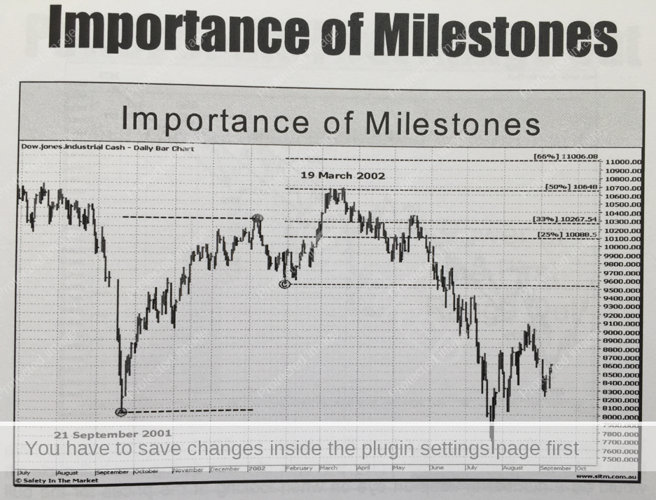
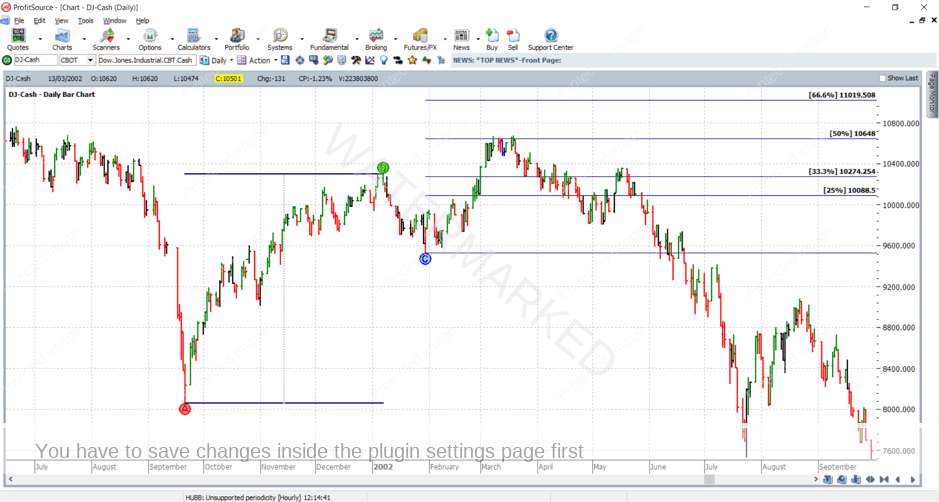
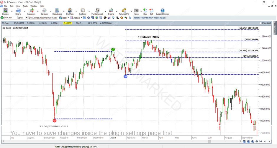
Below is an example of the ABC Pressure Points tool applied to a chart. It’s from an older Safety in the Market course manual which I got when attending a seminar as a student. It is applied to the Dow Jones cash chart (symbol DJ-Cash in ProfitSource).
Our goal yet again is to re-create the above chart in ProfitSource as closely as we can. Read this article one step at a time, following the instructions directly and applying them in your own ProfitSource installation. Start here:
- Open ProfitSource
- Charts -> New Price Chart -> Enter DJ-Cash and click OK
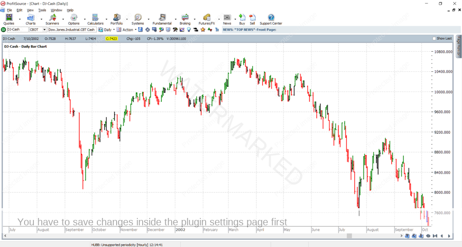
Now that you have the chart open, left click and drag it so that price data from roughly July 2001 to October 2002 comes into view. The F7 and F8 keys (or the arrow buttons in the bottom right-hand corner of the screen) can help adjust the time scale, and left clicking and dragging up and down on the right-hand side price axis will adjust the price scale. Now we are ready with a blank chart similar to the following:
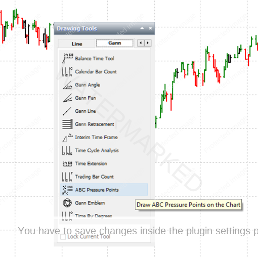
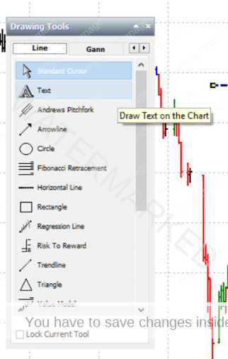
And now to apply the ABC Pressure Points tool to the chart. Click on the Drawing Tools icon to open the Drawing Tools box, then click on the Gann tab, and select the tool.
Now that you have selected the drawing tool, apply it to the chart as follows:
To apply Point A: hover the mouse over the September 2001 low, and apply with a left mouse click.
To apply Point B: hover the mouse over the January 2002 high, and apply with a left mouse click.
To apply Point C: hover the mouse over the (late) January 2002 low, and apply with a left mouse click.
If you have done everything correctly to this point, you should see something like the following:
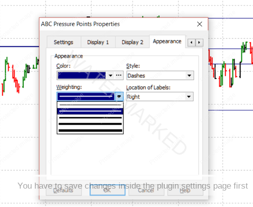
Now that the tool is on the chart, we’re almost done. Just a bit of fine tuning with its format, then a few labels, with the aim of reproducing the chart exactly as seen in the manual. Double click anywhere on the features of the tool to bring up its Properties box. Go to the Appearance tab. Change Weighting to a thicker style of line and set Style to Dashes.
Note: if your initial placements of the Points A, B and C fell on the incorrect days, you can go into the Properties box – Settings tab – and edit your dates. Prices will adjust automatically. Click OK.
Sometimes with this tool, it’s a good idea to “Lock” it into place (tick “Locked” in the Settings tab of the Properties box). Otherwise, if you later have an application of this tool to a chart where you wish to move the tool around – that is to your Point C – leave the tool unlocked.
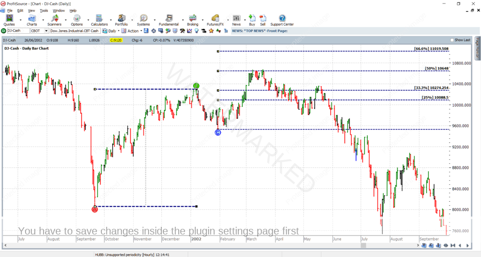
The final thing now is to add the labels. Go back to the Drawing Tools box and select the A Text tool.
Click on the chart below Point A, and of course, we type “21 September 2001”.
Repeat the process and add a label just above the 50% milestone, “19 March 2002”.
Font style, etc, is yours to play with. Finally, we should have a nice replica as per below…
As was the case in the last two articles you have homework. Take the following steps:
- Save your work in ProfitSource (click on the Disk icon in the toolbar above the chart page OR select Action -> Save Chart Page). This allows us to later re-open a chart should we need to.
- Send a screenshot to us at Trading Tutors
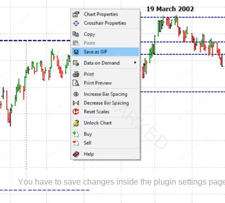
-> Right click on the chart and select Save As GIF. Save your GIF file in a known folder on your computer, then email it to us.