Triple Bottoms on the SPI200?
For a long time now, I’ve been focusing heavily on the Australian Dollar/US Dollar as I undertake research on some pretty deep levels! It’s easier to hone the research on one market than on many. However recently, I’ve also started keeping an eye on the SPI200 (API-Spotv in ProfitSource). In this article, I want to discuss a Double Bottom (and eventual Triple Bottom) setup that unfolded on the SPI200 over the last day or so. As I write this, the trade is still in its early days (or hours!) and time will tell how it unfolds. If you haven’t already done so, please read Gus’s article this month which walks you through the setup for the lows. Gus gives you the Price Forecast, although when you make a forecast like this, you are only calling the Price – you don’t know if it will be a Single, Double or Triple Bottom.
First, I will discuss a short trade I took while attempting to trade down into the bottoms. It is shown in Chart 1 below.
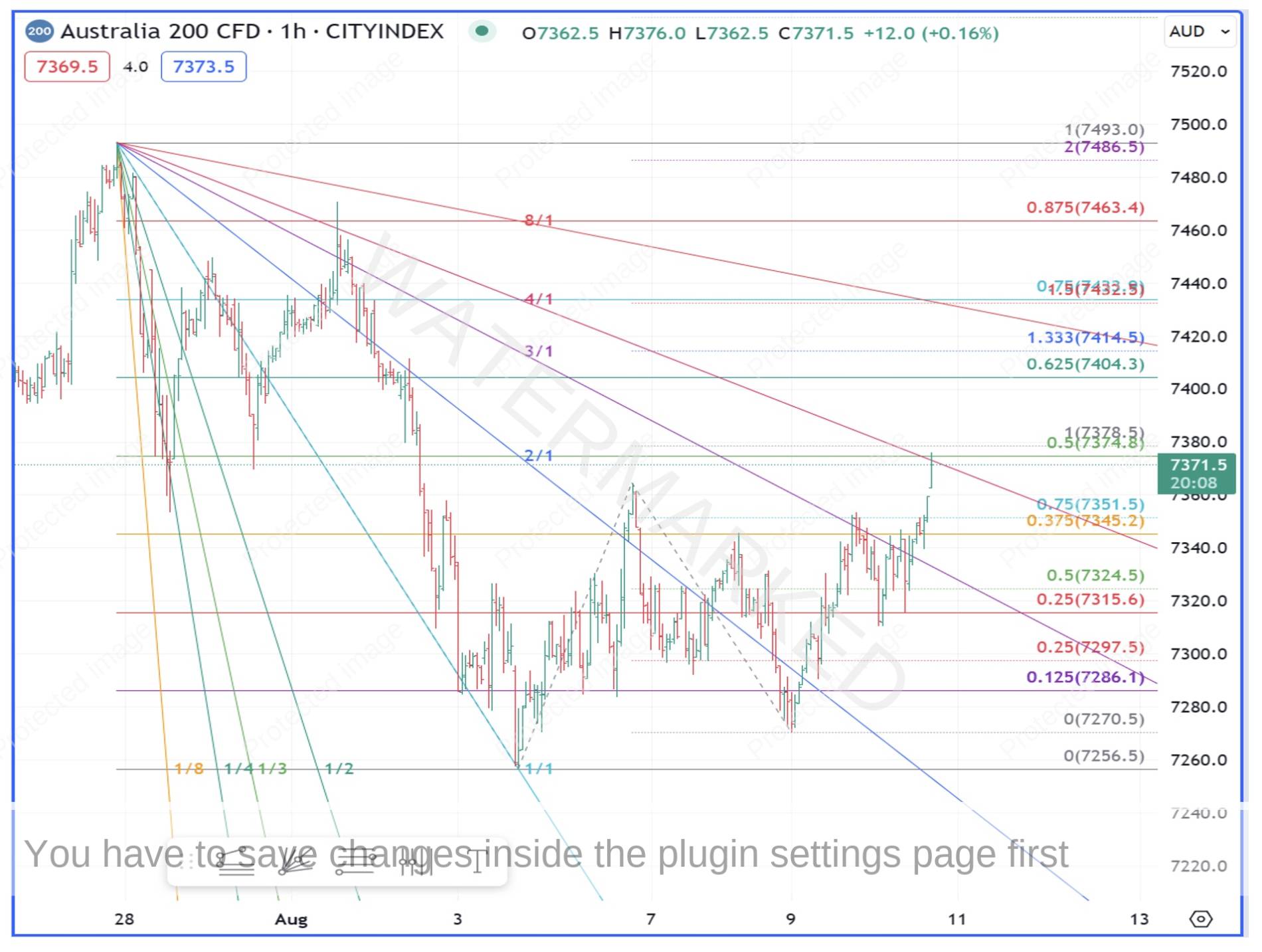
Chart 1 – SPI200 Setup
This is an hourly chart of the Australia 200 CFD using the TradingView Platform. The prices are slightly different to the actual SPI200 futures contract, but the underlying pattern is the same. Taking a look at the chart, the trade had quite a bit going for it. There was a 100% repeating range into a 50% retracement on a 1×4 Speed Angle of the First Range Out down. I took this short trade on Thursday night, 10 August and was stopped out on the same night.
This didn’t bother me too much, because a) the setup was a good one and b) I was expecting a low sometime this week. I was expecting a low because of the big picture Ranges shown in Chart 2 below. They show up more clearly on the Australia200 CFD chart on TradingView so I have used this chart.
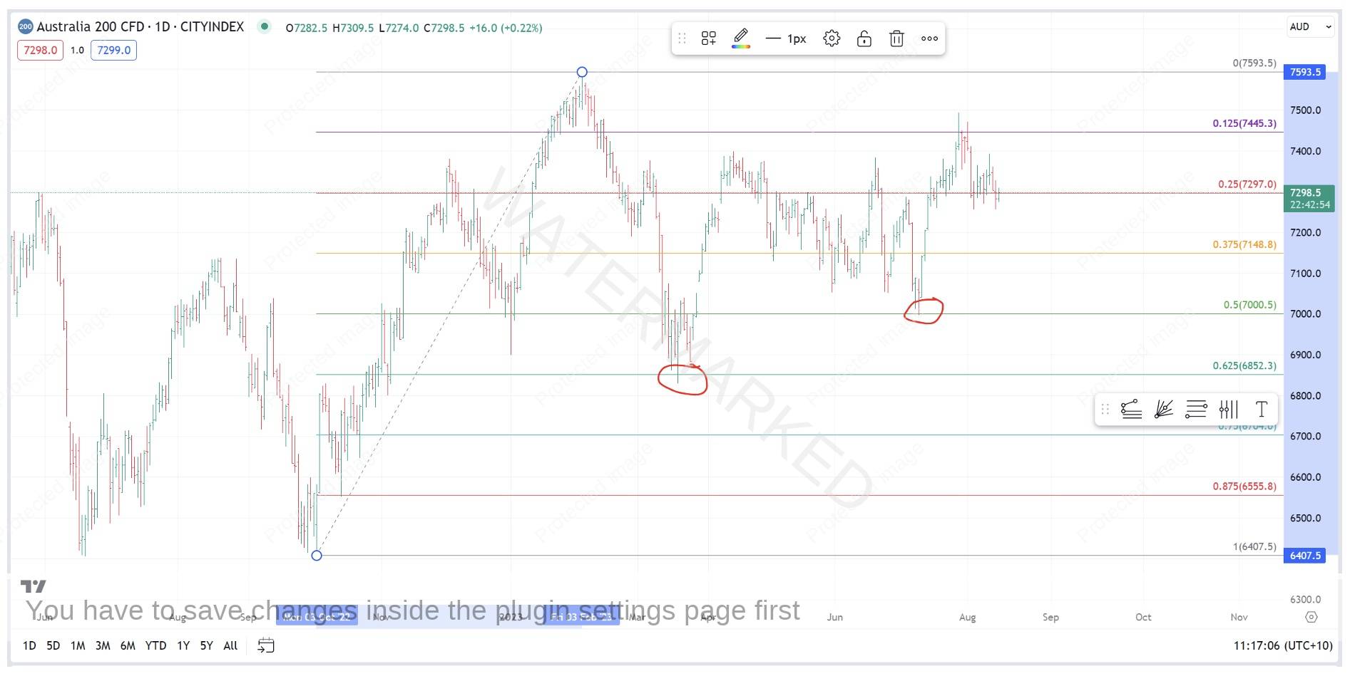
Chart 2 – SPI200 50% Retracement
After the February top this year, the SPI retraced 62.5% of the September to February range, then rallied, then fell back to make a low precisely on the 50% milestone on 10 July. From here, the SPI200 made an expanding weekly range up in to the 28 July high before retracing and ‘re-testing’ the 10 July low. This is shown in Chart 3 below.
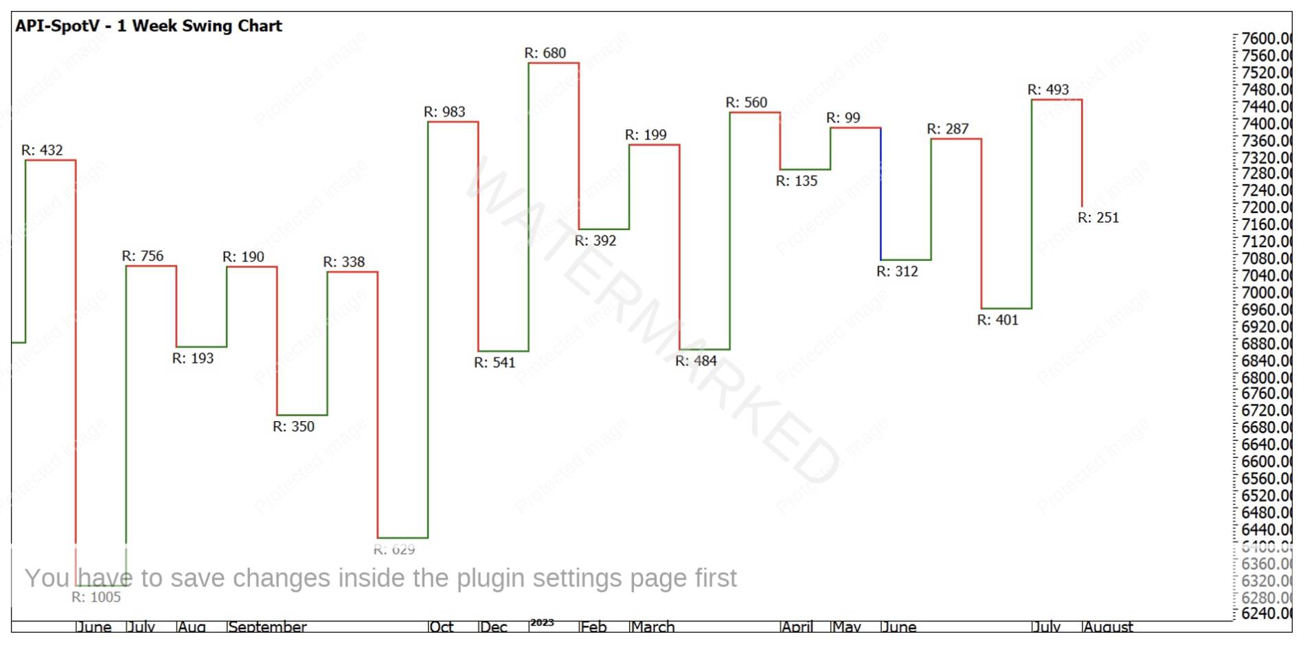
Chart 3 – SPI200 Weekly Swing Chart
Before moving on, it is important to pay attention to what is happening here. Firstly, we had a big 50% retracement at the 10 July low. Then, we had an expanding upswing on the weekly chart, which took out the last three weekly swing tops. From there, the market looked good – all it needed to do was put in a higher bottom.
When a market puts in the First Higher Bottom out of a strong pressure point, what it is really doing is ‘re-testing’ that low, trying to get back down there. When it fails, a higher bottom is formed, and the new trend to the upside resumes. So, what we are looking for is a sign that the push to the downside has failed. The failure of the short trade that I took was one sign that the down move was not strong. But what signs will the market give us that the re-test has completed? In the case of the SPI, there were quite a few signs! Let’s explore some of them.
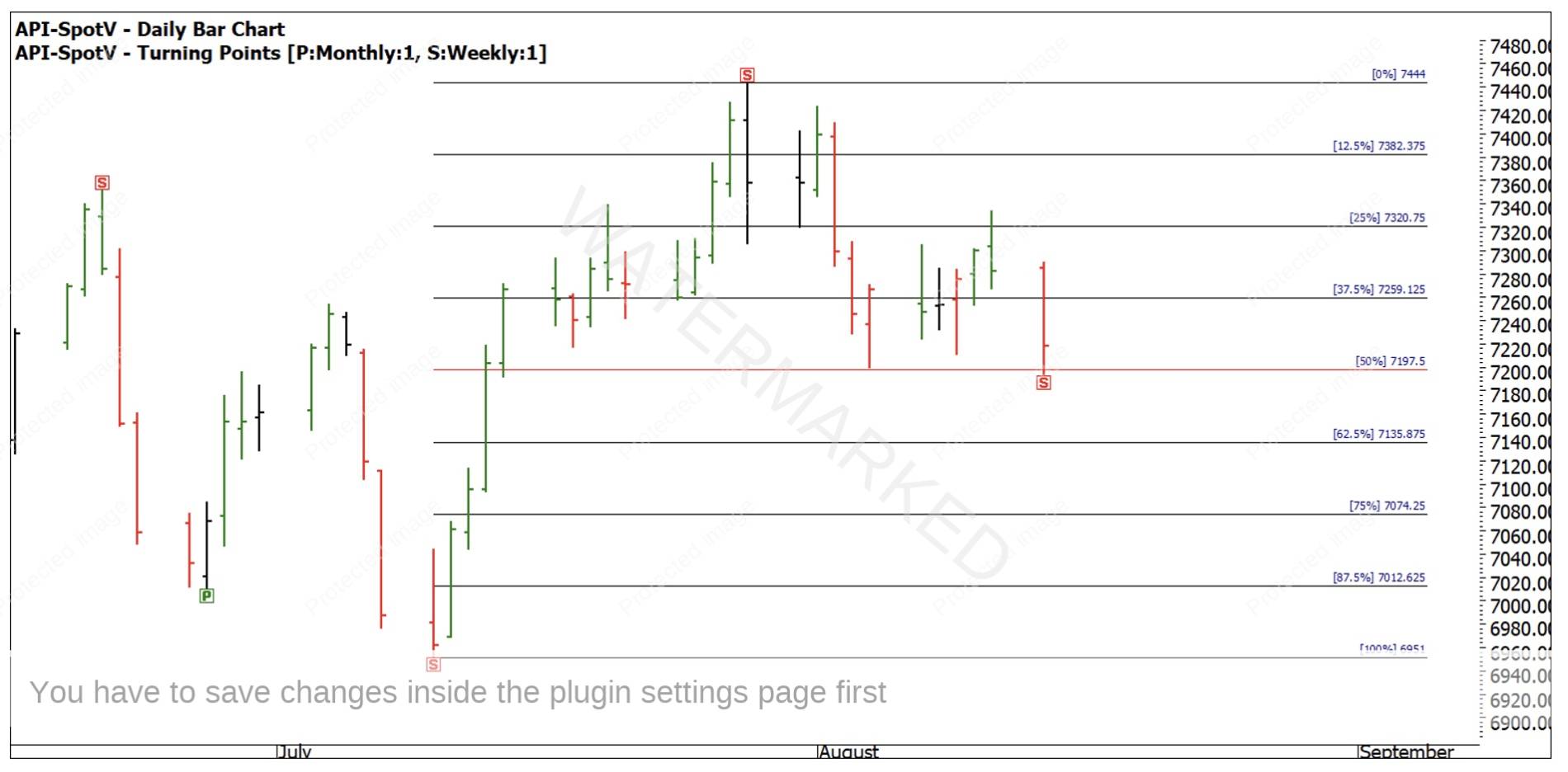
Chart 4 – Weekly 50% Retracement
In Chart 4 above, you can see that the Double Bottom (which was actually Triple Bottoms on the hourly chart) occurred right on the 50% retracement, and right on the Price Cluster indicated by Gus in his article. You might like to use the Time Extension Tool in ProfitSource or the Measure Tool in TradingView to count the days up and down here – 18 days up, 17 days down, a Balance of Time. So already, we have three good reasons for a trade – Double Bottoms on a 50% retracement on a Balance of Time.
In Chart 5 below, you can see that on the hourly chart, the 150% milestone of the First Range Out lined up with the lows. In addition to this, you can see in Chart 6 that there were in fact three equal ranges running into the Double Bottom. As we discussed during our Trading With Time program last Thursday night, market moves often run in three sections, so this was another key piece of confirmation for a trading setup. In this case, the First Range Out was 67 points, and the second and third sections were both 72 points. Technically, 5 points is a 7% difference, so you can argue they are not ‘equal’ but at the same time, 5 points is only a small amount of ‘slippage’ or ‘lost motion’ and I’m happy to call them equal. If you want to be pedantic, you can simply say it was three sections, and sections two and three were equal!
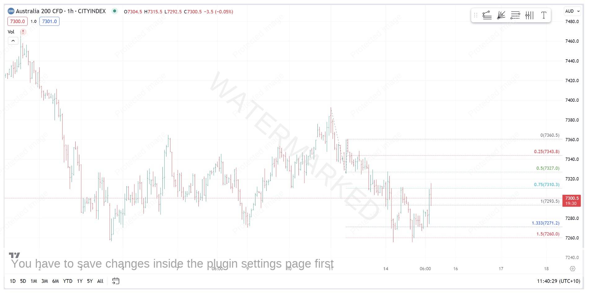
Chart 5 – 150% of the Hourly First Range Out
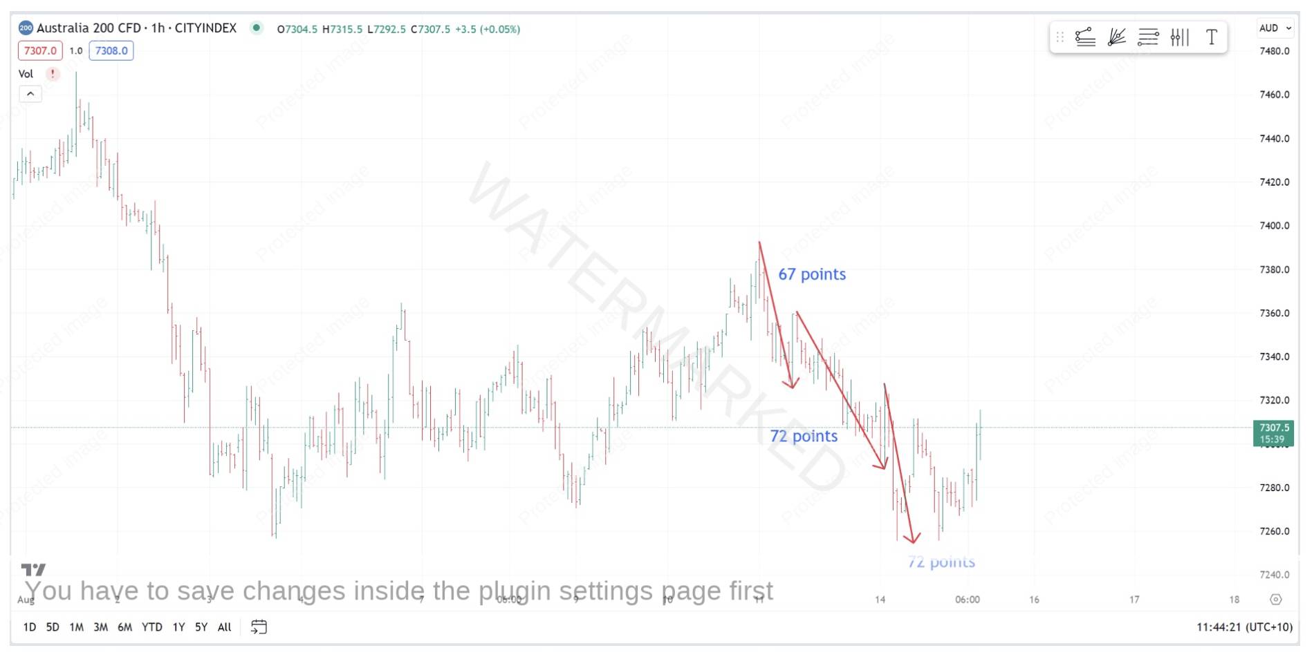
Chart 6 – Three Equal Sections
At this point, you have enough evidence to support taking a trade, and it will either be profitable or it won’t. Your analysis is finished – it’s time to put on your trading cap. There are only three main ways that you will enter a trade:
- At an exact price point
- As the swing chart turns
- On a confirmed higher bottom or lower top on a swing chart time frame.
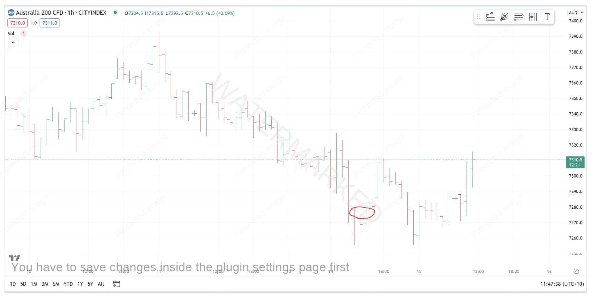
In Chart 7 below, you can see that a simple entry as the swing chart turned up on the hourly chart could have been taken a little over an hour after the low had come in. The market did come down and make a Triple Bottom overnight, so if you missed the initial trade (or got stopped out) you had two more entry opportunities: enter as the hourly swing chart turns up, or entry on the next higher bottom out of the Triple Bottoms.
A lot of thought has gone into the two articles this month on the SPI200, firstly to get you looking in the right areas for your clusters, and secondly to help you Form Read and trade the market around these pressure areas. Regardless of how this trade unfolds, I would strongly encourage you to take the time to recreate each chart in this month’s newsletter, and to spend some time thinking about how you might use the same techniques in your own market analysis.
Be Prepared!
Mat