What are the Markets Telling Us?
By looking at the stock indexes, we can often see what’s really happening…
End of financial year is just around the corner and a general malaise around the economy and markets seems to be spreading like a fog. Now that we are post the Australian Federal Elections there are some signs of new vigour re-entering the business landscapes when speaking to my contacts in a variety of business sectors. There is always a lag between the actions people undertake and the metrics that report on them. They are always rear vision mirror focused, that is why we can use particular stock market indexes as a forward-thinking instrument.
Big changes to equity markets are always felt when interest rates change, in Australia, we saw the RBA cut rates to new record lows and this, in turn, means those chasing a return may need to look outside cash and into markets like shares and property. I will leave property alone as it’s outside my rudimentary knowledge to comment but when it comes to stocks and indexes, we can see that recent price action is bullish and trends are predominately up across multiple regions.
Let’s start out with the SPI 200. In Chart 1 we can see how we are still trading below our high in 2008 while most global indexes have pushed higher than their GFC highs. There is a case to be made that if dividends were included, then we would have breached the 2008 high of 6880. We are trading around the 6600 level and I have also included the first range out pressure point of 150% that looms as a hurdle for this market to overcome.
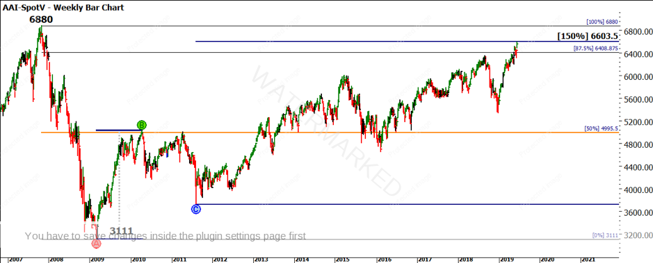
Chart 1 – SPI 200 Weekly Bar Chart
If we were to view this market as a proxy for the short to medium term, then the economy may start to show stronger numbers in the second half of the year.
The even bigger change of thought has been by the Federal Reserve in the US that has gone from a bias of raising rates to the potential for cuts. Again this reads differently to the economic results, with low unemployment numbers in the US suggesting a stronger economy than many think. I do make the point with a wry smile that economic data can be seen many ways, by many people and the integrity of the underlying data may not always satisfy the enquiring mind. Again, stick with the price action, at least we can know that it’s real and reflects the opinion of the market participants at the given time.
The US S&P 500 is also placed at an interesting junction, it has recently made 2 tops in September of 2018 and May of 2019. If this level of 2960.8 can be broken we may see further upside, although we cannot discount the fact that there has been no real significant pullback since the lows in 2009. Chart 2 shows a lows resistance card placed at the lows; we have travelled over 400% of that low in price and now sit at the major diagonal of the lows square.
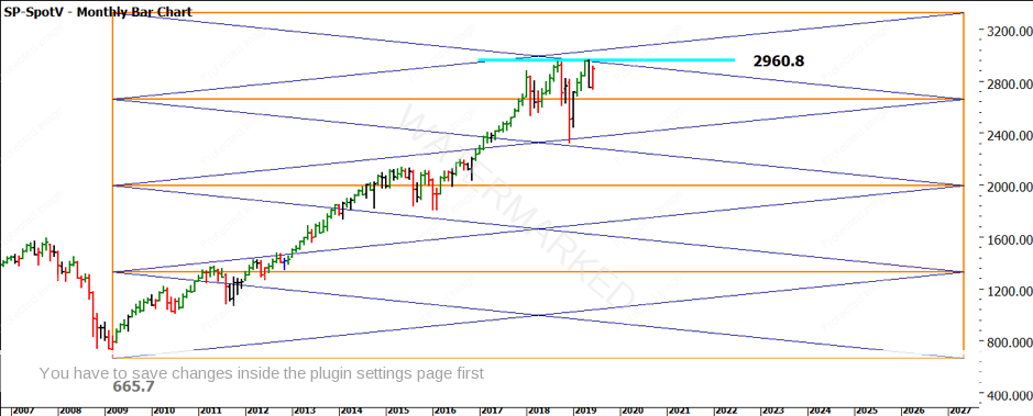
Chart 2 – SPI 200 Monthly Bar Chart
That chart also shows previous resistance approximately 3 times around the general area. Those who have studied Gann’s rule on this will note that he mentions prices breaking support or resistance on the fourth attempt, this is another confirmation technique I am watching for as a guide to the rest of the year.
The market that most would say reflects the weakest prospects would be the UK FTSE 100 given the turmoil of Brexit, change of PM and the continuing saga of no clear path to exiting Europe. This could see a FTSE with negative trends and falling price action if the sentiment on today was the price. The price action has held up quite robustly and has broken recent long-term resistance and the most recent pullback into the 50% level was met with a strong rebound in price as we see in Chart 3.
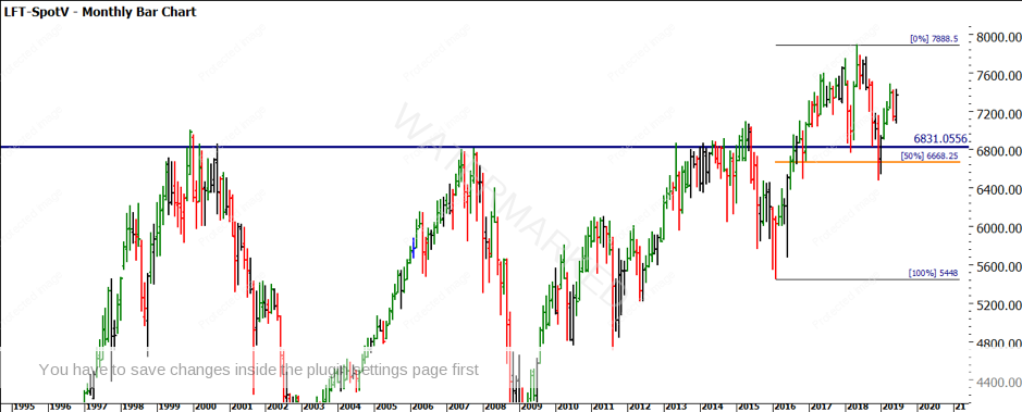
Chart 3 – FTSE 100 Monthly Bar Chart
We could continue around the European markets, with the exception of Germany that has been under pressure in 2018 and is recovering, the French and Swiss index markets confirm the overall upward bias on prices and show at least neutral outlooks on interest rates.
The main driver for many looking at the next 12 months may be the trade war with the USA and China and the often quieter but ever-present achiever India.
The Chinese market has still much to do to be a modern and mature financial market in terms of the indexes but still holds a lot of value in terms of analysis. In Chart 4 we see the DJSH producing a strong run in 2019 followed by a 50% pullback. There are some interesting time elements as well when you compare the time frames from A to B and B to C. Combined with the June seasonal date in the near future, this market could well provide some confirmation in the near term, especially if price can hold above the 400 point even number level.
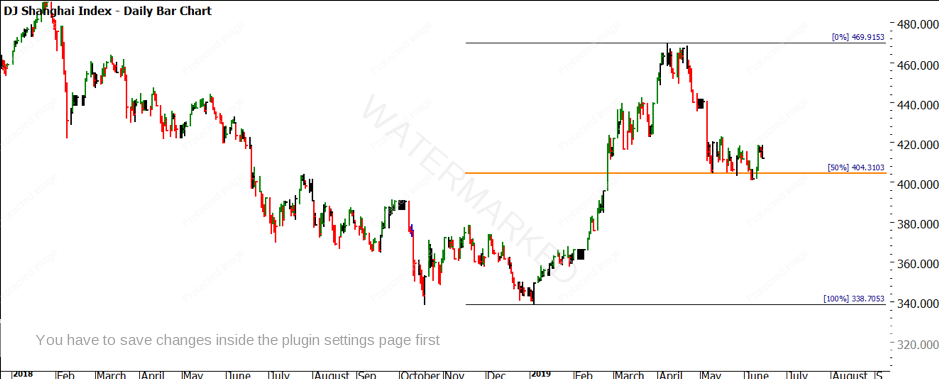
Chart 4 – DJSH Daily Bar Chart
Finally, we look to the Nifty, Indian market index. In line with the US growth story and the index increasing by 4 times since the 2009 lows. The Nifty can lay claim to a similar trajectory. Chart 5 shows a lows resistance card positioned on the 2009 low of 2228 points. This combined with the record highs this market is trading shows how the majority of the world’s indexes in standard and emerging markets are showing strength, however the next short-term window of time will be pivotal.
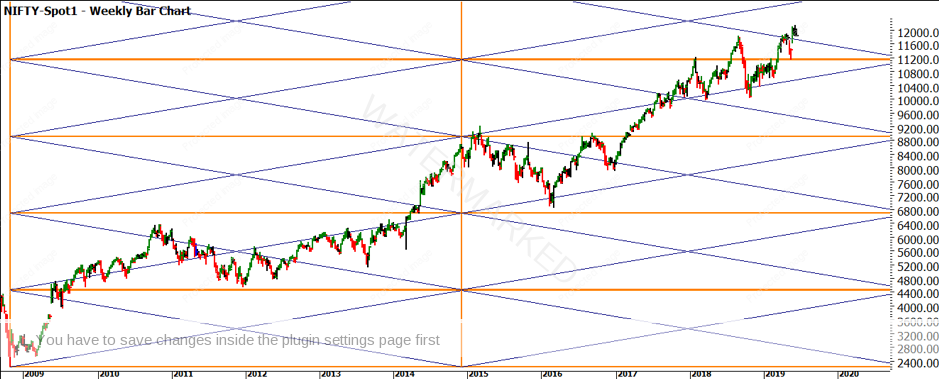
Chart 5 – Nifty Weekly Bar Chart
Those investors who sold in May and went away based on the old market adage may have missed out on some decent returns. There is now and always has been, many market themes and information about why they will go up and down, and this is some more to add to the mix. In the end, if you have put in the work to allow the charts to show you what is there, it does allow you to build a more confident picture.
As we close this financial year, it’s a perfect time to reflect on what financial outcome you have achieved? If it’s not in line with the goals you have laid down, what is going to change for you to achieve that outcome? More often than not, if we want different results, we need to focus on improving the right things. What have you done to improve yourself in the last 12 months and your trading?
Good Trading,
Aaron Lynch