In starting, I would like to comment that David’s ABC trades were a beginner’s trading method, and hence why they are taught in the first book of the Safety in the Market educational series, the Smarter Starter Pack. I want to take this article a step further and skip over the Smarter Starter Pack and dive into the Number One Trading Plan.
Before we get into the chart theory, let me share one of my favourite trading quotes with you from a Market Wizard Bruce Kovner. He said;
“One of the jobs of a good trader is to imagine alternative scenarios. I try to form many different mental pictures of what the world should be like and wait for one of them to be confirmed. You keep trying them on one at a time. Inevitably, most of these pictures will turn out to be wrong — that is, only a few elements of the picture may prove correct. But then, all of a sudden, you will find that in one picture, nine out of ten elements click. That scenario then becomes your image of the world’s reality.”
This is an important concept to always keep in the front of your mind as there are going to be many trading opportunities that fit your trading elements but will still leave you wondering ‘is this going to be profitable?’ or ‘should I be taking this trade?’
One particular set up that continually ‘clicks’ for me is Double Tops and Double Bottoms, especially when they are on a major 50% level. I could scroll markets upon markets to find this setup, as it seems to always offer a tradable opportunity – regardless of which direction the market decides to go.
After scrolling a number of markets within ProfitSource, it wasn’t long before I found the specialised setup. The market I found was a currency pair. The Australian Dollar (AD) paired against the Japanese Yen (JY). In ProfitSource the code is FXADJY. The FX stands for foreign exchange, followed by AD – Australian Dollar and JY – Japanese Yen.
As you can see in the chart below the market has fallen relatively heavy into a double bottom set up. This was identified by purely eyeballing the chart from the major trend – the weekly chart. I can’t say there are many rules around ‘eyeballing’ a chart – it may come with experience, however, what it does take is the discipline to have your objective in place and be able to scroll through multiple charts looking for a particular set up.
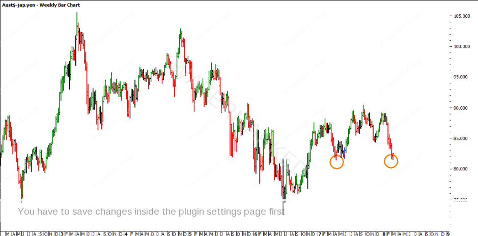
Chart 1 – Australian Dollar – Japanese Yen Weekly Chart
If we start to apply the price forecasting tools – which can be found in Section 11: Price Forecasting of the Number One Trading Plan, you can apply a Ranges Resistance Card from the June 2016 low at 72.45 to the September 2017 high at 90.39. This gives us a range of 17.94. If we divide this range by two (17.94/2) we get 8.97. Next step is to add it to the low at 72.45 (8.97 + 72.45) and we get a 50% level target at 81.42. As you can see from the chart below, the double bottom sits neatly on 81.42. At this point, this doesn’t mean anything more than we have a double bottom on a 50% level. We need to analyse further.
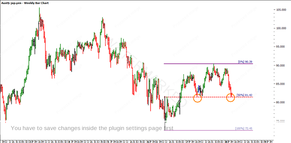
Chart 2 – Australian Dollar – Japanese Yen Weekly Chart
The real value is pulling apart the set up further to identify whether there is an opportunity to trade. If we step back and start looking at the bigger picture, by taking the range from the 2007 top at 107.87 to the 2008 low at 55.08, we get a range of 52.79. If we divide this range by two (52.79/2) we get 26.39. Like before, if we add it to the low at 55.08 (26.39 + 55.08), we get a 50% level target at 81.47. We now have a price cluster at 81.40.
Try finding some additional price resistance points using the techniques in Section 11 of your Number One Trading Plan. There are a few more, such as the lows Resistance Card from the 2008 low at 55.08.
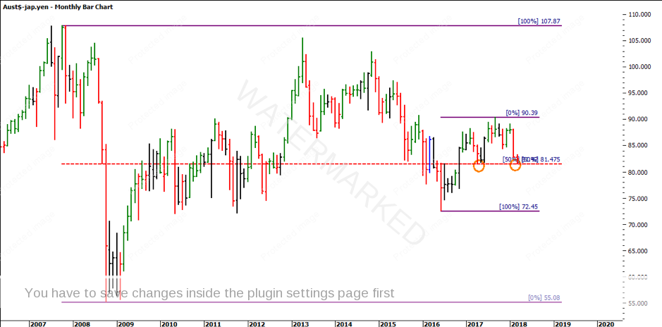
Chart 3 – Australian Dollar – Japanese Yen Monthly Bar Chart
So, while we have uncovered the Double Bottom set up on a 50% price clustered level, the real question is how are you going to trade the setup? From my experience, there is always an opportunity within Double Tops and Bottoms. In this case, there might be an opportunity to go long depending on how you trade it but there is also an opportunity to go short given the market breaks down and breaks the strong resistance level at 81.40.
Something to keep an eye out for is the number of days it projects up. From the most recent down move from January 2018, the market has only ever been able to retrace one day, so when you start to see the market retracing two days, the time may prove ripe.
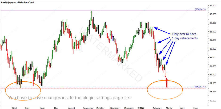
Chart 4 – Australian Dollar – Japanese Yen Daily Bar Chart
In closing, just remember Bruce Kovner’s suggested that “only a few elements of the picture may prove correct…” this is where we start to find out whether this opportunity is worth trading. If you take it a step further, Bruce goes on to say “you will find that in one picture, nine out of ten elements click” and this is where I like to see a high probability trade evolve from. This double bottom will likely move away, whether that be up or down.
It’s Your Perception
Robert Steer