At times like this, I am reminded of the words of Gann who of course quoted other great texts with the notion of a time to reap and a time to sow and the good news is nothing has really changed, at least to me in terms of that philosophy. The seasons of a market is very much alive, and we have just passed the September Equinox. A new season is upon us per se in many markets and with that, I want to review the current position on crude oil. It’s been quite some time since I have written about this crucial commodity and it’s interesting how it ebbs and flows in the public conscious. It’s not that long ago all the headlines in the financial media were about the movements in its price. Then suddenly it was replaced by another talking point of another market, more proof to me that there are seasons to all things.
Chart 1 shows the last 7 years on oil and the major sections or movements that have unfolded. There is more to be analysed going back to the all-time high in 2008 for those looking to broaden their understanding of this market but for now, we can focus on the four colour coded areas.
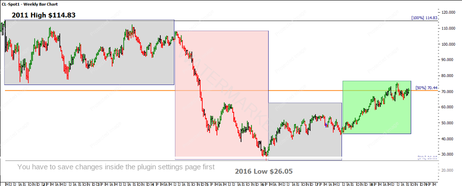
Chart 1 – Weekly Bar Chart CL-Spot1
Moving from the high at $114.83 in 2011 we see an extended sideways period that produced some good tradeable ranges. This followed a strong sell-off into the low in 2016. Since then we have seen the beginnings of a new bull market that started slowly and really took off in the green area from June 2017.
All these areas represent a movement in price and time and should be studied as they will show you some interesting patterns of history repeating not always in a pure 100% sense, so you should look to see what expansions (150%,200%) etc have occurred as well as contractions (50%,75%).
The interesting area of the 50% retracement level (Ranges Resistance Card) tags $70.44 as an area to watch for Support and Resistance. The recent price action has found support but mainly resistance around this level.
In Chart 2 I want to introduce another price level, when we add another Ranges Resistance Card from the all-time high in 2008 to the low in 2016, we see the 50% level again dominating the current picture. That level, $73.64, has acted as some upside resistance to the current move.
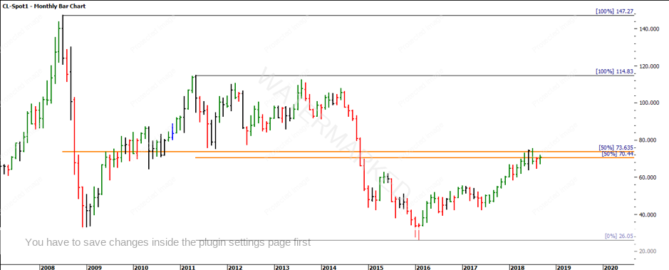
Chart 2 – Monthly Bar Chart CL-Spot1
Whilst these two price levels are important, they are not what we would normally suggest is a tight cluster and expect them to act in unison as the prices are 3% or more away from each other. In cases like this, we can follow David’s lessons where he would average prices and also times to combine two pressure points into a general area to watch for market activity.
Chart 3 for me represents the most interesting element of these two prices. When we average the two 50% levels from two vastly different ranges we can see the price difference between the two is $3.20. Taking 50% of that prime number we come up with $1.60 a familiar number to those who have done some work with me on oil over the years.
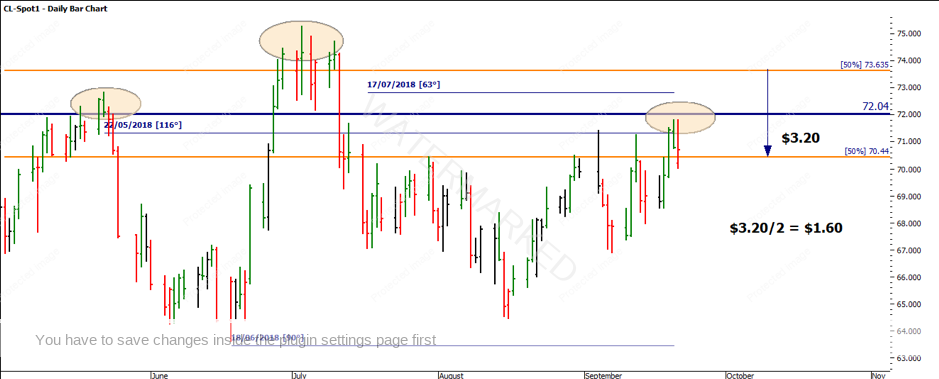
Chart 3 – Daily Bar Chart CL-Spot1
When we zoom into the daily chart I have added the blue line that is halfway between the two major areas noted in orange. There is a loose head and shoulders pattern potentially forming there for those that like to use other patterns in their analysis. I am interested to see how the market develops from here as the last price action closed above the $70.44 level, a decline from here could be an area to watch for lower tops and bottoms.
Now that we have some context for the current picture we can return to some of the seasonal timings that both Gann and David relied so heavily upon. The current area of September aligns with the seasonal time studies that we rely so heavily on. The most recent low on 18 June was dropping some hints that September could be the next area to ponder.
If we now stretch the picture back to a larger scale I have added some other important time data. The notion of history repeating should be one you are comfortable with, I have balanced time from the 2013 high to the 2016 low and extended the time count forward. This suggested we watch around the late July, early August for that cycle to complete. The price action had topped on 3 July (again close to seasonal time).
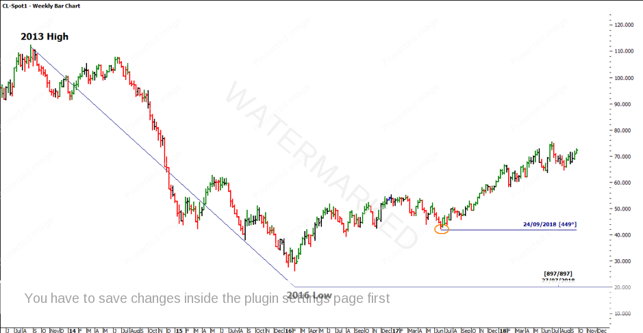
Chart 4 – Weekly Bar Chart CL-Spot1
As we are using multiple reference points to obtain a cluster you would have also been watching for the starting point of the green section in Chart 1 for an anchor point. That date is 21 June 2017 so we have now run 1.5 years into September 2018.
There are many concepts to focus on here, and they are not easily applied if you are new to this market or techniques. The notion that we have seasons in markets is important to prove to yourself through research, once you have established and proven the concept to yourself you will likely start to identify these seasons easier each time. Eventually, as David said your hindsight will become foresight if used often enough.
Good Trading
Aaron Lynch