
Chart 1 – A Blank Chart of the Australian Dollar for You to Work On!
So, how did you go? Were you able to call some of the major lows? The technique that I was directing you to is from Chapter 5 – Squaring Time and Price. It is described in the heading of page 159 – ‘Drawing a 1×1 Gann Angle’. David says that ‘when Time equals Price, you can expect a change in trend’. A 1×1 Angle (or line) is the very definition of Squaring Time and Price – that is, Time and Price are equal at any point on that line.
For Time to be equal to Price, you need to treat them as the same thing. A price range of 100 points would square out in 100 days on a 1×1 angle. That’s pretty straightforward, but here is where Squaring Time and Price can get very difficult, very quickly. Once you start considering that you can run lines such as a 1×2, 1×4, and 1×8, or 2×1, 4×1, and 8×1, and that you can run these lines in both Calendar Days and Trading Days, and that you can adjust point sizes by shifting decimal places around, you can very quickly end up with too many lines on your chart. Just using the basic settings, I have mentioned here, you could end up with 24 lines on your chart!
Let’s look at another quote from David:
The biggest mistake I see novice Gann traders making is having literally hundreds of lines drawn on their charts. The market must turn on one of their lines, but the hard part is deciding which line before or during the event. Myriads of lines only cause confusion.
Does David’s quote sound familiar? I know I’ve certainly been guilty of having too many lines on my chart at times. In fact, when I first started studying my Ultimate Gann Course as a student, I thought that if I put as many angles on my chart as possible, I’d be able to call every turn! Well, I was partially right…every turn that occurred happened on one of my angles, however I was rarely able to trade it, because I was so confused by all of the other lines!
One solution to this problem is to keep things very simple. And by very simple, I mean to start out with just the one line. This is similar to Price Forecasting – if you find yourself with too many lines on the chart, take off some of the less important lines, until you reach a stage where you can interpret the data comfortably, without being overwhelmed. Sure, you might miss some of the minor turns, but if you focus on the major lines, you’ll get the major turns. Which lines or angles are more important when we are Squaring Time and Price? The 2×1, 1×1 and 1×2. And out of those three lines, it is the 1×1 that is the most important, so that’s a great place to start.
If you haven’t already done so, go into ProfitSource, open up a chart of FXADUS, and find the 15 January, 2016 low at 6824 points. Then, apply either the Gann Fan or Gann Line tool to that low, focusing on just the 1×1 angles. It’s that simple. In the next two charts, I’ll show you the results, starting with Chart 2, below.
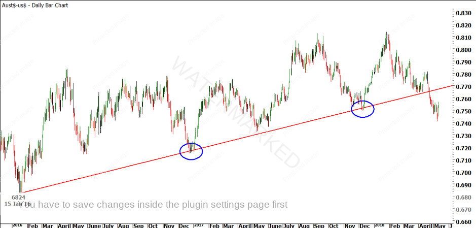
Chart 2 – A 1×1 Calendar Day Line on the Australian Dollar
See how a nice, simple 1×1 line (or angle) called the December, 2016 and December, 2017 lows? There are plenty of other techniques that called these lows, but Squaring Time and Price was always there. You can try it for all of the other lows, too!
But, you might be asking, what about the current market? The Australian Dollar has dropped below the 1×1 line. What should I do now? Well, you have two options, both equally valid. The first is to add a 1×2 line, especially now that you know the 1×1 line has worked well. The other alternative is to look at your Trading Day angles. Let’s start by adding more lines on Calendar Days first.

Chart 3 – A Gann Fan on the Australian Dollar
The green 2×1 line in Chart 3 went close to calling the September, 2017 high, but wasn’t all that useful otherwise. However, since the 1×1 line has been so instrumental in calling major lows, it would make sense to watch the blue 1×2 line, should the Australian Dollar continue to fall. But hang on, what if the Australian Dollar doesn’t continue to fall? What if the current, 9 May, 2018 low is the yearly low? It hasn’t fallen on an angle, so what does that mean? Well, for a start, it means you should take a look at a Trading Day chart, to see if that offers any clues.
I often see students sticking to either a Calendar Day or Trading Day line, but not trying both of them. To me, that’s a mistake. Thankfully, it’s a mistake that can be rectified with a single click of a mouse button! During more than a decade of researching markets and studying the techniques of David Bowden and WD Gann, I have seen that markets sometimes work in Calendar Days and sometimes work in Trading Days. I like to draw my charts in Calendar Days, but I always run angles in both Calendar Days and Trading Days. In ProfitSource, this is very easy to do – you simply click on either the “T” or “C” buttons at the bottom right of your screen, to switch your chart display to either Trading Days (T) or Calendar Days (C). Let’s try that on the Australian Dollar in Chart 4.
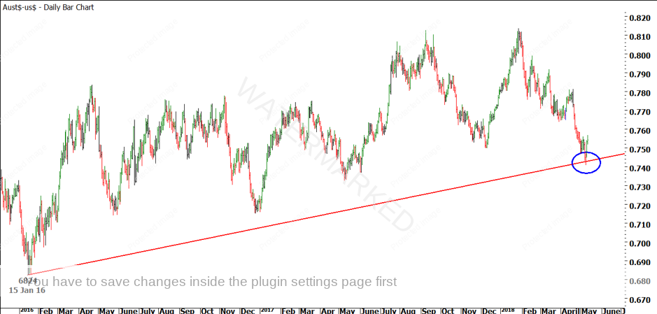
Chart 4 – A 1×1 Trading Day Line on the Australian Dollar
As you can see in Chart 4, the current low on the Australian Dollar lines up on a 1×1 Trading Day line from the 15 January, 2016 low. Now, this is not enough to just go running out and buy the low. Far from it! However, this is a good time to remember another of David’s quotes:
Squaring Time and Price is not a stand-alone indicator. It is not a mechanical system. It is, nevertheless, a brilliant backup for the trader who uses price ranges, time frames and Time by Degrees in his or her decision making. If you are at that stage in your trading, you have accomplished 90 per cent of the Squaring Time and Price lesson.
This brings us to the content of my video for this month. We’re going to take a closer look at the Classic Gann Setup that appeared on the Australian Dollar on 9 May, 2018. Sure, the Aussie Dollar bounced off the 1×1 Trading Day line. But what else was happening around the time? You might like to take a look for yourself to see what you can find, before heading over and watching this month’s video.
All the best!
Mathew Barnes