The Angle Indicator
To revisit the discussion from my last article The Volume Indicator, I explore how volume was used in combination with Price Forecasting to help determine the strength of the March low on the SPI200.
To recap some Price Forecasting,
- 100% of the last monthly swing range down = 8450
- 50% of the last daily swing range down into 30 March = 8452
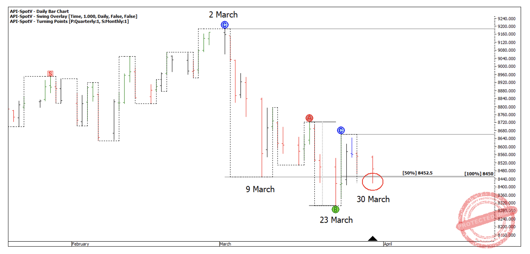
Chart 1
If we look at the daily swing ranges, at the time, the swing range up of 356 points is expanding and larger than the previous range of 214 points and the swing range down of 242 points is contracting and much smaller than the three previous swings down.
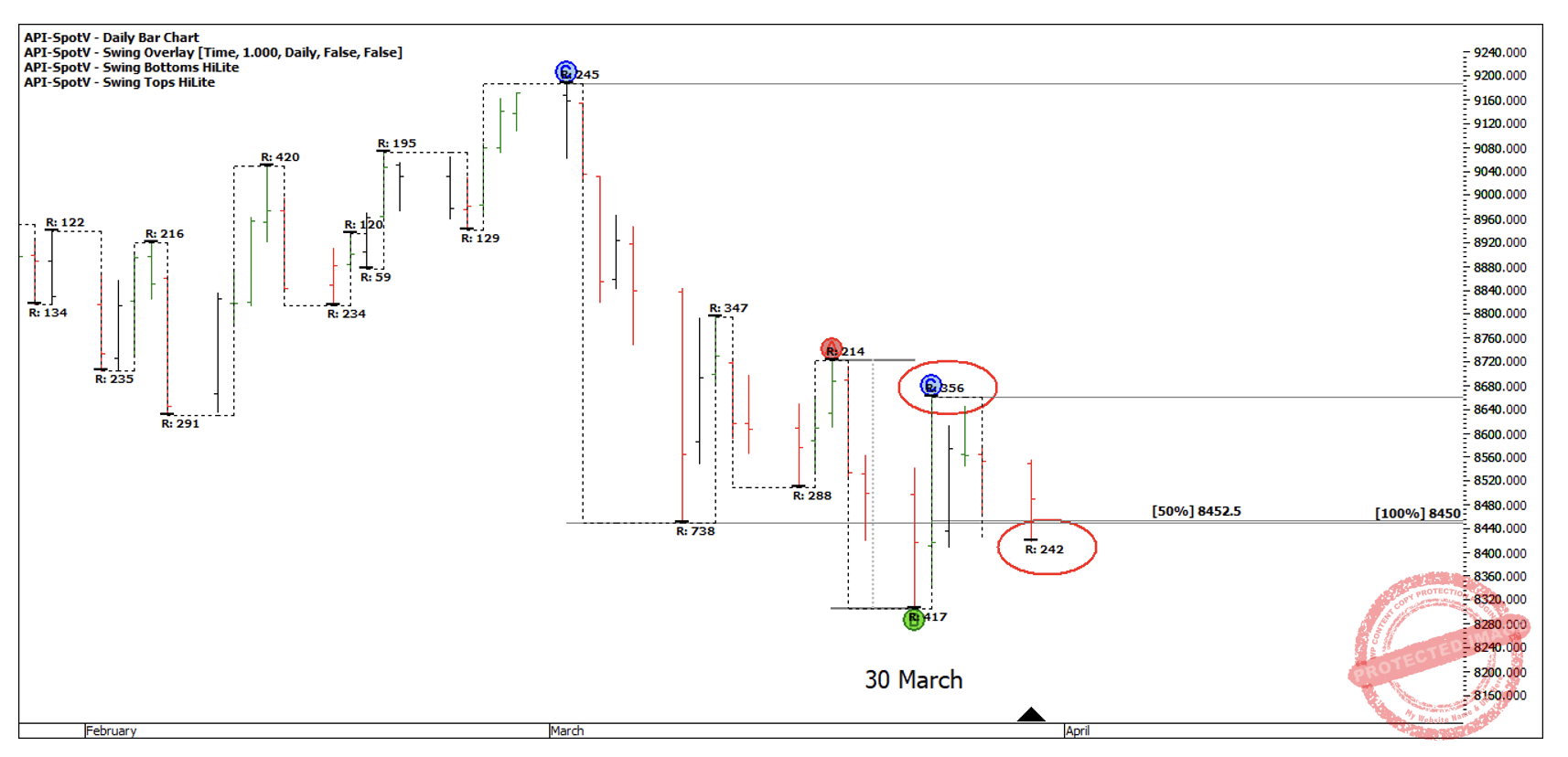
Chart 2
Then by looking at the volume of contracts traded around late March / early April, we can see increased volume showing a lot of buying was present.
When you go through the Smarter Starter Pack, David has you writing down ‘Estimated Point C’ for your ABC trades, and you may have thought it was a waste of time! I know I didn’t fully grasp what David was trying to teach us here, which was rating the strength of a market!
If the market was doing less than 50% retracements, it was strong. If the market was doing greater than 50% retracements, the market was weaker. This was our first lesson from David on rating strength and weakness in a market.
Then he showed us how using Volume was an indicator of strength or weakness. In this month’s article I’m going to add another layer with Squaring Time and Price. I’ve said previously that one of my favourite tools is the 1×1 and 2×1 Gann Angles, running from previous weekly swing highs and lows for rating strength and weakness.
Taking a look at the recent movements on the SPI200, the run out of the 2 March high into 9 March, ran roughly at an 8×1 angle with a setting of 10 points per day. This indicates to me a lot of weakness and not a safe place to be looking to buy as the bears are in control.
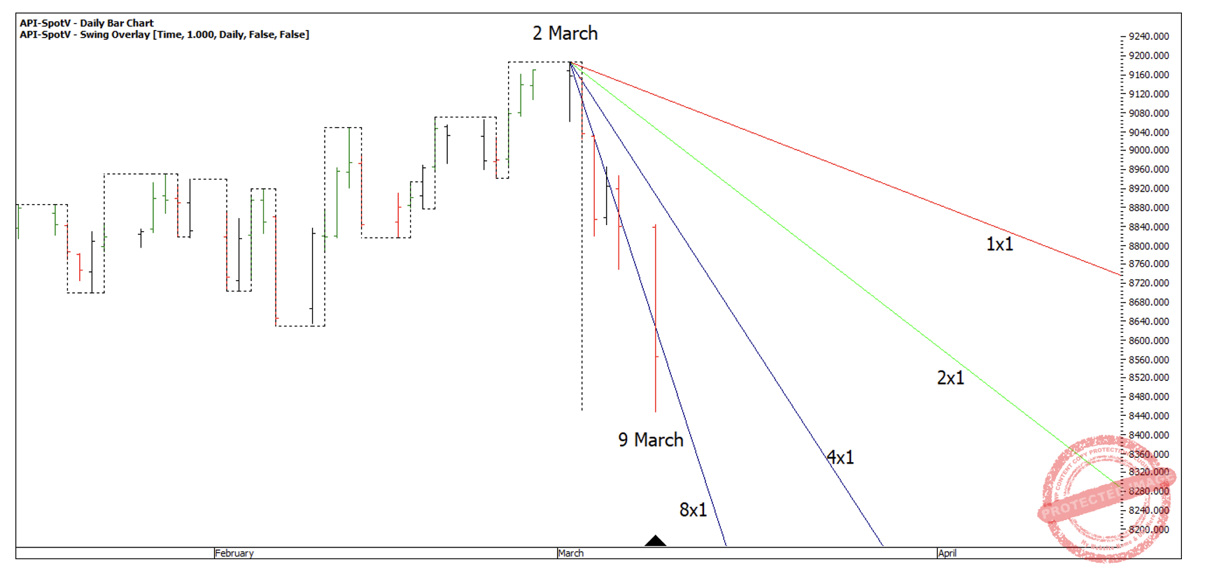
Chart 3
As a general rule of thumb, I see the market as weak while it’s trading under the 2×1 Gann Angles, therefore I like to see the market make a higher bottom on the 2×1. This doesn’t always unfold perfectly; however I do use this as a guide.
In Chart 4 below, you can see, the market moved sideways in a period of accumulation, as it regained the 4×1 and moved towards the 2×1.
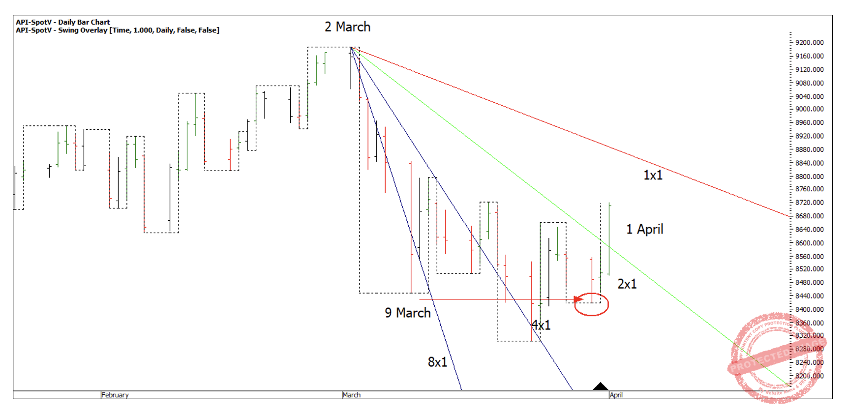
Chart 4
In this case the SPI200 broke through the 2×1 on 1 April with high volume of 57,470 contracts sold. Then if you run another set of angles from the 23 March Low, you can see the market holding support on the 2×1 running up.
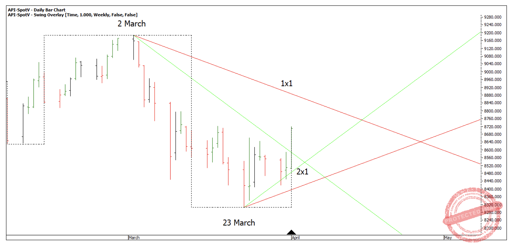
Chart 5
Since then, the market has regained the 1×1 running down and still above the 2×1 running up, although volume has started to drop off a little bit.
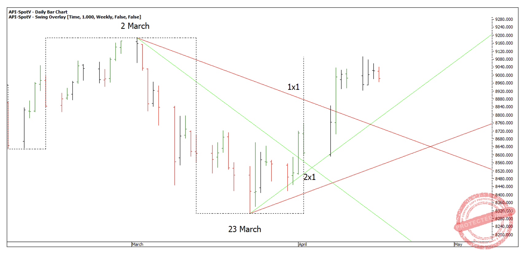
Chart 6
Even amongst all the crazy things happening in the world at the moment, my long-term view of the market hasn’t changed, I still think we have a few good years left of strong market returns, based on long-term Master Time Cycles. Even though that is a subject reserved for people with the Master Forecasting Course, I can drop some clues if anyone would like to go digging.
For this I use the 100-year Master Time Cycle on the Dow Jones. If you use the ProfitSource code INDU and look back at 1926 and compare that with the current market, you may see some similarities!
Happy Trading,
Gus